Wednesday, August 20, 2025

Boarding Actions Terrain - Part II


...and behind door number one...

It's been quite some time since I last worked on the boarding actions terrain, and honestly there's not a whole lot done quite yet. It's been staring at me for quite some time, but I've never been able to figure out the style I want to go for.

Since the last time I went over just about all of it with a black ink (tending towards brown) mixed with copies amounts of flow improver to turn it into a wash of sorts, and then used a damp brush to clean up some of the surfaces. The inks I'm using reactivate with water sometimes, so this method is almost like an oil wash in some regards. The general idea was to add some definition to places but to allow the base to be dirtied up a bit more in general. I should have done a drybrush to highlight before then, or even some simple edge highlights - might need to go back in and do that later. The ink can leave behind tide marks if too much water is used, so I leaned into that for scratches, dirt, and general wear & tear lines by using Nuln Oil later.

The cabling took a long time to figure out that a base coat of Corvus Black is enough for most of it. Mixing in either Stegadon Scale Green, or even better Incubi Darkness, gives them a little more colour for highlights without making them too similar to the base colour.

Recently I've been finding uses for the Two Thin Coats range, notably Doom Metal, and that's now my go-to for junction boxes, access terminals, and the like. I'll highlight with something later (likely Iron Warriors), reserving final highlights after I varnish everything.

Most of the brass looking areas are so far Castellax Bronze (a layer paint but with good enough coverage to be a base paint) followed by Runelord Brass (the old layer paint version). Retributor Armour for some of the buttons on the terminal just for visual interest, and all of the above for the lettering on the panels. I might yet put a shade around the lettering to increase contrast there and make them stand out more.

Still plenty to go - the skulls, the lighting, the terminal screen, and rust in a few places would be suitable. I'm tempted to try a couple of things with the airbrush for the terminal screen for a cheap OSL effect, which will need to wait until I have the painting space setup again for that. Same again for the lights above the door maybe (one will be red, the other green, imagining it would show door status, pressurisation, or some such information) however I don't know if I want the OSL on the door itself. That door opens, and it would look weird if it kept some of the OSL when that was the case. I'll need to think some more about that.

-- silly painter.


Wednesday, August 6, 2025

Devastator Squad - Part IX (Showcase of a Cherub)


Not what you imagined for drone delivery services.

Rounding out the squad is the little cherub familiar, delivering a canister of prometheum presumably. If I remember the lore correctly, these are vat grown flesh heavily augmented to fulfil whatever role - more akin to lab meat than anything else. While the appearance fits within the religious overtones of the setting, a "normal" servitor that could carry more and be outfitted with a greater array of sensors would be far more fitting on a battlefield - but hey, creepy flying baby.

In painting this up I based the entire scheme on a triad of Two Thin Coats colours picked up from recent model show: Barbarian Brawn, Dwarven Skin, and Elven Skin. These were used for all the skin areas by layering, glazing, and mixing on the palette. Obviously quite a matt finish and I probably should put varnish over it, but as quick free style piece I didn't really care that much for this model.

Robes are far too long.

The robes (or whatever) are built up as mixtures of Barbarian Brawn (to tie everything together), Mechanicus Standard Grey, Celestra Grey, (both of those Citadel of course) and Trooper White from Two Thin Coats. I have a bottle of White Star but haven't opened it yet - Trooper White is similar enough on small details and mixes ever so slightly better into other paints because it's an off-white.

The wings are Mechanicus Standard Grey, then mixed with Celestra Grey, and finally mixed again with Trooper White. Different mixture ratios and the extra skin tone in the robes make them and the wings look very distinct, even if mostly the same paints were used.

Silver metal is Doom Metal (from TTC), and then the usual culprits from Citadel. I have a preference for this approach rather than sticking to washes between metallics because I can just put everything on the palette and don't really need to wait for a wash to dry before I can continue on that area.

The canister is again Doom Metal, then Warplock Bronze (Citadel) mixed in to highlight up, then I think it was Sycorax Bronze afterwards to add highlights in a more NMM style, particularly along the rounded ends. It took a few successive layers to built up enough metallic contrast that wasn't completely overpowered by the gloss finish, but I think it worked rather well in the end - so long as you pay attention to the various angles the model can be viewed from and place highlights accordingly.

The gold details are nothing very different except I used Warplock Bronze to glaze into some shadowed areas or where I wanted more contrast. The rest of the smaller details are just whatever I felt like at the time - put one paint down and mix with what's already on the palette to build up highlights and shadows. This isn't entirely haphazard because I'm getting an idea of how various paints will mix and can use that experience to minimise the number of different paints I'm using, but also it's sometimes worth not writing it down because the key idea is experimentation. If something works very well then I'll make notes if I think it should be replicated on future models. In this case though, I really was just playing around.

Fun little model in the end, quickly painted up (by my standards anyway) and now I can look at what else is pending to be done.

-- silly painter.


Sunday, August 3, 2025

Devastator Squad - Part VIII


Never enough helmet lenses.

No, the squad still isn't finished. The Marines are, but not the squad. Turns out I had been leaving out a small familiar that needs to be quickly painted up, but more on that soon.

One of the things I've been still steering away from is bright edge highlighting. I went for something intense here, but not bright, so it's not as apparent in the final photos. This is partially a matter of taste, but also partially a matter of colour: as I've been trying different approaches to painting red armour, the orange tones of Wild Rider Red (my normal edge highlight colour) aren't quite matching anymore and I end up glazing back over them with Evil Sunz Scarlet. I may have gone too far on these models however, and I think the edge highlights are too little now.

I have a floating skull pet. Your argument is invalid.

The volumetric highlights have turned out well enough and are compensating to a degree for the underwhelming edge highlights. The airbrush stage setup a good sketch, but I still went back in with a brush after the final matt varnish to touch it up, which lead to a surprising development. First of all, the matt varnish did make some of the airbrushing noise fade - it's still there, but barely visible now. Trust the process I suppose. Second, a matt varnish will actually help dissipate surface cohesion of fluids on top (due to the roughed surface I suppose), which helps to feather out glazing. A little flow improver instead of water, and I was building up very smooth gradients very quickly. Using this helping hand I was able to reinforce volumetric highlights where they were lack, or create them if they were missing, to help tie the entire assembled model together.

Eat this.

For the missile launcher I tried just yellow and red that was on the palette to first build up a missile exhaust and then afterwards built up greys and black over the top to simulate smoke. In reality this would light up the rest of the model too (even in broad daylight) but sometimes a bit of artistic license is required. I didn't spend that long on the effect and it works ok - nothing too special, but the basic approach is sound and could be improved on with a little practice.

Let your worries just melt(a) away.

Reinforcing metallic paints with the mid-tone and then edge highlights all after the matt varnish works as expected still. I much prefer this way for metallic surfaces as opposed to pure NMM, but I am starting to take to a kind of hybrid approach: I've been starting to try and paint TMM but using NMM highlighting theory. One of the problems I personally see with NMM is that most will matt varnish afterwards, which makes the end result slightly dull and creates this dissonance of perception (the colours say metallic, but the lack of shine says paper). Using TMM gives the colours, shine, and while encourages a particular viewing angle it still works from others. The barrels of the multi-melta worked particularly nice with this approach so I'll continue to refine it.

That's not a laser pointer, this is a laser pointer.

I had a good deal of fun painting these models, even if they're considered older. They just have so much more character about them compared to more recent releases. I did buy Infernus Marines (for their poses) to kitbash with spare heavy weapons but unless I speed up my painting then don't expect to see that for a while. It was a slog to get through the Devastators but that wasn't the fault of the models, that was just "stuff going on". As mentioned before there is still the familiar to go, which I'll be using as a palette cleanser before figuring what I should tackle next.

-- silly painter.


Sunday, July 27, 2025

Fen Model Show 2025

 This is a followup to the previous post but focused on the Fen Model Show, which I had a chance to attend recently (and where I saw Two Thin Coats on display). I have yet to pull photos from my camera, so this will be another text-only post.

Overall I quite liked the event. I guess it needs to be compared to Kontrast Festival, even if that's not entirely an apples-to-apples comparison. Before anything else, however, there was one major issue when attending - and it was nothing to do with the event directly, but more some of the people there. Display areas are always crowded as people shuffle along to look at all the models and appreciate the effort put into items on display, but as a result there's also a continuous pressure to look and move along so the next person can see them. I tried to go through with my camera as fast as possible and get snaps of anything that jumped out at me, and tried to arrive early to beat the crowds (spoiler: that didn't work). A group of about 3 or 4 people however were _constantly_ in the way of everywhere I tried to turn. They just stood chatting and blocking access to everything. I believe one of them was an organiser too, who should know better. The polite and sensible thing to do would be to stand back slightly and let others pass by, but nope: they stood in the display area, they stood at the entrance, they stood at the stalls, and in two cases just pushed in front of myself. Rude little buggers. I held my tongue for my own sake (I didn't have anything on display personally and wasn't in a rush, I just don't like being blocked when I want to move) but someone else did tell them to step out of the way. It still left a poor impression and honestly is a deal breaker: I won't be in any hurry to go back if I'm not entering anything personally.

It wasn't poorly laid out, but anyone running such an event by now should recognise this is going to happen. Even a sign to remind me to basically keep it moving and allow others to have a look would be enough. You can't force people to file past, but you can hint at people to stop being pricks.

Actually this is something kind of important - I was so put off from dealing with the above that I purposefully tried to avoid looking at the models....when at a model show. It defeats the whole point of going there really, so it would be nice to see the problem being addressed in future. It's extra annoying because it's a paid event.

There was a good range of vendors with product to display. Not many, but a good range. Plinths, 3d prints, resin prints, brushes, paints, accessories, sci-fi, fantasy, historical, movie (I _really_ wanted Vasquez), etc. Even Element Games was there (with a bust by Angel Giraldez tucked away in a corner, so I picked that up). When I was at Kontrast Festival last time I had found the models to be much the same: mostly female, mostly sexualised, nothing particularly jumping out as different. Maybe that changed this year, don't know as I didn't go, but there was a wide variety at the Fen Model Show. Male, female, human, animal, robot, it was really all there.

This expression of diverse possibilities extended into the models on show as well. The competition wasn't about winning first, second, third, so much as about showing off models. Everything was welcome, there was no particular requirement - and I even saw someone showing off his daughter's models next to his own. I think I enjoyed that so much more than everyone trying to be the best to win and it naturally encouraged people to enter models that were just plain different. It wasn't really same-y for 90%, which is what I was feeling from Kontrast Festival. There were "frogs of the world" on display (that was really cool), a Weta (I think) Abaddon, scale model cars, creepy boats, goblins, tanks, floral shops, embossed cards, dioramas, pugs, and more besides. I could happily have strolled around the display area a few times if it were more comfortable to do so, but as it is I'll just have to go back over photos.

If I do start to enter competition then I'll go back to these places, but without that I'll probably avoid them in future. The stalls were good to browse, but I shouldn't be spending so much right now. Highlights were Two Thin Coats (the guys there were friendly and really knew their paints, shout out to one of them for pointing me in the direction of Major Brushes for a cheap synthetic that looks very promising to use for day-to-day painting), Element Games (can the event runners next time fix the accessibility so everyone can go to that area too please?), and Fantasy Wood Works (miniatureplinths.com, some very nice wooden plinths, also friendly people and I'm trying to get a custom size arranged from them).

-- silly painter.


TTC - Two Thin Coats

 No pictures here because why bother?

I finally attended a model show (more on that in another post) where the Two Thin Coats range was displayed. I've been keeping an eye on this paint range for a while, wondering what sets it apart from others. There's the obvious youtube ravings, but I don't trust them at the best of times because even if it's not a commercial then their perspectives on the matter are almost certain to differ from mine.

Let's back up though and start from the beginning.

Citadel paints are great. That's my opinion on the matter of course, but they get the job done, are widely available, flexible enough (with water or flow improver), and have a very large range. I even prefer their bottles for their own range of base and layer paints. They're also not paints that are aimed at a youtuber - they're aimed at essentially young teenagers, or parents of teenagers, or people who dabble in the hobby without getting too serious about it. That is the target audience, and the Citadel paint range fit that audience very well - but can also be used by people who are a little more into the hobby. Citadel also came out with the Contrast range of paints that everyone else has tried to copy (with varying degrees of success).

To anyone young and starting out in the hobby, I would absolutely say go pick up a starter set from Citadel.

I don't think Two Thin Coats are aimed at that audience. They can be used, sure, but the audience I think is the slightly more experienced painter. There's going to be a lot of overlap with Citadel paints in levels of experience of course, but the point is that the ranges are not in direct competition and to me instead can complement each other. More on how that will work (for me) in a moment.

At the show I approached the testing area to try out the white (White Star). I have no particular problem with White Scar (from Citadel) other than it dries very fast and can be a little difficult to thin properly and work with it when the weather isn't particularly friendly. I had heard that Two Thin Coats' white was very nice, so I thought I'd see for myself. Yes - it is very nice. It's definitely more translucent than the Citadel equivalent and as the name suggests it's best applied in two (or more) thin coats, depending on what is being covered. It also flows more smoothly across the surface - which is hard to describe without trying it for yourself. It has lower viscosity than most from Citadel, but good surface tension.

If I had to guess, slightly more pigment and flow improver in the Two Thin Coats range. The latter also means the working time is longer than what I'm used to, making wet blending almost trivial for me. I became rather experienced with glazing to combat the fast drying time of the Citadel range (which is generally going to be better for beginners) but now I'm at the level where some of what I would like to do is better achieved with a longer working time and being able to blend together on the model.

Here is where the paint ranges starting to complement each other comes into play. I think I will prefer base coating with Citadel paints because of the faster drying time - I can apply multiple coats more quickly, and depending on the paint it might need fewer coats for complete coverage. Using Citadel to sketch out initial highlights, then I can come in with the Two Thin Coats paints and smooth everything out. At least that's the idea - I'll need to build up a selection of paints first, which I'll only do as I need to replace my existing ones - everything I have works fine, but now I have further options when needed.

Finally, I tried Doom Metal. It's a nearly black metallic which is exactly what I've been after for a while. I was getting annoyed at everything metal being bright silver or steel, and wanted a darker look for e.g gun barrels. Doom Metal fits the bill nicely. The Citadel metallics work mostly just fine for me, but there are a few gaps and I think the Two Thin Coats range will fill that niche without me constantly trying to mix up something.

Finally: TTC are a much more matt finish, but this doesn't bother me because I always varnish my models anyway.

I've yet to try them through an airbrush, but I think the TTC range is impressive and what I need to continue to improve my painting at this stage of the journey. Right tool for the job and all that.

-- silly painter.


Monday, July 21, 2025

Devastator Squad - Part VII


Oh....yeah.

Slow and steady as the saying goes, and finally the Devastator squad is fully assembled. That doesn't mean they're complete - just that I can finally finish painting everything without needing to access otherwise difficult to reach areas.

There's simultaneously not a whole lot left, and yet it feels like an overwhelming amount. The armour needs edge highlighting and probably some of the volumetric highlights given another pass. While I was considering that last point I realised that perhaps the airbrushing could be simplified if I knew I was going to highlight again later anyway: rough sketch with the airbrush, fine tune with the brush later, edge highlight at the end. Worth thinking about. 

The right knee pad for Blood Angels shows which squad they belong to, and I picked blue with white cross this time around. I knew it would clash with the rest of the model and so I never used white (it's actually Grey Seer) but I think it's still too bright. Going still darker with the blue (near black then volumetric highlights with Night Lords Blue maybe) and a darker grey as "white" is probably the way to go. I'll bear that in mind next time.

Most of the rest is just filling out colours. I am painting them now one at a time, moving on when I get a bit bored, switching around for the last details. This is part of what I do like about the finished models - they're all a little unique - but it's also a nightmare for batch painting. I knew that going in, and now I just need to push through and get them done.

There is one final piece that's new though, and on all of them. The base. My usual drybrush paints are Underhive Ash followed by Terminatus Stone. Both of those are basically congealed pigment now and unusable (unless I get a mortar and pestle) so I needed a replacement. To that end:

  • Nurgling Green / Ionrach Skin (1:1) which gives the desaturated yellow-green of Underhive Ash.
  • Wraithbone, which is a close enough approximation for Terminatus Stone as it is.

They don't need to be calibrated and colour matched exactly, just close enough for the drybrushing to look the same, and I think the end result is most acceptable. Now I just need time to get through everything else so I can call these models done - time that should be on the way soon.

-- silly painter.


Saturday, July 12, 2025

Blood Angels Legion Terminator Praetor - Part IV


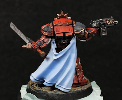
Not afraid to get that cape dirty.

It's been a few weeks since the last post, but I've not actually been idle - just haven't had time to take photos. One of the more recent tests has been the cape for the Praetor. I considered for a long while of how I wanted to show this, if it should be white, cream, or some other colour. Ultimately I wanted white to show purity and to help frame an otherwise darker model while still providing something to harmonise the brighter values of red on top and serve as a visual line to draw the eye upwards.

So the cape would be white, but white itself is never pure. There needs to be shadows, highlights, reflections from other colours, and so on. I ended up going for blue tints to continue the purity and angelic theme. Cream or beige is often associated with coarser material suitable for more rigorous endeavours, where as the blue is finery and status for the administrative halls of Terra. A high ranking Blood Angel seems to fit with status, purity, and the ornate armour already suggests artisan finery.

So far at least, the cape is just the basic outline and was entirely done with an airbrush. A few edge highlights will likely be added in, and then there's patterning to be added as well to break up the large surface (I'm thinking bright gold trim). I've struggled with capes in the past when using a brush, so this was mostly an attempt to gain experience with an airbrush to see what I could do.

The initial base colour is Night Lords Blue. This gives the deeper shadow colours, but it's not really too visible at the end - it will be entirely covered by the end, but covered with translucent layers. Next I mixed in Chemos Purple and used that to highlight some of the inner cape areas to act as a kind of reflection from the red armour. The end effect is subtle, but it's there.

Moving onwards through the paints I generally just remixed into an emptied but not thoroughly cleaned airbrush cup. The idea is to subtly influence each layer and help it blend into the one before - not sure it works too much, but it saves on having to deep clean between switching out paints. The next step up in blue was Macragge Blue, followed by Calgar Blue. These I started to add as highlights, but painting in thin layers and allowing them to over-spray into the folds.

One of the keys to cloth is that it's less about highlights and more about shadows: the mid-tones are the most important, deeper shadows away from the angle of the light source (_not_ just recessed areas, which might actually get direct light) and very soft highlights. The airbrush helps here: just angle the model and hit the sides or "walls" of the folds from one direction, adjusting the angle to reach recessed areas too as necessary.

Next up was White Scar, which was mixed with Calgar Blue in different ratios for multiple passes. Keep it thinned to almost glaze consistency here, and focus on raised areas the most. This was generally a filter to whiten the cape more than anything else.

After all of that I noticed some of the shading had been lost and so I went back with incredibly thinned Macragge Blue and deepened them again. I didn't want to go too much darker, again just filtering the colour is enough as that will naturally darken compared to white anyway. If I were to do this more then I would need to start adjusting air pressure, but as it was I played with trigger control and distance from the model for more or less the same effect (kind of, not really).

As always, the airbrush works best if the paints are thinned. Do not use them straight out of the bottle (at least not Citadel paints). Work in multiple layers, change colours gradually instead of going for large value jumps, and the end result can be very smooth without any speckling or "noise".

The cape is currently a little too contrasting to the rest of the model, however this will be sorted once edge highlights are applied on the armour (including the gold) and other details are added to the cape.

-- silly painter.