Sunday, July 31, 2022

Crimson Court, Vellas von Faine - Part II (Showcase)


Reinforced neck to help hold up the hair.

Vellas von Faine is "done", even if I'm not happy once again with the results. I skipped a few corners, trying to focus more on presentation than finer technical points. The gemstones for example are not done in the usual style, instead relying on a more solid colour to make the detail stand out. By this stage there's not much point in going over exactly which paints were used where, and instead give a post-analysis of what works, and what doesn't.

I attempts NMM on the swords, which in general is a weak area of mine. It didn't work out quite how I wanted, but does work better than a simple steel metallic paint approach. The reflective nature of metallics would have stood out too much against the armour. If I were to do this again, I would go with NMM on the swords - but I would also research a lot more, and use a lot more reference photos to get it right.

The purple armour was just something I wanted to try. It worked acceptably well, but I might use a dark blue in the shadows to increase the contrast a little more. I purposefully did not use variation in armour colour, opting to keep it all the same, but a little variation in places might be beneficial. This would come in the form of ambient light, or  perhaps some OSL from an off-model source. Either a red tint, or a more blue one to perhaps indicate night.

The skin tone I'm not unhappy with, but the highlights could have been pushed more on the face. This is difficult once the model is assembled (it's not a painter friendly sculpt) and I would probably need to invest in a better brush, but it would draw a little more attention there. The red eyes work well enough, and don't think I would change that.

The hair is acceptable, but could use something more. Normally this would be used to frame the face, but the volumes are used to balance out the darker nature of the rest of the model. Instead, it would benefit from a similar OSL mentioned previously - a light source to help define the geometry of the model. A cold white (i.e a very bright, desaturated blue) would go well here.

The cloth is both ok, and terrible. It works, and doesn't. The colour is ok, very desaturated purple-greys, but ends up looking like it was badly airbrushed. Perhaps some brown on the bottom to make it looks more dirty, or a freehand pattern to give it some more interest.

The base I'm ok with. This was a simple Basilicanum Grey over white through the airbrush, followed by Wyldwood splotched in a few places, and finally Dawnstone used for uneven edge highlights. Neutral hues, some tonal variation, enough to look like a stone dungeon but not enough to detract from the model. It didn't need to do any more than that. If the model was more complex, then the base might need some more work to balance that out, but in this case there's not a lot I would change to it.

So there we have it, another model finished. Running tally of permissible purchases is now 8.5, and there still remains one more with the Crimson Court. That last model isn't fitting my current painting mood, so I suspect it will end up again being something I won't be entirely happy with, so I will try to use it as another test piece for experimental techniques.

-- silly painter.


Sunday, July 24, 2022

Necrons - Showcase


Someone needs to make flaming clown scarabs.

I managed to complete the remaining Necrons. Right out of the gate: I'm not very happy with them, other than the scarabs. They look cool. So this post will go into a few details about what went wrong, and how I might fix it in future - the actual attempted painting was the same as for the prior Warden.

The scarabs turned out rather well. The central green glow just worked (white before the Mortarion Green was applied) and contrasts with the red "eye" quite well. There's no one single scarab standing out from the rest, and this helps give the impression of a swarm of them.

Lurch.

The Necron Warriors are simply too bland. The glow did not work on half the weapons, and there's nothing particularly striking about colours. The eyes are not bright enough to draw attention. The varnish layer made them too shiny and took away the metallic look, making them look once again like shiny plastic. The green shading went through a different airbrush and was either too strong in places, or too light. I should have done it immediately after the base coat to allow later stages to fix it up easier - or should have mixed the base coat with Mortarion Green! The gun casing is ok however - it's perhaps the one part that worked.
Looking for a panel beater.

I did try to use just Iyanden Yellow on some of the weapons, and this turned out much nicer. If I were to continue I would either use a bright green, or yellow. Again, however, the eyes just don't attract enough attention. It's really the let down of a focal point and ruins the entire model.

As for painting an entire army of these, that would certainly be possible. Depending on numbers, I might well skip edge highlighting on most. It doesn't do enough for the time spent on it. Picking or mixing a brighter final colour with the airbrush would do just as well while saving a lot of effort. I would likely prefer a black chest symbol with gold inlay, and possibly brighten the head just a little more to bring more attention to it. Either a bright green for the eyes, or otherwise expand the glow effect over more surface area.

Despite these being some of the worst models I've done to date, they are at least finished and I learned a few things. Not a total waste in other words. It was good to have a break from Space Marines, and they were only ever spare models that I never really wanted. They are also not part of the 1 model allowed to be bought for every 2 painted scheme, and so do not increase the running tally (which is currently at 8).

-- silly painter.


Sunday, July 17, 2022

Ultramarine Lieutenant - Part I


Blue Man Group auditions.

With new contrast paints having recently been released, I decided it was time to try out one colour in particular to see if I could get a much more vibrant result: blue. There are still various models I will paint blue (Librarians, a certain Primarch, for example) but always felt the existing Citadel paints lacked that really striking result of old-school Ultramarines. Now I think there's something close enough.

Although I'll detail the above scheme, I'll also write down what I'll do next time: this model is about learning, not about a final method.

To start with, a black primer as usual. I didn't want the white for a particular reason:I still wanted a dark blue in the shadows, and it's easier to build up brighter zenithal highlights than it is to darken shaded areas. Following that with some airbrush:

  • Night Lords Blue over the whole model.
  • Macragge Blue as a mid-tone, leaving the previous colour in underneath areas, recesses, etc.
  • Calgar Blue as a highlight colour.
  • White Scar (thinned of course!) added as a second highlight. This mostly covered the previous step, rendering it pointless really.
  • Asurmen Blue, fed directly into the airbrush. No thinning needed, although a little water in the cup probably did that anyway. This was sprayed over the highlights, perhaps too heavily in some areas, but overall saturating the brightness quite well and giving a very deep, but not dark, blue.
  • Gloss varnish to make sure everything was locked in place.
  • Naggaroth Nightshade in all the recesses to add some contrast.
  • Caledor Sky to highlight the edges. I tested some Hoeth Blue for this as well, but it was too desaturated, whereas Caledor Sky seemed to fit much more nicely.

I also added a decal on the left pauldron, and promptly ruined it. Good thing it's just a test model.

In future I'll scrap the Calgar Blue highlight stage and go straight to White Scar, possibly slightly more opaque, to give the Asurmen Blue extra "punch". I'll probably also do edge highlights with pure White Scar before the Asurmen Blue is applied, just to get that edge highlight more for free without having to colour match. And I'll use a better decal with a little less softener.

The above picture already has a matt varnish applied; I wanted to know if it would dull the vibrancy at all - and yes, slightly, but not enough to ruin it. Overall I'm pretty pleased with the result, and think that the new Contrast paints will work very well over white to bring out some good results.

-- silly painter.


Sunday, July 10, 2022

Space Marine Heroes 2 - Part III


Fear the might of the Imperial Beard!

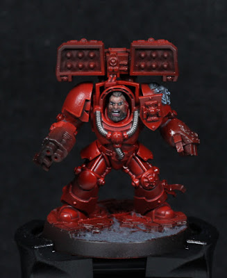
Very little progress on much of anything the past week in terms of painting, but there are a few notes on tools that will be included in this post. I have actually managed to paint all of the Crux Terminatus on the Blood Angels, but still still deciding on which colours to use for the Imperial Fist.

To start with however: the new paints from Citadel. I managed to try some out in store, and they are a solid addition to the Contrast range. It's also worth noting that the old glaze paints are essentially making a comeback - or at least the colours are. Although differing in intensity and being moved to the Contrast line, the colours are still there. Appropriate thinning will give any paint the ability to be used as a glaze, so this is indeed a welcome return to keep using some of those glaze colours with existing colour schemes. Paints change, but it's nice to keep army colours all the same, especially when it comes to something like a chapter or legion of Space Marines.

The shades are a mixed bag. Nuln Oil has changed dramatically. It's almost like a diluted form of the original, with a helping of Contrast Medium to make it pool slightly differently. The best use I can think of it for shading something tending towards white (marble, feathers, that sort of thing). Basically adding a shadow that doesn't shift the colour, keeping it as a grey tone. Agrax Earthshade appears to be ever so slightly a different hue, flows a little better than Nuln Oil, but also stains surfaces more. The new Agrax Earthshade is by no means a bad paint - I quite like it already and it has a lot of potential. It's just very different. Carroburg Crimson, however, is much the same as the existing, just not quite so watery. It flows well, stains a little, but doesn't pool overmuch. I'm really looking forward to trying that out on future models, and equally glad I don't have to hunt around for a replacement to my current method of painting Blood Angels!

On the topic of replacement shades: acrylic flow improver mixed with a contrast paint will turn it into a shade. It breaks the surface tension of the Contrast medium to make it behave far more like a shade, but is controlled slightly better than if just water was used. I've tried this out on Black Templar already, and it does work. Enough acrylic flow improver will turn any black in Nuln Oil really (Contrast or not), and I suspect Wyldwood could serve as a good Agrax Earthshade replacement. Will it be the same? No, but it might be good enough to not really matter.

And now onto some actual painting of a model! I just bought a headband magnifying set, i.e a headband with attachable lenses for magnification. It makes such a difference when painting eyes and very small details. How I got by without one I don't know. Everything is so much clearer, giving better control of the brush, and faster results. I still need to go back over the face of Beard Guy and fix a couple of points, but they are some of the better eyes I've done in a while - and that was the first practice run with the magnifying set! So I'll definitely be getting a lot more use out of those, so long as it's just for short stretches at a time. The change in focus itself can cause eye-strain, but only if over a long time.

I'm likely to switch from any sort of batched painting on the entire set and move to painting maybe three at a time. That was always the intention, now that all of them are fully assembled.

-- silly painter.


Sunday, July 3, 2022

Necron Royal Warden - Part II (Showcase)


Meh.

So I managed to get this model rather quickly, fulfilling that particular goal. The basic concepts used should allow the rest of the Necrons in the box to be done quite speedily. But. The Royal Warden looks horrible. The short version is that the greens and reds clash too much, drawing the eye to weird locations. This is a general problem with Necrons actually: the gun has that glow effect which catches the eye too much, and normally must be offset by a rather intense glow on the model "eyes" and a light colour to help draw attention there. There's a reason the reference model has a white stripe on the head. Basically, my attempt has a lack of focus and so overall is "meh", however I think the basic idea is solid for others - the real problem here is the green necklace. Perhaps I should have tinted it red, or made the gun energy effect green. Probably the latter - I'll cross that bridge when I come to it.

Anyway.

Carrying on from last time, I did indeed end up with some edge highlights of Canoptek Alloy. I also put Cryptek Armourshade in a few areas, but it's a very strong shade so I used it sparingly. After that:

  • Canoptek Alloy to highlight scratches and damage.
  • Agrax Earthshade in the damaged areas. Between the metallic and gloss varnish, this did next to nothing and can be skipped in future.
  • Warplock Bronze added directly into damaged areas, where shadows are expected.
  • Warplock Bronze also painted over the "bones". No highlighting was applied to these areas - I wanted them dark and to act as an outline, and decided that less was more to achieve that.
  • Liberator Gold more or less glazed onto the head, particularly in the middle. I wanted to make it brighter and help draw the eye to the head. Liberator Gold is also a green tinted gold, so it works well with the basic armour colour.
  • Stormhost Silver for extreme edge highlights, mostly about the eyes, but also mixed with Liberator Gold to make the centre line of the forehead even brighter.

The eyes are extremely simple:

  • White Scar dots on the eyes.
  • Blood Angels Red (Contrast) over the eye sockets.

The necklace:

  • Waywatcher Green (I still have that).
  • Biel-Tan Green because the previous step wasn't enough.
  • Liberator Gold to edge highlight and drawn across the top to bring out the symbols more.

Before I go further, in experimenting around the place I discovered that contrast paints over a gloss surface really just go directly into recesses. It can actually be brilliant if used as a shade in that case, especially if just a little bit of water is mixed in to really help it flow into recesses. I see myself using this technique to replace traditional washes - especially as I prefer to add a gloss varnish after airbrushing anyway.

The weapon I still wanted in metallics. This model is basically 90% metallics, because Necrons. I actually started with the energy effect:

  • White Scar thinned with water and "shaded" into the recesses. A couple of coats was needed here. I also applied a thin layer on the centre nodes (or whatever they are).
  • Casandora Yellow in between the centre nodes.
  • Fuegan Orange around the nodes.
  • Blood Angels Red on the nodes.

For the rest of the weapon:

  • Warplock Bronze around the casing.
  • Warplock Bronze mixed with Black Templar (Contrast) and applied over the barrels. I just wanted to see what mixing a contrast paint into the metallic would do, and I kind of like the result.
  • Nuln Oil (Gloss) over the casing.
  • Castellax Bronze for initial highlights.
  • Sycorax Bronze for edge highlights.
  • Skullcrusher Brass on the power transformer (for lack of a better term) just to break things up a bit.
  • Stormhost Silver mixed with Sycorax Bronze in different ratios and built up on the blade.
  • Incubi Darkness on cabling, followed by Black Templar to darken and then Incubi Darkness to highlight some areas.
Ribbed cabling was just made dark with two coats of Black Templar. Not a much visible detail, so go dark and keep them most unnoticed.

The base I did next to no effort with. I wanted to see what a slightly blue/purple tint would look like next to the green-gold of the armour, and it needed to be simple. Future models might follow this same pattern with a few rocks to add interest, and a skull or two here and there.
  • The Fang on the tactical rock, with Eshin Grey to darken some areas.
  • Astrogranite over the whole base, just to give an uneven surface.
  • Basilicanum Grey, mixed with a bit of water to break the surface tension, over most of the base.
  • Lucius Lilac drybrushed to pick out the texture.
  • Paint the skull.
Now ten more Necron warriors to go, along with some Scarabs. I'm kind of motivated to see just how well this exploration translates into a fast method of getting them painted, so I might spend some of this next week assembling them.

-- silly painter.