Friday, January 26, 2024

Terminator Chaplain - Part III


I'd like this guy as a school chaplain.

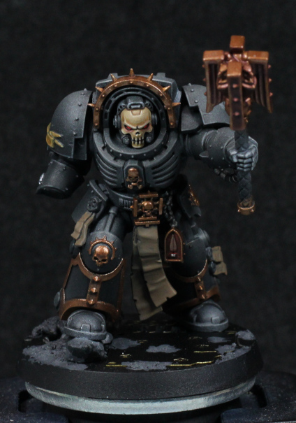
I wound up going with metallics for the chaplain, which so far seems to be working. The photo has them dulled down due to washes, but that will be fixed up later on. The main idea though is to be careful with the later highlighting and keep it consistent with non-metallic paint highlighting.

I'm using Balthasar Gold as the base here, just to keep it darker and in line with the gold method already used for the rest of Blood Angels that I've painted. There's also something else I've done: most of the details are gold, with very little variation in other colours. Sometimes I might paint a skull in bone colours, although for time saving practical reasons I've been doing less of that lately. I might try and paint a skull silver, but with a golden halo. None of that here: the trim and details are all the same. This isn't being lazy (although I certainly don't mind it being uncomplicated), but rather that I kind of felt it fit the model. Sometimes there's a certain elegance to simplicity. In the case of a Chaplain, I also feel that it lends an air of unyielding strength, the one in question devoted to their role and doesn't need flamboyance to show it. Sure that might be going overly analytical of a simple colour choice, but keeping in character to the model is what often informs how they're painted.

I don't have a photo of the shield, and was having a tough time deciding on the colours to use there. The background colour in particular I couldn't decide on, and then was playing with Blood Angels Red (Contrast) on a black background and thought it looked perfectly suitable. It was basically glazing the contrast paint on repeatedly until a transition from black to red started to appear. It's quite subtle, and I might need to edge some of it in Mephiston Red to bring it out a bit more, but thought it was a good experiment in yet another way to use Contrast paints. They're not normally applied over black.

The base I'm playing around with, but will probably go for something similar to the 30k assault marines in palette, with the idea that it can fit an industrial area or possibly the inside of a vessel. I don't have parts for "void war" bases or I'd use those: the armament suggests close combat in confined spaces (e.g a Space Hulk). I'll see how it goes.

Otherwise the model now feels to be well on the way, but there is one final note to make about it. With some details filled in, the black armour feels somehow "soft". That's only natural coming from the strong diffuse highlights; hardened black surfaces wouldn't have a reduced volume highlight profile, and be far more specular. I don't really want to fix this just yet, except perhaps on the feet, but at the end it might be a good idea to add very bright, defined edge highlights in places to darken the rest by comparison.

Definitely going with a white chapter symbol.

-- silly painter.


Thursday, January 18, 2024

Terminator Chaplain - Part II


Channel the rage.

I guess this is the next model to be completed, sorry dreadnoughts. I was inspired by Darren Latham's Legion of the Damned test (I don't have a specific link, but Google should easily show the model. There's freehand skull on a model and I like the colours, figuring they'd be suitable for the skull helm of a Chaplain.

I normally go for a shade of a blue or purple on skulls, but that creates a colder look - which is perfectly fine if I'm going for that, and it suited Lemartes rather well. The method here was a warmer bone finish, which to me fits with the "expression" on this model more, keeping a baleful glare without the starkness of brighter off-whites.

The steps here are again written directly from Darren Latham, but while presented as one colour then another, I mixed and layers between them all. The steps are more of a guideline, with going back and forwards as necessary.

  • Zandri Dust base.
  • XV88 for shaded areas and darker volumes. The brow and sides of the head are the most noticeable volumes that should be darker, but not the deep shadows of recesses.
  • Morghast Bone first highlight. Flow improver was used to thin and glaze this step.
  • Rhinox Hide in recesses.
  • (Ushabti Bone and Wraithbone were used in the original step, but I skipped these mostly because I was lazy at the time and the details so small that I mixed approximations from what was already on the palette.)
  • White for more extreme highlights. This step in particular was mixed with Morghast Bone and flow improver used to make sure the glazing was as smooth as possible.

The flow improver was key to the glazing being smooth, which can be troublesome with whites and lighter tones. I really should start using it more than just water because it really does help and I have plenty to work with.

The eye lenses I layered with pure white in preparation for next steps, and I figured instead of a normal gem or glass reflection effect I'd go for a glow. Maybe there's information being displayed on an internal HUD, but in any case I wanted a red glow to give the Chaplain more of a focused rage look. For this I used Blood Angels Red, and then played with adding white to try brighten the core lens area just to help it stand out more. This does turn pink, but it was helping - however ultimately I went over it all with Evil Sunz Scarlet mixed with a tiny dot of white.

The glow around the lenses I thinned Blood Angels Red with flow improver heavily to create a thin glaze and carefully built up multiple layers around the eye sockets - and even then I messed up a couple of spots and had to glaze Morghast Bone over it again. Lighter tones are troublesome for this, so I might one day try to first paint the glow, and then build up the main colours later, hoping that the red might still show through at the end. Or at least I could mix red in each step as I go.

I'm still torn between if I want to do NMM or metallics for the rest of the model. I have a concern that metallic shine will detract from that skull faceplate, and the head has set the need for more muted colours, but perhaps a matt varnish at the end can alleviate that problem. I'll try to fill in other details while I decide.

-- silly painter.


Tuesday, January 16, 2024

Karlina von Carstein - Part III (Showcase)


Come closer, I want to hit you with my cup.

I managed to find enough free time to finish Karlina to an acceptable level. I'd already decided that tabletop level was good enough, which seems to be an ongoing trend for me lately, but I'm not unhappy with the results. I played around with a few areas just for fun, with the most noticeable being the base.

I was originally planning on grey flagstones, but that just seemed too boring, and I didn't think it would fit with the model: a relatively bright upper body from the reflections, relatively light base, didn't see it working. Instead I went with cobblestones of the red-brown range that I've seen across various old cities. Doombull Brown was the main colour, after which I sketched the basic pattern in black, and then mixes of burgundy, black, Stegadon Scale Green, anything on the palette really. Even white mixed in for freehand edge highlights. The idea is to give each cobblestone variation in hue and value, which makes for a much more natural look. I don't think I achieved my goal unless it's viewed from directly above - perhaps the cobblestones could be larger, which would help view the pattern while also making the shapes rougher around the edges. Next time.

I did use Doombull Brown mixed with black to very lightly drybrush over the hem of the cape which would more naturally pick up dirt from the ground. It doesn't have to be much: when in doubt, do less. More can be added later if necessary, where it's much more difficult to remove it if applied too heavily.

The cup isn't quite as blue as I was going for, but I don't feel like glazing over it and pushing the colour mores more. It still looks like silverware and on the model is distinct enough from the sword. The colours are mixes of Grey Knights Steel, Iron Hands Steel, Stormhost Silver, and some black edging or glazing where appropriate. There are no formal steps here, it was just put those colours down on the palette and play around.

The rose is straight forward:

  • Screamer Pink base.
  • Pink Horror along edges, some volumes.
  • Fulgrim Pink for specular highlights. This step is more than just dots of the brightest points, and instead shifts the rose more into a brighter pink colour.

Stegadon Scale Green for the vine, with some brighter colours from the palette mixed in to highlight. I'm not a fan of the outcome - I perhaps should've used a more dedicated green/brown paint, but it's such a minor detail that it doesn't really matter.

The last interesting tidbit is actually the skull detail (buckle, perhaps) on the leg. I decided to go for something a little different:

  • Daemonette Hide base.
  • Mix in black for shadows.
  • Slaanesh Grey mixed in stages to highlight different areas. Use unmixed for the brightest edges.

And that's all - it's not the number of colours used that matters, it's the contrast to define the shape which matters for small details. I think it turned out well enough here, but I did use a very fine pointed brush and magnifier headset to get it done.

And that sums up this special edition model. I had a bit of fun with it, practised volume highlights, experimented on the base, but I'm glad it's finished. I won't be putting a varnish over the top as that would ruin the metallics, but it's also not likely to become a gaming piece anytime soon.

The count is now around 5 I think, but I'll say 4. Good thing I have more models to finish off soon, and motivation to save money right now.

-- silly painter


Saturday, January 13, 2024

Karlina von Carstein - Part II


The helmet is really just a hair shaper.

With the theme of the year to complete works in progress, I decided to start with Karlina von Carstein. It's a different model to a Space Marine, there's no need to replicate steps across multiple models, and shouldn't take more than a week (hopefully, but been there before!) to finish.

With the basic tones of the cape done, I wanted to turn my attention to the armour, however assembling models is really motivating for painting. Getting the head ready for gluing in place seemed the logical step for this, so I needed to paint the face and enough of the helmet that I could do this step.

The face itself I wanted to give a cold appearance. This isn't anything to do with how soon she has fed, but rather a reflection of what I imagined the personality of this character to be. I wanted an older aristocratic Lady, cruel but not malignant, desiring status over slaughter. For this I went with cooler blue skin, but without purples or reds which might indicate anything more sinister. The face is also barely visible, so I wasn't interested in multiple shadow tones or a bewildering array of paints, just something simple to make it stand out a little.

  • Kantor Blue over the entire face.
  • Rakarth Flesh, built up or mixed with Kantor Blue to sketch out volumes. Occasionally more of the blue to re-define those shapes where things went too light (e.g under the eyelids).
  • Deepkin Flesh, which is a naturally pale blue skin tone anyway, for highlights on the nose, cheeks, chin.
  • Screamer Pink mixed with Rakarth Flesh for the lips.
  • White (or close to it) for the teeth. Note this is closer to grey, as a pure white is too overpowering - even just straight Deepkin Flesh would be fine here so long as there's contrast to the rest of the mouth.

The eyes I kept black, mostly because they were getting frustrating to deal with and because I actually like the look. It worked with Horus, and works here to give a soulless expression; perhaps her eyes go black when the bloodlust of battle is upon her.

The armour I honestly wasn't sure about and tried a few things before landing on what I think is an acceptable result. The colours are indeed matching the boxart very closely, but the boxart was too light for my taste with this model. I wanted a darker, brown, polished look to the armour. I also tried to paint TMM as though it were NMM for no other reason than practice at how light behaves on reflective surfaces, and the painting lamp provided a good, consistent reference light source.

Originally I tried Warplock Bronze layered over with Screaming Bell. That didn't look right at all, but I mention it here because the result was a kind of orange metal look which is very suitable for steampunk vibes - or the kind of look I prefer for fuel tanks. It doesn't make practical sense, but visually it's immediate obvious what they are.

I next tried looking at some of the brass paints, which also didn't work at first because I'm used to layering and glazing rather than mixing paints. When it comes to repeatability across an army scheme I still find mixing unwelcome because it's difficult to get the ratios correct - but that doesn't matter to a single model like this. So in the end:

  • Warplock Bronze base coat.
  • Drakenhof Nightshade for recessed shading.
  • Brass Scorpion mixed with Runelord Brass for a volumetric highlight.
  • Brass Scorpion mixed with Warplock Bronze for volumetric highlights in darker areas.
  • Runelord Brass for general edge highlights.

I still intend to apply some Canoptek Alloy along selected edges later, but that will have to be done sparingly because it's a pigment-heavy paint. It's also worth pointing out that the photo above looks odd because the lighting was at a different angle than I used for actually painting the model - so while it's confusing a little to look at, I think the purpose still serves. I could use a thinned varnish to knock back some of the glossy shine, but I'm not going that far with this model - I'll save the competition level finish for something like Horus Ascended.

I've started on some other materials with Barak-Nar Burgundy when it hit me that another feature of cloth material is that sometimes the shading is about saturation over colour shift. This basically means starting from a midtone it might be as simple as mixing in black for shading. Something to explore later as well.

The model is starting to come together now and at first glance there doesn't appear that much left to be done, but experience tells me that it'll still take me a few days at least. The sword and cup are likely to be done next just to round off the metallics, then the folds of the inner robes, the arms, the rose, before finishing off any other details and basing the model.

-- silly painter.


Thursday, January 11, 2024

Year in Reflection - 2023

 Thanks to holidays, travel, and the usual sort of end-of-year enterprises, this is a few weeks delayed than I originally planned, but still wanted to write out a reflection of the past year in painting.

Originally for 2023 the plan was for it to be the Year of the Dreadnought. That didn't work properly. I only managed about half the number I wanted, but in return I did paint other models so it wasn't a total loss. Actually I'm not at all disappointed in the year, as I never intended to paint too many models to begin with, but it would have been nice to complete the Librarian.

Aside from the original plan failure, a fair number of detailed models were done or started (Jain Zar, Azrakh, Horus Ascended, and more) and some squads of Marines completed. Counted in the squads were quite a few tricky ones to work with or determine colours for, which always increases the time I spend on them, and course there was adapting to the scale of Titanicus and Legions Imperialis. It was a year of learning, and there was a lot of that.

One of the best outcomes of the year was stepping up a notch with the airbrush. The proper thinning of airbrush paints finally clicked, and I have a better feel for using Contrast through one now as well. I'm looking around for something to try that on again, which will likely be another squad that I can practice my new red approach on. Using the airbrush certainly has some drawbacks - there is that "grain" that often shows up, however I'm starting to lean towards not caring about that so much for squads: it's not too noticeable from any sort of distance, and the ease of highlights is worth the trade-off. I will still revert to normal brush highlights for more special models (e.g Horus) but the airbrush can still give a rough outline to start from.

In general I'm starting to be a little less fussy with the models, and this is a good thing. It means I can paint a little bit faster, and get through my backlog. I still want my skills to improve, and there are times to be fussy, but I'm going to be far more selective about that in future. Actually my handling of paint is probably just fine by now, but focusing more on colour and light is what will take me up to the next level.

Next (this) Year

The coming months I'm not really planning anything grand. I want instead to focus on finishing what has grown to a considerable number of works in progress. Terrain, a vehicle, several characters, all deserve to be finished so that I can clean up the painting area properly and start making inroads into the backlog again.

I will collect more Epic (Imperialis) models, but going to try and stick to only buying another box once the previous is painted. It's unlikely I'll be playing games, which will help keep the numbers down, and the Rhino transports taught me quite a lot about how to paint them effectively. I think individual tank models will be no more difficult than 40k scale Astartes, and for me might actually be somewhat easier.

I would like to return to oil paints on miniatures again, but not with oil washes. I want to pick and paint a model entirely using oil paints to blend and work at the colours in a more canvas painterly fashion. It will have to be something without too much detail, the oils will have to be applied as thin as possible, and it will take a month or two to cure probably, but it would be something different and exciting to try.

And with that, time to push fresh paper on the wet palette and get some painting done.

-- silly painter.