Monday, March 29, 2021

Bloodletters (Showcase)

They're all running from Smelly Armpit in the back.

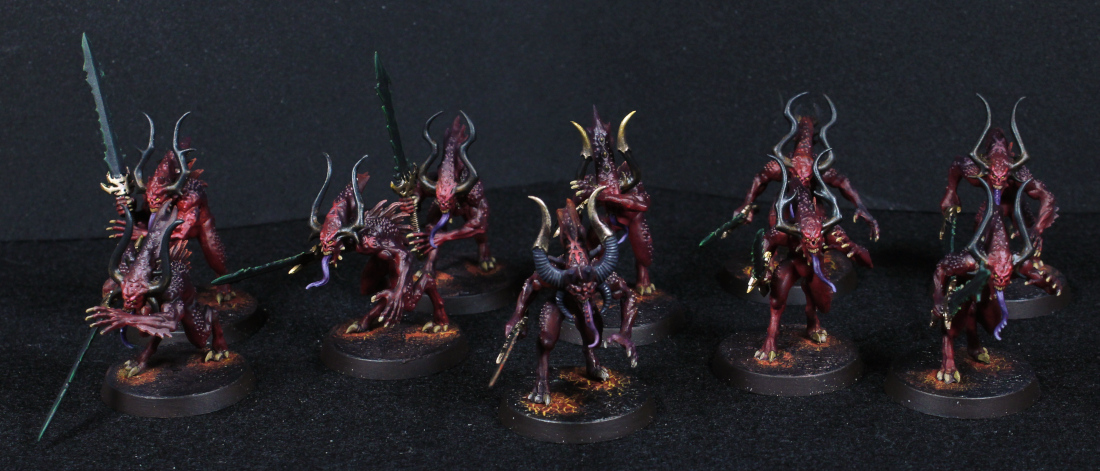
For no other reason than to give the airbrush a go with different reds, and to try out some of the crackle paint with a fire effect around feed, I've painted up some Bloodletters. I opted not to use banners, horns, or any such extras and instead just keep them reasonably simple.

With the exception of one. The leader was painted some time ago and is slightly darker than the rest, but in a group like shown it's not really that noticeable.

Wonder how many times it bites its own tongue.

To paint these models I decided to make the underneath lighter. This would kind of show as light from whatever warp taint is affecting the ground underneath them, and perhaps give the impression that their backs were somewhat more hardened - this is not a Bloodletter thing, but was a good excuse to practice such an apperance.

Basics from the airbrush, after a black primer, are:

  • Averland Sunset directed from underneath, with a little more on the face as well; the face is a focal point and I wanted it to stand out.
  • Khorne Red (obviously) over the entire model. Don't be too heavy on this step or the previous won't show through.
  • Calth Blue (Clear) on the back. I wasn't sure about this step - it may have been a little too dark, but I was betting on later steps of drybrushing to lighten things again.

And that was really it for the airbrush. The next step was attempting to use some Astorath Red to drybrush the bumps on their backs, but this didn't work as I wanted. So instead, Wazdakka Red was dotted on each bump. Each. And. Every. Bump. In hindsight I would skip the last airbrush step, drybrush the bumps, and then use Drakenhof Nightshade to clean up.

Wazdakka Red was also used for some highlights on the faces, followed by a little Pink Horror. This was also applied to the...stripe, fur, thing, down their backs. A little Corax White on the eyes for dots, followed by the Iyanden Yellow Contrast to give them an even more demonic appearance, and simple Morghast Bone and Skeleton Horde for the teeth and various claws. The tongue was Phoenician Purple, Warp Fiend Grey, and Druchii Violet.

The horns were Morghast Bone, over which was a slightly thinned (not enough) Wyldwood Contrast was applied. Black Templar Contrast was then thinned and applied to about 2/3 of the horns. I'm convinced this could work in future, but the Wyldwood needs to be thinned much more.

Runelord Brass, Agrax Earthshade (Nuln Oil on the handle, gloss variants of course), and some Skullcrusher Brass for the metallic bits. The brasses don't quite match, and actually I did this on purpose. Sometimes using colours or paints that don't quite fit together make something different - in this case I wanted the weapons to seem a little "wrong", and this was my way of doing so. The blades were black (Black Templar was used, it was sufficient for the first step) and then edged with Warpstone Glow. Following this a thinned coat of Black Templar Contrast was added to blend in the green a little, with some touch-ups done again later where it was too dark. Red, orange, yellow, just would have stuck out too much, and I find this far more interesting.

The bases were surprisingly simple. The key is to paint them a bright colour first, Averland Sunset in this case. A thin layer of PVA glue (or wood glue, however it's called) and then Martian Ironearth over the top of that. When it's completely dry, glue the model in place, and then start to cover the outer edges with Black Templar Contrast. Spreading out the Contrast paint naturally reduces what's on the brush, until it can be sort of "drybrushed" closer to the feed. It's hard to describe but this effectively fades the black into more of a red, and then from there to yellow of the underlying Averland Sunset. Rhinox Hide for the trim seemed better than black, just to give it an outline. I'm happy enough with the result and could easily imagine a larger diorama done this way, with prior footsteps visible as they fade away.

The fire around feet could also be explored more on a special model with a larger base, something like an Avatar of Khaine. Additional scenery, like plants or rocks, could be darkened and given a burnt appearance to show the heat being given off. Something to think about.

Anyway, that's basically it for these models. They were done as a bit of an exploration and I don't intend to keep them, so tabletop quality is sufficient.

-- silly painter.


Friday, March 19, 2021

The Sanguinor, Exemplar of the Host - Part I


Chest bump!

It's possibly not yet time for another post, but I wanted to record what I'd done to start with for the Sanguinor. This may end up leading into armour for Sanguinius, or tweaked for Adeptus Custodes, so it's worth noting it down.

Most of the work so far is with an airbrush:

  • Balthasar Gold (Air). Either the paint was a bit thin, the nozzle was too close to the model, or there was moisture in the line because this needed a the base paint version to clean up a few places afterwards.
  • Agrax Earthshade (Gloss) in recessed areas. This was just to make them darker, and the gloss version used for surface tension properties (or lack thereof) - the gloss finish itself doesn't matter as more metallic paint steps follow.
  • Relictor Gold (Air). This is a good yellow gold, and highlights well over the previous step. It's a little more yellow than Gehenna's Gold, perhaps a mix of that and Auric Armour Gold. This was applied mostly from above and the sides.
  • Thallax Gold (Air) mostly from above. This is a very nice gold, and close perhaps to Auric Armour Gold. It has a very yellow finish, and is one of the better paints I've used through an airbrush. Extra focus on the face, hair, and chest area.
  • Reikland Fleshshade (Gloss) back over recessed areas. I may have gone a little too heavy with this step, but wanted the definition of various areas so needed it. Later steps will very likely add a hefty amount of white and might fade out armour detail by comparison without such contrast.

It's well worth noting at this point that during the airbrushing I was doing metallics of another model and had some blowback - and thankfully I was wearing a respirator mask. The paint is bad enough if it enters the lungs without metal flakes in it as well. The extractor hood I use is fairly effective normally, but this had visibly escaped. Always wear an effective mask when airbrushing.

There are obviously a good amount of details to fill in with this model, and a bit of the halo needs some repair. The "hair" I intend to highlight with a very bright gold, or a silver, and of course the wings need to be figured out. Another problem for this model is the spray varnish step, which would dull the metallics unacceptably. I may therefore have to skip that step and instead stick to applying varnish to select areas with a paintbrush.

-- silly painter.


Tuesday, March 16, 2021

Wight King (Showcase)


Really wanted to be an opera singer.

This model was very fun to paint. Lots of character, not too difficult, detailed enough to stand out, and can fit nicely within my Hero Quest side project.

Models such as this are where Contrast paints really come into their own. The usual black primer was followed by a kind of zenithal coat of Wraithbone spray from above. It was perhaps heavier than I intended, but worked well enough.

The cloak is just Nighthaunt Gloom. The red clothing is Blood Angels Red, with a little bit of Wraithbone mixed into a red on the palette for additional highlighting purposes. The fur is Gore-Grunta Fur, with a little Agrax Earthshade in a few places, and a bit of Skag Brown mixed with Wraithbone to drybrush over the top.

The chainmail is a mix of browns, blacks, reds, whatever was hanging about to give some non-uniform appearance, then drybrushed with Iron Warriors, and a bit of Stormhost Silver after the usual varnish step.

The armour plates started off with Runelord Brass, and then shaded or highlighted as necessary with Iron Warriors in a kind of dabbing motion with an old brush. This was followed by Ironbreaker in some areas, with edges given over to Canoptek Alloy. A few dots of Skeleton Horde Contrast (which of course was also used on the skeletal areas) for rust, and pretty much done.

The sword, which isn't very well seen in the photo, started as a base of Iron Warriors, with some Leadbelcher over that to help define shape. Typhus Corrosion was then dabbed on, followed by Leadbelcher (again in a dabbing motion), and finally Stormhost Silver using the same technique. By making the dabbing random and overlapping it gives a worn, rusted appearance. This particular effect is something I very much want to explore further - it was incredibly simple to do, but gives an impressive result in this case.

Side note: Aethermatic Blue over Runelord Brass looks very similar to Nihilakh Oxide following the varnish step. A bit of the Canoptek Alloy over the top in a few places restores the metallic look. This was used on the sword hilt.

Last mention for this post is actually something else for stone. On the base, after a zenithal highlight, Basilicanum Grey and then drybrushed with Longbeard Grey. It may be another case of simply the small size of the area on which this was done, but for darker stone carvings I'd like to explore this further as well.

-- silly painter.


Saturday, March 13, 2021

Blood Angels Standard Bearer (Showcase)


Banner Man.

The last of the Primaris from the Dark Imperium boxed set, a couple of first points: the writing on the banner is terrible (more on that in a moment), and I can't really understand Blood Angels, with Dante as Chapter Master, calling these guys an "Ancient". So I'm sticking with Standard Bearer.

The banner itself is the most interesting part, painting-wise, of the model. There's a lot going on there, and quite a few new things on my part. The background yellow is essentially the same as for the Lamenters Gravis Captain, but I used stippling a little to create some highlights. They were smoothed over later, but enough shows through to give that cloth impression. There's also some Casandora Yellow around edges just for definition.

The edge box and halo were done with an NMM style approach as this fits with a banner: it's some kind of embroidered pattern, but the artistry behind it would lend naturally to NMM techniques. This was in the end:

  • Dark Reaper as a first step. This is a layer paint, so multiple layers will be needed.
  • Thunderhawk Blue as first stage highlight.
  • Fenrisian Grey as second stage highlight.
  • Nuln Oil in a few key places to give some more contrast.

Happy enough with the results for that, and may well keep it in mind for future NMM, perhaps with an edge paint to punch the contrast a little more if necessary.

The lower panels of the banner were helped along greatly with some decals. 2nd Company, and so a number 2 is shown. I added a little filigree to outline the panel, which thanks to a size 000 Windsor & Newton brush worked out rather well.

Scribbling on the purity seals and banner were done with a fineliner pen, and of course coated with (spray) varnish to seal it and give a matt finish. As can be seen, it gives excellent results for small writing, but doesn't scale very well. In future I will rectify that problem by using more ornate writing, but I guess I was just in a rush this time around. With a bit of planning though, and a decent font, I'm convinced it could be greatly improved upon and still look just as effective as though a brush were used.

On the subject of the fineliner, one new approach that works rather well on larger scrollwork where mistakes are far more visible is to first coat it with a varnish of some kind. I used Stormshield, but any varnish is fine. If a mistake is made, a little bit of cleaner (I'm still using airbrush cleaner) and a cotton bud can be used to wipe it clean without damaging the underlying paint. I actually did just that on this model - wiped off and rewrote the word "blood", something I wouldn't have found quite so easy with just paint.

Not seen in the photo, I didn't wait long enough for the decal on the left pauldron to completely dry before the spray varnish step, so it has some little bumps similar to on the Gravis Captain. It's not readily seen, and there's no frosting again, so it's not all that bad. Also not seen in the photo, the left hand is painted black in homage to the old Terminator style. It just seemed to fit.

Finally, the banner keeps breaking off this model. It's a little frustrating, and the connection points are small and thin enough that pinning wasn't something I was willing to tempt. Have to remember this when handling this model in future.

-- silly painter.


Thursday, March 11, 2021

Lamenters Gravis Captain - Part III (Showcase)


Given their history, capable armour for a Lamenter is a must.

Turns out there wasn't much left to do on the Gravis Captain. A decal, some of my personal approach to power fields on a sword, some metallics after the varnish spray, and that's about it.

I could have done more with the base, but somehow had the impression it would run the risk of looking cluttered if I did. The model is relatively bulky and takes up enough points of interest on its own.

There are a couple of places where the varnish spray didn't set quite right, thanks to a few light drops of rain while leaving it to dry, but thankfully there was no frosting.

Anything I might change in future would be to add some edging in places to break up the yellow a bit. There is simply too much of it. Maybe deeper shading would help, e.g airbrush with Seraphim Sepia.

I do like how the left pauldron turned out though.

Only a Son of Sanguinius can keep a cape clean on the battlefield.

-- silly painter.


Sunday, March 7, 2021

Lamenters Gravis Captain - Part II


The chapter symbol all painters fear.

More progress on the Lamenters test model, now fully assembled. I'll say it right out off the bat: that chapter symbol is a nightmare to paint. I don't want to even think of trying to do that for an entire army. Self printed decals would be the only way to go, if sculpted shoulder pads were unavailable.

Make no mistake, under a magnifying glass it doesn't look very neat at all, but I'm otherwise happy with the checkers and symbol turned out, especially considering my lack of freehand expertise.

The blue winged skull details are also something that worked much better than I originally anticipated. It's a good "punchy" blue, but not a bright blue (something that would have ruined the look when compared to the more muted mustard yellow). Recipe for the blue is:

  • Nightlord Blue
  • Altdorf Blue as a first stage highlight.
  • Nuln Oil in the recessed areas.
  • Ahriman Blue as secondary highlight.

Turned out well enough that I might consider the formula for whenever I paint a Nightlords model.

I do wonder if green eye lenses wouldn't have been a better choice. They might have stood out some more, drawn more attention to the face area. The iron halo (or whatever it's intended to be) I debated painting more silver, but ultimately went with a brighter yellow that wouldn't overtake anything else for attention. Didn't really quite work, but not sure what else I might have done.

The inside of the cape was

  • Wraithbone (multiple layers to get a smooth, even finish).
  • Seraphim Sepia in all the folds, particularly the deeper recessed areas.
  • Morghast Bone, thinned, to blend in the wash staining.
  • Wraithbone again, thinned, to lighten the raised areas.
  • Screaming Skull (you guessed it) thinned to give a final highlight.

The corner details were left alone after the second step. So much of the model is already white or yellow that anything to make it stand out more would have been too much.

The model is very nearly done: a decal or two to add something in a couple of areas, varnish spray, metallics, and the power sword effect. At this point I'm still not a huge fan of Gravis armour, but I think the blue and chapter symbol have rescued this particular paint job.

-- silly painter.


Wednesday, March 3, 2021

Blood Angels Lieutenant (Showcase)


"Say again....he did what?!"

Another model from the Dark Imperium set done. One of the Lieutenants and a model I quite like because of the different pose and loadout to normal.

Not a whole lot to really say, as there's been nothing new in the way I paint the model. It's all been recorded before, with the sole exception of the weapon strap, which is just Snakebite Leather over Zandri Dust and a bit of Screaming Skull for wear lines on the edges.

The grass tuft has gone a bit white after the varnish spray, suggesting that I should add it after that step in future. It could use a little Agrax Earthshade to tie it to the base more, but I probably won't get around to that.

 The pistol holster (which isn't very visible) has been done in the same style as the recent Primaris Death Company, but I don't like it as much with all the red armour. In future I'll switch back to the old style for normal marines, but keep the new style for any further Death Company.

The relic storage ... thing ... could use an edge highlight as well (or a thinner Contrast coverage in future), but again I'm not likely to do that. It might draw too much attention away from the face, which turned out relatively ok if not looked at too closely.

-- silly painter.