Friday, May 3, 2024

Commander Dante - Part I


Head hunting.

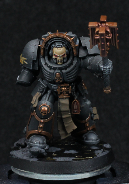
One of the first models that I painted when I got back to painting was Commander Dante. That was a finecast model, and I had painted the metal version long ago (and had also given that army away long ago). The new, Primaris, Command Dante is an excellent update to that old sculpt. The basic design remains the same, but has been updated with modern approaches to miniature design, and of course a slightly larger scale.

I was thinking for quite some time about how to paint the new model. I wasn't going to do NMM, but I also didn't want to go for a simple approach - I wanted to try use metallics to push the envelope and see what I could do with them.

Originally I tried to base coat with the airbrush using Balthasar Gold. I was definitely leaning towards the original paint scheme itself and I like the darker colour that gives a more antique and master crafted feel to the armour. Unfortunately I forgot to first base coat with Rhinox Hide, and didn't know how to properly thin airbrush paints at the time. The result was very poor coverage with an awful lot of speckling, and black does not work as a shadow colour here.

After a very long time trying to think how I might want to fix airbrushing mistakes, I finally decided to simply go in with a brush using the same colours and smooth out the initial highlight volumes. The airbrushing, for all of the mistakes I made, still shows the volumes nicely and gives a great idea of where to place highlights. It's about here where I thought to deviate slightly and take some hints from the idea of painting NMM, but with metallic paints.

Only the left leg has been started because I wasn't sure how it would turn out and figured the legs wouldn't draw as much attention as the face, but do offer a large enough space to get an idea about how the rest would end up. All I did was mix Rhinox Hide and Balthasar Gold in varying ratios, layering and glazing over the volumes. The Rhinox Hide dulls out the Balthasar Gold, giving a very satisfying satin finish - highlights are certainly more reflective than shaded areas, but not excessively so. Flow improver helps to thin the mixture, and I'm starting to experiment with Lahmian Medium to slightly dull the more "pure" metallic glazing. I do want contrast in surface finish (more matt in the shadows, satin or slightly gloss on the brighter points), but I want more control over it and I'm hoping the medium will permit that.

I'm quite pleased with the result so far. I've already started on the "face" (helmet) and have highlighted that up further with Gehenna's Gold and Auric Armour Gold along the same lines. Gehenna's Gold has some Rhinox Hide mixed in mostly for the surface finish, and while it works I'm still considering pushing it a bit further. The details need more highlight contrast to properly make them out, which is something often missed when using magnifying glasses all the time.

-- silly painter.


Wednesday, April 24, 2024

Assault Intercessor with Jump Pack - Part III


I'm about...this tall.

Painting has been extremely slow going still, and that won't be letting up anytime soon unfortunately, but I have managed to finish all ten of the helmets (bar the sergeant insignia) and all the holsters (bar some finishing touches after the matt varnish stage).

The helmets were much easier to airbrush this time around, although I did mess up in a few places with too much pressure too close to the surface - this leads to the paint running in thin liquid veins and pooling in places. This was too unsightly for me and I went back in with Flash Gitz Yellow and Phalanx Yellow to rebuilt the highlights. Rebuilding them too quite a good deal of patience, a good brush, and some flow improver to make a glaze out of each colour, but it smoothed everything out in the end.

The gloss varnish as ever let the washes settle into recesses far easier without staining the rest of the area, with the slight exception of shallow depths. If the recess is too shallow and curves gently into the surrounding surfaces then I find that the gloss varnish impedes a smooth transition and it might need a few touch-ups later on. This is most noticeable up close on the stripe (for lack of a better term) on top of the helmets. Just something to keep in mind.

The eye lenses were relatively simple to do this time around, even with the reflection dot. A combination of a very pointy brush, paint which takes slightly longer to dry (flow improver, or use an ink), and a magnifying headset really helped in this regard. A few minor mistakes, but nothing that wasn't quickly fixable (or as quickly as poor coverage of yellow paint will allow for).

This leads me back around to the colour yellow. As a primary colour, it's actually difficult to get a very pure yellow - paints will naturally tend slightly towards the red or green side of things. Normally I would try to keep base, midtones, and highlights on one side, but here a mix is actually used. Averland Sunset is more of a red shifted base colour, but for example Flash Gitz Yellow (or at least my pot of it) is slightly green shifted. Does this really matter too much? Not entirely, thin enough coats will balance it out enough, but it's made me start to consider what is really going on, and if perhaps I could use something similar to my advantage in the future.

By highlighting with a very slight green shifted yellow over a red shifted yellow base, it pulls the result into a more balanced midpoint, giving a rather vibrant highlight. This won't work if the shift from either is too great - it will probably just end up looking more brown - and the highlight will need to be higher up in value as well (not a problem, that's partially what makes a colour a highlight). It also gives a little more contrast between final edge highlight and shadows. This would really only work with primary colours because of how difficult it is to mix up a "pure" primary colour, but it explains why the red paints I use work so well - there's a subtle blue hint in Carroburg Crimson, and the final highlight of Wild Rider Red is more of an orange (sometimes excessively so, and I need to knock it back with Evil Sunz). I've not tried it too much with blue. There's no reason secondary colours can't follow this as well of course, it's just going to rely much more heavily on glazes to shift colours where wanted - partially why Lamenters Yellow is very good at highlighting greens.

None of the above is really anything new, and seems almost obvious. The key difference for me was not really any hidden colours in a colour wheel, but instead a new way of thinking about my selection of paints for a particular scheme. Normally I might be thinking "that one looks brighter, I'll go with that", but now I'll think much more along the lines of "that one looks brighter and shifted away enough that a glaze will pull it towards the colour I really want".

I guess I'll see what difference it makes with future models, however long it takes me to start on something more experimental again.

-- silly painter


Sunday, April 7, 2024

Blood Angels Furioso Dreadnought - Part II


He can always headbutt - and win.

I was motivated to do a little more of the Furioso, so thought it about time to do an update. Some of it has actually been sitting a while and was done alongside the Librarian.

Firstly, the left shin name plate I'm particularly proud of. I didn't change how I paint it at all, but everything came together almost perfectly - it was the shadowed upper area that I noticed early on and leaned into, matching the highlighting elsewhere on the model. I can't really repeat this on every model - the sculpt itself is slightly concave and the painting simply accentuated the depth. Writing on that will certainly be done with a decal.

It's worth noting that this model was the last I had done with the three coats of reds to build up highlights. That's why they're not quite as bright of "punchy" as with the Librarian. I'll need to really sharpen up the edges later.

The sarcophagus will be the next item of focus now that basic torso colours are blocked in. The hope is that once I can make the sarcophagus either complete, or nearly so, then it will start to make the rest of the model look nearly finished, and that will motivate me to carry on more quickly. I fully intend to the follow the box art for basic colours. The arms I'll focus on once the core of the Dreadnought is finished.

The white wings on the torso (and again on the arms actually) is something I think I like, and was incredibly simple to do. Corax White as a base coat, and then a mix of Apothecary White / Basilicanum Grey / Contrast Medium (about 1:1:2) to give definition. Given the already white look, there was no point is trying to highlight anything further and I'm all for the softer shadows in this case. The one downside is that the medium used can dry a bit thick; it's fine as it is, but if I add anything more than paint will start to obscure detail. The intent is to try this same effect on the crossed bones, but given their lack of detail it might not turn out quite as nicely.

The metallics were applied with an airbrush, and poorly at that, but fortunately are dark enough that I can get away with simply highlights later. Metallic paint through an airbrush definitely needs thinning before use, but not too much or it really easily separates and pools weirdly. I do want to try a different approach at some point, which is to drybrush metallics over a black (or very dark) undercoat.

-- silly painter.


Friday, April 5, 2024

Assault Intercessor with Jump Pack - Part II


Not sure any pistol should be doing that.

It's been a while since my last post, and while I've trying to be doing anything hobby related, the reality is that I've been very busy and haven't done that much. I've not really touched the next Dreadnought, there's a fair bit waiting for airbrushing, and I have another particular model that has all of a foot done. So with everything going so slow, I've taken a kind of break and have been very (very) slowly assembling more of the Assault Intercessor troops.

The first test model doesn't have too much additional done: some colours blocked in, a couple of decals applied, and glued to a base. What is more interesting however is the plasma pistol, which I took some inspiration from Angel Giraldez for. I don't really recall the actual paints used, but that's relatively unimportant: just use reds, oranges, yellows, mix in white. I was looking at the model and noticed that the red overspray gave an interesting look to the pistol, almost like it was slightly glowing, and I recalled a painting of Mephiston that Giraldez had done. I also have recently been thinking of OSL effects, and it occurred to me that instead of painting this pistol in the "normal" way, I would try a little OSL and punch it some more by keeping the rest of the pistol very dark in comparison (no metallics). This works really well in the end, but the trick was to use Corvus Black to build up from (or layer down to), which gives a coal black that's a little more flexible with the lighting. At any rate, I'm happy with the result.

The base is nothing special, but actually I painted eleven of them in a batch, all magnetised, and waiting on other models. This particular model is missing a gun holster, and actually after gluing one to another model I've decided to paint them all separately and glue them later. It just makes getting at the armour panels and undersuit ribbing that much easier. I'm also painting all of the helmets in a line, and they're nearly ready now. With the jump packs already given initial airbrushing and shading, that really only leaves the bodies to be done.

The main bodies I very likely will still not batch paint in one go. I'll limit it to two or three at a time, if for no other reason than it keeps the airbrushing sessions shorter and more manageable with the free time I have. Assembly though, that I've been doing on occasion as a kind of chillout exercise: assembling models without any rush, small details one at a time, means that I'm still getting something done and can keep at it whenever I have a few spare minutes. Kind of like painting with only one paint over the course of two or three days, it's sometimes much easier to keep a small set of tools handy over multiple days, rather than a small number of models that need a large amount of tools and paints.

I will probably keep going like this for another week, maybe with some painting of the Furioso when I get to the right paints, but keeping things moving at a slow and steady pace.

-- silly painter.


Wednesday, March 20, 2024

Blood Angels Librarian Dreadnought - Part VII (Showcase)


Space wizard in a robot suit.

I'm calling the Librarian Dreadnought done. As is typical, there's always more I could do, but I think it's time to move on to another piece now. I'm overall satisfied with the end result, and I think as a model it holds up well even after all this time. The character that it portrays beats any of the more modern dreadnought designs.

The red I think worked out quite well. I was a bit concerned that the varnish would tone everything back too far, but I think it's ok. The photo doesn't really do it justice - the gradients are a little smoother in reality, particularly on the right shoulder, but I'm hopeful that as I continue to refine it a little then it will become what I wanted airbrushing to achieve in the first place. I'll still paint special models by hand, but it can replace squad based work...maybe. I'll find out with the assault squad.

The force weapon I kind of just stopped with. I could go back in an do a lot more detail, but basically I just didn't feel like it. I probably would have if there wasn't a sculpted design already in place, though now I think about it I could just make that design glow.

It's about here that I was considering again about why I paint, and what I want to achieve. Ideally I'd like to move onto single miniature work one day. That's the goal. To do that however, I'd need to put aside painting up armies, as there's just no time otherwise. So instead I'm focusing on above average tabletop standard for squads, a little higher for characters, and building up an army in that style. It won't ever win a painting competition, but it sure looks nice on display and I can experiment a little more easily. All speed painting techniques, all hacks to make me paint faster, are only done without sacrificing quality.

All that said, I think I'll have to get out an extra-special model soon and really go to town with it, over time.

-- silly painter.


Thursday, March 14, 2024

Blood Angels Librarian Dreadnought - Part VI


Put your...hands? In the air!

Some progress on this Dreadnought, even if it's painstakingly slow due to being basically incredibly busy right now. Still, progress is progress and it shouldn't be that much longer before I can call it done.

The major change has been to the base, where I went with a black marble again. Actually I also left some of the airbrushed red in places to give it some colour from that, but mostly I just played around with various colours to give the characteristic veins of marble. In doing so, I believe I've come up with some new ideas on painting marble.

One of the steps that's often missed with generic baby wipe and airbrush is that marble has shades, not just lines. Shades and transitions between them can often inform where to places veins actually, and soften some of the harder lines later. Normally I just fill in some colour and then feather it out randomly to help define these shades, but then I was playing with contrast paints and actually using something like them and allowing some "coffee staining" to take effect gives an easy, random, and convincing edge to act as a guide later on. The trick is to make sure it all flows in one general direction instead of being circular. Overlapping this effect (allowing drying time between of course) can even help give some depth impression, before and after building up some the striations. I want to explore this more later, and will definitely search for an excuse to do that - possibly with the next Dreadnought.

As a minor point, the colours were Abaddon Black, Corvus Black, Eshin Grey, and Mechanicus Standard Grey, with a little white or pale yellow mixed in places if I wanted something that little bit brighter.

When the marbling was done, I still wanted to add some shadows and highlights. Space Wolves Grey glazed into areas worked rather well to add shadow and some ambient occlusion, while Apothecary White acted as a general brightening filter. Using Apothecary White in a more concentrated fashion also helped give definition to the broken sides; marble has a quality where broken edges look brighter, and this was a fast and mostly acceptable way to achieve that look. A little Wyldwood around some areas in various concentrations (glaze vs shade) gave some more earthen tones, though I might add a little more rubble and dust before I'm done.

Moving onto metallics, I played with mixing blues, purples, yellows, and browns to get a machine oil look on pistons. In the end I mostly went with Snakebite Leather. On its own it's almost like a fresh lubricant oil, perfect for those parts which receive regular maintenance. Adding a blue or purple helps dirty it some more, edging it closer to thickened grease. I'll have to remember this when it comes to Imperial Knights.

Space Wolves Grey works nicely over Grey Knights Steel as well. I played with this on the force weapon, but there's not much to show there yet. It darkens without shifting the colour away too much, and I want to experiment with that to paint metallics in a NMM style.

Next up I'll be working on the scrolls, purity seals, etc, to put "writing" on them, and then I can probably lock everything in place with a varnish. Then I'll be able to see how well the reds turn out. I did edge highlight in a few places, but much of that will be toned back with the matt varnish and will need re-applying later. I just need a couple of days without being too otherwise busy and I could get it all done, but let's see how that goes. I'm not counting on it.

-- silly painter


Sunday, February 25, 2024

Assault Intercessor with Jump Pack - Part I


Shiny armour is shiny.

As a bit of a background project (because I don't have enough of those already!) I bought a bunch of the older jump packs with the idea of converting an Assault Intercessor squad into a jump pack capable squad. This was before the newer models were released, but while I don't entirely dislike the newer jump pack design, the ankle thrusters look out of place to me. I also prefer the poses of the non-jump assault infantry, so just putting old style jump packs on them combines the best of both worlds really.

I also just realised that I haven't added all the appropriate bling to this model yet - various pouches, backup knife, holster, grenades, etc. I was apparently in a rush, so I'll need to glue them on later.

Mostly this model right now was an excuse to test a new way of painting up red armour. I don't have it fully nailed down yet, but I think it shows a lot of promise. The basic overview:

  • Dryad Bark / Mephiston Red in a 1:1 ratio, over the whole model (airbrush to make this easy). This will serve as the shadowed colour.
  • Mephiston Red (again with the airbrush) for basic midtone.
  • Averland Sunset (still with the airbrush) to sketch out highlights.
  • Blood Angels Red (Contrast) (yep, the airbrush) to cover the last layer and blend it all together.
  • Gloss varnish (airbrush still makes this easy).
  • Carroburg Crimson mixed with artist grade acrylic flow improver (not Lahmian Medium) and used as a pin wash.

There will of course be edge highlights later on, and a matt varnish followed by any edge higlight touchups, but that's the basic approach I'm trying to use now.

I've learned to properly thin paints in an airbrush, and that helps dramatically. Cleaning is quicker, fewer dry tip problems, and far more control. The Averland Sunset helps to show where the highlights will be without getting lost in smooth transitions, but I'm still getting used to upping the opacity with several layers here. The brighter it is, the more it will show through the Blood Angels Red filter.

The newer Carroburg Crimson formula works nicely as a pin wash when combined with acrylic flow improver. The older shade formula didn't seem to mix as well, and thinned out too much - just didn't seem to work as nicely. No water or dish soap was added - the flow improver has low enough surface tension as it is, and combined with the gloss varnish it was almost like working with an oil wash. The drying time is increased slightly too, so any mistakes can be fixed up quickly.

There are downsides of course. The gloss varnish obscures mistakes sometimes, and they only show up after the matt varnish is applied. I'm hoping that won't happen here, but I'm likely to do this first test model before I try move on to the next nine of the squad.

I'm both hopeful and slightly confident that this approach will work out. It's not necessarily fewer steps, but each step can be done with far more confidence. This means fewer mistakes to fix, and a greatly reduced time spent on each step. I should be able to get this basic level done much more quickly - but I'll very possibly only use this on basic squads. Special characters that I really want to stand out are still almost certainly going to use a trusty brush to really control the highlights.

I'll continue this model as I go with other projects, such as the Dreadnoughts which are next in line to be finished.

-- silly painter.


Imperialis Baneblades - Part II (Showcase)


11 barrels of bling!

I'm calling the Baneblades here, if for no other reason than I've had enough of painting them. I messed up with them, and simply don't feel like investing the time to redo and recover them.

The main problem is the colour scheme: I don't like it at all. It doesn't work here. The models are simply too dark, which makes the Blingblade trim stick out too much, airbrushing didn't work, recess shading doesn't give enough contrast, the list goes on. The trim on the Blingblade I decided to cover up with Balthasar Gold because it was far too much of an eyesore, and I can tell why they have that trim on the Imperialis models: it outlines the shape. You can instantly see on the table what kind of tank it is, and I think it really works with the right colour scheme. In future I would probably do something like the Solar Auxilia with Contrast paints. I don't always like copying colour schemes, but I'm not sure what else I'd like to do here.

Drive me closer, I want to use flamers!

The second Baneblade I didn't paint the trim, and used Agrax Earthshade to dirty down some of the recesses, and I do like the end result much better, but it's still missing something. The shape isn't as well defined, so perhaps some more tone contrast on the edges could help with that. It's no good collecting more of the Imperial Guard tanks until I know how I want to paint them.

What did work was the barrels on the back. Warplock Bronze, and Screaming Bell over the top. I also mixed in Sycorax Bronze for additional highlights, and it ended up very close to how I wanted. I generally use this kind of look for canisters that might have a flammable liquid, or otherwise might need to deal with intense heat. It also gives much more visual interest to the models.

The viewports are basically Evil Sunz Scarlet. I tried a purple to shade them in places, and Fire Dragon Bright for highlights, but not much of anything other than the red shows up. The front headlights are Dorn Yellow covered with Talassar Blue, which gives a very bright, light, vibrant blue. Such points help to break up the plain colours and gives little hints of visual interest - it's not much, but it's critical to have.

Not much else to say. I should have started with drybrushing, then used contrast paints, and maybe a bit more drybrushing to highlight. Next time.

-- silly painter.


Sunday, February 11, 2024

Imperialis Baneblades - Part I


Blingblade.

I picked up a couple of Baneblades for Legions Imperialis because tiny tanks. They are not going to plan.

To start with I intended to follow the ideas from the Rhino experimentation. White undercoat, some edge highlighting, and then Space Wolves (Contrast) over the top. The problem really is that the design of the Baneblade doesn't have a whole lot of flat surfaces, even if the basic shape is a box. The detailing doesn't lend itself well to the highlighting I was trying to do, and there was insufficient space to give enough of a gradient. Instead I should've simply stuck with highlighting with a drybrush.

With all those guns, must have a convoy of ammunition behind it.

I've been practising my drybrushing with relatively cheap army painter brushes, and I can see the potential. The trick really is in getting the consistency of the paint just right - not flowing like a wash, but not actually dry either. It will take a lot of practice to get "right", but for a model like this it's an ideal approach.

I'm also attempting a different approach to some of the metallic areas. Instead of base coating and then washing into recesses, using a Contrast to darken and then layer over the top with a metallic. This is basically drybrushing but in a far more controlled fashion.

The other trick I've been trying here involves gloss varnish, Black Templar, and acrylic flow improver (not Lahmian Medium, which has other components that make is unsuitable here). Basically mixing the flow improver with a Contrast paint gives it a similar behaviour to oil washes over a gloss varnish, and I used it to recess shade the model. Using Black Legion would probably work better owing to its more concentrated pigment count, but the idea looks to be sound. The result rubs off quite easily too, so a matt varnish later will almost certainly be required, but mistakes can also be easily corrected. I will be trying this a lot more going forward, but it only looks to work properly with Contrast paints - I couldn't get the same effect with regular acrylics.

Unfortunately I'm not convinced with the golden armour trim look. The gold is too bright in contrast to the rest, so I've not done it on the other model yet. I'm unsure what to do here: go with the trim, or go with a far more unified armour panelling look? There are still plenty of details to fill in, so perhaps I should just do those first and see how I feel at the end. The Blingblade can be some rich aristocrat's personal command vehicle or something.

-- silly painter.


Terminator Chaplain - Part IV (Showcase)

Guidance counsel get serious.

Rather than spend any recent time with posts, I decided to simply finish this model instead. In what is becoming an annoying trend for the year, yet more health problems have made it take far longer than I'd like, but I'm calling it done now.

As an experiment in using Contrast through an airbrush it kind of worked. I wouldn't use the same approach for black again, at least not directly. I would probably prefer a very slight hint of blue were I to do this again, but whether that's mixing into the Contrast step or as part of the original volume highlights I'm not sure. I also would prefer some of the edges to be more sharply defined - and that's actually difficult to do with already desaturated colours. It ends up looking like the left hand, which doesn't look black then.

The lack of red on the pauldrons was a wiser choice I think. It fits within the overall theme much nicer, and ties in with the idea of leading Death Company, or someone close to joining them such as the storyline in Death of Integrity. The trim in gold was also a saner choice compared to trying to do everything black, which would only have worked had the black armour worked better.

The base was intended to be interpreted as either in a Space Hulk, industrial, or heavily constructed urban environment. It was initially too light and needed to be heavily toned down and given a small bit of interest to balance things out. It kind of works; I could do much more to it, but that's true of just about everything I paint up.

Faith is my shield!

The shield worked well enough in the end. The subtle red is nice, though next time I'd like to airbrush that first. That wasn't an option here as I didn't really know how I wanted it until much later. Although I did ruin one of the purity seals (the paint smudged out of place), the bones worked out nicely. I want to keep that in mind for skeletons in future:
  • Wraithbone base coat.
  • Druchii Violet in the shadows, recesses, and surfaces facing away from the light source.
  • Skeleton Horde over the whole surface - not too heavily, but not exactly light either
  • Wraithbone thinned and glazed to highlight again.
I'm convinced that a mix of primer, washes, and drybrushing could replicate the look closely enough for army painting. Even a base coat of violet and then zenithal of Wraithbone, then Contrast and drybrush should be efficient enough for painting, say, a Tomb Kings army.

Finally, decals and micro-pens make putting writing on scrolls incredibly simple. If I really wanted to take it a step further I would paint over the decals, but in this case it looks good enough as it is. The count is now at 4.5.

-- silly painter


Friday, January 26, 2024

Terminator Chaplain - Part III


I'd like this guy as a school chaplain.

I wound up going with metallics for the chaplain, which so far seems to be working. The photo has them dulled down due to washes, but that will be fixed up later on. The main idea though is to be careful with the later highlighting and keep it consistent with non-metallic paint highlighting.

I'm using Balthasar Gold as the base here, just to keep it darker and in line with the gold method already used for the rest of Blood Angels that I've painted. There's also something else I've done: most of the details are gold, with very little variation in other colours. Sometimes I might paint a skull in bone colours, although for time saving practical reasons I've been doing less of that lately. I might try and paint a skull silver, but with a golden halo. None of that here: the trim and details are all the same. This isn't being lazy (although I certainly don't mind it being uncomplicated), but rather that I kind of felt it fit the model. Sometimes there's a certain elegance to simplicity. In the case of a Chaplain, I also feel that it lends an air of unyielding strength, the one in question devoted to their role and doesn't need flamboyance to show it. Sure that might be going overly analytical of a simple colour choice, but keeping in character to the model is what often informs how they're painted.

I don't have a photo of the shield, and was having a tough time deciding on the colours to use there. The background colour in particular I couldn't decide on, and then was playing with Blood Angels Red (Contrast) on a black background and thought it looked perfectly suitable. It was basically glazing the contrast paint on repeatedly until a transition from black to red started to appear. It's quite subtle, and I might need to edge some of it in Mephiston Red to bring it out a bit more, but thought it was a good experiment in yet another way to use Contrast paints. They're not normally applied over black.

The base I'm playing around with, but will probably go for something similar to the 30k assault marines in palette, with the idea that it can fit an industrial area or possibly the inside of a vessel. I don't have parts for "void war" bases or I'd use those: the armament suggests close combat in confined spaces (e.g a Space Hulk). I'll see how it goes.

Otherwise the model now feels to be well on the way, but there is one final note to make about it. With some details filled in, the black armour feels somehow "soft". That's only natural coming from the strong diffuse highlights; hardened black surfaces wouldn't have a reduced volume highlight profile, and be far more specular. I don't really want to fix this just yet, except perhaps on the feet, but at the end it might be a good idea to add very bright, defined edge highlights in places to darken the rest by comparison.

Definitely going with a white chapter symbol.

-- silly painter.


Thursday, January 18, 2024

Terminator Chaplain - Part II


Channel the rage.

I guess this is the next model to be completed, sorry dreadnoughts. I was inspired by Darren Latham's Legion of the Damned test (I don't have a specific link, but Google should easily show the model. There's freehand skull on a model and I like the colours, figuring they'd be suitable for the skull helm of a Chaplain.

I normally go for a shade of a blue or purple on skulls, but that creates a colder look - which is perfectly fine if I'm going for that, and it suited Lemartes rather well. The method here was a warmer bone finish, which to me fits with the "expression" on this model more, keeping a baleful glare without the starkness of brighter off-whites.

The steps here are again written directly from Darren Latham, but while presented as one colour then another, I mixed and layers between them all. The steps are more of a guideline, with going back and forwards as necessary.

  • Zandri Dust base.
  • XV88 for shaded areas and darker volumes. The brow and sides of the head are the most noticeable volumes that should be darker, but not the deep shadows of recesses.
  • Morghast Bone first highlight. Flow improver was used to thin and glaze this step.
  • Rhinox Hide in recesses.
  • (Ushabti Bone and Wraithbone were used in the original step, but I skipped these mostly because I was lazy at the time and the details so small that I mixed approximations from what was already on the palette.)
  • White for more extreme highlights. This step in particular was mixed with Morghast Bone and flow improver used to make sure the glazing was as smooth as possible.

The flow improver was key to the glazing being smooth, which can be troublesome with whites and lighter tones. I really should start using it more than just water because it really does help and I have plenty to work with.

The eye lenses I layered with pure white in preparation for next steps, and I figured instead of a normal gem or glass reflection effect I'd go for a glow. Maybe there's information being displayed on an internal HUD, but in any case I wanted a red glow to give the Chaplain more of a focused rage look. For this I used Blood Angels Red, and then played with adding white to try brighten the core lens area just to help it stand out more. This does turn pink, but it was helping - however ultimately I went over it all with Evil Sunz Scarlet mixed with a tiny dot of white.

The glow around the lenses I thinned Blood Angels Red with flow improver heavily to create a thin glaze and carefully built up multiple layers around the eye sockets - and even then I messed up a couple of spots and had to glaze Morghast Bone over it again. Lighter tones are troublesome for this, so I might one day try to first paint the glow, and then build up the main colours later, hoping that the red might still show through at the end. Or at least I could mix red in each step as I go.

I'm still torn between if I want to do NMM or metallics for the rest of the model. I have a concern that metallic shine will detract from that skull faceplate, and the head has set the need for more muted colours, but perhaps a matt varnish at the end can alleviate that problem. I'll try to fill in other details while I decide.

-- silly painter.


Tuesday, January 16, 2024

Karlina von Carstein - Part III (Showcase)


Come closer, I want to hit you with my cup.

I managed to find enough free time to finish Karlina to an acceptable level. I'd already decided that tabletop level was good enough, which seems to be an ongoing trend for me lately, but I'm not unhappy with the results. I played around with a few areas just for fun, with the most noticeable being the base.

I was originally planning on grey flagstones, but that just seemed too boring, and I didn't think it would fit with the model: a relatively bright upper body from the reflections, relatively light base, didn't see it working. Instead I went with cobblestones of the red-brown range that I've seen across various old cities. Doombull Brown was the main colour, after which I sketched the basic pattern in black, and then mixes of burgundy, black, Stegadon Scale Green, anything on the palette really. Even white mixed in for freehand edge highlights. The idea is to give each cobblestone variation in hue and value, which makes for a much more natural look. I don't think I achieved my goal unless it's viewed from directly above - perhaps the cobblestones could be larger, which would help view the pattern while also making the shapes rougher around the edges. Next time.

I did use Doombull Brown mixed with black to very lightly drybrush over the hem of the cape which would more naturally pick up dirt from the ground. It doesn't have to be much: when in doubt, do less. More can be added later if necessary, where it's much more difficult to remove it if applied too heavily.

The cup isn't quite as blue as I was going for, but I don't feel like glazing over it and pushing the colour mores more. It still looks like silverware and on the model is distinct enough from the sword. The colours are mixes of Grey Knights Steel, Iron Hands Steel, Stormhost Silver, and some black edging or glazing where appropriate. There are no formal steps here, it was just put those colours down on the palette and play around.

The rose is straight forward:

  • Screamer Pink base.
  • Pink Horror along edges, some volumes.
  • Fulgrim Pink for specular highlights. This step is more than just dots of the brightest points, and instead shifts the rose more into a brighter pink colour.

Stegadon Scale Green for the vine, with some brighter colours from the palette mixed in to highlight. I'm not a fan of the outcome - I perhaps should've used a more dedicated green/brown paint, but it's such a minor detail that it doesn't really matter.

The last interesting tidbit is actually the skull detail (buckle, perhaps) on the leg. I decided to go for something a little different:

  • Daemonette Hide base.
  • Mix in black for shadows.
  • Slaanesh Grey mixed in stages to highlight different areas. Use unmixed for the brightest edges.

And that's all - it's not the number of colours used that matters, it's the contrast to define the shape which matters for small details. I think it turned out well enough here, but I did use a very fine pointed brush and magnifier headset to get it done.

And that sums up this special edition model. I had a bit of fun with it, practised volume highlights, experimented on the base, but I'm glad it's finished. I won't be putting a varnish over the top as that would ruin the metallics, but it's also not likely to become a gaming piece anytime soon.

The count is now around 5 I think, but I'll say 4. Good thing I have more models to finish off soon, and motivation to save money right now.

-- silly painter


Saturday, January 13, 2024

Karlina von Carstein - Part II


The helmet is really just a hair shaper.

With the theme of the year to complete works in progress, I decided to start with Karlina von Carstein. It's a different model to a Space Marine, there's no need to replicate steps across multiple models, and shouldn't take more than a week (hopefully, but been there before!) to finish.

With the basic tones of the cape done, I wanted to turn my attention to the armour, however assembling models is really motivating for painting. Getting the head ready for gluing in place seemed the logical step for this, so I needed to paint the face and enough of the helmet that I could do this step.

The face itself I wanted to give a cold appearance. This isn't anything to do with how soon she has fed, but rather a reflection of what I imagined the personality of this character to be. I wanted an older aristocratic Lady, cruel but not malignant, desiring status over slaughter. For this I went with cooler blue skin, but without purples or reds which might indicate anything more sinister. The face is also barely visible, so I wasn't interested in multiple shadow tones or a bewildering array of paints, just something simple to make it stand out a little.

  • Kantor Blue over the entire face.
  • Rakarth Flesh, built up or mixed with Kantor Blue to sketch out volumes. Occasionally more of the blue to re-define those shapes where things went too light (e.g under the eyelids).
  • Deepkin Flesh, which is a naturally pale blue skin tone anyway, for highlights on the nose, cheeks, chin.
  • Screamer Pink mixed with Rakarth Flesh for the lips.
  • White (or close to it) for the teeth. Note this is closer to grey, as a pure white is too overpowering - even just straight Deepkin Flesh would be fine here so long as there's contrast to the rest of the mouth.

The eyes I kept black, mostly because they were getting frustrating to deal with and because I actually like the look. It worked with Horus, and works here to give a soulless expression; perhaps her eyes go black when the bloodlust of battle is upon her.

The armour I honestly wasn't sure about and tried a few things before landing on what I think is an acceptable result. The colours are indeed matching the boxart very closely, but the boxart was too light for my taste with this model. I wanted a darker, brown, polished look to the armour. I also tried to paint TMM as though it were NMM for no other reason than practice at how light behaves on reflective surfaces, and the painting lamp provided a good, consistent reference light source.

Originally I tried Warplock Bronze layered over with Screaming Bell. That didn't look right at all, but I mention it here because the result was a kind of orange metal look which is very suitable for steampunk vibes - or the kind of look I prefer for fuel tanks. It doesn't make practical sense, but visually it's immediate obvious what they are.

I next tried looking at some of the brass paints, which also didn't work at first because I'm used to layering and glazing rather than mixing paints. When it comes to repeatability across an army scheme I still find mixing unwelcome because it's difficult to get the ratios correct - but that doesn't matter to a single model like this. So in the end:

  • Warplock Bronze base coat.
  • Drakenhof Nightshade for recessed shading.
  • Brass Scorpion mixed with Runelord Brass for a volumetric highlight.
  • Brass Scorpion mixed with Warplock Bronze for volumetric highlights in darker areas.
  • Runelord Brass for general edge highlights.

I still intend to apply some Canoptek Alloy along selected edges later, but that will have to be done sparingly because it's a pigment-heavy paint. It's also worth pointing out that the photo above looks odd because the lighting was at a different angle than I used for actually painting the model - so while it's confusing a little to look at, I think the purpose still serves. I could use a thinned varnish to knock back some of the glossy shine, but I'm not going that far with this model - I'll save the competition level finish for something like Horus Ascended.

I've started on some other materials with Barak-Nar Burgundy when it hit me that another feature of cloth material is that sometimes the shading is about saturation over colour shift. This basically means starting from a midtone it might be as simple as mixing in black for shading. Something to explore later as well.

The model is starting to come together now and at first glance there doesn't appear that much left to be done, but experience tells me that it'll still take me a few days at least. The sword and cup are likely to be done next just to round off the metallics, then the folds of the inner robes, the arms, the rose, before finishing off any other details and basing the model.

-- silly painter.


Thursday, January 11, 2024

Year in Reflection - 2023

 Thanks to holidays, travel, and the usual sort of end-of-year enterprises, this is a few weeks delayed than I originally planned, but still wanted to write out a reflection of the past year in painting.

Originally for 2023 the plan was for it to be the Year of the Dreadnought. That didn't work properly. I only managed about half the number I wanted, but in return I did paint other models so it wasn't a total loss. Actually I'm not at all disappointed in the year, as I never intended to paint too many models to begin with, but it would have been nice to complete the Librarian.

Aside from the original plan failure, a fair number of detailed models were done or started (Jain Zar, Azrakh, Horus Ascended, and more) and some squads of Marines completed. Counted in the squads were quite a few tricky ones to work with or determine colours for, which always increases the time I spend on them, and course there was adapting to the scale of Titanicus and Legions Imperialis. It was a year of learning, and there was a lot of that.

One of the best outcomes of the year was stepping up a notch with the airbrush. The proper thinning of airbrush paints finally clicked, and I have a better feel for using Contrast through one now as well. I'm looking around for something to try that on again, which will likely be another squad that I can practice my new red approach on. Using the airbrush certainly has some drawbacks - there is that "grain" that often shows up, however I'm starting to lean towards not caring about that so much for squads: it's not too noticeable from any sort of distance, and the ease of highlights is worth the trade-off. I will still revert to normal brush highlights for more special models (e.g Horus) but the airbrush can still give a rough outline to start from.

In general I'm starting to be a little less fussy with the models, and this is a good thing. It means I can paint a little bit faster, and get through my backlog. I still want my skills to improve, and there are times to be fussy, but I'm going to be far more selective about that in future. Actually my handling of paint is probably just fine by now, but focusing more on colour and light is what will take me up to the next level.

Next (this) Year

The coming months I'm not really planning anything grand. I want instead to focus on finishing what has grown to a considerable number of works in progress. Terrain, a vehicle, several characters, all deserve to be finished so that I can clean up the painting area properly and start making inroads into the backlog again.

I will collect more Epic (Imperialis) models, but going to try and stick to only buying another box once the previous is painted. It's unlikely I'll be playing games, which will help keep the numbers down, and the Rhino transports taught me quite a lot about how to paint them effectively. I think individual tank models will be no more difficult than 40k scale Astartes, and for me might actually be somewhat easier.

I would like to return to oil paints on miniatures again, but not with oil washes. I want to pick and paint a model entirely using oil paints to blend and work at the colours in a more canvas painterly fashion. It will have to be something without too much detail, the oils will have to be applied as thin as possible, and it will take a month or two to cure probably, but it would be something different and exciting to try.

And with that, time to push fresh paper on the wet palette and get some painting done.

-- silly painter.