Tuesday, December 27, 2016

Rhino Transport WIP#1

Paint first, assemble later.
It's time for a tank.
The Rhino troop transport offers an excellent vehicle for more airbrush practice, and to see how quickly it can be painted up. It's also not as complex as other models, and can be cut from the sprue quickly and easily enough.

The first step is to paint the inside compartment. The added bonus is that if things go a bit wrong, it really won't be seen that much, so I can afford a bit of experimentation to see what works, and what doesn't.

First step, as always, is a primer base spray. After thinking on the matter a good deal, I used black. This was with the trusty spray can, and provides a good surface for paint to stick to afterwards. Black, because I didn't want it to end up brighter than the troops it's meant to transport.

Getting out the airbrush next, a coat of Zandri Dust (air), evenly applied. Dryad Bark (air) in the corners and around objects next, followed by some Terminatus Stone (air) in an attempt to highlight a few areas. That last step turned out to be too bright, so back to Zandri Dust (air) to cover it all, and blend back over the Dryad Bark a little bit.
The results are quite acceptable, and very quick to do. Takes longer to tear down and clean the airbrush than to actually use it! Anyway, using an airbrush for initial base, shade, and highlights looks more feasible every time I try.

A few points of note:
  • The airbrush blending is effective, but trying to replicate it with the normal paints is very, very difficult. So trying to correct mistakes is going to be very difficult - experience will help with that, but don't even plan on going back over large areas. Leave fix ups to smaller sections.
  • The paint applies differently, blends differently, so painting over the top of it does look a little bit different. It's something to keep in mind. Not shown, but I did try the usual blend approach over the "boxes" (darker brown) in the compartment. It wasn't quite the same, took a few goes to get things right.
  • Karak Stone provides a good edge highlight. Only on the very edges, but definitely helps give definition over everything.
  • Decals of the Legion number, in honour of the Primarch.

On a final note, again not shown in the photo, the "boxes" ended up with:
  • Dryad Bark (base)
  • Gorthor Brown (layer) (bottom 2/3 of the boxes)
  • Baneblade Brown (layer) (bottom 1/3 of the boxes)
  • Agrax Earthshade (wash) (draw from bottom to top, let it dry so the wash settles in the same direction)

Still a good deal to go for the inside, but it's a start.

-- silly painter

Sunday, December 18, 2016

Stormcast Eternal Liberators

Hammer hammer hammer hammer hammer...time!
Before anything else, ignore the join lines! These models were an exercise in relative speed painting, and the first group to receive airbrush attention. The painting standard was therefore intended to be less than perfect - I quite expected to make a few mistakes.

For the first time using an airbrush however, quite a bit was learned. Airbrushes do not work the same as a normal brush, and the same techniques cannot be applied. I wanted to see if highlighting could work; it can, but is necessarily different. Point of source lighting, or colour transitions across large areas, that sort of thing seem to be best suited: anything that doesn't require the fine control that a good brush affords. The speed of painting though is very much faster. Stay tuned for more airbrush soon....

Overall, the colour scheme for the Liberators made them fairly quick to paint as well. Lots of gold trimming, made easy with the gloss shades. Stock standard approach: Retributor Armour, Reikland Fleshshade (gloss), Liberator Gold. The only interesting part was the "clouds" on the bottom. Purely drybrushed approach this time of whatever was on hand: I believe it was Mechanicus Standard Grey, some Dawnstone (dry paint), just dabbed on with a drybrush. It's not a bad effect, and certainly quick, though it doesn't give as much depth as the original.


It's probably the most tabletop standard I can do. Acceptable for mass painting though, so i'll keep them as references for that.

-- silly painter

Saturday, December 3, 2016

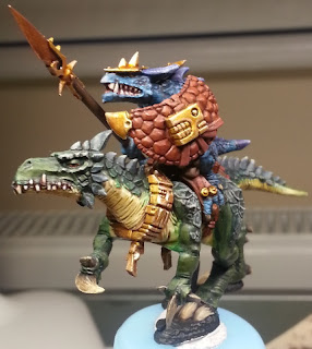
Lizardmen Cold One Cavalry (Complete)

Lemmings to the cliff.
Well it took a while, and the photo is (as usual) incredibly bad, but they're finally done. Nothing particularly special about the riders that hasn't been covered before, with the possible exception of the "banner". Decided that a pure gold banner would look too much, and be considered too heavy to hold aloft going into battle. Instead, it's mostly Dryad Bark with some gold edging in places to make it look fancy. Also decided that it was a fire snake of some kind, and the leaves would be dyed to reflect that, so they've been given a fire type look.

The bases are not the originals, but instead the Shattered Dominion oval bases done up to look like a swap overtaking some ancient ruins. Fairly easy in the end, and gave some opportunity to test out the airbrush a little (hint: if you have an airbrush and are using the Citadel Air range, get some squeeze bottles to put the paint into!).
  • Black (air)
  • Terminatus Stone (air)
  • Lustrian Undergrowth (technical)
  • Elysian Green (layer) (just on some plants)
  • Niblet Green (dry)
  • Hexos Palesun (dry)
  • Dawnstone (dry) (just on the stone areas, funnily enough)
  • Agrax Earthshade (shade)
The cracks in the bases were made to look like little streams running through the undergrowth, just by painting them a dark blue/green. This ended up being:
  • Macragge Blue (base, watered down to shade consistency)
  • Drakenhof Nightshade (shade)
  • Colia Greenshade (shade)
 That's about it really. I'm not a huge fan of the detail (or lack thereof) with the Shattered Dominion bases, but they give something to work with at least. Just be nice for a bit more detail in them.

The airbrush adventures deserve their own post, but I'm still learning with that. The idea is to make the base colour and initial highlight steps much faster - something I can only really play with more on the next set of models.

-- silly painter.


Wednesday, September 21, 2016

Legion Praetor Tribune (Complete)

 I actually finished this model a couple of weeks ago, but had it on display in the local Games Workshop store (or Warhammer store, as it's called now). An incredibly fun model to paint.
Gimli
 There's not too much to say about the painting, although a couple of points stand out. The gold trim was a combination of several layers, being:
  • Balthasar Gold (Base)
  • Druchii Violet (Shade)
  • Gehenna's Gold (Layer) (Most of the area, leaving recesses alone)
  • Auric Armour Gold (Layer) (Less area, mostly edges)
  • Reikland Fleshshade (Gloss Shade) (Selected areas)
  • Liberator Gold (Layer) (Edge highlights)
And my axe.
Another point of interest might actually be the base. After covering it with Astrogranite, some Mechanicus Standard Grey helped to even out the colours and bind the texture paint down. Multiple drybrush applications, picked almost at random and I can't recall exactly what was used now and then different shades applied. It's the different shades that ended up being the most useful: Nuln Oil, Reikland Fleshshade, Seraphim Sepia, Agrax Earthshade, even a little Drakenhof Nightshade. It all just helps to give extra definition and depth to the base. Incredibly simple, but quite effective.

Last note: messed up the head a bit. Couldn't quite get the eyes right, so he's a little battle scarred.

-- silly painter.

Thursday, September 1, 2016

Legion Praetor Tribune WIP #2

Arm-ament ongoing
A short update on the Legion Praetor Tribune, including a very bad photo. Hoping to get that sorted out soon - a proper lighted booth and turntable to take photos in.

The usual armour higlighting was done, however a coat of Purity Seal was added part way through because everything became too "shiny" from the flow improver (Lahmian Medium alternative) used. This really can't be seen in the photo, but the effort to he basic armour highlights, as ever, pays off in the end.

Gold trimming was a bit of an exercise this time around:
  • Balthasar Gold (Base)
  • Druchii Violet (Shade)
  • Gehenna's Gold (Layer), first highlight
  • Auric Armour Gold (Layer), second highlight
  • Reikland Fleshshade (Gloss Shade), just in select areas
  • Liberator Gold (Layer), final edge highlight

The blue wings on the chest piece works nicely as a bit of balance, and will help to create more focus in that area. A different head to the standard will be used, but it's not painted yet. I've decided to attempt to give the head a blue glow, emanating from within the armour itself. This is partly in preparation for when I work on Horus, and also just for something different to make this model stand out from others.

Next, however, I will likely concentrate on enough to get more of the model assembled.

Another Lizardman Rider has been finished too. Only 5 more of those to go.

-- silly painter

Tuesday, June 28, 2016

Cold One Rider, Legion Praetor

Not sure how the rider really sees.
 The rider was done in two weeks. Must be a record for me. Drybrushing was the key to that, but also knowing how I wanted to do everything helped. I could just paint each component and not think overly much about how to paint it.
A couple of interesting notes though: some of the new gloss washes were used, which really to help with metallics. Just saves a lot of messing about trying to keep the metal sheen while still trying to shade and highlight it. I would have liked a Seraphim Sepia version, but perhaps Games Workshop will release that later on.
The spear shaft I also ran some drybrushing along to simulate the grain of wood. Dryad Bark was used for the base colour, with Sylvaneth Bark and Golgfag Brown drybrushed over the top of that, and a coat of Agrax Earthshade wash used to tie it all together a bit more. Fairly subtle, but it works.

...and my axe!
The second model for today is the recently released Legion Praetor Tribune; a special weekend model. The original holds a glaive, but what made me decide to work on this model now was inspiration to replace the blade with an axe head. I had one left over from the Sanguinary Guard sprue, and I personally think it makes the model look much more powerful. This also marks the first time I've tried pinning (small metal rod to hold pieces together). Fortunately I drilled holes correctly aligned the first go, so it fit together quite nicely. The benefit of pinning here is that the axe head won't break off quite so easily - something I was concerned with if I had just glued it on. Much more solid now and I don't have to be quite so delicate in handling the model during painting.
So I guess it's back to red armour while I finish off the Lizardmen (6 more to go!).

-- silly painter.


Wednesday, June 8, 2016

Grey Knight (Done)

The first Grey Knight is now considered "done". I may go back later and add scrolls, books, or other such attachments, but for now the model is complete.
So awesome, he glows.
There's not much of note to say really. The besagew (at least, I think that's the intended function of the little shield) and wrist-mounted storm-bolter are the main additions, with a little base work to round things off.

The base could have been done better. I tried using some pre-made elements, but they don't sit flush with the rest of the base. So there's this muddied rock or concrete slab with a Guardsman's flask and some shell casings that doesn't really fit. The flask was Stegadon Scale Green (base), Agrax Earthshade (wash), and a bit of Straken Green to highlight some edges. Might make a nice Guardsman uniform basic later.

The besagew has a half white, half red colour scheme. The "white" was just Celestra Grey with Ulthuan Grey over the top. Going to White Scar would have been too much. Larger areas given the same treatment might benefit from edge highlights with White Scar, which is again something to keep in mind for later.

Only one more problem remains: four more of them to assemble and paint still.

-- silly painter.

Monday, May 16, 2016

Grey Knight WIP #2


The Grey Knight has had quite a bit of work done and is starting to come together now. A few pieces are still missing, with the storm bolter and heraldry shield being the most notable, but feel of the pose is coming through.
Obviously Leonardo was his favourite turtle.

I'm not entirely happy with how the pose turned out actually. The left sword should have been a little lower perhaps, and the torso twisted slightly more. I wanted a pose of the Knight charging forward, ready to swing a falchion at some evil from the Warp, but it doesn't quite "click" for that. Maybe it will later.

I've decided to go with a Wazdakka Red as target for Grey Knights. It subtly distinguishes them from the Blood Angels I have painted, though I'm not sure if I'll use a Khorne Red or Mephiston Red base to work up from yet (likely to be the latter though).

Books are a big part of Grey Knight iconography. Pages are very similar to scroll parchment in how I intend to paint that, but the book covers will be very much like here: Mournfang Brown as a base, possibly a wash after (not used here because there wasn't enough shown), and then Wazdakka Red for the corner protectors. Using Wadakka Red ties back in to using it elsewhere, and I can see that being a running theme.

Let's dance.
I wanted something different to the force weapons seen out there, and also separate from the average power weapon. Power weapons are often seen with an electrical effect dancing over the edges, and force weapons are given a kind of blue glow over the entire blade. I always thought a force weapon should look like it was ingrained with more than just metal however, that it should have some kind of circuitry running through it, and that was the idea behind this attempt. As a first go, it turned out ok, but I think with a bit of practice it will look much better, so I'll likely stick with it. The basic idea is:
  • Leadbelcher and Ironbreaker as usual.
  • Altdorf Guard Blue for the base pattern. Quite thin helps, but not too thin. Consistency is key; here it was a little too strong, and I'd rather it be a bit more transparent.
  • Xereus Purple - not everywhere, but gives some definition to some parts of the pattern. I found myself applying it mostly at corners, or where the lines were darkest. Again, very thin.
  • Guilliman Blue - a glaze over parts to help bring out the blues, but also darken the metal and tie it all together. Don't use it everywhere, leaving some of the silver untouched. This gives an impression of power moving through the blade, and really adds a dynamic touch to the weapons.
I'll have to experiment further with colours, patterns, and paints for the blades in future. I've seen something similar with aqua colours that looked very impressive, so maybe for a halberd or hammer that can used.

-- silly painter.

Saturday, April 16, 2016

Blood Angel Chaplain

"I kneed an enemy of Mankind in the balls so hard that I damaged my armour."
There's nothing particularly special that I haven't already covered in how this model was painted, so it's mostly a case of having fun with what I could already do.

This model was a lot of fun to paint. It has loads of character, and a very dynamic pose. Definitely one that every Blood Angel player should have.
He was entered into the local GW painting competition, to which I can proudly say he came in equal second, but the main purpose was to serve as inspiration for others: he has now joined some other models on display there.

I guess the only part to talk about is trying to highlight black. I always find that extremely difficult. Everything will stand out in stark contrast, so my typical style of blending colours up to an edge is quite difficult to achieve smoothly. In the end, I settled on using Dark Reaper as the first highlight stage, and then Skavenblight Dinge for the edges. It's a fairly subtle effect in the end, which I quite like; details are defined without the armour looking overly shiny.

The other part with this model that I tried different was the mix of metal-metallic and non-metal-metallic effects. It's a good way of drawing attention to the NMM parts, of giving them a bit of extra depth. I'll probably keep that going forward now.

The eye sockets actually have a red glow deep within them, but only if the lighting is right. It was purely by accident, but really gives the model a menacing air about it, fit for leading the Death Company into action.

Next model to get done: the Grey Knight Terminator.

-- silly painter.

Thursday, March 31, 2016

Captain Karlaen (Done)

Unimpressed with damage to his halo.
Another very quick post, just to round off this model. The NMM on the "wing" of the hammer turned out rather well, and is very simple to do.
  • Averland Sunset (base).
  • Druchii Violet (shade).
  • Yriel Yellow (layer, use Lahmian Medium to thin it down). Applied to the outer edges. If the shade is too dark, then a very thin layer of Averland Sunset can be applied before this stage.
  • White Scar (layer, again thinned down). Just added to the tips, with an extra layer / dot on the very tip.
That's it really. It's not difficult, it's just a matter of thin layers (as just about everything I do is).

The hair was a mix of browns and yellows, and sort of "striped" on. I tried to make it a little darker near where the part in the hair would be, just to give it a bit of depth.

The model is on display at the local GW store (or Warhammer store as it's called now). I may put on a replacement halo one day, as I still haven't found the one that broke off the ornamental cup on the back of his armour.

-- silly painter.

XVIII Legion - Salamanders (Done)

This is a bit of a shorter post, just to show off the model.

Light it up.

The model followed Painting Buddha's (https://www.youtube.com/user/paintingbuddha) guidelines for an Ultramarine, but applied to a Salamander.
And no, not the greatest picture. I'm also aware that the shoulder pads should be black, but that wouldn't show off sourced lighting from the flamer as well. On that subject, this model is definitely worth getting setup with a proper camera for one day, simply to show it off a bit. The lighting really worked well, and the glow of the eye lenses (or reflection of a pretend flame) give this Marine a true presence on any table.

I will likely hand paint legion symbols one day, but that's for later - to do so before I'm much better at that would simply ruin things. Or it's from before their Primarch was found.

Note the battle damage around the feet. There's more on the shoulder pads, and a few other areas. That really worked nicely, and was just so incredibly easy to do. Watch the Painting Buddha videos for how that's done, and also help their crowd funding efforts if you can.

-- silly painter.

Friday, March 4, 2016

Captain Karlaen WIP #2

Ok, so it's been a little while. Ooops. New job, fair bit of other things going on, and I simply never got around to putting up a few things.

The Salamander is actually finished, so I should do another post on that model soon.

Today is a much shorter post than usual, just something for record keeping before I mess it up.
"Give me a cookie!"
There's not much new to how I did skin tones long ago for one of the Death Company, just better brushes now. The photo, as usual, is not the greatest, particularly because it's a camera phone zoomed in, but overall the quality survived ok. The usual hint of red for lips, some white for teeth, and playing with various shades for the skin tones.

As with the Lizardmen (which still need to be finished!), having different coloured skin tones for each model will make them look more natural when placed together. So the key really is just to play around with the paints a bit and not to plan it all ahead.

The eyebrow needs a bit of work, perhaps just a thin lighter line. Karlaen, as is typical for many Blood Angels, will have lighter hair. The next time I do a face however, I might go with black hair, just because it looks fairly ok here.

-- silly painter.

Friday, January 1, 2016

XVIII Legion - Salamanders WIP #2

Fire it up.
Work progresses on the Salamander marine. Glowing red eyes are the theme of the day. There were originally yellow dots for lens reflections, but it was a bit too yellow, so a bit of Bloodletter glaze fixed that up. The glaze was also applied around the edges for the glow effect - it's not quite as I wanted, but I'm not sure how to improve upon it just yet.

Owing to the contrast of red and green, the eyes really are the focal point of the whole model. The idea of a reflection really does make it seem like the crazed eyes of a dragon attempting to burn what they see through pure thought - so it kind of fits.

The base was done by first applying Khorne Red, then highlighting up "veins" of fire through brighter reds, orange, yellow, and finally very thin lines of white. I won't go into more detail - there's plenty out there on the 'net for such things - but there are a couple of extras done. Once the base colour was complete (including some Nuln Oil to darken between the "veins"), a watered down layer of PVA glue was applied. I had read that this would increase the size of cracks later (which, as it turns out, worked rather well). A generous coat of Martian Ironearth was applied over the whole area and left to dry. As can be seen, the cracks are large and the paint underneath can be easily seen.
I didn't cover the Martian Ironearth with black while it was drying, so I must now darken everything (with Nuln Oil) by hand. Quite a tedious task, and a mistake I won't make in the future.

-- silly painter.