Sunday, December 27, 2020

Horus Lupercal - Part VI


Armed and armoured.
 

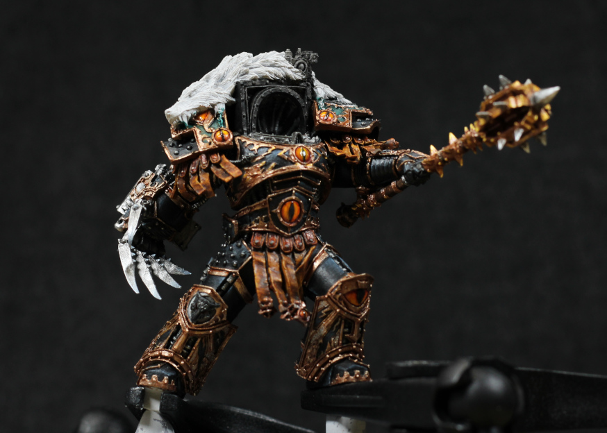
Finally some more of Horus has been painted. There's not a whole lot of information to add, so the focus for this post is on the talon metallics.

The sculpt itself has some excellent designs that lend naturally to NMM approaches for the talon, so I decided to keep with that, but use metallic paints. The key behind NMM is contrast: bright points next to dark shadows, and a range of paints were mixed in to try and create the various shades. Quite a bit of back and forth, but it went something along the lines of:

  • Iron Hands Steel across all silver metal areas.
  • Leadbelcher, thinned a little, as a first stage highlight. This was mixed with some Iron Hands Steel on the palette to help smooth this out.
  • Basilicanum Grey (Contrast) mixed with some Contrast Medium to further darken some areas, or cover an area entirely (such as the bolter casing).
  • Ironbreaker, thinned a little, to further highlight areas. Mixed with some of whatever was on the the palette to try have smooth transitions in places, but also unevenly dragged along edges to create a sharp highlight.
  • Stormhost Silver along edges, tips, or corners just for bright highlight points.
  • Grey Knights Steel on selected points ("bumps" along the inner talon, and the very tips of the talons). This is yet another reflection of Horus being the opposite of what the Imperium was intended; as the Grey Knights are armoured, Horus uses such a thing for weapons instead.

The uneven highlighting adds a little more variation to the model, gives characters, mimics scratches and wear. Horus has obviously kept his equipment in excellent condition, but has used it, and this uneven edge highlighting tricks the viewer into seeing it with more realism.

Still a very long way to go before this model is finished.

Horus about to "mic drop".


-- silly painter.


Sunday, December 20, 2020

Dark Elf Sorceress - Part II


Not an incredibly long post, but the Sorceress is now finished.

The fingertips of the left hand are supposed to be showing some spell being cast, but I'm not sure it worked. Looks more like she just dipped her fingers in some paint. Stilll, it's a bit of contrast to the red, so I'll take it.

The staff is just Incubi Darkness with a bit of Corvus Black in places as shading, and some Lupercal Green as a small highlight line. Nothing fancy about it at all or else it might taken some focus away from the rest of the model.

Couldn't really get the face right, even though for once I'm happy enough with how the eyes turned out. A lot of back and forwards with the skin tones, and while the lighting has given it a more warmer red, I'm going to call it and say "good enough". This is meant to be a model to play with, not entered into a Golden Demon competition.

Overall I think the reds worked well. The NMM worked really well, and definitely makes the model far more interesting in the end. The staff head was actually painted with metallics, but in an NMM style so that it still looks the part after the varnish spray.

Basically, happy enough for the first adventurer to join my Hero Quest project.

-- silly painter.


Thursday, December 17, 2020

Dark Elf Sorceress - Part I


This one has a fiery temper.
 

Just for something different, the next model in my Hero Quest remake is the replacement for the Wizard. I decided to use a Dark Elf Sorceress as the main model based on a similarity of pose and because I thought it might be fun to paint. Just one of those models that's fairly simple, but somehow carries a lot of character.

The original idea was simply to copy the reference colours, but at the last moment I decided that I'd give red hair another go, which messes with the entire look of the model and forced me to reconsider basically everything.

The hair didn't quite turn out as red as I'd like. It's more ginger than red. Still, it was a fun experiment. During painting, all brush strokes were kept in the one direction. This helps keep the natural shape and flow associated with hair.

  • Rhinox Hide over all of the hair.
  • Skrag Brown over most of the hair, but concentrating on more raised areas with a second coat, and then a third with the lighter areas. Obviously each coat was quite thin.
  • Deathclaw Brown over more prominently raised areas, with maybe 30% coverage.
  • Cadian Fleshtone on the tips and more reflective areas.
  • Contrast Blood Angels Red, mixed with Contrast Medium at about a 1:4 ratio. This was covered over all of the hair just to give it more of a red tone.
  • Contrast Iyanden Yellow, mixed with Contrast Medium at about a 1:4 ratio. This was applied on the tips and more reflective areas.
  • Reikland Fleshshade in deeper areas, or wherever I felt it was too bright.

The photo isn't quite colour accurate, but it's close enough to the end result. It could use a little more vibrance, and slightly shifted more towards red, but this is why a single model is good to experiment on: it's not like I'm committed to painting a whole army this way.

The rest of the reds are, well, reds. I didn't keep specific notes on purpose, because I wanted to play and make the model unique. One of the best ways to do that is simply just add and mix colours on a palette and see how it goes, but there are still a few points of interest:

The red leather is a brighter red, with highlights that lend towards pink. There's not a whole lot of contrast, and very few desaturated highlights in an attempt to give a gloss appearance.

The NMM red tends more towards orange. Shadowed areas are burgundy mixed with black, with brighter points pink, then glazed with Wild Rider Red (which tends towards orange). This keeps the NMM components distinct from the red leather.

The cloth I intend to keep more towards burgundy, with fairly muted highlights.

There will be some metallics on the miniature, likely the head of the staff.

Skin is primarily Rakarth Flesh at this point, with some very weak shading to give some outline to the sculpt in preparation for next steps.

-- silly painter.


Friday, December 11, 2020

Necron NMM - Part IV

For battlefield repairs, Necrons use strips of gauss.

 Went ahead and finished the Necron model, which was fairly simple to do once the "copper" was finished. There isn't too much colour variation throughout the rest of the model, so relatively few paints were used.

For the inner skeleton structure, the blade of the weapon, and charging coils / heat sinks / whatever on the weapon:

  • Incubi Darkness across the more prominent areas.
  • Thunderhawk Blue highlighted over that.
  • Fenrisian Grey as final edge highlights.
Baharroth Blue was used on the chest piece symbol, mostly because I didn't actually want it to stand out too much. Green would have made for good contrast, but would also have taken focus away from the face. As it is, the gun is doing that perhaps a little too much.

The weapon I had the idea to not paint as a uniform glow, but instead brighter towards one end to indicate power charging up and getting ready for firing. I could have made it a little more exaggerated, but essentially can't be bothered to do more on it now.
  • Administratum Grey over all the glow areas.
  • Ulthuan Grey over about two thirds of the glow area.
  • White Scar over about one third of the glow area.
  • Waywatcher Green (old glaze) across the whole glow area.
  • Hexwraith Flame across about one third of the glow area, or any areas I wanted to nearly fluro in colour.

Standard approach for the rest of the weapon, with Eshin Grey and Dawnstone to highlight around the edges.

Ribbed cabling was Administratum Grey covered with Black Templar Contrast, then using brighter greys from the palette just to highlight some more. I could have pushed the contrast more for NMM there as well, but just didn't think it would have really added much to the model.

The base is the same as for most of everything else: Zandri Dust, Agrax Earthshade, Armageddon Dust drybrushed on top, and Terminatus Stone as a final drybrush step. I was a bit concerned it wouldn't work, but the lighter base complements the darker models tones well enough.

Happy enough with the final result, even if the NMM could have been improved on. At least I learned quite a lot, and the copper tones I think worked out very nicely. Still, I wouldn't want to paint an entire army this way.

-- silly painter.

Sunday, December 6, 2020

Assault Intercessor Death Company (Next)


Steady aim, bringing pain.
 

Death Company number four in the assault intercessor range. Not much to say on the model really, everything is mostly the same as it was for the other models except for a lack of Blood Angel specific iconography. That was all painted or added with decals.

In the case of the left shoulder pad, the chapter symbol was a little too large, but I didn't have the proper size available.

The base is entirely from the moulded one supplied with the miniature. The rocks were given a very slight red tone on the base layer before drybrushing. There's a slight difference in appearance as a result, but it should still fit with the the other models overall.

Really enjoyed painting the assault Primaris, mostly because they reach the final assembly phase that much quicker for me.

-- silly painter.


Sunday, November 29, 2020

Necron NMM - Part III


Fresh from slumber and ready to shine.

Mostly working keeping me busy, but managed to finish the basic copper armour of this little Necron. Some of it I'm happy with, some I'm not. Nothing wrong with that because I learned quite a lot in the process.

Starting with areas that worked: the hands, the right foot, the pelvis worked ok, the left arm is mostly ok as well. Most of this has something in common: the brightest edge highlights are next to the darkest colour used, giving extreme contrast and the impression of reflection.

The areas that didn't work so well: the chest, legs, and the back carapace was a bit hit & miss. The colours blend together very well, no problems there, but how to apply the contrasting lines needs a lot of practice. I don't really have a feel for it on larger surfaces yet.

I'll continue with some extras on the endoskeleton, possibly using more of a teal colour. I definitely don't want it to stand out too much against the copper, so I might keep it to a darker tone. I'm undecided about the weapon.

-- silly painter.


Thursday, November 19, 2020

Necron NMM - Part II


Copper a load of this.

After quite the extended time from painting for personal reasons, slowly getting back at it. It will take a bit longer to start posting regularly again, but at least there's a tiny bit of progress on the Necron.

This step shows the Mournfang Brown and Doombull Brown applied to the main body, which doesn't yet show much of what the final result will be. The latter brown is fairly subtle at this stage, but such subtleties build up.

Hopefully another couple of photos in the coming days to show the progression towards the appearance of the head. I'm not sure if the end result will be quite how I want it - in fact I'm almost certain it won't be, but have to start somewhere with NMM, and a single model like this is a great practice piece. Wouldn't want to do an entire army in this way though.

-- silly painter.


Sunday, October 18, 2020

Necron NMM - Part I


So it's not the best photo, simply for being in a rush the lighting makesthe top of the head darker than it should be, but for my first real experiment in NMM, it's ok. There's a few things gone wrong, a few things gone right, and a lot learned in the process

Rather than be normal and start with a silver, or a gold, I wanted something a little different: copper. As it turns out, copper is really hard to do owing to it being a bit of strange mix of colours. There's reds, browns, hints of orange, pinks, blues, even a bit of white. Still, I'm lucky enough to have a wide variety of paints, and I don't intend on painting an entire army this way, so for a bit of practice it would be fine. Also the Internet is a great resource for getting started with - always do a bit of research first to get off to the best start.

I've decided that NMM techniques are all about two things: contrast and transition. High contrast along edges, and transition across larger surfaces. So I wasn't going to be afraid of using quite a few paints to achieve a nice gradient, which helps reproduce the effect later on. Plenty of water or flow improver was used to make sure the paints were very thin; glaze consistency for the most part. Don't rush, spend some time building up the layers.

  • Mournfang Brown over the entire area. It's worth a couple of thin coats to get a nice, even coverage. This serves as a little darker than the midtone, where it can be lightened or darkened from.
  • Doombull Brown to glaze the areas that should be lighter. The top of the head, the temples, the lower jaw, the bridge of the nose.
  • Tuskgor Fur to further glaze and lighten, just a little less areas covered than before.
  • Squig Orange then glazed to further lighten, and start to really brighten the sharpest edges. 
  • Emperor's Children glazed across yet smaller areas, and edge highlighted to bring out contrast along sharper areas, or where the light is expected to reflect with higher intensity. It's this part where the colours really start to stand out and it might start to look a bit coppery.
  • Deepkin Flesh, chose specifically because it has a very slight blue to it, used for highest intensity reflections. Sharp edges, or highest points in a curve. There is a lot of back & forth between previous colours and here - wet palettes help with this a lot, along with good brush!
  • Barak-Nar Burgundy glazed into the darker areas. This essentially forms a line against the sharper edges, increasing contrast and giving the impression of reflection. I might have used a deeper purple, or a blue, but the burgundy allows me to recover a little if I mess it up and still push it a bit further into blue later on if necessary.

I think this has worked well enough that I'm confident enough to keep going with it across the rest of the model. The main outer armour or carapace surfaces will be copper, and I'm considering a very dark silver, or perhaps a shiny black, for between those areas.

I've yet to decide on the weapon, but the energy glow will either be a green, or perhaps teal, turquoise, aqua.

-- silly painter.


Thursday, October 15, 2020

Horus Lupercal - Part V

Just flapping in the breeze.

 Time again for minor progress on Horus. Mainly I just wanted to jot down some notes on something new now, rather than wait until I've done a lot more and roll it up into a larger post.

Today it's the pteruges hanging from the waist. There's still some work to go on them, but there's enough to actually glue that part into place. I've already done those that fit on near the right shoulder, but they won't be attached until the full arm is ready as well.

I thought about the colour to use for a while and ultimately went with leathery brown, almost the same hue as the filigree edging on the the armour but with perhaps slightly more red to it. The whole idea is that they should not stand out against the upper chest, or eventually the face. I've gone with quite a bit of Contrast in the end:

  • Wraithbone base over the leather areas.
  • Snakebite Leather applied in a thin layer over the top. This is more glaze consistency - don't allow it to pool.
  • Gore Grunta Fur / Contrast Medium (1:2 mix) to again glaze over the area. A second glaze was applied if that wasn't quite enough.
  • Blood Angels Red mixed in with the leftover from the previous step, about a brush load. This was applied to the upper areas just for a little variety, and harmonises very well with the eye jewel on the torso area.
  • Agrax Earthshade applied over most areas, but again not allowed too pool heavily. This step gives greater definition and depth to individual lengths of the leather.
  • Wyldwood was lastly applied very carefully and in very small amounts to give greater depth and darken the areas a little more. Glaze consistency is again key.

I'm not yet fully done, as mentioned. The red needs some shadowing more against the belt, and a few edge highlights here and there wouldn't go astray. Just need to be very careful not to overdo it - it will be very difficult to fix mistakes from this point.

The metal ends I ended up with a more red metallic than the armour. I didn't want the bronzes of the armour, nor the golds on the weapon. Perhaps a different metal was used: gifts from allies, or trinkets made from the salvage of fallen enemies. Using a reddish metal ties it together with some colouring I've started to use on Blood Angels weapons, which again both signifies the closeness that Sanguinius once shared with Horus, and how that changed when Horus turned traitor.

  • Screaming Bell as a base.
  • Cryptek Armourshade to do what shades do.
  • Runelord Brass as a first highight.
  • Canoptek Alloy as a final edge highlight. This is a very light, desaturated metallic and so is best thinned down a little first. It ends up very close to a bright silver (just a little more brass into the mix) and was used directly on the pteruge studs.

There still a little eye jewel to be done as well, and I may end up with Contrast paints once again because this is the sort of area where they're very effective.

-- silly painter.


Sunday, October 11, 2020

Assault Intercessor Death Company - Part V

Quickly, run perpendicular to the enemy!

Abso-fraggin-lutely!

Stand still, I want to hit you with my chainsword.

And done. There could be a little more work on the base to make it more interesting, but I mostly just can't be bothered now. It's been a bit of a struggle to finish these guys actually; thinking over it, each Death Company ends up quite unique, and so painting each one feels like a character in their own right, naturally taking more effort and care each.

For painting, nothing really new to speak of, no new colours that haven't been tried before. I do like how the base and chestplate tie together, but don't like how my Windsor&Newton brush decided to split while trying to write out some words. I'm not going back over it now, but have to look at why that brush is doing so. Frustrating to say the least.

I've bought another Assault Intercessor, so this squad of Death Company will grow soon enough.

-- silly painter.


Saturday, October 10, 2020

Assault Intercessor Death Company - Part IV

Here, catch.

A brief extra today just to take notes on what I'd actually done. They're not yet finished, but really aren't very far off now.

  • The chestplate winged skull:
  • Morghast Bone
  • Skeleton Horde Contrast
  • Agrax Earthshade in the deeper recessed areas to really make it stand out more. A little of this was needed at the end to fix some mistakes too.
  • Ushabti Bone along the edges
  • Screaming Skull as final edge highlight, mostly on the tips of the "feathers".

The engine of the chainsword is taken from Lieutenant Tolmeron's power sword hilt:

  • Screaming Bell
  • Reikland Fleshshade Gloss
  • Hashut Copper as highlight.
  • Fulgurite Copper as final edge highlight

The chapter badge:

  • Celestra Grey. Two thin coats to get a nice solid colour.
  • Blue Horror edge paint to give a hint of blue.
  • Ulthuan Grey, focusing on the more prominent areas.

Note that the model pictured here does not have a blood drop gemstone in the chapter badge. This is intentional: as a full chapter badge is black, so the Death Company wear white. Where there's something to set the gemstone into, I will paint that in the usual red.

-- silly painter.


Friday, October 9, 2020

Assault Intercessor Death Company - Part III

Goblet and halo on the backpack. Why? Because he can.
 

Fully assembled now, I'm starting to pick back up the pace with painting these Death Company. None of the red has been highlighted yet, but the outline of the red crosses on the armour has been done. These will be brightened to make them stand out more.

The metallics are mostly done for this phase, and I'll come back to them after the varnish spray. I've used the gloss shades this time around because the base was already quite dark (Iron Hands Steel) and I didn't want to push it further. The gold is Balthasar Gold with Cryptek Armourshade Gloss just to see how it would look. The shade has a slightly red hue to it, and I've been looking for an excuse to see how it goes with the various golds.

Back in black.

 The holster is another new experiment with the Contrast range.

  • Zandri Dust over the leather areas.
  • Screaming Skull to add scratches, creases, and general wear along the edges.
  • Gore Grunta Fur over the whole area. It was applied a little too heavily in this case.
  • Agrax Earthshade around some recessed areas, or to darken as necessary.

I'm not entirely convinced that Gore Grunta Fur was the right choice, but I don't have much of the Contrast range and so it was the best choice at the time. It should have been applied just a little thinner however. The Screaming Skull doesn't show through particularly much either, so might need something a bit brighter in future. Still, while this might not work against full red armour, here it's better than the normal brown I've been using.

The purple gems on the right pauldron I was going to keep mostly as purple, but may try to highlight to a red just for something different.

-- silly painter.


Saturday, October 3, 2020

Skeletons

Possibly one used to be an adventurer, before he took an arrow to the head.


These skeletons are the beginning of a side project that I've been planning for some time, which is to build stand-in models for the Hero Quest board game. The ultimate goal is to recreate the entire game, including the board and furniture, so the models are meant to be played with. For that reason they are not in any way intended to be up to my normal standard: I'm expecting these models to be roughly handled and occasionally damaged.

 The skeletons are done mostly with contrast and metallic paints. The actual bone was rather simple:

  • Black primer, just because it's excellent as a primer.
  • Wraithbone spray, two coats to try get good coverage.
  • Skeleton Horde from the Contrast range.
  • Morghast Bone to fix any areas that don't look quite right. This is mostly to highlight something, or smooth over where Skeleton Horde didn't quite dry nicely enough. It's virtually identical to the raised areas after the Contrast paint stage, which is a nice piece of information to remember.

The eyes were simply Corax White and Aethermatic Blue. It didn't quite give the appearance I wanted; a more purple colour would have fit better.

Most cloth was covered in Nighthaunt Gloom, wood was covered in Wyldwood, and metals are a combination of various paints - there's no real recipe there, it's just play with them and try get some rust effects with washes and different metal tones.

For a lazy approach to wood grain, particularly on the shields, a hack is to first prime the shield black like usual, and then use one coat of Wraithbone base paint, applied by keeping brush strokes in one direction and making it very uneven and streaky. When Wyldwood is applied over the top, the streaks of the base paint will come through. With a little practice it can be fast and doesn't just look like a sloppy paint job.

The bases were Astrogranite, thinned with water Wyldwood, and some Hoeth Blue drybrushed around the out edge. I'm not actually sure if I won't be later using clear bases anyway, so no thought went into this process - it was mostly that I wanted to see how it would look (result: it looks bad, but at least I know that now).

The varnish spray at the end has also muted the colours quite a lot. Too much actually, though at least with undead skeleton warriors this is somewhat fitting.

Painting these models did allow me to experiment with Contrast paints some more, and basically play around without caring to be neat or paint to a high standard. Even so, the Tyranids were simpler to paint, and came out looking better, in that sense these skeletons were a bit of a failure.

-- silly painter.


Wednesday, September 23, 2020

Assault Intercessor Death Company - Part II

Death Company Primaris are all the Rage now.

 Just a small update on Assault Intercessor Death Company progress, now that there has been a little progress. The photo doesn't really show the effort put into the black - my own fault for the lighting and wanting a deeper black to the armour.

The problem with black is that it doesn't highlight well. Greys can be used, but then it's mixing two of the most troublesome colours: white and black. This is why there's often a little blue or purple added, just to help those transitions. I didn't want that, so I'm stuck with trying to be difficult.

Something that is helping is sharper edge highlights with Dawnstone. I've been moving away from such things, but it's really needed in this case to outline and give definition to the model. So if nothing else, I've learned that for black, sharp edge highlights matter.

In the past I've done all the blood drop symbols as red, and that will be the case on the model shown, but there are times when it's too much with the red crosses. For another of the Death Company I will likely try a deep purple instead - this worked well for Karlaen, and helps keep each member of the Death Company unique.

Green eye lenses are really working on this model too. I was concerned that it wouldn't give the right effect, but it contrasts nicely with the red and really draws attention to the face (at least for now - still much to be painted on the model yet). Death Company come with a lot of detail normally - red crosses, ropes, honour rolls, skull icons, and the usual winged blood drop of the Blood Angels. It can be easy to get carried away, so the trick will be adding just enough to make it interesting without unbalancing or overwhelming the model. It's going to be fun.


-- silly painter.

Wednesday, September 16, 2020

Tyranid Carnifex


Carnie the Carnifex.
 

And this is the last of my Tyranid models, hopefully now in a position to sell and then free up storage for something else. Obviously named Carnie, the carnage loving Carnifex.

There's not a whole lot different again from the methods I've been using to paint Tyranids so far, and that's making everything fit together really well as a fully painted army. There are some small additions: Nighthaunt Gloom with Contrast Medium around the sack attached to the left hand, and again as a spot colour on the weapon. Hexwraith Flame is also applied in some areas as hints of venom sacks (not visible in the photo) which ties that into the Tyranid Warriors as well. Otherwise only differences in that it's such a large model.

The model itself I didn't really enjoy too much. It's nice now that it's finished, but the assembly was very problematic. The legs aren't quite flush with the base, and I had to use green-stuff to give additional purchase under the left hoof. It's not noticeable once the texture paint is applied, but I have a concern about how well it's going to hold a fairly heft model. Perhaps I should have pinned it - and I may well do so if it breaks off. Owing to this, I think the torso is angled down more than it should be as well, which in turn affects the positioning of the head.

The arms don't sit quite as I would have liked. The right talon in particular is at a strange angle because the other right arm gets in the way. The weapon arms were a pain to try and partially assemble before painting - and in the end I had to break them apart when gluing to the torso, and then fill in gaps with green-stuff and paint over it again.

The carapace didn't fit together nicely at all, and a lot of gaps were plugged with green-stuff, or misalignment (e.g with the "chimneys") filed back to make them more flush.

Finally: mould lines everywhere! I kept finding them after Volpus Pink coverage, and would either have to carve them back, or try use Wraithbone to make them a little less obvious. That was very frustrating.

I may have to do another post showcasing the entire army (for some small definition of army), but Carnie was definitely a good way to finish the Tyranids. The contrast paints made it much quicker to get the models to an acceptable finish, and a little bit of effort on the carapace makes them really stand out. If nothing else, it was just good to get models done.


-- silly painter.


Tuesday, September 8, 2020

Genestealer Broodlord


Freddy the Hunchback
 

The Spawn of Cryptus painted, for no other reason than it was relatively simple and I felt the sudden motivation to try and get the Tyranid models finished.

In terms of paints used, there's no difference to how the Genestealers, or any other Tyranid in general, was done before. Same paints used, although a little more care in places because this is such a centrepiece model:

  • The "skin" was given a Wraithbone glaze after the contrast stage just to give some areas more definition, or because they were too pink previously.
  • Additional blending was done on bones to remove any clear line between them and the "skin". Mostly I wanted it to look like the carapace was slowly hardening more as the creature grew. In some places I started to put a slight purple tint, just to show it turning slowly into the hardened carapace seen on the back. The blending on the "horn" for example shows this in progress.
  • Much finer lines on carapace edges, and some blending back of the purples if the colours were sticking out too much.

-- silly painter.


Sunday, August 30, 2020

Assault Intercessor Death Company - Part I

I see a Blood Angel...

...and I want it painted black.

The recently released "start painting" kit of the Assault Intercessors provided an excellent opportunity to do a bit of kit bashing on limited numbers of models, and to practice some more on Death Company. The limited number is important if I'm to keep plastic mountain from growing much further.

The models came with Ultramarine insignias that needed to be chopped off, fortunately only the shoulder pads and therefore easily hidden behind the replacement spare Blood Angels variants. So converting to Blood Angels, and readying for Death Company, wasn't actually all that difficult.

Although I'm only showing the one at the moment, priming the models was done using black, naturally, for "battle ready" there's not a whole lot more that needs doing. I wanted to do more of course, so the airbrush came next:

  • Corvus Black over the entire model. This isn't quite as pure a black as Abaddon Black, so it leaves some room to maneuver when it comes to highlighting and shading.
  • Dawnstone for highlighting. I normally would choose Eshin Grey, but that's not available in the Air range from Citadel, so I used Dawnstone. It is much more saturated than I liked, but this can be fixed later. In future I might mix normal Eshin Grey with some thinner and use that directly in the airbrush.
  • Abaddon Black for shading, but owing to it being slightly thin (at least with my usage) it also served to tone down the highlights as well.

The models still come out a little lighter than I like at this point, so some brush work was still required; I prefer Death Company to have a deep black armour, to represent their descent into madness.

Normally I would use thinned Abaddon Black as a glaze to darken areas, however I also tried Black Templar from the Contrast range. This was a bit hit & miss, and ultimately I might stick to Lahmian Medium with the former black. If I can tweak the airbrush stage, then this wouldn't require as much effort either.

Thinned Dawnstone to edge highlight in places, and Nuln Oil to really make the recesses black, and that's about it.  I don't edge highlight as much these days, but it's needed to define armour plating when everything is painted black.

I'll paint the head and helmets next, just to assemble that stage before starting on filling in some red crosses and getting started on blocking in other colours.

-- silly painter.


Saturday, August 29, 2020

Blood Angel Inceptors - Part III


Oily Marine #1

Oily Marine #2

Sergeant Oil

 The three Inceptors from the Dark Imperium set are now finished...sort of. The spray varnish step was a miscalculation; the were was far too much moisture in the air, and it was far too cold to be doing this step. The models were completely frosted up, and so I turned to the one thing to try and fix that: olive oil. As a result, the models are a little more shiny than I wanted, but it's still better than they were.

So while I'm a little disappointed in not waiting for better weather, at least I've learned something in the process, and I was never too invested into the Inceptors anyway. They just don't feel Blood Angels to me. If I was going to mess up on any models, it's probably better to be these ones.

-- silly painter.


Sunday, August 23, 2020

Blood Angel Inceptors - Part II

The "mike drop" stance.

There's really nothing new being done painting wise to these models, so this post is pretty much just a work in progress showing the armour being completed. The only real item of note is covering as much of the metal areas with black first - this makes applying the metallics much easier, even if it takes a bit of time. Othewise the red will show through the metallics, which isn't really wanted in this case.


Chest bump!

Corvus Black is still the choice at this point, although I may experiment with Abaddon Black as the metallic undercoat in future owing to how thin Corvus Black naturally is.


Platform clogs, now available for battle.

Losing a little motivation with these guys on account of how much they still don't feel like Blood Angels to me. Despite the Blood Angels love of mobility, they are an assault based force, and Inceptors look far too bulky to fulfill that role comfortably. So I don't see myself buying any more of them in a hurry.

 -- silly painter.


Monday, August 17, 2020

Blood Angel Inceptors - Part I


I believe I can fly....

Next up on the Dark Imperium Primaris models are the Inceptors. Close support unit. That drops from orbit. And effectively has heavy bolters. For close support. Ok.

It can be guessed that I'm not particularly a fan of the Inceptors as a concept, and even less so for Blood Angels. They simply don't fit the feel of a Blood Angel. A little less bulky, remove the shovel shoes, give them close quarter combat weapons, and then they might be ok.

The helmet is the most visibly striking point of interest, being yellow. Method for this is similar to what was done for the Imperial Fist of long ago:

  • Averland Sunset, with the airbrush.
  • Flash Gitz Yellow, initial highlight with the airbrush.
  • Phallanx Yellow as finial airbrush highlight.
  • Casandora Yellow in recessed areas, just to help outline the shape of the helmet.
  • Fuegan Orange in the deeper recessed areas.
  • Dorn Yellow as edge highlight, typically about the bridge of the "nose" area, and the brow.

Eye lenses are the usual method for Blood Angels. I decided to keep them as a green appearance because it ties all the models together, regardless of general helmet colour.

I've put black rings on the jump pack (or whatever it is) just to add a bit more interest. Gun casings will be black as usual, which should help balance it out a bit more, but I won't know if it works until the model is complete. At least I'm able to reach the fully assembled stage quickly, which might make the next steps a bit faster (still need to apply finishing shades and highlights to the red armour).

-- silly painter.


Sunday, August 2, 2020

Adeptus Titanicus - Imperial Knight - Part V

Stampy is all fired up.

Mr Snuggles says something is about to have a very bad day.

Stompy and his big cannon.

The Imperial Knights, Titanicus scale, are now done. Not too much beyond what was mentioned before, mainly just the banners and, for lack of a better term, rondel shields. The banners are painted in the same manner as the secondary trim colours, except with thinned Black Templar to make them slightly darker.

The decals turned out well. I'm improving with their application; copious amounts of solvent to soften them, and a cotton bud to press them into the underlying shape makes all the difference. There's no real purpose behind the applied decals, I was mostly just playing around.

Photos are a little blurry due to the normal photography area being used for other purposes.

The Purity Seal does dull the metallics quite a lot, but I don't really mind that too much. The colours are still there, the models are protected, and I probably put more effort into them than I originally intended as well. I've learned enough I think that future Titanicus models will be as easy to paint, and may come out slightly better. Whenever I get around to getting them done.

-- silly painter.


Monday, July 27, 2020

Adeptus Titanicus - Imperial Knight - Part IV

Stompy
Although my painting speed has slowed down recently for reasons, I'm still progressing on the Knights. Owing to taking so long, bits of dust have started to appear on the models, which can be seen in the photos because I forgot to brush it off.

Stampy
No change to the basic approach, so this won't be a lengthy post. The only real different is deciding to paint the banners with a base of Stegadon Scale Green, after which I intend to highlight with Thunderhawk Blue (as with the trim colours), but then darken it back down with thinned Black Templar.

Mr Snuggles
Still to come are finishing touches, decals, and a coat of Purity Seal. That last step will dull the metallics, but will protect the models.

-- silly painter.

Saturday, July 4, 2020

Adeptus Titanicus - Imperial Knight - Part III

The Knights go marching one by one.

Some progress on the Knights, although none are entirely finished quite yet. I decided that that main reference model was far enough along that I could starts the others, and hopefully then finish all three at about the same time.

Before going into detail particulars, I've tried to use upper carapace patterning to give simple differences to each, and I may try to further this on the "shoulders" and other larger armour plate areas. They're obviously part of the same House, but differences in markings help reinforce that they're ultimately a collection of individuals rather than a more cohesive military unit.

The bases took me some time to figure out, and in the end I'm still not entirely happy with them, but didn't want to delay further. It makes painting them somewhat easier at this stage if they're glued to a base. In the end I went with concrete road that they're walking down. It implies an urban environment, or industrialised to some degree, is easy to paint (it's just a flat surface), and lane markings help give a sense of scale. I could (and maybe should) add rubble or impact craters at some point, but I also want to not put quite as much effort into painting these models as I do for Blood Angels; I need to paint faster, and the Titanicus models are intended for playing with one day.

Anyway, the road is simple enough to paint:
  • Celestra Grey over the entire base.
  • Administratum Grey layered over the entire base.
  • Dawnstone layered over the entire base.
  • Stormvermin Fur, watered down quite heavily, and painted along each "lane". If roads are looked at, then where cars travel there will be dirt, wear & tear, etc, where tires are constantly passing. This means the centre of the lane is relatively clean, but flanked by colour variation. Brush strokes are always in the same direction when doing this step.
  • Ulthuan Grey for the road markings. I used some specialised masking tape to stencil in the straight lines, but this is only done once previous steps are completely dry. Not all tapes are equal, but anything can be used that doesn't lift up the paint.
  • Black Templar is also being used to give some shadow on the ground. Imperial Knights are large, and will cast noticeable shadows - however this is best done after the model is fully assembled, and I'm still getting this step right. I suspect I will need to work at it a lot more.

Reactor casings, which are on the rear of the models and not seen here:
  • Warplock Bronze
  • Sycorax Bronze
  • Fulgurite Copper

The void shield generators on top:
  • Screaming Bell base.
  • Agrax Earthshade, with two coats probably needed to tone down the base colour.
  • Fulgurite Copper for highlights.
The repetition of Fulgurite Copper here is to convey a sense of those components being more archaic, barely understood technology, as opposed to the brass and bronzes of shell casings.

All cabling is being painted the same. It's not fully done at the time of typing, so this is more of what it will be: something simple as a time saving step. Hazard stripes look nice, but the Imperium likes to standardise equipment, so I'm using that as an excuse to paint all outer cabling the same.
  • Dark Reaper - this may require two coats as it's layer paint.
  • Black Templar (Contrast)

Finally, for the second and third knights I tried to paint with Nuln Oil (Gloss) instead of using Deathshroud. It does not work as effectively, and so future models will revert back to using Deathshroud. It's less precise, but gives a much darker shade to the metallics that just fits better with these models.

-- silly painter.


Saturday, June 27, 2020

Blood Angel Hellblasters - Part III

Blue helmets and overcharged night lamps.

Dark Imperium Hellblaster squad finished. Not quite as quickly as I might have liked, but they're done now.

The plasma coil "glow" is sufficient for line troops, although I'll admit it looks more coloured than glowing. I could do more - highlight edges with more white, add some extra shading to areas, maybe some OSL, but have decided that this is sufficient. Quite why there would be glowing plasma coils I'm not sure - wouldn't it be better to keep an obviously sensitive area of the weapon armoured? Unless it's for a different purpose, such as heat dissipation - but then I've no idea why it would glow. In any case, it does serve to make the squad immediately recognisable. Same reason that blue helmets actually make a kind of sense: a battlefield commander can instantly see where their heavy support options are.

The decals I'm getting better at. There are still some problems once everything has dried, so I still prefer carved icons, but decal skills are useful. Mostly I cover the entire decal with a solvent, wait a little bit, then press it down further with a cotton bud. This helps to really make the decal flush with the surface because the solvent makes it a little more malleable. When that's dry, a coat of Stormshield to protect the decal before covering everything in Purity Seal varnish.

Quite happy with the squad overall though, and looking forward to the next squad now.

-- silly painter.


Wednesday, June 24, 2020

Blood Angel Hellblaster - Part II

Lean, mean, plasma shooting machine.
The first of the Hellblaster squad from the Dark Imperium boxed set is finally finished. No changes in painting from the last post, it's mostly that this time the decals have been added, or an icon hand painted (right knee), and Purity Seal varnish has been applied. Some metallic highlights afterwards as well, of course.

The first model always serves as an excellent reference point, and I think the rest of the squad will turn out well enough based on the Sergeant. My approach to painting Blood Angels (and I do keep a document describing how I do each component, in addition to occasionally looking back over this blog) is slowly being refined, but not much now needs changing. I'm hopeful that I can start to progress a bit more quickly through squads now, though I'm not yet convinced that I can do it in any sort of batch painting process.

The problem with batch painting and myself, particularly where it concerns Blood Angels, is that my desired level for individual troops requires individual attention - and that's not good for bulk model painting.

I'm far more motivated once a model is fully assembled, and it's unfortunate that this rarely happens before a model is nearly completed anyway. That's another point that slows down batch painting - it takes much longer to get all models to the point where final assembly has been done.

All that said, I did try partial batched painting here, so the rest of the squad isn't far off from being done. Painting all the backpacks in one go was a resounding success, and the same for the bases. Painting all the guns at once was a moderate success - but that might not be such a problem if I could paint hands and gun separately. The gun would be far easier to give a basic airbrush initial highlight, and is something that might be feasible for models that aren't push-fit. Painting all the helmets at once however, was definitely another resounding success.

Dance off!

Overall, preparing five models at a time is probably worth it, but I need to be careful about how many models to try paint at the same time.

Just in case I need to reference it again later, the helmets were painted the same as with the Aggressors. Starting with the airbrush:
  • Kantor Blue
  • Macragge Blue first stage highlight.
  • Caledor Sky second stage highlight.
Then fill in the details with a normal paintbrush (this includes Nuln Oil for the breather grill), followed by:
  • Drakenhof Nightshade in various recessed areas, to help pick out the shape of the helmet.
  • Macragge Blue highlight, particularly over edges on the top, rear and sides of the helmet.
  • Caledor Sky for detailed highlight around the top of the breather grill and "brow" of the helmet.
At this point is might be worth mentioning that by painting helmets separately, it does become more difficult to match up against the lighting direction of the final assembled model. In this case I didn't even try: the face of the helmet is highlighted more than the rest, regardless of where the model will be looking.

There is a reason I do this: the helmet is a focal point, and the highlighting keeps the focus there. Lighting isn't just about being physically accurate with painting, it's also about defining the shape and impression of the subject, and by bringing focus around the eye lenses, it gives much more character and life to the model.

-- silly painter.

Tuesday, June 16, 2020

Blood Angel Hellblaster - Part I

Powering up.
With Mephiston completed, and despite other projects in the works, I wanted to carry on with more troops in an effort to simply get more models done. Primaris models are still good for airbrush practice, and I have pretty much everything else sorted for them, and so can get individual models done fairly quickly (by my standards).

Still, there's always something new with any squad. In this case, Hellblasters have plasma weapons. This means I had no reference for gun casing colours, but did have an idea for the plasma coils from the original Mephiston model.

So the plasma coils are quite simple in this case. I had thought of trying to use the airbrush for them, but ultimately decided that it would look out of place, and it was just as quick to use a normal brush anyway. This is really something that the contrast paint range excels at too.
  • Corax White over all the plasma coils, and a little along the edges surrounding it. Alternatively for the edges, just make sure they're highlighted quite brightly.
  • Aethermatic Blue over all the coils.
  • Aethermatic Blue again, but heavily applied around the lower edges and allowed to flow over the surrounding gun casing areas.
I dabbled with a bit of Temple Guard Blue for lighting effects, but found it didn't really work properly.

I quite like the effect. It's not overly bright, but instantly recognisable as a plasma weapon - Hellblasters will easily stand out as such. The Aethermatic Blue works well as an energy colour, and being a green-blue complements red armour well, and is still distinct from the deeper blue of the helmets.

The head this time was done far more simply than normal:
  • Wraithbone over the exposed head areas. A couple of coats was required to make it even, naturally staying clear of the eyes which were done previously.
  • Guilliman Flesh contrast paint over the head.
  • Eshin Grey, very thin, mixed with a little of the Wraithbone still on the palette, to give a shaved head impression. This step really gives a lot of character, and is definitely well worth doing.
The blues for the helmet (and right knee pad) are quite simple:
  • Kantor Blue for the base.
  • Macragge Blue for initial highlights.
  • Caledor Sky for final edge highlights.
For other helmets I will likely use Drakenhof Nightshade in recessed areas to give a bit more depth, but it wasn't needed in this case.

Everything else is as normal. The model isn't complete yet, but it's not far off. The next squad member will have a little more contrast in tone from the airbrush step - this is something I'm still very much working on, but also getting better at. I don't think I'll ever beat the quality of what I can do with a paintbrush, but I'll leave that time consuming task for special characters.

-- silly painter.

Monday, June 15, 2020

Adeptus Titanicus - Imperial Knight - Part II

Room for a knight.
Some progress on the Imperial Knight. Still a bit slow going, as I decide on colours here and there. I'm having real trouble making it seem like a Knight instead of an attachment to an Astartes battleforce - I've been painting it like Space Marine armour, not considering cheverons, markings, and the like. Never have been one for bling.

Anyway, the metallic trim from before is now fully:
  • Castellax Bronze
  • Agrax Earthshade (Gloss)
  • Sycorax Bronze
This keeps it distinct from the Space Wolf model I painted, in helping make my chosen Titanicus colour scheme different from them. What also helps is the trim. I wanted a more harmonious colour to the blue-grey, which discounts black, and also not a metallic. Too much of that, and it would detract from the head. A complementary colour would do the same. I also didn't want simply a shade of blue-grey. Any shade of red would also not fit for the same reason. This really only left muted purples or greens - a dark blue-green would be about right. I think I've managed something rather well with:
  • Stegadon Scale Green
  • Thunderhawk Blue (been wanting an excuse to use that one for a long while!)
  • Drakenhof Nightshade in the deepest of recesses, or to border the trim. I may revisit this and use Coelia Greenshade instead at some point.
This trim colour is used on the upper carapace, half of the cannon shielding, and the knees. I'm also experimenting with it on the banner hung between the legs, but the jury is still out on that one.

Cowling above the head is:
  • Corvus Black
  • Dark Reaper for initial highlights.
  • Thunderhawk Blue for edge highlights.
  • Abaddon Black thinly applied to tone it back and tie it all together.
The same was done on the edging around the knees. This separates the metallics on the thigh and trim armour, giving more definition to there being knees, and creates a kind of triangle (head and knees) for balance.

Some Agrax Earthshade (Gloss) has been added in various unseen areas from that camera angle. It's meant to give hints of oil, grease, lubricants mixed with battefield dust, etc. I'm still working my way through that, but have to be careful not to overdo it. The gloss shade isn't as strong as the non-gloss variant, which is mostly why I'm using the gloss shade for this step.
A little Nuln Oil in places has been used, though sparingly - mostly just to better outline rotors around the elbows and other joints.

The pelvis joints have been covered in Black Templar (Contrast) just to make them distinct and give a less rigid appearance to the grey metallic skeleton. That area is crucial to a walker's movement, and I wanted something that gave an impression of more flexibility (less shine, less rigid, more flexible).

Finally, a bit of whatever was on my palette to give the visor on the head a red glow appearance. This spot colour really draws attention there, although I might make it a little brighter later on. I believe it was actually Gal Vorbak Red.

-- silly painter.


Wednesday, June 10, 2020

Adeptus Titanicus - Imperial Knight - Part I

'Tis but a scratch!
And so I've started on models from Adeptus Titanicus. Actually I've had the Knights ready to go for a while, but couldn't fully decide on the colour scheme. The colours I choose now will be across the Titan battlegroup, and the Aeronautica Imperialis aircraft as well.

Ultimately, I decided not to have red. Well, maybe a Red Baron or something for a single model at some stage, but overall I wanted something distinct from Blood Angels. I also didn't want a deep blue, for no other reason that many of the reference models and colour schemes are that, and I wanted something a little more original. In the end I settled on blue-grey, which works within urban settings, and allows brass and copper trim to be used instead of gold. This is highly similar to Space Wolf colours I know, but still works as a neutral colour scheme for combat machines. House details will likely be either black or red, or some combination thereof.

The model shown has really only just been started. The foundations were done with an airbrush:
  • Leadbelcher across all metal areas.
  • Ironbreaker to highlight some metal areas.
  • Deathshroud Clear to add some shading. Nuln oil would also work to a degree.
In future I may try a base coat of Iron Warriors owing to it being a darker silver, allowing Leadbelcher to serve as a midtone. Continuing the airbrush:
  • The Fang across upper panelling, and shin armour.
  • Russ Grey to highlight these areas.
I then painted in remaining armour panels by brush with the same colours. I've also started on using Drakenhof Nightshade in some areas, but haven't completed that yet. I will do more as I continue the trim, because it allows me to hide mistakes with that easily.
Not seen, the reactor core (I presume) on the back has been base coated with Warplock Bronze. I will likely continue with a bronze or copper highlight on that. The armour trim is Castellax Bronze - a slightly lighter bronze, but a layer paint and so may need a couple of coats.

And that's about it so far. I need to continue with the armour trim, and then work on showing oil, rust, and grime on the pistons and joints before I can glue the arms into place. They have been started as well, but won't be glued in until I've done enough on the areas they'll block easy access to.

-- silly painter.

Thursday, June 4, 2020

Tyranid Ripper Swarm

om-nom-nom-nom-nom
Just for a light little something to paint, I decided to clear out a few of the extra bits from the various Tyranid sprues. Some come with Rippers, so I decided to assemble them into a little swarm, 3 to a base to try make them flexible for use.

I did not even attempt to do more than tabletop quality of them because they're not a centrepiece, but fundamentally there's no real difference in painting them when compared to any of the other Tyranid models I've done.

Collectively, they're known as "you little Rippers". I'm sure they're so eager that they just let rip all the time. Ripper & tear.

On the subject of letting rip...

Sphincters. With teeth. And tentacles.

I'm not really sure what these other accessories are intended to be (spore chimneys perhaps), but they look more like the, uh, back end of a Tyranid invasion. Really didn't spend long painting them (four in total, but only one pictured), because they're not really even a playable piece, but might be useful for objective markers or something.

Still a couple more 'nid models to go before the army is ready to be sold off. It's the Carnifex that I'm dreading the most to get done.

-- silly painter.

Saturday, May 30, 2020

Horus Lupercal - Part VI

Eye eye eye, not entirely armless.
This is only a short update with some details filled in for Horus. Almost all the eye icons have been completed, with the exception of the right pauldron (which I haven't entirely decided to paint the same yet).

All the eyes were painted the same as before, copy & pasted here for convenience:
  • Jokaero Orange (base)
  • Yriel Yellow (layer)
  • Bloodletter (glaze)
  • Carroburg Crimson (shade)
  • Corvus Black (base, iris)
  • 'Ardcoat (technical, varnish)
It's really the Bloodletter that makes it work and gives the Eye of Horus symbol that firey, forbidding appearance.

The right knee symbol of the Luna Wolves was mostly done with contrast paints:
  • Corax White as a base coat across the entire symbol.
  • Apothecary White on the sliver of background moon.
  • Basilicum Grey on the remaining background.
  • Black Templar across the wolf head.
  • Mephiston Red for the eyes of the wolf.
  • Stormhost Silver to write the XVI on the wolf's forehead.
The last step was a pain, required quite a lot of fixing, and looking at it closely isn't perfect. Normally I would have done the wolf head silver and let a wash fill in the XVI naturally, but that doesn't work when I wanted the wolf head itself as black.

Damn this model is taking me a long time.

-- silly painter.