Tuesday, December 27, 2022

Space Marine Heroes 2 - Part VII


More hammer!

Another two Terminators finished just before the year's end, and bringing the total of models I'm allowed to buy up to 10.5! Only another two to go before the series is complete.

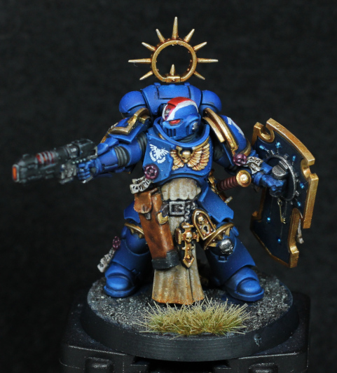
I finally finished the Imperial Fist, painted so just because I had a duplicate of the model and didn't want to paint it up as a Blood Angel again. It does bring some planning requirements with it, namely what colours to do? The helmet was painted up before I realised that actually Imperial Fist Terminators often come with white helmets, so I glazed it brighter with Dorn Yellow to make it trending towards white while still allowing other areas to be given a brighter treatment if need be. The storm shield is an example of this, and it admittedly took me a long while to figure out what colours to use on that, until I looked at the Imperial Fist insignia and realised white and black would be perfect. I could highlight the black details more, but at this stage didn't want to overdo it, and the white isn't given any shading because it's white and difficult to do that with.

I actually tried a little bit of oil paint on this model. There's a subtle OSL effect from the hammer, but I had such trouble with the oils that I kind of gave up on that idea. There's a slight white hint on the top of the left pauldron, and that oil worked great (possibly because it doesn't contrast with the already bright yellow), just not enough for me take it any further.

The base is predominantly blue and darker, to contrast and frame the model by mirroring the blue hint from the hammer. On the topic of thunder hammers, I've been giving a highlight to both ends up until now, however it occurred to me that the back end probably shouldn't glow - it's probably essentially a big capacitor and it's the front where a disruption field would be. So in future I might just drybrush highlight the front.

Someone call for a heavy flamer?

Another duplicate model and I decided to try my hand at a small bit of converting. I had a spare (right hand) power fist from a Death Company kit, and the heavy flamer comes from Grey Knights. The besagew is just there to cover up some really terrible gap filling. It's not perfect by any means, but just different enough to set it apart from the other one (which is still being painted). The power fist, being on the right, is not painted black like the others on purpose. And now that I look at the photo, I realise I've not written anything on the scrollwork - so that will be shortly rectified.

The heavy flamer is painted up in colours mostly borrowed from the Aggressors. That's now my go-to for flamer cowling, even if it takes quite a good deal of effort! I haven't blackened the nozzles in this case for no reason really, other than there's probably enough force behind any spray that it's unlikely to give backwash that might burn that area.

This is probably the last post for this year; I doubt I'll finish anything more over the next few days, but I will make notes if I get anything interesting done. Then it's back to work and copious amounts of travel, so I'll see how I get on with the all the pending projects throughout next year.

-- silly painter.


Monday, December 26, 2022

Sons of Horus Contemptor Dreadnought - Part I


That look of "well this is going to be fun".

A few days ago I had the brilliant idea of starting preparations on the Year of the Dreadnought, and started on converting a pre-painted model. I wasn't sure which Legion it would belong to, but I just wanted a bit of practice with the re-positioning the old Contemptor plastic kits. Their original pose isn't my favourite, but with a little effort I figured I could make something more dynamic.

I ended up purchasing a piercing saw (also called a jeweller's saw) for precision cuts that didn't remove too much of the model. It was an excellent purchase and really allowed this project to go forward. There was just one small problem: dust. A vacuum cleaner is great for cleaning all the plastic dust, but care should be taken to keep a tight grip on the pieces; much to my misfortune I lost one of the hip joints into the vacuum cleaner! Using green-stuff and a white clay mold I managed to build one from scratch, but I would have preferred to keep the original.

Oooh, my hip!

There is of course the issue of building joints up again after repositioning. The thighs I needed to almost completely reconstruct, after using spare sprue to glue pieces in the position I wanted. The sprue acts as a foundation to build upon, either with green-stuff or milliput. I'm pretty terrible at sculpting, but the results are...serviceable. The hips were somewhat interesting in that I ended up filling internal space with (rounded) sprue, and then pinning the legs into position with a paperclip. This appears to have worked nicely enough and should make the model a little more robust. The torso was a simple cut and rotate slightly, and with the head being much the same - just with a lot more cutting away to allow that to happen.

The hips I covered up with flexible ribbing by rolling green stuff into thin sausages and then carefully (and most frustratingly at times) layering each next to another on the model. I think it works well enough and I'll keep it in mind for future conversion work.

The original idea for the re-pose was to have the left leg standing on a tactical rock, with the torso turning slightly for the occupant to point the assault cannon at some target of interest. In doing this I had the model standing at some point on the desk and rotated the assault cannon arm up high - and behold he looked way better as if trying to block some attack with that arm. Having recently watched the Death of Hope trailer (awesome!) again, I then had the notion that perhaps another Contemptor was charging in and about to give this one a bit of a beating. This in turn made me think that perhaps a Blood Angels dreadnought would be on the assault (preferring that combat role in general) - which then makes sense for this to be Sons of Horus and perhaps taking place on Terra.

Having an idea of a duel helped to fill out the base for the pose. I really didn't want the hassle of cutting and repositioning the feet, so instead one foot is sliding on the ground to give a more stable stance in an attempt to fend off the incoming attack. I've tried to build up some uneven ground with milliput and then cover it with a texture paint to give just that impression. The base also has some bits of old resin scenery stuck around, but I might end up adding more rubble later on. Sprue cut to pieces, with some holes drilled in a few places, makes for great girders or bricks, and I have some additional scenery that I could use. I don't want to overdo the base and make it look like a junkyard, but right now it feels a little to sparse.

On a note of paint removal, that proved interesting. I used a kitchen degreaser to soften the paint and an old toothbrush to remove it in areas I felt the old paint to be too thick. I also tried an electric toothbrush. Hint: don't bother with an electric toothbrush. This is not something I'll have to do often fortunately because it took a while - if this was a regular thing for me I would definitely invest in a sonic cleaner. I also ended up digging out paint from recesses with a metal pokey stick (technical term) just to really get everything clean. It took a long time, but I think it will be worth it later on. The helmet could have used the same treatment but I had already stuck it in place by then. I'll just have to be careful not to use too many layers and obscure any more detail.

What would I do next time differently? Well I have two more of this kit somehow, so I'll have the chance to practice more. The hip joints are the troublesome part, and so I might focus a little more there. I could build up the connecting internal structure first, separate from the model, and then cut it into place once I've come up with a pose I like. I've learned that milliput is far more workable once it's cured for 15 or 20 minutes, and that should allow me to build up appropriate strips on top of the basic shape and make it look more like the parts from Forgeworld (or the new plastic Contemptors). The feet might prove easier to work with before assembly as well, so I intend to give that a go next time. Otherwise I think the repositioning has turned out about as good as I'd hoped - now to prime the model and start airbrushing the base colours.

-- silly painter.


Sunday, December 25, 2022

Space Marine Heroes 2 - Part VI


Whatever the problem, Thunder Hammer is the answer.

Another two of the Space Marine Heroes 2 set have been completed. There are actually more that are very close to being done too, but it will probably be a few more days before I get them finished so decided to make a post now.

The majority of work on these models is, once again, nothing new. The same basic approach that I've been using for Blood Angels for quite some time now, however I may make some adjustments going forward. I'm always on the lookout for small improvements to the process, and in this case it relates to edge highlights and varnishing.

On these two models I decided to reapply edge highlights of Wild Rider Red before the final varnish step. They weren't coming through well enough and I wanted some areas to stand out just a little more, to help give definition to specific areas (notably the helmet). Unfortunately the edge highlighting gets lost a bit again when the matt varnish is applied later, unless there's a very distinct brightness contrast. In future I may therefore apply the edge highlight after the gloss varnish (seems little point in doing it before), and then reapply it along selected edges after the matt varnish. This does take a little longer, but the double step will help keep selected edges more vibrant, while still allowing a lesser highlight elsewhere. Note that this problem only occurs because of the varnishes I'm using and I could opt to simply not varnish, but I still prefer to lock the airbrush paints in place and to use the properties of the gloss varnish to help with recess shading.

Fist is ready to ram down a xenos throat.

I'm also starting to use my fine detail brushes more regularly, which is helping to speed up painting. Combined with the magnifying headset it just makes it much quicker to apply paint more precisely over specific details. Right tools for the job and all that. Another help is that I can rely on the wet palette to mix colours for unique details and just do what I feel like without having to stop and switch paints out. The bulk of each model still follow the basic formula, but details can really slow me down - so being able to just mix paints off the palette without worrying about noting down what I'm actually doing is somewhat more relaxing than normal.

As mentioned above, there are a couple more of the Heroes 2 series that are very nearly completed, which leaves a couple more (still in early stages) before they're all done. Right now the tally of models I can buy is at 9.5 (I bought something else on holiday) and it would be nice to have it at 10 or more before the end of the year. I also have other projects that need attending to, once these Terminators are completed.

-- silly painter.


Sunday, December 18, 2022

Year in Reflection

The Year in Review

Not quite any more models completed yet, although a couple are very close, now that I'm back and recovered I thought a year in reflection was in order. Essentially I want to go back over the year of painting, if I achieved whatever goals I set, learned anything new in particular, and what I plan on doing next year.

Officially I have completed 50 models this year (and two more to be done in the coming days) so on average that makes one model per week, with a few caveats: a good number of the models were actually started last year, and Necrons make up a portion of models done. So while I can fudge the numbers and feel good about, the reality is that I didn't really paint as many as I wanted. There's nothing to really blame: I have been away quite a lot, but at the same time I'm incredibly slow to paint even when I know exactly what I want to do.

The "Project 20 Marines" taught me that I really cannot batch paint. It's just too demotivating to have so many lined up, especially when it's the older tactical squads where every model is as detailed as any characters and requires individual attention. Primaris Marines on the other hand are more similar and I have fewer troubles getting through those. With this in mind, I will very likely keep one or two Primaris on the go at all times as kind of "gap filler" between other projects.

The Ultramarine Lieutenant was a good deal of fun for something different and allowed me to play more with getting a good blue ready for whenever I paint a certain Primarch. The formula worked very well, giving an intense cobalt blue finish, but does rely on the airbrush. Covering up mistakes will be tricky but not impossible, and I'm certain that will be the approach I use on Guilliman. Further on the Ultramarine I attempted to use oils, and I've come to the conclusion that I don't like using oils on miniatures. They simply don't flow as nicely with fine details compared to acrylics (at least not for my experience level with each) and so I intend to stick with acrylics going forward.

Azrakh has not progressed since the last update, however I'm constantly looking at photos; the NMM effect really works on the model and I do want to explore it more. I still think the use of NMM is more limited to anything that looks part of a diorama where the lights sources are more controlled. NMM also helps define details with greater levels of contrast, but also takes an incredible amount of time to get done. I will continue with Azrakh soon enough, but it's a model that will have to be done in small stages. It should be noted that I'm purposefully replicating boxart, something I've grown more comfortable with purely because it represents practice with less mental heavy lifting.

The Crimson Court was a fresh break from Space Marines, letting me explore more organic shapes and the texture of clothing. Painting each in their own style felt more natural than attempting to give them matching colours, and ultimately lead to one of my favourite results of the year: Gorath the Enforcer. The dark moonlight effect really sells that model, and it just goes to show what can be done with a very limited palette. I'm keen to try something similar again, although with different colours, and have Cypher picked out for this.

 Tools

One thing I haven't written much about is any change of tools. I've been impressed so far with the new (white) synthetic brushes from Games Workshop, and they're now my go-to brushes for the majority of my painting. The bristles will form a slight hook as with any synthetic brush, but so far it's been quite manageable. One brush has started to deteriorate slightly, however I'm quite unkind to it and it's lasted far better than any other that's received such levels of punishment.

I mostly keep older brushes around to help transfer paint onto a wet palette now. This is helping to keep the good brushes from wearing out quite so quickly I've noticed, and also helps control how much paint is within the tip; more control of paint on the brush helps with more control over painting.

I've been starting to keep a small drop of flow improver on the palette and using that to thin paints rather than water. The flow properties compared to water are much more favourable with pigment manipulation, and it ends up saving considerable time in trying to get an even coat.

Lastly for tools, I now use a pair of magnifying lenses. They really help see details, and my eyes are not going to get better in the coming years so I'll take what help I can. Coupled with one of the fine tip brushes (a really good sable hair, the artificer series from GW are sufficient for me) and it makes painting details (especially eyes and lenses) so much more pleasant.

Next Year

I'm happy with a few select models forcing my painting skills to improve, and these won't be done in any hurry; I'll finish specialised models in months, not weeks, taking them well into next year. Equally, I want more practice in just getting through models without over thinking them - thus the intent to keep simple models going in the background at all times.

The big challenge for next year however will be some larger "miniatures". I'm dubbing 2023 as "The Year of the Dreadnought". I have many of those war machines to paint up (nine at current count) and I want to finally get some of them done. At least one will also be the focus of some heavy conversion efforts - the old plastic Contemptor variants could use a bit of reposing, despite the effort that will involve.

I'm hopeful that my understanding of the airbrush, coupled with a healthy dose of paint scheme inspiration from around the Internet, will help complete dreadnoughts more quickly than normal.

There is every chance that plans can change of course. I may simply be inspired to paint something else when the next round of models is finished, or travel plans can interfere, and so on. I'm not going to force anything upon myself: if plans start to feel like a chore instead of motivation then they will change.

-- silly painter.


Tuesday, November 8, 2022

A Note on Skin Tones

When I first started to write some of these posts, the entire idea was to keep track of what I was painting and how I was painting it. The how is particularly important when painting up an army: I want to replicate the style across all miniatures in an army to make it look cohesive. The how is also important in learning new techniques, painting theory, etc: I can look into what I've done before and make certain tweaks the next time around. It's this last point that has prompted today's post.

No photos today, apologies, but the camera is being packed away in preparation for holidays.

I'm painting a 3d printed model just for something different, at 75mm scale (whatever that really means!). There's a good deal of skin showing, being the exact reason I chose the model. I wanted to practice skin tones and how lighting works across a body. This is something rarely done with Games Workshop miniatures, which normally show faces, hands, sometimes some of the arms. Exploring more of a whole body on a larger scale will hopefully transfer that knowledge into the smaller scale and improve my painting overall. So that's the intent.

This new model didn't work as I wanted, but then I should never have expected it to. I've learned a lot, and that's what counts. The number one issue is lack of colour variation. I really need to exaggerate the lighting and shadows to give more visual interest, which other than subjectively making it look more pleasing also adds information that more immediately identifies the shape and form of the model. I tend to go with subtle, and subtle gets lost with any sort of distance and ambient lighting.

Particularly across larger models with organic shapes, smooth blending everywhere is hard and takes a lot of time. I've been trying to rush this model, so spending days on a single finger wasn't an option and I relied heavily on the airbrush instead. The colours used:

  • Dryad Bark across the entire model.
  • Barak-Nar Burgundy (normal brush) in some shadowed areas. Ultimately this was lost in the later layer noise (more on this in a moment).
  • Thondia Brown for a general mid tone over most of the model.
  • Mix Deathclaw Brown into the pot, about 1:1 with the previous step and an equal amount of thinner, for initial colouring.
  • Mix more Deathclaw Brown and thinner to add more blended highlights.
  • Mix Cadian Fleshtone and thinner, concentrating on the upper facing surfaces only.
  • Mix Kislev Flesh and thinner, mostly around the face and larger surfaces.

The final skin tone I quite like. The colours themselves make for a tone that I could explore more. The thinner used is also critical: I really got the feeling of building up translucent layers that blend together nicely. This is really something to keep in mind - thin, smooth layers are possible with an airbrush with a little care.

The problem really is that the end result looks very flat. I have tried to go back in and add some shading, add some extra highlights (Baneblade Brown has worked well for that), but it would have given more contrast had I done more of that with the airbrush. Burgundy shadows for example, they were completely covered and very little showed through by the end. I have some plans on how to adjust this approach in future:

  • After the mid tone step, add the shadows more strongly with the airbrush. The shading can also be done with a paintbrush without much thought to blending. Later stages or reapplication of the mid tone can soften shadow edges.
  • The stronger the underlying shadow, the more it will show through later. Very thin airbrush layers will help to keep control of this.
  • Use more colour variation. Even in basic ambient lighting there are subtle reflections off the surrounding environment, and artistically exaggerating this on a miniature often gives a far more pleasing result.
  • Following all of the above, more exploration of pressure on body parts can help too. Crossed legs, hands resting on the face, etc, all can potentially impact blood flow, colour, shape, of those areas. Drawing attention to that gives subconscious visual clues that make the viewer read the entire model far more easily.

Also, headset magnifying lenses with a nice pointy brush is a really great combination.

With that, it's likely to be a month until my next post due to holidays & travel. I'm not taking paints with me, that's far too much hassle. There are terminators, jetbikes, NMM, and more waiting when I'm back; I've not forgotten about any works in progress.

-- silly painter.


Saturday, November 5, 2022

Avatar of Khaine - Part III (Showcase)


Feeling hot hot hot.

Here is the "finished" Avatar, or at least as much as will be finished prior to transport and final assembly. There is an army to which it will belong, but I don't know how the bases there look, so I'm leaving that alone for now. The left arm is also not glued in place for transport reasons, so the final position will be slightly different.

I've had to rush through this project recently to have it ready in time, and that shows in a few places. The freehand on the loincloth is missing (mostly because I know I'd mess it up), the gemstones are done slightly unusual (there are over 80 in total!), however I think overall it came out ok. The lack of base is letting it down, but otherwise I'm happy enough.

The sculpt itself is both incredibly detailed, and yet strangely simplistic. Most of the body is the magma glow, a few pieces of armour, and a face. There's no real complexity about it. Just a lot of gemstones.

To paint all of the gemstones, I opted for an alternative approach that takes advantage of contrast paints:

  • Ulthuan Grey over the gem. White could be used as well, but I try to avoid pure white whenever I can.
  • Basilicanum Grey over the gem. This is a thinner paint and mostly settles around the edge to give definition to the shape.
  • Black Templar, but applied so that the paint is kind of drawn across the surface to pool in the darker areas of the gemstone. This is hard to describe, and it might take some practice, but it helps in creating a transition.
  • Ulthuan Grey thinly applied to the opposite area to brighten it up again. A second, strong, edge can also help for the next step.
  • Pick your Contrast colour and cover the gemstone. As much or as little as you want.

White reflection dot and 'Ardcoat as normal, and the gemstone is done. Again, this isn't quite as nice a result as using more traditional acrylic paint methods, but it's a lot faster when there's so many to get done.

The armour is also something surprisingly simple:

  • Morghast Bone over the entire armour.
  • Seraphim Sepia as recess shading.
  • Skeleton Horde (very similar to Seraphim Sepia actually) glazed into shadowed areas. Contrast paints work well for glazing.
  • Wraithbone glazed as a midtone and initial highlight, with a second pass for extra highlights.
  • Screaming Skull as a very thin glaze for extra highlights, but this wasn't done much here.

The trick is really using the contrast and shade paints to take advantage of the sculpt's details. With a smoother surface this would actually be much more difficult, but the model has a rougher texture to it that makes it easier to give extra interest to the light and shadow.

And that's the painting highlights. Of course it's not a step-by-step, and there are other areas that I could mention (the greys used for the head and hair for example), but that's all fairly obvious. The paint used doesn't matter, the end result and general colours are more important and visually apparent in the photo.

Final note on the loincloth: that was almost entirely airbrushed. White gives a speckled finish sometimes, and in this case I actually wanted that to make it look more like cloth material and less like vinyl. A very subtle red in places was done to tie it into the rest of the model, as glow reflection from the body, but I kept it to a minimum to not ruin the look.

And now to pack up the model for transport!

-- silly painter.


Sunday, October 23, 2022

Azrakh the Annihilator - Part II


Shiny Shoulder Skull

After some experimentation I've managed to come up with an approach that I think works well for my spin on the model. The sheer amount of trim means the NMM is going to take an extraordinarily long time to complete, but as it turns out the majority of the model is red, yellow tinted trim, and grey/silver areas. It's actually a more limited palette than I might have used coming up with my own scheme, which might help nudge progress along every now and then.

I don't intend to get it done in one go. Just work on little pieces here and there over time while getting other models done. The initial experiment is rather obviously on the shoulder pad, and from there I'll just work my way around the model.

The red I had planned before, but the mix of a brown to create shadows simply wasn't working and so I switched that out with black instead. The final mix is thus:

  • Khorne Red base coat.
  • Agrax Earthshade around all the recesses. This will create a fairly thick line around the edges which is just what is wanted.
  • Khorne Red / Abaddon Black 1:1 and glazed into the shadows. Actually the mix can be worked with some more - 2:1 to start with, move to 1:1, 1:2, etc. Glazing or mixing paint on the palette is rarely so precise.
  • Abaddon Black in the recesses, applied as a thin line around all the details to give extra definition.
  • Khorne Red / Evil Sunz Scarlet 1:1 and glazed into highlights.
  • Evil Sunz Scarlet glazed further into highlights.
  • Evil Sunz Scarlet / Wild Rider Red 1:1 glazed very thinly onto extreme highlights just to give even more contrast.

There is a lot of back & forth between all those steps, and a lot of glazing involved to try and get smooth blends. Even now I might go back with Khorne Red in some areas to soften the transitions a little bit more. This approach is not for competitions, and definitely not for tabletop standard. For me, it's essentially for relaxation - I don't have to worry about all the steps to get the model done, it's just something small, limited palette so I'm not swapping paints out very often, and I can just take my time.

The brass trim I've shamelessly taken from Juan Hidalgo, specifically here:

https://www.youtube.com/watch?v=NJiYKAZPswo

I've not repeated all the steps, and I'm leaning towards giving it a thin glaze of yellow for saturation, but otherwise I just followed the formula. In short:

  • Baneblade Brown as a base coat.
  • Ushabti Bone to sketch in higlights.
  • Zamesi Desert / Ushabti Bone 1:1 to soften the transitions some.
  • Baneblade Brown again, glazed to soften transitions more.
  • Gorthor Brown glazed into shaded areas.
  • Gorthor Brown / Abaddon Black / Lupercal Green in a 1:1:1 mix and glazed into deeper shadows.
  • Zamesi Desert / Ushabti Bone 1:1 to highlight the edges.
  • Ushabti Bone to highlight the brighter edges.
  • Ushabti Bone / White Scar 1:1 for the brightest edges.
  • White Scar for final point hightlights.

There is again an lot of mixing on the palette, and it helps to apply in very thin glazes. It takes time. Zoomed in with a camera it also looks horrible, but I suspect that's the lighting at work on the sensor - it looks far better in reality.

I intend to glaze Iyanden Yellow on the central icon to see how it goes. If I don't like it, then it can be fairly safely ignored and I can carry on without it for the rest of the trim. It's going to take months probably to finish, but it will look amazing when done.

No post next week, as I'll be travelling. And after that there's more travel, so posts will very likely become sporadic over the next two or three months.

-- silly painter.

P.S - Iyanden Yellow on the skull looked wrong, but Lamenters Yellow very thinly applied over the brighter highlights works well enough.


Saturday, October 15, 2022

Operative Umbral-Six - Part II (Showcase)


You can't see me, I'm hiding.

I'm calling the model done, despite there being nothing added to the base, and despite it being a little more bland on the assassin then I'd normally be happy with. The motivation here wasn't Umbral-Six, but instead the statue they've setup camp inside of.

I was originally going to try some OSL from below, but decided against it because the statue looked too nice to be so easily ruined. Instead I concentrated highlighting from that direction in general, leaving much of the rear darker (happily also meaning I didn't have to spend as much time painting that). I could have spent more time pushing or dulling highlights, but again motivation was in the way and I'm happy enough with a tabletop standard here.

I unfortunately didn't keep much in the way of notes about which paints were used. That's just part & parcel of considerable disruptions right now - I take what opportunities to paint that I can, and anything that's taking time away from that I kind of just don't do. This is a bit of a shame, but also not terribly important in this case: I don't really have any inclination to replicate the model, and so no need to replicate how I painted it.

There is perhaps one exception: the gun casing. That started out with Stegadon Scale Green, and I thought to build it up as a very dark aqua of some kind. Mixing a little dark blue (Night Lords Blue) for shadows, and some Celestra Grey (just happened to be on the palette) for highlights, I later realised the casing looked far too blue. I was painting the assassin separately from the statue, and putting it together resulted in the gun clashing far too much with everything else. The contrast against the gold was inharmonious, and it was very confused against the green tones of the statue. It was simply wrong. In thinking of how to fix this, I remembered the old glaze paints - Waywatcher Green in particular. The glazes were great for shifting colours, and while the Contrast range can do the same thing, I didn't have an appropriate colour there. Two thin coats of the glaze shifted the casing colour into green nicely however, and made it much more coherent with the verdigris. The assassin no longer quite so confusing to the eye.

With this model done, I would normally consider the tally to be 11, however I've just bought Jain Zar and so the tally is back down to 10. The free Warhammer+ model recently is already factored into this, but I might take a double just be certain I haven't forgotten something, so I'll make the tally 9!

-- silly painter.


Sunday, October 9, 2022

Azrakh the Annihilator - Part I


Giving someone the finger...with a chainsaw.

After some time away (and a nasty cold still ongoing) I'm finally back to some painting. I decided that I didn't have enough models on the go and started working on Azrakh the Annihilator, simply because it doesn't have much in the way of sub-assemblies, and it's something different. I doubt I'll finish this model very quickly, but it might be just a case of doing a little as I get motivation.

I decided not to use the airbrush here. The trim makes up half the armour anyway, so the airbrush would be of limited value in applying highlights, and the more precise nature of a normal brush would allow me a level of control that I like to use on more special characters. Even so, I perhaps should've done that one base coat of Khorne Red with an airbrush - it took about four thin layers to get a smooth finish, and took far too much time!

I've decided to go with the box art on this model, itself which is based on the original MG artwork. There are particular reasons for this: I want to try my hand at NMM again, and the box art provides an excellent reference point - I say reference, but I fully intend to just copy it. This raises a discussion point that I've seen before: is it ok to simply copy the box art? Yes. I'm not portraying this as my own original work, it's not being entered into any competitions, and it's solely for my own enjoyment. I'm not particularly interested in custom colours and all the colour theory effort behind that either - the model is based on (2D) artwork, and the whole appeal for purchasing this model is to bring that artwork into a 3D representation. The colour planning has been done, the mood of the model has been set, and examples are provided. I want to learn more NMM, and while determining where bright points go is part of that, there is also the topic of which paints to use, experience in blending properly for the effect, and even how to take photos to show it off. I'm still the one applying the paint at the end of the day, so copying the box art is, in this case, entirely ok - all the style hard work as been done and far better than I could do, so I'm going to use that work to more quickly paint up the model. Again, so long as I don't misrepresent it anywhere, it's all fine.

On such topics as which paints to use, the basic red on the armour I intend to shade with a brown, and possibly mix one of the browns with Khorne Red to glaze into shadowed areas. I normally highlight with Wazdakka Red initially, but not yet sure where I'll go from there. I don't want it to be the same red tones as Flesh Tearers, and instead might try to shift it more towards a saturated red rather than the pink that Khorne Red is actually closer to. Reds can be complicated.

Juan Hidalgo has a nice tutorial on NMM brass that I like the look of, and might well try that out on the trim. It's a little more involved than what I was originally hoping, and I might shift it slightly more to the yellow spectrum, but I could possibly also cut a few steps seeing as there aren't large surfaces for multiple gradients; armour trim will need value contrast, but might need fewer precise blends.

As a final note, it can be seen that the model is not stuck to a base for easy handling. This is because some of the areas are hard to reach with a brush, so it will be on some pins for a good long painting time, or at least until the legs are entirely done.

-- silly painter.


Saturday, September 17, 2022

Operative Umbral-Six - Part I


Headless assassin inside a head.

As an initial disclaimer, I obtained some heavy inspiration from this video: https://www.youtube.com/watch?v=6QXvE2-dfRc

Of course, the final rendition looks quite different, and the approach has been modified greatly - I used it for inspiration, a base to build from, rather than simply copying and really wanted my own take model. I also spent a while looking at verdigris, seeing how it flows and builds up over time. Most modern statues where it's apparent are absolutely covered in it, to the point where none of the underlying copper colour is visible at all. I imagined that the statue here was more carefully looked after, perhaps regularly polished until war broke out and it was cared for a little less, before finally suffering some damage from the fighting. The assassin perched there poignant for the vengeance the Imperium visits upon those who desecrate such sacrilege against imagery of the Sisters, while fires burn in the streets below. The damage though, is perhaps relatively recent - exposing metal that hasn't yet had a chance to oxidise into verdigris.

All this backstory does play a role in painting. It informs which colours to use, how heavy to apply them, perhaps lighting angles, and so forth. Here, the assassin should be dark, and without many (if any) reflective points. The weathering on the statue will be less severe than other renditions of this model. Lighting is more intended to come from below rather than overhead, informing where to place highlights.

Before even priming the model, I decided to remove the Vindicare from the stand. Painting him/her separately would be much easier in theory, though in hindsight I probably could've just left the front of the statue off. No matter. If I ever want to use the model in a game (almost zero chance of that in all honesty) then removal will be useful - and there's always the excuse of just wanting to see if I could. So I cut the model clear, drilled some very careful holes for the smallest of my magnets, and then green-stuffed back over some the damage I caused when cutting. I could have done a better job at repairs, but motivation wasn't exactly at a high point - and a little damage seems to fit anyway. I did also have to slightly trim a few points to make the Vindicare fit better with the statue in place, but that's well hidden. The magnets aren't the strongest, but do keep everything place well enough for display purposes. Naturally the rifle has a hole drilled in the barrel.

Priming everything was done using one from Vallejo instead of the usual Citadel spray can. There's no sense in letting a bottle of primer go to waste, and using it through the airbrush means not having to leave models outside in dubious weather. It's acceptable on plastic, but doesn't bond very well on resin or metal. The Citadel spray primer is still superior in my opinion, assuming good weather.

The statue:

  • Leadbelcher base coat. This was intended to build up a slightly glossy undercoat, and give a lighter tone to the finish.
  • Balthasar Gold. Another base, but only needing a single coat. Completely even coverage is not required.
  • Runelord Brass (the old layer paint version) applied as what can only be described as a "wet drybrush". It was built up a little more heavily in highlighted areas.
  • Canoptek Alloy, applied similarly to the previous step and kept mostly as a highlight. The focus was on the lower left (with reference to the photo).
  • Coelia Greenshade applied over almost all of the statue. This was more of a glaze than a shade - while some areas were indeed given a shade, it was thinly glazed over flat surfaces too, acting as a subtle green filter.
  • Aethermatic Blue. I don't have Nihilakh Oxide and didn't want to but a whole bottle for this one model, so used a contrast paint instead. Aethermatic Blue is far more translucent and might take multiple layers to build up, but for my usage this was more preferable: I didn't want the intensity of Nihilakh Oxide to begin with, going for a more subtle expression of verdigris only beginning to appear.

There's some structural bracing to be painted up still, and I'll likely give that an oxidised and slightly rusted iron appearance. I had some practice of that with the base on Horus, and I'd like to repeat it here. I also intend to try give some warm highlights indicating flames from a street below, but now I'm not so certain about that. It would look much better if exaggerated, but doing so would need really give a light/dark contrast, which would make much of the statue verdigris hidden - basically, I'd need to start from scratch. I might simply darken some places with a filter of some kind later on instead - I like how the statue looks far too much and don't want to ruin it.

-- silly painter.


Sunday, September 11, 2022

Legion Scimitar Jetbikes - Part II


Some angels have wings. This one has a jetbike.

Managed over the course of a week to get some of the major colours blocked in on the jetbikes. This was mostly an exercise in airbrushing up to now, with the next steps switching to a normal brush to clean up a few details.

The red doesn't much explanation at this point, but regardless:

  • 50/50 Dryad Bark / Mephiston Red base layer.
  • Mephiston Red midtone.
  • Evil Sunz Scarlet for the highlight.

The metals were nothing special either, but were actually done before the reds:

  • Leadbelcher base layer.
  • Deathshroud clear into shadowed areas.
  • Iron Hands to "highlight" (it didn't really make much difference to me).
  • Castellax Bronze lightly applied across the top engine cover.

The last step just gives some variation to the metal areas, acting as a very slight colour filter that adds some visual interest. After the matt varnish step I'll likely push it a little further from the silver tones with metallic glazing. I actually find the metallic paints quite effective at glazing, but it will need to be done later to restore that metal sheen.

The riders are being done at the same time, but the temporary handles attached for painting don't make them easy to add for photos just yet. I'm hoping to have them ready in time for the next update.

Painting the metal areas separately from the red panels and using an airbrush presented an interesting challenge: how to mask off pieces of the model, and which order to do them in? I ended up painting the metal areas first, reasoning it was easier to fix them up than try to re-paint red gradients and transitions. In hindsight, this was the correct choice. Masking off areas however, that took a bit more thought. First of all, let the metallics sit for at least 24 hours to ensure they're fully dry and cured, giving them maximum adherence to the model. Don't really want the masking medium to strip the paint off. To mask areas off, I ended up using very cheap branch blu-tac. It's not as flexible or sticky as branded, but that actually made it fit for purpose in this case: the cheap variant was pliable enough to cut to shape and press over areas, but also peeled off very easily later on. As an added benefit, I can re-use it for masking other models in the future as well.

I've decided to properly glue all the flying stands in, but not glue to the clear bases yet. The stand will always be used anyway, and I find it useful when holding the model for painting.

Next steps are to fix a few small areas that weren't masked properly, or accidentally masked off entirely, before adding edge highlights to the red panels and then sealing it all with a thin gloss varnish. The matt varnish step later seems to be dulling the edge highlights, so I'll likely make them a little bit stronger this time and see how it goes. I'm also toying with the idea of adding a black strip across the front of the jetbikes, similar to the Thunderhawk Gunship, but black trim and gold filigree are a contender as well. That's a decision for another day.

There are likely to be sporadic posts over the next weeks, and possibly rest of the year. I'll still be painting, but trying to give weekly updates will be giving way to the necessity of a more flexible timetable.

-- silly painter.


Tuesday, September 6, 2022

Space Marine Heroes 2 - Part V


The enemy has time to bleed.

Not really deserving a full post, so this might be shorter but a couple more models are now "done". There are a few places on each where I'm not entirely happy, but they're not going into competitions and are well enough to give each model some presence, so I'm classifying them as done.

I struggled with the bases for a long while, and in the end Celestra Grey with Basilicanum Grey did most of the heavy lifting for me. Once that was done, the rest kind of just followed. There's a lot of neutral grey in there, but it's not colour I was interested in so much as a lighter value to offset the armour. I find it balances well against the Aquila on the chest, the Crux Terminatus, and the blacks elsewhere.

The assault cannon model (Brother Fuerran) has the best decal application of recent times, but it still look a lot to get it right.

Missiles.T That look like eyes. Well that's creepy.

Brother Ebellius could also have done with a little more work on the right knee pad, but I didn't want to ruin it with a poorly applied decal, or even worse freehand, so I left it alone. And now I look at the picture, there are two service studs on his head not painted - something very soon to be corrected! The chapter symbol decal was so troublesome that I ended up actually putting down a little gold freehand filigree - and it's not even decent by any stretch of the imagination, but still looks better than what it's covering up. The face also has so much character that I couldn't imagine using the helmet option.

With these two finished, the tally of models in the "1 for every 2 painted" now stands at 10.5, and hopefully will rise a bit more before the end of the year. There are still six more left in the Heroes 2 set that I have.

-- silly painter.


Sunday, September 4, 2022

Space Marine Heroes 2 - Part IV


Clawing his way through the enemy.

Continuing with the Space Marine Heroes 2 set, another Terminator is finished. I've been working on a small set of them rather than batch painting, so expect more coming soon. All are in some level of basic armour finished, and I'll just be working my way through them two or three at a time now.

There's nothing particularly new with the painting again. Same formula as normal for my Blood Angels approach. The gloss varnish step really does help with applying shades, but also makes the model difficult to predict how it will end up - the matt varnish is still only done almost at the end, but I have an understanding of how it will turn out now.

The gold was done slightly different, purely because I wanted to see how it would look. I borrowed the specific colours used on the Ultramarine Lieutenant. It works ok in some areas, bu perhaps I'll mix it up in future with the "normal" gold approach I've been using with Blood Angels. It would serve as an excellent way to mix up filigree on future models.

As a random note, Skrag Brown heavily thinned makes for a good rust colour.

Decals are once again a massive pain for me to work with. The sheet used is seemingly of lesser quality - the decal did not adhere nicely, and softener had an incredibly hard time getting rid of the silvering effect. I decided to cover some of that up with a bit of battle damage - there's already some on the sculpt anyway, so it's not entirely out of place. Just another example of why I always prefer to paint sculpted details, or freehand, given the option - but the models here are too connected to the shoulder pads and decals it is. I'm sure some of the next models will have the same problem.

The lighting claws are Hoeth Blue, Skink Blue, and Wrack White. I could then use Praxeti White if I really wanted to punch the white some more, but I'm leaving it as is for now. My drybrushing techniques have slowly been improving, with the key for myself being to wipe off most on a paper towel rather than a plastic palette. With a little more practice I could even see myself being able to paint the majority of a model with drybrushing - something to think about one day.

The left glove in black is of course something that's been done on Blood Angels Terminators for a long time, and it just adds so much to the model that I'm continuing the trend.

Now onwards to the next model!

-- silly painter.


Tuesday, August 30, 2022

Legion Scimitar Jetbikes - Part I


Admit it, you want to make "vroom vroom" noises.

Despite a bunch of Terminators still to get some attention, I have motivation to start on yet more models. This might put a bit of a strain on "numbers on the go", but at the very least I can get these started. The design of these jetbikes is visually incredible, and I've been wanting to have some of my own done up since I first saw them - and now is the chance.

A suitably large amount of planning has gone into assembly, colours, and even which stand height to use. These will be Blood Angels, naturally, and will likely be part of the 30k force that I have enough models for now. For this reason I'm using some of the older Forgeworld MkIV shoulder pads - the design is ever so slightly more ornate, and reflects the IXth Legion style, as opposed to the Blood Angels Chapter style. It's a small thing, but important.

There are three jetbikes in the kit, and I'm highly unlikely to be expanding that number anytime soon, so I can afford to be a little more careful with these models. While perhaps not a centrepiece, they will definitely demand attention on the tabletop, so I want them to look nice. The rough colour scheme will be red (of course) with black trim, and then gold filigree patterning on the armour panels. I'm considering a black/red split on the helmets, perhaps indicating them as a specialised unit, but that's not set in stone. More than likely I won't be going with yellow helmets, for no other reason than I consider that a 40k choice and helps to separate Legion and Chapter more.

I've magnetised the weapon options, which turned out to be a not too terrible experience. Just a matter of getting the right drill bit size, making an indent where the centre is, making a pilot hole and then drilling out just enough to fit the magnet. I didn't bother with any putty to help keep the magnets in place, but can easily adjust that if they come out later on. Aligning the magnets was also much easier than I'd originally thought too: there are convenient matching slots that can be used for this purpose. Without that I would have had to do a lot of careful measuring, marking, and slow drilling to get everything just right.

Speaking (writing) of alignment troubles, I did have to pin part of the jetbike in place. Where the rider's seat connects to the front, the attachment points aren't the best. There was just not enough surface contact to form a proper bond, so a small piece of paperclip is helping to strengthen that. To make sure this was all aligned properly, I first drilled one side and then used a smaller piece of paperclip sticking out. By putting a dot of paint on this and then connecting as close as possible to what it should be, I was able to get a matching guide point. A pilot hole and then drilling out more for the paperclip, and all just kind of worked. The hole is about a half-millimeter (or less) diameter larger than the paperclip just to give some wiggle room in matching the pieces - the glue will fill that in readily enough.

There are naturally some gaps when working with resin, and I used milliput for some of them. I tried liquid green-stuff as well, but that didn't work quite as well. The particular milliput I used was fine grain, and sanded back quite smooth. I suspect it will be my go-to for future resin gap filling. I also used milliput to add some padding underneath where the jet engine connects to the piece behind the rider. There are again poor connection points around there, but I couldn't get a good angle for pinning it. Seems to have offered good enough gap filling to keep everything securely in place.

For the joys of working in resin, this is one model I wouldn't mind seeing a plastic version of. Still, they're all assembled now, excepting some pieces left off for painting.

The bases I'm not decided on - I could leave them clear (and have covered parts in a masking glue to prevent paint getting on those areas) or paint up the base. And I still have to decide how to magnetise the base, if at all, for storage and transport. Plenty of time to decide on that, but I will glue the stand in place fully. The connection point could use the reinforcement, and I can always drill it out if I want to change anything later on.

Hopefully i can get started on airbrushing the bikes this weekend.

-- silly painter.


Thursday, August 11, 2022

Ultramarine Lieutenant - Part II (Showcase)


Defending the patch of grass!

I have very little to say. It's late, overly warm, and more besides. I have, however, managed to finish (except for some varnish in places) the Ultramarine Lieutenant. This means I've now painted all of the models in the Recruit Edition boxed set. This particular model was also not counted towards the running tally, which therefore still remains at 9.

There is not much to mention about what colours were used, save that the gold is Retributor Armour, Guilliman Flesh, Liberator Gold, and then edge highlights of Stormhost Silver. It's not my usual gold, but the last edge highlight really sells it much better than usual. It looks far superior on the actual model - for whatever reason this time, the photo doesn't nearly do it justice. I will likely try this on the Terminators in progress, just to see how it looks on a red backdrop - I suspect I will revert to a more favoured approach for Blood Angels, but even then some have details that would benefit from different golds.

If the enemy is close enough that a sword is useful, there's trouble. For the enemy.

The decal on the left shoulder pad was a failure, but I'm leaving it. I like to be reminded of what doesn't work sometimes. I also used a very small amount of oils - dirt on the bottom of the tabard / cloth, barely visible hints on the scabbard for the sword, and a little black at the bottom of the shield (which turned out the best blending very nicely in). And again it's not the pigment of oils that makes them useful, it's the ability to mix, blend, and the mediums used to work it. I would probably use them a lot more on busts or much larger scales - so I'll have to try that very soon.

Another difference was that I spent a long time on details. Not obsessing over them, but just being very careful with the brush most of the time. I still had an idea of how to paint parts though, so it didn't take that much longer overall, and right now was just what I needed: something slightly different.

Holidays coming up, so no new posts for the next two or three weeks.

-- silly painter.


Wednesday, August 3, 2022

Crimson Court, Gorath the Enforcer (Showcase)


So you're walking down a dark alley at night and see this guy...

For something a little bit different I've always wanted to try a model with a very limited palette, focusing on shape and form rather than colour. That's when I struck upon an idea with this model: it wasn't motivating me for whatever reason, but I considered that as a vampire he'd but out during the deep of night where colours are far more muted and with perhaps a little moonlight to to tease out that magical atmosphere.

Feels a bit like cheating, but I kind of like the end result. It's incredibly fast to do, evocative, and the yellow eyes absolutely sell that this is an undead creature and not just a statue.

The first step I tried was actually to use oils. I need more practice with them, and this seemed an ideal place to get some in. It didn't work in one sense, but has lead me to the realisation of how I would like to use oils on miniatures: not as base colours, but instead as filters over areas. Oils make for brilliant glazes, depending on the medium they are mixed with. So I think in future that's where I'll start to practice more: glazes, filters, pin shades.

Although a failure for base colours, I did recognise during some testing that nice colours for a moonlit evil are black (of course), a dark blue, violet, and a light blue. In that order, oddly enough, from darkest to lightest. Using the violet as a midtone just works - I can't really explain it proper colour theory, but the violet has a higher value than the dark blue, and so acts as a kind of value and chromatic highlight to bring out the features. Black of course is used for deeper recesses and added contrast, and light blue is the opposite - used to highlight some edges and for zenithal lighting based on relative location to the moonlight. In this case, the moon would be behind and to the (model's) left.

Caped, but not a crusader. And a notched mace.

After allowing the oils to cure slightly (and then varnishing because I'm impatient) I set to work to redo the model. The oil colours still come through in the end, but an airbrush just makes everything so much easier to do for this kind of effect.

  • Night Lords Blue as a basic dark blue. Kantor Blue would also suffice, but with the oils already giving quite a dark base to work from I went with Night Lords.
  • Phoenician Purple mixed with Khorne Red (3:1) for a violet hue, angled from the sides and top mostly. Focus was more on left for this.
  • Lothern Blue mixed with dirty water in the cup to then gradually add some highlights.

That's it for the airbrushing. A shade of black oil paint was then done to add some more depth in places and help define the shape. Mineral spirits (artist's grade low odour) really means you can just slap it on and it will settle in the recesses without worrying about tinting other surfaces.

Lothern Blue was then added in a few places for edge highlighting, but built up slowly rather than going for strong lines immediately. Using the same colour as the last airbrushing step just helps strengthen the colour without going too bold or bright. A tiny bit of White Scar mixed in on the palette also helps to make just a few of those edges really stand out, but the key behind all this highlighting is subtlety - I overdid it in a couple of places, and it's surprisingly easy for that to happen without noticing.

White Scar for the eyes and teeth, and some Iyanden Yellow contrast on the eyes to make them yellow, and that about wraps it up. There is some of that red varnish technical paint (Blood for the Blood God) on bottle at the hip - completely out of place, but basically I just wanted to. Call it a little experiment in perhaps one day doing a grey scale model, but then picking out points of interest in some hue (normally red) to catch the eye. A very common effect in cinematography. I can imagine a diorama with a horde of creatures in the night, surrounding a hero painted in red as they prepare to do battle.

Despite the speed at which this model was painted up (all told about half a day, but with a night break to let the oils cure) I quite like the end result. I like it much more than if I'd gone the traditional route. This simple experiment really gives so much more emotion to the end result. It's not just a miniature, it's almost a small scene from a larger diorama all on its own. A good way to wrap up the Crimson Court.

-- silly painter.

P.S - and that means 9 models in the running tally of how many I'm permitted to buy.

Sunday, July 31, 2022

Crimson Court, Vellas von Faine - Part II (Showcase)


Reinforced neck to help hold up the hair.

Vellas von Faine is "done", even if I'm not happy once again with the results. I skipped a few corners, trying to focus more on presentation than finer technical points. The gemstones for example are not done in the usual style, instead relying on a more solid colour to make the detail stand out. By this stage there's not much point in going over exactly which paints were used where, and instead give a post-analysis of what works, and what doesn't.

I attempts NMM on the swords, which in general is a weak area of mine. It didn't work out quite how I wanted, but does work better than a simple steel metallic paint approach. The reflective nature of metallics would have stood out too much against the armour. If I were to do this again, I would go with NMM on the swords - but I would also research a lot more, and use a lot more reference photos to get it right.

The purple armour was just something I wanted to try. It worked acceptably well, but I might use a dark blue in the shadows to increase the contrast a little more. I purposefully did not use variation in armour colour, opting to keep it all the same, but a little variation in places might be beneficial. This would come in the form of ambient light, or  perhaps some OSL from an off-model source. Either a red tint, or a more blue one to perhaps indicate night.

The skin tone I'm not unhappy with, but the highlights could have been pushed more on the face. This is difficult once the model is assembled (it's not a painter friendly sculpt) and I would probably need to invest in a better brush, but it would draw a little more attention there. The red eyes work well enough, and don't think I would change that.

The hair is acceptable, but could use something more. Normally this would be used to frame the face, but the volumes are used to balance out the darker nature of the rest of the model. Instead, it would benefit from a similar OSL mentioned previously - a light source to help define the geometry of the model. A cold white (i.e a very bright, desaturated blue) would go well here.

The cloth is both ok, and terrible. It works, and doesn't. The colour is ok, very desaturated purple-greys, but ends up looking like it was badly airbrushed. Perhaps some brown on the bottom to make it looks more dirty, or a freehand pattern to give it some more interest.

The base I'm ok with. This was a simple Basilicanum Grey over white through the airbrush, followed by Wyldwood splotched in a few places, and finally Dawnstone used for uneven edge highlights. Neutral hues, some tonal variation, enough to look like a stone dungeon but not enough to detract from the model. It didn't need to do any more than that. If the model was more complex, then the base might need some more work to balance that out, but in this case there's not a lot I would change to it.

So there we have it, another model finished. Running tally of permissible purchases is now 8.5, and there still remains one more with the Crimson Court. That last model isn't fitting my current painting mood, so I suspect it will end up again being something I won't be entirely happy with, so I will try to use it as another test piece for experimental techniques.

-- silly painter.


Sunday, July 24, 2022

Necrons - Showcase


Someone needs to make flaming clown scarabs.

I managed to complete the remaining Necrons. Right out of the gate: I'm not very happy with them, other than the scarabs. They look cool. So this post will go into a few details about what went wrong, and how I might fix it in future - the actual attempted painting was the same as for the prior Warden.

The scarabs turned out rather well. The central green glow just worked (white before the Mortarion Green was applied) and contrasts with the red "eye" quite well. There's no one single scarab standing out from the rest, and this helps give the impression of a swarm of them.

Lurch.

The Necron Warriors are simply too bland. The glow did not work on half the weapons, and there's nothing particularly striking about colours. The eyes are not bright enough to draw attention. The varnish layer made them too shiny and took away the metallic look, making them look once again like shiny plastic. The green shading went through a different airbrush and was either too strong in places, or too light. I should have done it immediately after the base coat to allow later stages to fix it up easier - or should have mixed the base coat with Mortarion Green! The gun casing is ok however - it's perhaps the one part that worked.
Looking for a panel beater.

I did try to use just Iyanden Yellow on some of the weapons, and this turned out much nicer. If I were to continue I would either use a bright green, or yellow. Again, however, the eyes just don't attract enough attention. It's really the let down of a focal point and ruins the entire model.

As for painting an entire army of these, that would certainly be possible. Depending on numbers, I might well skip edge highlighting on most. It doesn't do enough for the time spent on it. Picking or mixing a brighter final colour with the airbrush would do just as well while saving a lot of effort. I would likely prefer a black chest symbol with gold inlay, and possibly brighten the head just a little more to bring more attention to it. Either a bright green for the eyes, or otherwise expand the glow effect over more surface area.

Despite these being some of the worst models I've done to date, they are at least finished and I learned a few things. Not a total waste in other words. It was good to have a break from Space Marines, and they were only ever spare models that I never really wanted. They are also not part of the 1 model allowed to be bought for every 2 painted scheme, and so do not increase the running tally (which is currently at 8).

-- silly painter.


Sunday, July 17, 2022

Ultramarine Lieutenant - Part I


Blue Man Group auditions.

With new contrast paints having recently been released, I decided it was time to try out one colour in particular to see if I could get a much more vibrant result: blue. There are still various models I will paint blue (Librarians, a certain Primarch, for example) but always felt the existing Citadel paints lacked that really striking result of old-school Ultramarines. Now I think there's something close enough.

Although I'll detail the above scheme, I'll also write down what I'll do next time: this model is about learning, not about a final method.

To start with, a black primer as usual. I didn't want the white for a particular reason:I still wanted a dark blue in the shadows, and it's easier to build up brighter zenithal highlights than it is to darken shaded areas. Following that with some airbrush:

  • Night Lords Blue over the whole model.
  • Macragge Blue as a mid-tone, leaving the previous colour in underneath areas, recesses, etc.
  • Calgar Blue as a highlight colour.
  • White Scar (thinned of course!) added as a second highlight. This mostly covered the previous step, rendering it pointless really.
  • Asurmen Blue, fed directly into the airbrush. No thinning needed, although a little water in the cup probably did that anyway. This was sprayed over the highlights, perhaps too heavily in some areas, but overall saturating the brightness quite well and giving a very deep, but not dark, blue.
  • Gloss varnish to make sure everything was locked in place.
  • Naggaroth Nightshade in all the recesses to add some contrast.
  • Caledor Sky to highlight the edges. I tested some Hoeth Blue for this as well, but it was too desaturated, whereas Caledor Sky seemed to fit much more nicely.

I also added a decal on the left pauldron, and promptly ruined it. Good thing it's just a test model.

In future I'll scrap the Calgar Blue highlight stage and go straight to White Scar, possibly slightly more opaque, to give the Asurmen Blue extra "punch". I'll probably also do edge highlights with pure White Scar before the Asurmen Blue is applied, just to get that edge highlight more for free without having to colour match. And I'll use a better decal with a little less softener.

The above picture already has a matt varnish applied; I wanted to know if it would dull the vibrancy at all - and yes, slightly, but not enough to ruin it. Overall I'm pretty pleased with the result, and think that the new Contrast paints will work very well over white to bring out some good results.

-- silly painter.


Sunday, July 10, 2022

Space Marine Heroes 2 - Part III


Fear the might of the Imperial Beard!

Very little progress on much of anything the past week in terms of painting, but there are a few notes on tools that will be included in this post. I have actually managed to paint all of the Crux Terminatus on the Blood Angels, but still still deciding on which colours to use for the Imperial Fist.

To start with however: the new paints from Citadel. I managed to try some out in store, and they are a solid addition to the Contrast range. It's also worth noting that the old glaze paints are essentially making a comeback - or at least the colours are. Although differing in intensity and being moved to the Contrast line, the colours are still there. Appropriate thinning will give any paint the ability to be used as a glaze, so this is indeed a welcome return to keep using some of those glaze colours with existing colour schemes. Paints change, but it's nice to keep army colours all the same, especially when it comes to something like a chapter or legion of Space Marines.

The shades are a mixed bag. Nuln Oil has changed dramatically. It's almost like a diluted form of the original, with a helping of Contrast Medium to make it pool slightly differently. The best use I can think of it for shading something tending towards white (marble, feathers, that sort of thing). Basically adding a shadow that doesn't shift the colour, keeping it as a grey tone. Agrax Earthshade appears to be ever so slightly a different hue, flows a little better than Nuln Oil, but also stains surfaces more. The new Agrax Earthshade is by no means a bad paint - I quite like it already and it has a lot of potential. It's just very different. Carroburg Crimson, however, is much the same as the existing, just not quite so watery. It flows well, stains a little, but doesn't pool overmuch. I'm really looking forward to trying that out on future models, and equally glad I don't have to hunt around for a replacement to my current method of painting Blood Angels!

On the topic of replacement shades: acrylic flow improver mixed with a contrast paint will turn it into a shade. It breaks the surface tension of the Contrast medium to make it behave far more like a shade, but is controlled slightly better than if just water was used. I've tried this out on Black Templar already, and it does work. Enough acrylic flow improver will turn any black in Nuln Oil really (Contrast or not), and I suspect Wyldwood could serve as a good Agrax Earthshade replacement. Will it be the same? No, but it might be good enough to not really matter.

And now onto some actual painting of a model! I just bought a headband magnifying set, i.e a headband with attachable lenses for magnification. It makes such a difference when painting eyes and very small details. How I got by without one I don't know. Everything is so much clearer, giving better control of the brush, and faster results. I still need to go back over the face of Beard Guy and fix a couple of points, but they are some of the better eyes I've done in a while - and that was the first practice run with the magnifying set! So I'll definitely be getting a lot more use out of those, so long as it's just for short stretches at a time. The change in focus itself can cause eye-strain, but only if over a long time.

I'm likely to switch from any sort of batched painting on the entire set and move to painting maybe three at a time. That was always the intention, now that all of them are fully assembled.

-- silly painter.


Sunday, July 3, 2022

Necron Royal Warden - Part II (Showcase)


Meh.

So I managed to get this model rather quickly, fulfilling that particular goal. The basic concepts used should allow the rest of the Necrons in the box to be done quite speedily. But. The Royal Warden looks horrible. The short version is that the greens and reds clash too much, drawing the eye to weird locations. This is a general problem with Necrons actually: the gun has that glow effect which catches the eye too much, and normally must be offset by a rather intense glow on the model "eyes" and a light colour to help draw attention there. There's a reason the reference model has a white stripe on the head. Basically, my attempt has a lack of focus and so overall is "meh", however I think the basic idea is solid for others - the real problem here is the green necklace. Perhaps I should have tinted it red, or made the gun energy effect green. Probably the latter - I'll cross that bridge when I come to it.

Anyway.

Carrying on from last time, I did indeed end up with some edge highlights of Canoptek Alloy. I also put Cryptek Armourshade in a few areas, but it's a very strong shade so I used it sparingly. After that:

  • Canoptek Alloy to highlight scratches and damage.
  • Agrax Earthshade in the damaged areas. Between the metallic and gloss varnish, this did next to nothing and can be skipped in future.
  • Warplock Bronze added directly into damaged areas, where shadows are expected.
  • Warplock Bronze also painted over the "bones". No highlighting was applied to these areas - I wanted them dark and to act as an outline, and decided that less was more to achieve that.
  • Liberator Gold more or less glazed onto the head, particularly in the middle. I wanted to make it brighter and help draw the eye to the head. Liberator Gold is also a green tinted gold, so it works well with the basic armour colour.
  • Stormhost Silver for extreme edge highlights, mostly about the eyes, but also mixed with Liberator Gold to make the centre line of the forehead even brighter.

The eyes are extremely simple:

  • White Scar dots on the eyes.
  • Blood Angels Red (Contrast) over the eye sockets.

The necklace:

  • Waywatcher Green (I still have that).
  • Biel-Tan Green because the previous step wasn't enough.
  • Liberator Gold to edge highlight and drawn across the top to bring out the symbols more.

Before I go further, in experimenting around the place I discovered that contrast paints over a gloss surface really just go directly into recesses. It can actually be brilliant if used as a shade in that case, especially if just a little bit of water is mixed in to really help it flow into recesses. I see myself using this technique to replace traditional washes - especially as I prefer to add a gloss varnish after airbrushing anyway.

The weapon I still wanted in metallics. This model is basically 90% metallics, because Necrons. I actually started with the energy effect:

  • White Scar thinned with water and "shaded" into the recesses. A couple of coats was needed here. I also applied a thin layer on the centre nodes (or whatever they are).
  • Casandora Yellow in between the centre nodes.
  • Fuegan Orange around the nodes.
  • Blood Angels Red on the nodes.

For the rest of the weapon:

  • Warplock Bronze around the casing.
  • Warplock Bronze mixed with Black Templar (Contrast) and applied over the barrels. I just wanted to see what mixing a contrast paint into the metallic would do, and I kind of like the result.
  • Nuln Oil (Gloss) over the casing.
  • Castellax Bronze for initial highlights.
  • Sycorax Bronze for edge highlights.
  • Skullcrusher Brass on the power transformer (for lack of a better term) just to break things up a bit.
  • Stormhost Silver mixed with Sycorax Bronze in different ratios and built up on the blade.
  • Incubi Darkness on cabling, followed by Black Templar to darken and then Incubi Darkness to highlight some areas.
Ribbed cabling was just made dark with two coats of Black Templar. Not a much visible detail, so go dark and keep them most unnoticed.

The base I did next to no effort with. I wanted to see what a slightly blue/purple tint would look like next to the green-gold of the armour, and it needed to be simple. Future models might follow this same pattern with a few rocks to add interest, and a skull or two here and there.
  • The Fang on the tactical rock, with Eshin Grey to darken some areas.
  • Astrogranite over the whole base, just to give an uneven surface.
  • Basilicanum Grey, mixed with a bit of water to break the surface tension, over most of the base.
  • Lucius Lilac drybrushed to pick out the texture.
  • Paint the skull.
Now ten more Necron warriors to go, along with some Scarabs. I'm kind of motivated to see just how well this exploration translates into a fast method of getting them painted, so I might spend some of this next week assembling them.

-- silly painter.