Tuesday, August 30, 2022

Legion Scimitar Jetbikes - Part I


Admit it, you want to make "vroom vroom" noises.

Despite a bunch of Terminators still to get some attention, I have motivation to start on yet more models. This might put a bit of a strain on "numbers on the go", but at the very least I can get these started. The design of these jetbikes is visually incredible, and I've been wanting to have some of my own done up since I first saw them - and now is the chance.

A suitably large amount of planning has gone into assembly, colours, and even which stand height to use. These will be Blood Angels, naturally, and will likely be part of the 30k force that I have enough models for now. For this reason I'm using some of the older Forgeworld MkIV shoulder pads - the design is ever so slightly more ornate, and reflects the IXth Legion style, as opposed to the Blood Angels Chapter style. It's a small thing, but important.

There are three jetbikes in the kit, and I'm highly unlikely to be expanding that number anytime soon, so I can afford to be a little more careful with these models. While perhaps not a centrepiece, they will definitely demand attention on the tabletop, so I want them to look nice. The rough colour scheme will be red (of course) with black trim, and then gold filigree patterning on the armour panels. I'm considering a black/red split on the helmets, perhaps indicating them as a specialised unit, but that's not set in stone. More than likely I won't be going with yellow helmets, for no other reason than I consider that a 40k choice and helps to separate Legion and Chapter more.

I've magnetised the weapon options, which turned out to be a not too terrible experience. Just a matter of getting the right drill bit size, making an indent where the centre is, making a pilot hole and then drilling out just enough to fit the magnet. I didn't bother with any putty to help keep the magnets in place, but can easily adjust that if they come out later on. Aligning the magnets was also much easier than I'd originally thought too: there are convenient matching slots that can be used for this purpose. Without that I would have had to do a lot of careful measuring, marking, and slow drilling to get everything just right.

Speaking (writing) of alignment troubles, I did have to pin part of the jetbike in place. Where the rider's seat connects to the front, the attachment points aren't the best. There was just not enough surface contact to form a proper bond, so a small piece of paperclip is helping to strengthen that. To make sure this was all aligned properly, I first drilled one side and then used a smaller piece of paperclip sticking out. By putting a dot of paint on this and then connecting as close as possible to what it should be, I was able to get a matching guide point. A pilot hole and then drilling out more for the paperclip, and all just kind of worked. The hole is about a half-millimeter (or less) diameter larger than the paperclip just to give some wiggle room in matching the pieces - the glue will fill that in readily enough.

There are naturally some gaps when working with resin, and I used milliput for some of them. I tried liquid green-stuff as well, but that didn't work quite as well. The particular milliput I used was fine grain, and sanded back quite smooth. I suspect it will be my go-to for future resin gap filling. I also used milliput to add some padding underneath where the jet engine connects to the piece behind the rider. There are again poor connection points around there, but I couldn't get a good angle for pinning it. Seems to have offered good enough gap filling to keep everything securely in place.

For the joys of working in resin, this is one model I wouldn't mind seeing a plastic version of. Still, they're all assembled now, excepting some pieces left off for painting.

The bases I'm not decided on - I could leave them clear (and have covered parts in a masking glue to prevent paint getting on those areas) or paint up the base. And I still have to decide how to magnetise the base, if at all, for storage and transport. Plenty of time to decide on that, but I will glue the stand in place fully. The connection point could use the reinforcement, and I can always drill it out if I want to change anything later on.

Hopefully i can get started on airbrushing the bikes this weekend.

-- silly painter.

Thursday, August 11, 2022

Ultramarine Lieutenant - Part II (Showcase)


Defending the patch of grass!

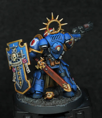
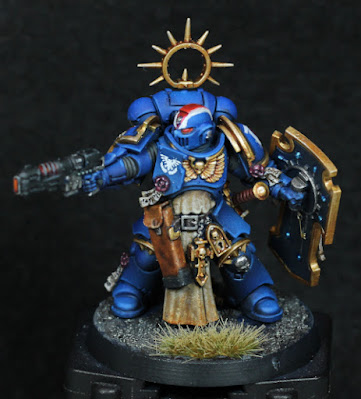
I have very little to say. It's late, overly warm, and more besides. I have, however, managed to finish (except for some varnish in places) the Ultramarine Lieutenant. This means I've now painted all of the models in the Recruit Edition boxed set. This particular model was also not counted towards the running tally, which therefore still remains at 9.

There is not much to mention about what colours were used, save that the gold is Retributor Armour, Guilliman Flesh, Liberator Gold, and then edge highlights of Stormhost Silver. It's not my usual gold, but the last edge highlight really sells it much better than usual. It looks far superior on the actual model - for whatever reason this time, the photo doesn't nearly do it justice. I will likely try this on the Terminators in progress, just to see how it looks on a red backdrop - I suspect I will revert to a more favoured approach for Blood Angels, but even then some have details that would benefit from different golds.

If the enemy is close enough that a sword is useful, there's trouble. For the enemy.

The decal on the left shoulder pad was a failure, but I'm leaving it. I like to be reminded of what doesn't work sometimes. I also used a very small amount of oils - dirt on the bottom of the tabard / cloth, barely visible hints on the scabbard for the sword, and a little black at the bottom of the shield (which turned out the best blending very nicely in). And again it's not the pigment of oils that makes them useful, it's the ability to mix, blend, and the mediums used to work it. I would probably use them a lot more on busts or much larger scales - so I'll have to try that very soon.

Another difference was that I spent a long time on details. Not obsessing over them, but just being very careful with the brush most of the time. I still had an idea of how to paint parts though, so it didn't take that much longer overall, and right now was just what I needed: something slightly different.

Holidays coming up, so no new posts for the next two or three weeks.

-- silly painter.


Wednesday, August 3, 2022

Crimson Court, Gorath the Enforcer (Showcase)


So you're walking down a dark alley at night and see this guy...

For something a little bit different I've always wanted to try a model with a very limited palette, focusing on shape and form rather than colour. That's when I struck upon an idea with this model: it wasn't motivating me for whatever reason, but I considered that as a vampire he'd but out during the deep of night where colours are far more muted and with perhaps a little moonlight to to tease out that magical atmosphere.

Feels a bit like cheating, but I kind of like the end result. It's incredibly fast to do, evocative, and the yellow eyes absolutely sell that this is an undead creature and not just a statue.

The first step I tried was actually to use oils. I need more practice with them, and this seemed an ideal place to get some in. It didn't work in one sense, but has lead me to the realisation of how I would like to use oils on miniatures: not as base colours, but instead as filters over areas. Oils make for brilliant glazes, depending on the medium they are mixed with. So I think in future that's where I'll start to practice more: glazes, filters, pin shades.

Although a failure for base colours, I did recognise during some testing that nice colours for a moonlit evil are black (of course), a dark blue, violet, and a light blue. In that order, oddly enough, from darkest to lightest. Using the violet as a midtone just works - I can't really explain it proper colour theory, but the violet has a higher value than the dark blue, and so acts as a kind of value and chromatic highlight to bring out the features. Black of course is used for deeper recesses and added contrast, and light blue is the opposite - used to highlight some edges and for zenithal lighting based on relative location to the moonlight. In this case, the moon would be behind and to the (model's) left.

Caped, but not a crusader. And a notched mace.

After allowing the oils to cure slightly (and then varnishing because I'm impatient) I set to work to redo the model. The oil colours still come through in the end, but an airbrush just makes everything so much easier to do for this kind of effect.

  • Night Lords Blue as a basic dark blue. Kantor Blue would also suffice, but with the oils already giving quite a dark base to work from I went with Night Lords.
  • Phoenician Purple mixed with Khorne Red (3:1) for a violet hue, angled from the sides and top mostly. Focus was more on left for this.
  • Lothern Blue mixed with dirty water in the cup to then gradually add some highlights.

That's it for the airbrushing. A shade of black oil paint was then done to add some more depth in places and help define the shape. Mineral spirits (artist's grade low odour) really means you can just slap it on and it will settle in the recesses without worrying about tinting other surfaces.

Lothern Blue was then added in a few places for edge highlighting, but built up slowly rather than going for strong lines immediately. Using the same colour as the last airbrushing step just helps strengthen the colour without going too bold or bright. A tiny bit of White Scar mixed in on the palette also helps to make just a few of those edges really stand out, but the key behind all this highlighting is subtlety - I overdid it in a couple of places, and it's surprisingly easy for that to happen without noticing.

White Scar for the eyes and teeth, and some Iyanden Yellow contrast on the eyes to make them yellow, and that about wraps it up. There is some of that red varnish technical paint (Blood for the Blood God) on bottle at the hip - completely out of place, but basically I just wanted to. Call it a little experiment in perhaps one day doing a grey scale model, but then picking out points of interest in some hue (normally red) to catch the eye. A very common effect in cinematography. I can imagine a diorama with a horde of creatures in the night, surrounding a hero painted in red as they prepare to do battle.

Despite the speed at which this model was painted up (all told about half a day, but with a night break to let the oils cure) I quite like the end result. I like it much more than if I'd gone the traditional route. This simple experiment really gives so much more emotion to the end result. It's not just a miniature, it's almost a small scene from a larger diorama all on its own. A good way to wrap up the Crimson Court.

-- silly painter.

P.S - and that means 9 models in the running tally of how many I'm permitted to buy.