Saturday, January 30, 2021

Horus Lupercal - Part VIII


Wolf goes om nom nom.

The further this model is towards being finished, the more motivation to paint it, so it's no surprise that I was inspired to do more recently. I'm really wanting to move to the point of attaching Horus to his base, but still need to do a little more.

The focus of this next step is really the wolf pelt, but the "hood" has also received some attention.

The pelt I didn't want black. that's too close to the armour, and wouldn't really fit. Brown is also unsuitable given the pteruges, gold, brass, and reds. Grey on the other hand balances nicely against the talons of the right hand, so this is what I went with:

  • Grey Seer base over the entire pelt. This was easy enough because the spray primer was a white anyway.
  • Apothecary White (Contrast) covering the entire pelt. This is actually subtle colour shift mostly intended to give depth and help bring out the detail in the lighter areas.
  • Basilicanum Grey (Contrast) thinned down, sometimes with water, and applied to the upper areas (flanks and back of a wolf). Multiple layers were used where I felt like it, and a little more added under some of the overlapping sections (the sculpt has large sections that look to overlap, it's just something that can appear on fur).
  • Black Templar (Contrast) really thinned down, against sometimes with water, and mostly along the back and spine of the pelt. Normal (not thinned) was also applied over the nose.
  • Nuln Oil in a few key areas, just to give much greater depth.

The pelt had no highlights applied - instead it was an exercise in darkening. The Contrast range really helped with this, but anything wash consistency would equally do the trick. This is mostly because the model is a really good sculpt and is extremely easy to work with in this regard.

The eyes are a basic pick-your-red (Flesh Tearers Red was on hand at the time) around the edges, black in the middle, and a dot of 'Ard Coat. I went with the black middle to make it stand out a little less, lest it take attention away from Horus' face (when I get that done).

Lips are some Volupus Pink, carefully applied, with Morghast Bone and Screaming Skull across the teeth.

The claws of the pelt are brown covered in greys. No particular method for this - Gorthor Brown was used, Skavenblight Dinge, Stormvermin Fur. I might add an extra highlight at some point.

Back must get chilly, needs a fur to keep it warm.

The "hood" on the armour is painted much the same as the rest. It's mostly black, but I felt it needed something extra and so put a thin brass line around an inner edge. I might brighten that some more still, but I'll wait and see how it goes once the head is done.

The glow effect can't really be seen in the photo, but this was done with Flesh Tearers Red in small amounts, multiple layers, a little Blood Angels Red, and some Mephiston Red for select edges. Keeping a bit of Screaming Skull around to mix with any red doesn't hurt either, if a bit more punch is wanted. I also used a bit of Bloodletter around the inside of the collar (again, can't be seen in the photo). I haven't gone very bright with the glow effect - I've intended it to be visible, but not overpowering. Keeping it as a dark glow reinforces the idea of Horus being evil at this point, and also doesn't look like it's blinding him.

Still various small details to get done, but they'll start to be less obvious between photos - which means it's really not long until he's finished.

-- silly painter.


Monday, January 25, 2021

Horus Lupercal - Part VII


That cape must really get in the way.

Finally judged enough done to assemble more of Horus, notably his cape. There's perhaps a little more do go on it yet - some of the folds could be a bit darker, and the wolf pelt is obviously still pending. Still, the closer to completing this model, the more motivation there is.

I didn't want the cape to be a deep purple. The armour of Horus is dark enough, and the cape just wouldn't have framed that effectively as a deep purple. By the same token, a bright red would have drawn far too much attention. Ultimately I decided on a midpoint: burgundy. It's also a good midtone from which to shade and highlight.

I also didn't want the cape to be strongly highlighted. No hard lines, and no metallic effect on the edging, to help give the impression of cloth over some harder surface.

After much deliberation and a few sources of inspiration:

  • Gal Vorbak Red over the entire cape.
  • Basilicanum Grey / Contrast Medium (1:1) spread over most of the cape, staying clear of the more prominent upper edges and folds. I may do this step again at a later point, just to darken some areas a little more.
  • Gal Vorbak Red again, thinned down, to highlight some of the areas.
  • Gal Vorbak Red / Khorne Red (1:1) thinned and again used to highlight. Mixing these paints was done rather than simply layering because they're each a base paint and have a much higher pigment density; mixing helps with the blending.
  • Khorne Red, thinned, really on the "tops" of the most outwards folds.
  • A little Mephiston Red mixed with the previous step, for very select edges, just to brighten things a little bit.

The edge line and Eye design are fairly flat, and again this is intentional. It looks more like brightly coloured stitching rather than inlaid gold, and I felt this was a much better look given the actual gold metallics on the rest of the model.

  • Balor Brown, with two coats needed because of it being a layer paint.
  • Steel Legion Drab, thinned down and used to desaturate in the shaded areas.
  • Averland Sunset, thinned down of course, and used to highlight some of the edging as appropriate.
  • Yriel Yellow, just to give it a little more saturation in normally highlighted areas.

At this point I could very well glue Horus to the base, but I will still leave that step until I've finished just about all of the model. No particular reason other than it's easier to handle everything right now while attached to a painting handle.

-- silly painter.


Sunday, January 24, 2021

Dark Angels Tactical Squad - Part I


This thing is really heavy.

Just for a bit of practice at painting a different basic colour, and to clear off older models, I'm finishing the tactical squad of Dark Angels from the old Dark Vengeance (Sturm der Vergeltung) boxed set.

There are a few gotchas I'm trying to stick to. Firstly, don't really want to go all out on the models, if for no other reason than they didn't age too gracefully. This means I won't be too perfectionist, but will use them for a bit of experience with green. I'm also not going to paint the bases. I intend to sell them off once done, just to clear the shelf, and this will allow anyone to base them to an existing army scheme should they wish. The models are push-fit, and the sculpts suffered from bad quality when being made. They were only intended for an intro box, but no amount of careful painting compensates for some of the issues. Another reason not to care so much about the result and only go for "table-top ready".

Still some details to go, but the last five marines should be ready in about a week. I'll be glad to have them done, as for whatever reason it's a struggle to paint them and I'm eager to start something else.

-- silly painter.


Saturday, January 16, 2021

Legion Praetors - Sons of Horus - Part III (Showcase)


Gaze of the Legion.

The Sons of Horus Legion Praetors are now considered finished. It's about as all-out as I want to go with them - and yes, there's a lot more I could do, but with extremely diminishing returns. So they're done.

The heads I wanted somewhat different to the Blood Angels. It's nothing special:
  • Bugman's Glow over the whole head.
  • Guilliman Flesh Contrast over everything.
  • Cadian Fleshtone for some highlighting.

A good paintbrush and thinned paints for the eyes, and basically that's it. I did mix in a little grey with the Bugman's Glow to glaze over the scalp to give a bit of a fuzz look, but fairly subtle. With all the bionic attachments, these guys keep a clean scalp.

I'm fairly pleased with the skin tone, as it contrasts well with the armour and keeps focus on the face where it belongs.

The trim metallics I tried to use Castellax Bronze on, but that ends up being about the same colour as the mix of Balthasar Gold, Warplock Bronze, and some Agrax Earthshade. All I ended up doing was adding back the metallic look after the varnish spray. Good to know that I could simply use Castellax Bronze in future. It was highlighted with Sycorax Bronze, and then a few extreme highlights with Canoptek Alloy.

One wonders how he sees past the pauldrons.

I played a little with Contrast paints over various silver metallics, which worked well enough on the weapons. Gives them a rugged, military look - aesthetics aren't as important to these praetors.

Good painting start to the year.

-- silly painter.


Saturday, January 9, 2021

Legion Praetors - Sons of Horus - Part II


Told the armourer to make it all shine.

The praetors are starting to look very close to how they'll end up, even if the gloss shades are currently a little overbearing. This will change once the varnish spray is applied, so it's not quite how the models will be in the end.

The main armour colours are what might be expected:

  • Sons of Horus base coat.
  • Sons of Horus / Lupercal Green (1:1) mixed and layered to create an initial highlight. The mix doesn't need to be done, but Lupercal Green is relatively desaturated and this just helped get the blending done more smoothly.
  • Lupercal Green edge highlights. This isn't visible much, and was mostly done to make certain edges more prominent rather than act as a pure edge highlight.
  • Sons of Horus thinned down to glaze consistency and used to smooth out rough blending. The key is really making it a glaze by using either water, or Lahmian Medium.
  • Drakenhof Nightshade in the recessed areas.

Armour trim is so far a simple mix:

  • Balthasar Gold / Warplock Bronze (1:1) mixed as a base coat. This is quite dark, and will get darker still, but is being used as a base for a later bronze appearance. This should help match against what is so far done with Horus, and pure Balthasar Gold is too yellow to fit.
  • Agrax Earthshade (Gloss) to really get some dark recesses going. This is where the shine in the photos is coming from.

A lot of cabling is getting a new treatment:

Iron Warrior base over all the cabling.

Basilicanum Grey (Contrast) covering that.

Later step might highlight with Leadbelcher, but not until after the varnish spray.

Golden details are so far:

  • Balthasar Gold
  • Reikland Fleshshade (Gloss)
  • Something will follow this later - very likely Gehenna's Gold.

Weapon hilts are:

  • Retributor Armour
  • Canoptek Armourshade (Gloss)
  • Something will again follow this later, probably Liberator Gold. Very small details don't need much else to build them up.

The pteruges are done as with Horus, and I'm still deciding if that's enough, or if a little bit more of a red tint might be later used.

Still a little more to go before the varnish stage, but hopefully they'll be done before too much longer. It would be a good start to the painting year.

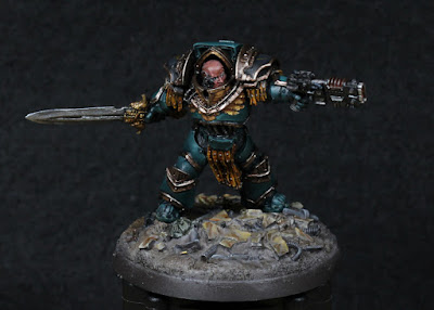
Ready to rip and teal.

-- silly painter


Sunday, January 3, 2021

Legion Praetors - Sons of Horus - Part I


Regrets not having a scabbard.

Next models to start on are a couple of Legion Praetors. Upon recommendation, they're being painted as Sons of Horus to go alongside their Primarch. Normally I would do Blood Angels, but I already have other models for that purpose.

Owing to the base to which Horus will eventually be attached, I decided to copy the scheme from there and apply some marbled tiles amongst other debris. The photo does not do them justice. Same method as used before, with the slight red tint contrasting to the armour, which has only a base coat at this stage.

Not really shown too well in the photos is some kind of cabling on the bases, and that was done a little differently to a typical wash over metallics approach.

  • Mechanicus Standard Grey
  • Dawnstone painted across raised areas as a first stage highlight.
  • Administratum Grey as more desaturated highlight.
  • Basilicanum Grey (Contrast) over all the cabling.

Takes some extra effort, but the varnish spray won't impact the final appearance. It's something I intend to look at some more for cabling - I've never really liked "metal" cabling and still look for alternative painting schemes.


Special blu-tac boot soles; obviously slippery ground.

I'm going to try paint both the models that come in the Forgeworld blister pack, at the same time. This is mostly an exercise in painting more at once, to try and at least match the number of completed models from last year. It will take quite an effort however, and I'm starting the year with very detailed models that deserve quite a lot of attention.


-- silly painter.