Sunday, December 15, 2019

Blood Angel Intercessor (again)

Told apart from his twin by looking another way.
Another Intercessor from the Dark Imperium boxed set. Still another three in the squad to go, but I'm definitely getting faster at having these guys painted. The practice on this model was just to use some more airbrush.

I've been having some trouble with getting a bright enough red out of the airbrush right now. Seemingly the air reds are a little thinner, and so might take a couple of coats to show through. In this case it was the usual:
  • Mephiston Red / Dryad Bark (1:1)
  • Mephiston Red
  • Evil Sunz Scarlet
Some sharper edge highlighting has been skipped on this model, now that I look back at it. I've been reserving that for special characters and trying to keep everything to a table-top standard, though I think just a little extra Evil Sunz Scarlet in this case would have been useful on the arm. The helmet has received the bulk of brush highlighting, seeing as that would be the natural focus of the model.

Next time I might try a more prominent base coat of Mephiston Red to start with (still have an old spray can of that stuff), darken it in shaded areas with the 1:1 mix, fix again with a thin Mephiston Red, and then finally Evil Sunz Scarlet. I'm hoping for a less desaturated red result. So that's for the next Intercessor, which owing to the holiday season means it won't be for another 4 - 6 weeks.

Still, it has been fun "speed" painting (for me at least) one at a time. It gives me a chance to get airbrush practice in more frequently, and has been a real boost to motivation.

-- silly painter.

Wednesday, December 11, 2019

Blood Angel Intercessor

Here's looking at you.
Not much of a painting update, but rather proof that I can complete a single Blood Angel in four days. This is incredibly fast for myself, and hopefully I can continue on this to clear off some of my pending models.

The relative fast speed is a combination of experience in knowing what colours to use, how they combine, nice brushes, and a wet palette. Not having to spend a long time considering which colours, in what order, really made all the difference though.

I originally airbrushed the model, but that didn't turn out properly. Poor mixing of the paint I suspect, but regardless I had to fix up everything with tried & true paintbrush. This is where the wet palette came in handy - the paints were ready at my disposal, easily thinned, and easily used to correct mistakes. Not having to constantly switch paint bottles saved a lot of time, particularly with the reds.

I did end up using Corax Black for all the of the initial black areas, highlighting with Eshin Grey and Dawnstone, and later going back over it with thinned down with the more traditional black. This works quite well to get the highlighting right, so I'll be following this pattern going forwards.

The eye lenses were also a simple Wraithbone and Waywatcher Green glaze, but despite the menacing look of a Blood Angel clearly starting to fall under the influence of the Rage, I'll switch back to my normal method in future. More tricky, but a better result.

Forwards! To find my head!
Couldn't help myself, and when the opportunity arose to get the Space Marine Heroes 2 set, I did. Also really wanted to play with one while motivation is high. This is imply an initial airbrush highlight, and I'll be going back over the armour to really make it "pop" later on. Of far more immediate interest is the Barak-Nar Burgundy being used on the baltea. I strongly suspect this will soon become a default for baltea, once I've figured out beyond the base colour.

-- silly painter.

Thursday, December 5, 2019

Sanguinary Priest (finished)

Care for a drink?

Espresso machine. Or beer fridge.
There's really not too much to say, this is mostly a showcase of the finished model. Face and hair are largely the same as can be seen with the Aggressor Sergeant, and is something I picked up from a White Dwarf once upon a time. I should perhaps detail what was used one day, perhaps a special on painting faces (though I still can't do them right).
Two things I'm trying however are: don't use pure white for the eye (Grey Seer was used in this case), and use something other than black for the iris. I'm not actually sure what was used here - simply something from the palette, perhaps left over Dark Reaper from some Horus work.

Side note: lighting is a little better for these photos, so the red appears different to previous, but nothing was actually done.

Rear view shows the vials, and how a little brighter line makes them look partially filled. A little 'ardcoat over the top makes them look more like glass as well, but does mute that line (especially on the red).

Yellow cabling was Averland Sunset, a little Agrax Earthshade, and then some Bestigor Flesh. I didn't want a bright yellow, so was looking for other colours and that just seemed to work. I'm not entirely happy with the result, but it's close to what I wanted.

Random note: old Finecast models are horrible to prepare.

-- silly painter.

Monday, December 2, 2019

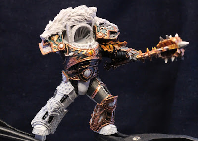
Horus Lupercal (WIP)

Arming himself for the Heresy.


Time for a more dedicated post to continued painting of the Warmaster. There's not a whole lot to actually say - for the most part it's continued with the same as before, just more done now.

As can be seen, the left arm is actually glued into place now. If it comes off then I'll pin it in place; the superglue being used isn't the best batch ever produced.

Last time I was unsure about the studs on areas of the armour. I've ended up with a simple approach of:
  • Leadbelcher
  • Black Templar (contrast, blobbed on top of the stud)
  • Leadbelcher (mostly in the lighting direction)
  • Ironbreaker (fewer studs, in the lighting direction)
So far it seems they aren't overtaking the model in terms of focus, so I'll continue with that method. The use of a contrast paint here helps to really darken things down, and it also pools mostly about the edges, giving a kind of natural shading. Nuln Oil could easily be used as well, but might require two or more applications to get the same effect; contrast is being used as a bit of a shortcut in this case.

The mace ended up using the "Sanguinary Guard gold" approach, which was intentional for two reasons: it again ties back to Horus' closeness with Sanguinius before the Heresy, and also helps to differentiate the weapon from the armour (which is more of a brass or bronze than gold).
  • Balthasar Gold
  • Reikland Fleshshade (gloss; I'd use Seraphim Sepia instead if that came in a gloss)
  • Gehenna's Gold (first stage highlight)
  • Auric Armour Gold (edge highlight)
The silvers were similar to the usual:
  • Leadbelcher
  • Nuln Oil (gloss)
  • Ironbreaker
  • Stormhost Silver
And the rest of the mace grip:
  • Warplock Bronze
  • Castellax Bronze
  • Sycorax Bronze
No need for a shade owing to how small the areas are, but I would use Agrax if I felt the need for a larger piece.
Furthermore, the mace had a little blow dryer done to straighten it out. I wasn't sure if I was willing to risk that, given that it could crack or otherwise damage the paint, but the slight bend was annoying me too much. No damage fortunately, but I really should be more careful in future resin model preparations.

Just because it's good to do a roundup, the armour detail is:
  • Balthasar Gold
  • Reikland Fleshshade (gloss, or normal for deeper recesses)
  • Sycorax Bronze (first stage highlight)
  • Runelord Brass (edge highlight)
With the base colour:
  • Abaddon Black (several thin coats to get this really smooth)
  • Dark Reaper (built up slowly with thin coats)
  • Russ Grey (edge highlight)
The wet palette makes this very quick to do now. It will hopefully show more in future photos; the shadows and white balance easily hide it in most.

There's some small detail on the legs, with light rays being depicted that are normally a different colour to the rest of the detail (at least from most reference models I've looked at). I've been playing a bit with that, so I'll jot down some thoughts in case it goes anywhere:
  • Retributor Armour (too yellow)
  • Liberator Gold (nicer, but still too yellow)
  • Reikland Fleshshade (gloss, helps tone it back)
  • Ironbreaker (kind of drybrushed across the top)
I'll probably fill in the rest of the leg black before deciding whether to stick with that, or redo those areas completely.

Going forward, I've started to black in some of the left leg, and will continue with that until it's completely smooth. I'll likely get the thigh finished first, and then just work down from there. Once the left leg is entirely complete, the same for the right will have to be done. At that point I'm not sure about getting the right arm done, or trying to attach the model to its base. While painting on the base might be slightly trickier, it does help with motivation and would allow me to start harmonising Horus and the base. I've some time to think about it though, so I'll see what I feel like later on.

-- silly painter.

Sunday, December 1, 2019

Sanguinary Priest (continued)

Could just be turtling.
The Sanguinary Priest is coming along, but nowhere near where I had hoped to be by now. It's all the little details really - figuring out how to paint them takes a hefty amount of time.

Oh, and the picture is a little blurred. Rushed the photo, didn't accurately focus the camera.

The metallics are the normal, mostly. Balthasar Gold, Gehenna's Gold, Auric Armour Gold. Shoulder pads have some Agrax Earthshade (gloss) on the wings, which actually works ok. I wanted something different than Druchii Violet, for no particular reason. A little Carroburg Crimson for ornamental chalice handles, but that's not very visible. It was just to give them a little extra colour.

Corvus Black definitely works as an excellent base to highlight from, normally by using Eshin Grey. The more traditional black can then still be used very thinly to darken as required. Need to keep that in mind for future Death Company marines, but the more immediate use will probably be boltgun casings.

Another note is that after continuing with Corax White, and a contrast paint of Apothecary White, this works quite well. It's probably very suitable for future painting of wings (again, something Death Company will have), though perhaps I would mix in just a touch of a blue. The final contrast leaves a colour similar enough to Grey Seer in recesses, and Ulthuan Grey on raised areas, so each of these can be used to fix mistakes later on.

A note on blood in vials: techical paint (Blood for the Blood God) works as a base, but I finally figured out how to create a "level" of blood (i.e the capsule/vial/whatever isn't entirely full): a very thin line of red mixed with white, running along the "top". It really only works for side-on views, but for that it works really well. Perhaps later I'll show this with a photo of the back of the model.

There's a very small strip of rope wrapped around the top of the flask, hanging from the left hip. A minor detail, but excellent to continue experimenting with to get that golden rope appearance. I'm a bit further with that, using:
  • Steel Legion Drab
  • Balor Brown
  • Agrax Earthshade
  • Tau Light Ochre
It could use a little brightening still, but I think it works better than my usual approach of basing with Averland Sunset. Perhaps a glaze of Lamenters Yellow, but I'll hold off on testing that until I find something larger to play around with.

Not shown in the photo, but the green vial on the backpack (presumably some kind of combat drug cocktail) ended up as:
  • Caliban Green
  • Vulkan Green
  • Kabalite Green
  • Kabalite Green / Ulthuan Grey (tiny mix to use as the "level" in the vial).
Rather than try to show the "empty" space in the vial any other way, that was left as pure Caliban Green showing. It's quite a dark paint, so there's no need to do anything else. Only the "filled" space received highlight colours. While somewhat more muted in tone than the neon show in the reference photos, it still gives an excellent contrast to the red elsewhere on the model.

Not much else to say other than new tools that I've been playing around with. I'm getting better at using a wet palette, which really helps to layer blend. Paints don't dry as fast (or at all), and so some mixing can be done to really speed the process up.

Another little tool recently released is the Citadel paint pot holder. Basically a bit of rubber that can hold pots and prevent them from accidentally being knocked over. Invaluable when using shades and contrast paints. It's also useful to stabilise a pot when trying to remove dried paint from a lid. Much easier and faster to use than a 3d printed alternative I have, I can highly recommend getting one.

Final note: I've been slowing doing little bits & pieces of Horus. I'd hoped to have one arm glued on by now, but keep delaying it. Not long though, and I'll prepare better photos then.
Still looking for his armies.
-- silly painter.

Saturday, November 23, 2019

Sanguinary Priest (continued)

Mostly 'armless.
Colours are a bit off in the photo, which is because I'm playing around with a lightbox, and haven't fully sorted it out yet. More diffusion required, and the white balance needs adjusting too, but if I wait to do that then this will never get written out.

Not much has actually been done, but enough experimenting that I wanted to note down how I achieved the effects. The halo collar was entirely coloured with washes and glazes, no layer paints of any kind. I could go back and do something more, but at this point it's not really worth it (and because I haven't decided what more to do).
  • Corax White (just the base coat)
  • Lamenters Yellow (glaze)
  • Casandora Yellow (wash; I just wanted an excuse to use that wash again)
  • Fuegan Orange (wash; again, just wanted the excuse, limited to more recessed areas)
  • Druchii Violet (wash; gold colours look better with a bit of violet)
  • Seraphim Sepia (wash; just to tie everything together)
I let a few colours bleed into the lower collar areas, but otherwise kept that white. This keeps the focus on the halo itself rather than the entire collar, and also that area will be hidden somewhat by the helmet or head later on.

The flask on his left is something I spent far too much time with. I wasn't sure if I wanted it transparent or not, and ultimately went with "mostly not". So while it's still towards the red end of the spectrum, it's not blood-red. I did want the neck to be darker, hinting that the bottom of the flask is filled with something. Ultimately, the following:
  • Shyish Purple (contrast)
  • Gal Vorbak Red (base, thinned, more layers towards the bottom)
  • Screamer Pink (layer, more towards the bottom)
  • Bloodletter (heavily applied to shift away from pink, more to red)
Shyish Purple is a very dark purple. I'm considering it for part of Horus' cloak, or perhaps for Tyranids. It's so dark as to almost not be effective as a contrast paint, but I like the shade of purple regardless.

Lahmian Medium and Nuln Oil (about 3:1) were mixed and added into recessed areas of the armour to give it a bit more contrast. Ulthuan Grey turned out rather well as a highlight, but it's very subtle. Don't want to do much more - white is such a hard colour to work with that I could easily mess it up.

Next steps are to start filling in some metallics, and highlight the flask stopper slightly.

-- silly painter.

Thursday, October 31, 2019

Sanguinary Priest (WIP)

Low hanging jewels.
Diving right into it, the cloak I wanted to have some kind of texture. It shouldn't be too bright, shouldn't have hard edges, and should be a little dirty in places (the predilection for "my" Blood Angels to not have dirty armour in the middle of a battle does not extend to their cloaks). I also wanted to play with contrast paints some more. So ultimately, the red cloth is as follows:
  • Grey Seer (base)
  • Blood Angels Red (contrast)
  • Agrax Earthshade / Lahmian Medium (1:1 mix, mostly in recessed areas)
  • Astorath Red (dry, concentrating on raised areas, or where armour is directly pushing against the cloak)
  • Sylvaneth Bark (dry, around the hem)

And that's really it. The last stage doesn't really show too well in the picture, but it gives the appearance of the cloak having been brushed against the ground quite heavily, and not just freshly back from steam cleaning.

Armour is even easier:
  • Corax White (base)
  • Apothecary White (contrast)
There are more stages to go as well. I may use some thinned Nuln Oil in deeper recesses, and I'm uncertain whether to use Ulthuan Grey or White Scar to highlight with at this stage. I'll pick an area for the former, to see if it's actually lighter than how the armour already appears or not. Overall though, I'm quite happy without how Apothecary White works for white armour, even if it's not something I paint much of.

I'm experimenting with my lighting setup a little. Once I have that organised, I should be able to better white balance and take much nicer photos.

-- silly painter.


Sunday, October 6, 2019

Horus Lupercal (WIP), Sanguinary Priest (WIP)

One eye is colour blind.
Still having some trouble with getting the lighting just right, but it's late and I wanted to get something written out. So the above picture will have to do.

Small progress on Horus after a bit of a break. Mostly just filling out the belt and remaining torso armour plating. Nothing new in terms of colours, so far it's just a continuation of the same I've used before.

I've been thinking for a while about how to paint the studs, for example those seen on the pauldrons. Most variations of Horus have them as silver, however I'm slightly concerned that it will be too bright and take focus away from the rest of the model. On the other hand, the rest of the model isn't really there yet, so it could actually balance out once the model is finished. Perhaps it's worth seeing if Leadbelcher can mix well with black, or otherwise blob some contrast over the top to tone it down somewhat.

I'm also still deciding on the colours for the mace (Worldbreaker). I could strictly speaking glue one of the arms on now, but I'll wait longer until the mace is nearly finished, and perhaps more of the left leg, for reasons of ease of brush access.


Hanging pretty low there.
Purely for additional experimentation with Contrast paints, I've also started on a Sanguinary Priest. It's the white armour that I'm interested in. The above is a test on areas that are actually hidden behind robes, so they're intentionally a little darker than normal.
The armour is:
  • Corax White (primer, and then base paint for a smooth finish).
  • Apothecary White (contrast paint)
  • Basilicanum Grey / Contrast Medium (1:1)
That's really it. The recesses where shaded naturally from the paint. It's somewhat more grey than exposed armour should be, so future steps will just use Apothecary White, and then some white or light grey (perhaps Ulthuan Grey, or White Scar in a pinch) for edge highlights.
The robe seen here is:
  • Mechanicus Standard Grey
  • Blood Angels Red (Contrast)
  • Druchii Violet (Shade)
  • Mephiston Red / Dryad Bark (1:1) for edge highlights
Actually the last step is Mephiston Red with some pigment added in, but the pure pigments can't be bought anymore, so the equivalent now would be to mix in Dryad Bark (something I've done for the airbrush paints). On the outer garments I'll probably just drybrush Mephiston Red directly for the last step, both to change the texture and make it a little brighter.

Choosing the right base prior to applying Contrast does make a noticeable difference, so it's important to get that right. I may use something slightly brighter for the outer garments, and the outer garments should be done before the armour. Otherwise it's going to make fixing mistakes very difficult; white is an unforgiving colour if mistakes are made in red.

-- silly painter.


Wednesday, September 11, 2019

More Stormcast (finished)

Sir Glowhammer
There's actually three done, but they do look very similar. Three at at time is basically confirmed to be best for me at this point. It just seems to be easiest to manage.

Weapon handles are a surprisingly simple formula:
  • Mournfang Brown
  • Tuskgor Fur (edge highlight)
  • Agrax Earthshade

The short sword scabbard I was hazy on some details about from before (because they weren't written down properly - shame!) so instead I chose to experiment with some new purchases. I didn't want the same as Blood Angel armour, so the result in this case is:
  • Gal Vorbak Red
  • Carroburg Crimson
  • Word Bearers Red 
  • Wazdakka Red (edge highlight)
Seems to work ok in the end, so it will probably be the basis for whenever I paint a red Word Bearers legionnaire.

The shield deviates from the last batch of Stormcast by using Grey Knights Steel for the lightning bolts. It's a subtle thing, but worth it. The hammer is a mix of Leadbelcher, Ironbreaker, Nuln Oil, and Liberator Gold in places. The clouds I'm not entirely happy with this time, but the basic approach is do drybrush colours together, going darker in the process instead of lighter:
  • Celestra Grey
  • Administratum Grey
  • Eshin Grey
I did go back over some areas with mixes of colours to make starker edges, or blend it together slightly. More practice needed, but ultimately I still think something on the bottom of the shield helps to balance out the model.

Hammer glow was drybrushed, but I couldn't remember what I had used last time. Again, always write this down - that was the whole purpose of this blog! I don't know if this is better than before. It's certainly different; not better or worse, just different:
  • Imrik Blue
  • Skink Blue
  • Wrack White
  • Grey Knights Steel (to blend back into the hammer head)
The last paint was not drybrushed, but I figured thinned down it might help to soften a few edges. High pigment opacity with that paint though, so be careful trying this.

The white cloth next to the short sword is standard purity seal parchment detailed before for Blood Angels, so I won't bother recounting that here.

Using some spare bases from the shattered realms set, these were first primed with Corax White from a spray can, and then covered in Basilicum Grey in selected areas. That didn't have quite the hue I wanted, so pulling out the old Guilliman Blue glaze helped give it just the right colour. A more pure grey just stood out too much, so the subtle blue helps tie things together more. The "earth" in between was Gore-Grunta Fur and Agrax Earthshade. It's a little too red, but I don't have many contrast paints to play with right now, and I wanted to see how it worked. Thinned contrast paints do work well as glaze replacements.

The painting speed of these models has definitely improved. Mostly that's just experience: I know what colours to use, and how I want the model to look. The airbrush also saved a good deal of time, and I'm starting to get the hang using one (at least with blue).

-- silly painter.

Tuesday, September 3, 2019

More Stormcast (continued)

Preparing for war, with all the trimmings
Painting in batches of three is definitely working much better so far. I'm progressing surprisingly fast for my normal speed, but then I'm also not doing other hobbies right now. Doesn't matter; painting motivation comes and goes in waves, just like any other hobby.

Much of the model is starting to be filled in now, and I could probably start to think about gluing the shields in place soon. The gold armour trim is:
  • Retributor Armour
  • Reikland Fleshshade (Gloss)
  • Reikland Fleshshade (normal, to bring down the shine in deeper recesses)
  • Liberator Gold (not yet done, but will be used as a highlight)

The tabard (basically anywhere purple) is:
  • Naggaroth Night
  • Druchi Nightshade
  • Xereus Purple (higlight)
And I may do a little more edge highlighting in select areas, just so separate the cloth a bit. Chances are this will be:
  • Daemonette Hide

The silver scales on the loincloth are fairly easy, but can be more than it might first appear. Only the first two stages are done so far, but the intent is for them to be:
  • Leadbelcher
  • Nuln Oil (Gloss)
  • Nuln Oil (normal, only in the deeper recesses)
  • Ironbreaker (highlight raised areas)
  • Stormhost Silver (additional highlights on the most raised areas)

Steady progress for tabletop ready models, which will hopefully be done in another week (work pending). I've also thought about really going to town and adding some subtle blues to the silver scales, as reflections from the armour, but they're only tabletop quality and I'd rather not spend months in getting them finished. I'll save such details for character models.

-- silly painter.


Wednesday, August 28, 2019

More Stormcast (continued)

With such a big hammer, it's obviously going to be a big nail.
Not much to write; this is mostly for comparison purposes. Drakenhof Nightshade in the recessed areas, and Alaitoc Blue for edge highlights. It's a fair amount of work to get to this stage, but well worth it I think.

Edge highlighting is back here, after being missing from some models while I explore how it should be done. I think the answer is that I'll continue to edge highlight, but the colour used must be picked correctly. It shouldn't be so bright as to be distracting, but neither can it be simple repetition of the previous layered colour. Something to consider going forward with Blood Angels.

Next up it's time to start blocking in some base colours - the gold trims will take some time, but the airbrushing really did save a lot of time to get the basic armour into decent shape.

-- silly painter.

Monday, August 26, 2019

More Stormcast

I'm blue da ba dee.
So first off, the image above is adjusted slightly to exaggerate the highlighting done by using an airbrush. Perhaps it could use a little less contrast, a little more light, but it's still better than the original. I can see the appeal of working with raw files.

Following on from the Aggressors, I've decided that doing three models at a time seems to be my sweet spot. I'm too involved in details to be able to batch paint effectively - so squads of ten Marines at a time is probably not going to work. Mini-batch painting means the details don't get tedious, and it's still better than one at a time.

In this particular case, I wanted something to paint that wasn't red, and wasn't as detailed as Blood Angel. Stormcast offer that alternative; easy to paint, different colour, and I have references to work with (just that I didn't write down the original painting steps - oh well!).

I bought Night Lords Blue to try as a darker blue. Kantor Blue was too light as a base colour last time I tried this, but is effective as a first stage highlight. So all that's seen above is just an airbrush witih:
  • Night Lords Blue (base colour)
  • Kantor Blue (highlight)
  • Caledor Sky (additional highlight)
This has all worked out fairly ok. The blues don't appear to spatter much either, so the transitions between colours works very well. Later on I'll use Drakenhof Nightshade in recessed areas, or to better define armour plating, and Caledor Sky again for edge highlighting. Alaitoc Blue is an alternative edge highlight colour if that doesn't really work.

At the time of writing, the heads have actually been done already, just because gluing them into place doesn't obscure anything else. The colour scheme for the helmets is quite simple:
  • Celestra Grey
  • Drakenhof Nightshade
  • Celestra Grey (thinned down, soften shaded areas)
  • Ulthuan Grey (edge highlighting)
Most have a kind of halo, which is done in typical metal style:
  • Leadbelcher
  • Nuln Oil
  • Leadbelcher (thinned down, soften shaded area)
  • Ironbreaker (highlight)
  • Stormhost Silver (edge highlight)

Hopefully these can be finished quickly, just because a quick "win" would be nice.

-- silly painter.

Tuesday, August 13, 2019

Blood Angel Aggressors (Finished)


First note I'm going to make is that I really didn't do much in the way of edge highlighting on the red armour. I think next time I'll add a little - not much, but enough to make the edges stand out some. The edge highlight can easily be changed to match how dark or light the surrounding area is: Mephiston Red for the darker areas, Evil Sunz Scarlet for mid-range, and Wild Rider Red for the lighter areas. This will definitely take more time, but I think it would be worth it. Without this, the armour just doesn't stand out as much as I would like.

The rope has a thin layer of Ushabti Bone over it, just because it was too yellow before. Perhaps it still is. I may look into rope more in future.

Incubi Darkness for some of the rear cabling, with a wash of Nuln Oil. I didn't want anything fancy for those cables, feeling it would distract from the rest of model if I made them too bright, or even too dark.

The rear fuel tanks are golden/brass, as with the flamer cowling, just because silver would have been too boring. Perhaps it brings too much focus to then when viewed from behind, but that's ok.

Corax Black is my new favourite base paint for weapons. It's ever so slightly grey, which allows Eshin Grey to highlight against it much easier, and Dawnstone for edging. Nuln Oil, or even the more traditional black thinned down, then gives shading as appropriate. The slight hint of grey just gives something to work from; pure black or white give almost nothing to work from.

The Sergeant has a blood vial attached on the left pauldron, so I figured the best colour to use would be Blood for the Blood God. It's a deep red with a gloss finish, so fairly ideal for this purpose. A little Hoeth Blue parallel to the ground to give the impression of a liquid in a jar, some Carroburg Crimson wash, spot white reflections, and finally 'Ardcoat to restore the gloss. It looks to work rather well, so I'll likely repeat that for future vials.

Not much else to say really. Everything was based off prior work, and going back through these posts saved me a lot of effort in figuring out what I previously done.

-- silly painter.

Sunday, July 28, 2019

Blood Angel Aggressors (WIP)

My, what...

...big hands...

...you have.
Work in progress when I'm not busy with Horus. Nothing much since the last update on these guys, but the flamer cowling is of something new:
  • Balthasar Gold
  • Reikland Fleshshade (Gloss)
  • Agrax Earthshade (Gloss), just underneath to match the lighting, but Agrax really works well with this sort of thing.
  • Hashut Copper, initial highlight and to tone back shade pooling.
  • Fulgrim Copper, as additional highlighting.
  • Stormhost Silver, for edge highlighting.
  • Nuln Oil, just in the cowling holes.
For the Sergeant on his left pauldron, in keeping with Blood Angel army colours:
  • Averland Sunset
  • Casendora Yellow
  • Fuegan Orange, spot shading in the most recessed areas.
  • Phalanx Yellow, for initial highlight.
  • Dorn Yellow, for edge highlights.
This is slightly different from the original paints used, and was mostly an excuse to try out Phalanx Yellow more. Unfortunately it's too close to the rope for my liking, so I will likely touch up the rope a bit more later on, possibly with a soft beige layer of some kind.

Might continue on these guys a little bit longer before returning attention to Horus.

-- silly painter.

Tuesday, July 23, 2019

Horus Lupercal (WIP)

Damn it, hurry up and paint me.
Only a very short post with a better picture. Same lighting as before, but a better camera. Some of the easily spotted mistakes on the model have already been fixed.

Just to draw attention to the Luna Wolf icon on his left pauldron, that was simply Gree Seer (base), over which was laid some Black Templar (contrast). A bit of Wazdakka Red for the eye, and done. This is a really good example of where contrast paints shine. It would have taken me an awful lot longer to highlight that wolf head icon, but I don't feel the need to touch it any further now - except to fix the odd mistake, of course.

Gold trim is coming along, and should be done relatively soon. All the same as before, although it's not a good idea to paint tired. Eyes have trouble focusing.

-- silly painter.

Wednesday, July 17, 2019

Horus Lupercal (WIP)

Starting to look....jaded. Yeeeeaaaaaahh.
Slow progress on Horus. The chest plate metallics have been filled in, though I might still go back over some areas with Reikland again to really bring out the contrast some more.
I did play around with a tiny bit of Skullcrusher Brass to add some colour variation (it really can't be seen in the photo), which is something I intend to introduce some more on the legs and arms. I want to make the engravings ever so slightly different from the trim in areas, just to avoid overdoing the same exact colours. I'm not sure it will ultimately matter.
The shoulder pads are green as a hat-tip towards the Sons of Horus primary colour scheme. No Primarch would be entirely different from their army colours, so it was important to have this present on the model. I picked this up from the Forgeworld paint work, and it really does make sense. In order:
  • Lupercal Green (base)
  • Sons of Horus Green (layer)
  • Athonian Camoshade (wash)
  • Lamenter's Yellow (glaze)
The last step was perhaps a little too far. I've pulled it back with the layer, but might glaze it with Lupercal Green later if I feel that's not enough. Depends how it looks once the trim and details are filled in.

-- silly painter.

Sunday, July 7, 2019

Horus Lupercal (WIP)


Finally started to work a little more on Horus. It's about time I did so. He's been waiting patiently for me to bring my skills to the proper level, so it's time to continue with the model.
The Eye of Sauron Horus.
Of course the photos are terrible still. Really must do something about that soon. The chest piece is being done as previously detailed with the arm, but now that I can see it starting to take form, then I think the colours will work out.
The one note on the chest piece for now is the Eye of Horus in the middle. That is a combination of:
  • Jokaero Orange (base)
  • Yriel Yellow (layer)
  • Bloodletter (glaze)
  • Carroburg Crimson (shade)
  • Corvus Black (base, iris)
  • 'Ardcoat (technical, varnish)
The idea is to make the centre area more yellow, fading to orange and red at the outer edges. It's tricky to get the blending right with such a small area, and I had to go back & forward with Yriel Yellow a little, but it works ok I think. I'm happy enough with the effect that I think it will work elsewhere too. The varnish final step was learned from painting gemstones, and particularly from Blood Angel models, and really does give the eye the finishing touch.

Horus must still assemble his arm-ies.

I'm using Horus as an excuse for small amounts of contrast paint experimentation. Having decided that contrast paints are better suited to small details, that's exactly what I'm looking at doing; in this case the "dangling straps" (technical term) are some play with the following:
  • Wraitbone (base)
  • Snakebite Leather (contrast)
  • Gore-Grunta Fur (contrast)
  • Bloodletter (glaze, selected areas only)
I will very likely go back over this later with more glazing to subtly change the hue and give a different appearance between the upper and lower straps. Possibly some more layers will go on later, but it's a good start. The Snakebite Leather (which still smells like the old paint with the same name from long ago) was far too light, which is why Gore-Grunta Fur was added afterwards. While not finished entirely, I probably won't do more on the straps until later.

Small details on the arm were a simple matter of:
  • Grey Seer (base)
  • Basilicanum Grey (contrast)
Again, I'll do more later, but only to neaten up a few bits, or make some edging highlights. I wanted something other than a metallic, and this sort of thing is again where contrast paints appear to work rather well. It is similar to a shade in this case, but with better consistency and doesn't just run into recesses, but kind of glazes everything as well. I may just continue to use this for small skull icons on Space Marine helmets.

-- silly painter.


Sunday, June 30, 2019

Legion VI - Space Wolves (finished)

Scientifically proven to be a bad photo.
Before anyone complains, yes I know the shoulder pad colours aren't correct and it's missing Legion symbols, etc. Just pretend it's before their Primarch was found.

And the photo is really bad. I'm in the middle of a cleanup, the lighting isn't setup again properly, and I still don't have a decent camera to use. Which is a shame, because the model looks very flat in this photo, but actually has quite a lot of shading. No matter.

Not really that much to say. The model was painted. I tried some contrast paint for the eye lenses, but really it didn't turn out much better than normal methods. The area is just too small and requires more shading than contrast paints are capable of.

There is one cool thing I did learn, which naturally isn't shown in the picture, and that's Black Templar over Leadbelcher. A contrast paint over metallics in detail areas works rather well. It's a different kind of shading compared to using any of the washes, so can be used to help differentiate parts of the model. I tried it on some cabling on the backpack, and it works really well. I've struggled with "metal cabling" in the past, but I think this might just work ok.

-- silly painter.

Wednesday, June 19, 2019

Legion VI - Space Wolves

Simply because I wanted to try out the blue-grey colour scheme of the Space Wolves, a parallel project to the Aggressors is another Legion model. This colour scheme is important because I intend to use something similar (if perhaps a shade darker) when I eventually unpack some of the Adeptus Titanicus models.

Why only half the metallics are done is anyone's guess.
Initial airbrushed colours were The Fang, Russ Grey, and Fenrisian Grey. These worked fairly well, although later I used a very slight Drakenhof Nightshade through the airbrush as well, just to give some extra lighting contrast. That shade was also used with a traditional brush in the recesses later on, and to mark out areas where mistakes were made.
Mistakes happen. Battle damage is one way to hide these mistakes, if they can't be easily fixed normally, and sadly that is a problem with the airbrush sometimes. Either because of the "grain/noise" associated with using an airbrush, or because of slight colour variations, trying to touch up with a paintbrush might not quite look right. With experience, mistakes are minimal and normally close to edges that are more easily fixed with a highlight or shade, but sometimes there's sometime more serious. So in this case I'm still deciding whether it will be battle damage, or perhaps I could write runes around the right greave. Or both.
In any case, the metallics on this model are:
  • Balthasar Gold
  • Reikland Fleshshade (Gloss) (not shown in the picture here because the areas are too small)
  • Sycorax Bronze
  • Skullcrusher Brass
Now the last layer paint might seem an odd choice. It's a different hue than Sycorax, essentially making the final highlight a slight shift in colour as well as being a brighter edge. This ultimately works, but it's difficult to pinpoint why exactly. Perhaps it's because reflections often end up that way, with a reflected light being a different colour than reflected flooring. Certainly it helps give the appearance of directional lighting - and it might be well worth investigating this more in future, though I will probably just keep it as a subtle thing with this model.

I also got my hands on some of the new paints from Games Workshop, and decided to give them a go on a boltgun. I was particularly curious about some of the blacks, seeing as I struggle with highlighting that sometimes.

Quick edging of boltgun...
Above is Grey Seer as a base, with Black Templar (contrast paint) slathered on top. The edges really do stick out like they're highlighted, it's not just the poor lighting and photography skills. Still, on something with flat surfaces like this, it  looks like many applications of a shade. There's no sense of lighting direction, no uniform gradient,  and a somewhat blotchy appearance in areas. Edges in particular are always apparent; there's no discrimination of natural lighting, it's more like escaped visual from Tron. Above is a rare case of the photo looking much better than the actual model.

...now with more grimdark!
Corvus Black (a new base paint) thinned down  to the rescue, with the more traditional Abaddon Black on top of that. I'm unsure which was better to stick with, but the end result is effective enough. Does it compare to layered blending? Well, no, not really, or at least not yet. A bit more experience with the paints and it might. I did, however, get it done in a fraction of the time, and it's good enough for my version of tabletop quality.

So I'll continue to use contrast paints and see how well I get on. I think the potential is there with boltguns to give a basic start. Black is a very difficult colour to highlight, and this may make it easier in doing the reverse - create some definition highlights, and then darken areas down to black afterwards.

Lastly, Corvus Black has definite potential. It's ever so slightly more light, perhaps with just a hint of grey, or blue-grey. It's not much, but in having that to work from it makes it such a better base to use for highlighting from. I will have to try it out on the shoulder pad trim for the Aggressors. All in all, I believe the new paints from Games Workshop are well thought out. Not just the contrast paints, but new base and layers fill niches that have been missing for a while. And bringing the Forgeworld paints back, and indeed making it a part of the standard range, is excellent to see. I look forward to many more Legion models to try all these paints out on.

-- silly painter.


Sunday, June 9, 2019

Contrast Paints (early impression)

Down at the local GW store (or Warhammer store), I managed to play around with the new contrast paints for all of 5 minutes. Not much time to see what they can really do, but enough to get an impression of them.

They're definitely something different.

I've seen the term "thick wash" bandied about a little bit. Is that accurate? Well, yes and no. Contrast paints do share some of the properties of a wash (shade) paint: the contrast paint will pool more in recesses, leaving raised areas with a thinner application. They are more translucent than a base, or even layer, paint, and do appear to work best going from light to dark (e.g are best applied over a lighter colour rather than a darker one).
Where a wash is close to the flow properties of water however, a contrast paint is more like a gel. It doesn't pool in recesses so much as the pigment seems to get drawn into them as the paint drys. I'm not sure it should be applied either as heavily as some apply a wash, or if it should be applied more. The tagline is "one thick coat", and I didn't really play around with that aspect much - too used to the multiple thinner coats to do much else. Contrast paint is also designed to be applied everywhere, whereas a wash is more for applying in select areas.

I'll be honest. I don't think contrast fits well with Space Marines. The armour plating is too smooth and large of an area, and the contrast paint can easily leave "tide marks" behind. A bit of experience will help with that, but it's still very difficult to get an even application over a larger smooth surface. The end result is a lot of samples look blotchy. I personally think traditional layer paints will give a much smoother finish on the armour.

It's not all bad though. Perhaps some of the browns (or whichever colour) can be used to dirty around the feet some, tying the model more in with the base. Where a contrast paint really shines however, is anything organic. Skins tones, perhaps fur, parchment, cloth, skeletons, rope, etc. I can see it being extremely useful in those cases. Lizardmen especially are likely going to benefit from these paints, and Orks. Even Eldar (or Aeldari now I suppose) where there is something closer to fabric between their armour plating. An Avatar would look pretty nice.

So I don't see the paints as the answer to everything. They're another tool to be used - good in some areas, not in others. I personally will see how well the black works with boltguns as well - initial impression with that shows promise, but it will take some experimentation to get right.

Sadly, the local store was unable to order any for me (everything sold out already - though quite how that should happen with a pre-order I don't know). I suspect it will be a few weeks before I can get my hands on some.

Last note: Grey Knights Steel base paint. The airbrush variant is a very nice colour indeed, and I'm glad to see it coming to the traditional brush.

-- silly painter

P.S - photos of slow works in progress coming soon. I hope.

Friday, March 29, 2019

Ultramarine Legion Herald

Biggus Stickus
So finished the Herald. Mostly stuck to the cover picture from the blister pack, so I didn't go completely overboard with the painting. Mostly it was an excuse to use blue with the airbrush originally, but I also explored some more highlighting beyond just the base armour colour. So most trimming, symbols, etc, has some directional highlighting applied as well.

As far as the model goes, I have a few issues with it. Some of that is down to manufacturing processes: there's excess on the standard that I couldn't trim down without breaking it. Those imperfections are annoying (and are something I would fix on Blood Angels), but I really do want to speed up getting some of my models painted, so it'll have to be classified as battle damage.

Actually the base has some more colour variation to it, but the lighting washed it out. Next time I'll have to remember that and exaggerate the variation more.

Lessons learned will be used on other models, including Horus. A combination of Mournfang Brown, Wazdakka Red, and Agrax Earthshade (or perhaps Carroburg Crimson, or both) I've decided will look good for pteruges. And next time I do eyes, I may well use Celestra Grey instead of white; a solid white can stand out too much on the face sometimes.

-- silly painter.

Sunday, March 24, 2019

Cheap Win

Felt like the need for a "cheap win"; wanted a model that could be done quickly instead of spending weeks on it. To that end, the Tomb Banshee looked like it might do the trick.
Somehow reminds me of The I.T Crowd
Really simple model to paint, particularly the flowing dress. Just Hexwraith Flame over white. I did try a thin layer of Hexwraith first, and built it up, but had some trouble with that. It's a paint that would take some getting used to, however would be well worth it for any Undead army. Nighthaunt Gloom was layered over white for the "skin", and worked rather well. Those are very good paints for what they do.

The eyes were simple enough: white, with Carroburg Crimson surrounding them. I figured the red would make her look more malevolent. The hair was built up from Jokaero Orange, Squig Orange, Wild Rider Red, Flash Gitz Yellow, Bloodletter (glaze), and Carroburg Crimson. It might have been better to go for a deeper red for the hair, but basically I paint so much red for Blood Angels that I wanted something subtly different. The vest was a mix of purples: Naggaroth Night, Xereus Purple, and some Warpfiend Grey.

Other than a silver dagger, that's really it. Not much to it, but it still took a full afternoon from sprue to finished model. The white paint (Ceramite White) was, as is typical for that paint, fairly wrecked. So the end base coat was a little tacky, and picked up some dust which is visible on the back of the model. Most annoying. Purity Seal should stop it gathering more so easily, but as far as quick & easy goes, I'll just deal with it. Tabletop quality, finished in a single day, I'll take the cheap win and know that I'm able to do it if I really want.

Before moving back to the Aggressors, a little more of the 30k Ultramarine Standard Bearer.
If taken into battle, one wonders how much damage the highly visible standard normally suffers.
Slowly filling in detail for this model. Just want to get it finished really, so I'll probably keep at it before returning to the Aggressors. Might do the cape (not shown) with the airbrush, just for the fun of it.

-- silly painter.

Thursday, March 14, 2019

Blood Angel Aggressors

It's been a while since the last post, mostly because of personal items of interest claiming spare time, but finally a bit more painting done. I do seem to be bunny hopping from project to project, but that's ok - it keeps motivation higher sometimes. I still have Horus as a long standing project, then there's a Ultramarine Legion standard bearer, and now the Aggressors.

The aggros go marching one by one...
These were picked just because large surface areas, which is ideal for some quick airbrush experience. And they have helped in that regard. I'm still getting used to what works best for me, but a three stage approach seems to be working ok so far. After priming, there's a dark base coat, then highlight with the "true" base coat, then finish with a highlight.

Airbrushing is must less precise than a paint brush, so I'm trying to adapt highlighting techniques to match. Directional highlighting is easy, but less interesting sometimes, so I'm going for "patched highlighting". Basically pick an area and highlight as an entire patch, regardless of detail or corners. I'll go back over it later with a shade or some fine-tuned highlights to soften up patch and harmonise everything together. If that makes sense.

Aggressors have the unfortunate attribute of needing to glue the heads in place during torso assembly. So in this case, the heads and inside cowling was painted first and then assembled. Some blu-tac was used to cover up the area prior to priming the (mostly) assembled model and during airbrushing. This seems to have worked rather well, so now it's time to start filling in details and bringing these guys to life.

Oh, and the picture doesn't do them justice as always. Still need to source another proper camera.

-- silly painter.