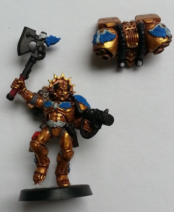
Mechanicus Standard Grey was used with the joints, for opposite reasons to the wings. Normally I would paint them black, and then highlight over the top. This time I'm reversing that and using a lighter colour, with the intention of using Nuln Oil later to make the recesses darker. This is something that did turn out rather well.
Rhinox Hide for the pouches, and Khorne Red for the axe handle. The handle I wanted darker than the blood drop gems, so a darker base is used. Caliban Green on the wreath on the head, Warplock Bronze on the mask tubing, Rakarth Flesh on the scrolls, and Mephiston Red on the seals rounded out the base colours.
With the base done, it was time to start layering.


Mephiston Red, although a base paint, was thinly applied to any blood drop gems. Watering it down slightly let it be applied more smoothly, and also gave it a brighter colour due to the underlying Celestra Grey. Ulthuan Grey was brushed onto the wings, although it's there that a bit more work should have been done to cover the blue. As it is, I feel the blue stands out too much rather than acting as more of a shadow colouring. Better brushes would have let me paint individual wing "feathers" to solve this issue, which is something to try next time. Still, it's not so bad, and the tips, also painted with Ulthuan Grey, help give a whiter appearance.
Leadbelcher was applied to any gun or other shiny weapon areas. Again, this is a base colour, but it looks far better when applied over a black coat, so I consider it more of a layer paint. I also gave a highlight of Ironbreaker to most of the same areas.
Nuln Oil was applied to the armour joints, which gave a far better look than trying to highlight the edges. I'll be using this method on future models.
It's not really apparent in the photos, but a tip picked up from a Games Workshop "colour card" (used to show their recommended paints for Blood Angels) helped with highlighting black edges. Eshin Grey was brushed onto the jump pack cabling, and along the gun edges. Black is one of those tricky colours to highlight, and while I wasn't impressed with my first efforts (really must get a better brush soon), I'm convinced that Eshin Grey will be more effective with a bit of practice.
A shade of Carroburg Crimson was given to the purity seals, just to darken them a little when compared to the gems. It was also applied to the axe handle.
Kabalite Green on the wreath finished this stage. The wreath is one of those tricky parts, because it's a fairly minor component, but the contrast of green against the golds and reds is crucial to balancing out the head when compared to the rest of the model.


Above is the next stage of highlights and layering. Blood drop gems were given a watered down Abaddon Black darkened tip, Wild Rider Red highlighted base, and a white dot inside the black to give it that gemstone quality. While this is sometimes effective, I'll probably work on that method come the next model.
A little Runefang Steel on weapon edges gave them a brighter look, after shading with Nuln Oil (and spilling it in the process - darn).
Scrolls and parchment were shaded with Agrax Earthshade, and then highlighted with Karak Stone. During the shade phase, I also made sure to apply a little in the corners where the scrolls meet the armour. This gives a darkened border to a) help those elements stand out, and b) makes the join look more shadowed. It's difficult to describe the difference without better quality photos, but the results are far better this way, and it's again something I'll be doing more of going forward.
A glaze of Bloodletter was given to the shaft of the axe, just because I thought it would look better than all silver. It does. All silver is sometimes abused a little too much, and models can be far more interesting with a subtle change in hue (perfect for glaze work). The axe head was given two coats of Guilliman Blue glaze for that glowing energy look. It's an ok effect, and worked with the Dreadnought, but isn't as effective here. I may give some light blue edge highlights later.
The wings were given a final highlight of White Scar. This time, I tried to carefully paint each "feather", one by one. It worked rather well in the end, and is again something I'll be doing more of in future. While they might appear ideal for drybrushing, I find wings need to be more exact than I can currently to with drybrushing, which is perhaps better suited to armour edges, hair, fur, etc. Or I just need to get better at drybrushing.


Last details (for now) are the pouches, touchups to armour (not visible from these photos), and a bit of colouring to the gun. But first....
The scrolls and parchment were given a final coat, or two in the case of the shoulder pad, layer of Screaming Skull. This turned out quite well, and would likely work rather well with Dark Angel robes. With the wings already highlighted to white, I didn't want the parchment to be as bright and so didn't highlight them all the way to white.
The head wreath was given a final highlight of Warpstone Glow. I might be tempted to mix a little white with that and do another highlight down the track, but I'm happy enough with it for the moment.
The pouches on the model's right were highlighted with Gorthor Brown on the edges, just to give them some form. The right holster, on the other hand I decided was too brown, and something more fancy befitting a Commander would be needed. A thinned down coat of Screamer Pink, followed by a shade of Carroburg Crimson gave it a very velvet appearance, and really does give a much better finish than brown. I did not highlight the edges - instead, I simply made sure the shade wasn't applied there, and gave extra shade towards the centre areas. I haven't felt the need to highlight the edges after that, so that's another trick to keep in mind.
Although not really visible in the photos here, I did end up using small amount of Brass Scorpion on the gun barrel to give it a blasted look. The layer was actually a little too much at first, so I then went over some of it with a very thin layer of Ironbreaker. I would actually blend the Ironbreaker in towards the more blasted areas where possible, ensuring the brass look didn't vanish. The effect is quite reasonable, and I'll be exploring that combination with further models.
So this time a lot of techniques were learned that can be put to good use with future models. This is something you really only get to experiment with from those extra special models, another good reason to not leave them to paint until last.
'til next time.
-- silly painter
No comments:
Post a Comment