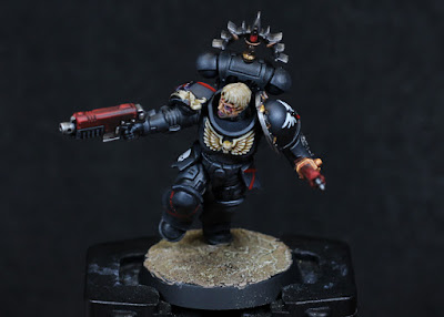
So it's not the best photo, simply for being in a rush the lighting makesthe top of the head darker than it should be, but for my first real experiment in NMM, it's ok. There's a few things gone wrong, a few things gone right, and a lot learned in the process
Rather than be normal and start with a silver, or a gold, I wanted something a little different: copper. As it turns out, copper is really hard to do owing to it being a bit of strange mix of colours. There's reds, browns, hints of orange, pinks, blues, even a bit of white. Still, I'm lucky enough to have a wide variety of paints, and I don't intend on painting an entire army this way, so for a bit of practice it would be fine. Also the Internet is a great resource for getting started with - always do a bit of research first to get off to the best start.
I've decided that NMM techniques are all about two things: contrast and transition. High contrast along edges, and transition across larger surfaces. So I wasn't going to be afraid of using quite a few paints to achieve a nice gradient, which helps reproduce the effect later on. Plenty of water or flow improver was used to make sure the paints were very thin; glaze consistency for the most part. Don't rush, spend some time building up the layers.
- Mournfang Brown over the entire area. It's worth a couple of thin coats to get a nice, even coverage. This serves as a little darker than the midtone, where it can be lightened or darkened from.
- Doombull Brown to glaze the areas that should be lighter. The top of the head, the temples, the lower jaw, the bridge of the nose.
- Tuskgor Fur to further glaze and lighten, just a little less areas covered than before.
- Squig Orange then glazed to further lighten, and start to really brighten the sharpest edges.
- Emperor's Children glazed across yet smaller areas, and edge highlighted to bring out contrast along sharper areas, or where the light is expected to reflect with higher intensity. It's this part where the colours really start to stand out and it might start to look a bit coppery.
- Deepkin Flesh, chose specifically because it has a very slight blue to it, used for highest intensity reflections. Sharp edges, or highest points in a curve. There is a lot of back & forth between previous colours and here - wet palettes help with this a lot, along with good brush!
- Barak-Nar Burgundy glazed into the darker areas. This essentially forms a line against the sharper edges, increasing contrast and giving the impression of reflection. I might have used a deeper purple, or a blue, but the burgundy allows me to recover a little if I mess it up and still push it a bit further into blue later on if necessary.
I think this has worked well enough that I'm confident enough to keep going with it across the rest of the model. The main outer armour or carapace surfaces will be copper, and I'm considering a very dark silver, or perhaps a shiny black, for between those areas.
I've yet to decide on the weapon, but the energy glow will either be a green, or perhaps teal, turquoise, aqua.
-- silly painter.


