Showing posts with label crimsoncourt. Show all posts

Wednesday, August 3, 2022

Crimson Court, Gorath the Enforcer (Showcase)


So you're walking down a dark alley at night and see this guy...

For something a little bit different I've always wanted to try a model with a very limited palette, focusing on shape and form rather than colour. That's when I struck upon an idea with this model: it wasn't motivating me for whatever reason, but I considered that as a vampire he'd but out during the deep of night where colours are far more muted and with perhaps a little moonlight to to tease out that magical atmosphere.

Feels a bit like cheating, but I kind of like the end result. It's incredibly fast to do, evocative, and the yellow eyes absolutely sell that this is an undead creature and not just a statue.

The first step I tried was actually to use oils. I need more practice with them, and this seemed an ideal place to get some in. It didn't work in one sense, but has lead me to the realisation of how I would like to use oils on miniatures: not as base colours, but instead as filters over areas. Oils make for brilliant glazes, depending on the medium they are mixed with. So I think in future that's where I'll start to practice more: glazes, filters, pin shades.

Although a failure for base colours, I did recognise during some testing that nice colours for a moonlit evil are black (of course), a dark blue, violet, and a light blue. In that order, oddly enough, from darkest to lightest. Using the violet as a midtone just works - I can't really explain it proper colour theory, but the violet has a higher value than the dark blue, and so acts as a kind of value and chromatic highlight to bring out the features. Black of course is used for deeper recesses and added contrast, and light blue is the opposite - used to highlight some edges and for zenithal lighting based on relative location to the moonlight. In this case, the moon would be behind and to the (model's) left.

Caped, but not a crusader. And a notched mace.

After allowing the oils to cure slightly (and then varnishing because I'm impatient) I set to work to redo the model. The oil colours still come through in the end, but an airbrush just makes everything so much easier to do for this kind of effect.

  • Night Lords Blue as a basic dark blue. Kantor Blue would also suffice, but with the oils already giving quite a dark base to work from I went with Night Lords.
  • Phoenician Purple mixed with Khorne Red (3:1) for a violet hue, angled from the sides and top mostly. Focus was more on left for this.
  • Lothern Blue mixed with dirty water in the cup to then gradually add some highlights.

That's it for the airbrushing. A shade of black oil paint was then done to add some more depth in places and help define the shape. Mineral spirits (artist's grade low odour) really means you can just slap it on and it will settle in the recesses without worrying about tinting other surfaces.

Lothern Blue was then added in a few places for edge highlighting, but built up slowly rather than going for strong lines immediately. Using the same colour as the last airbrushing step just helps strengthen the colour without going too bold or bright. A tiny bit of White Scar mixed in on the palette also helps to make just a few of those edges really stand out, but the key behind all this highlighting is subtlety - I overdid it in a couple of places, and it's surprisingly easy for that to happen without noticing.

White Scar for the eyes and teeth, and some Iyanden Yellow contrast on the eyes to make them yellow, and that about wraps it up. There is some of that red varnish technical paint (Blood for the Blood God) on bottle at the hip - completely out of place, but basically I just wanted to. Call it a little experiment in perhaps one day doing a grey scale model, but then picking out points of interest in some hue (normally red) to catch the eye. A very common effect in cinematography. I can imagine a diorama with a horde of creatures in the night, surrounding a hero painted in red as they prepare to do battle.

Despite the speed at which this model was painted up (all told about half a day, but with a night break to let the oils cure) I quite like the end result. I like it much more than if I'd gone the traditional route. This simple experiment really gives so much more emotion to the end result. It's not just a miniature, it's almost a small scene from a larger diorama all on its own. A good way to wrap up the Crimson Court.

-- silly painter.

P.S - and that means 9 models in the running tally of how many I'm permitted to buy.

Sunday, July 31, 2022

Crimson Court, Vellas von Faine - Part II (Showcase)


Reinforced neck to help hold up the hair.

Vellas von Faine is "done", even if I'm not happy once again with the results. I skipped a few corners, trying to focus more on presentation than finer technical points. The gemstones for example are not done in the usual style, instead relying on a more solid colour to make the detail stand out. By this stage there's not much point in going over exactly which paints were used where, and instead give a post-analysis of what works, and what doesn't.

I attempts NMM on the swords, which in general is a weak area of mine. It didn't work out quite how I wanted, but does work better than a simple steel metallic paint approach. The reflective nature of metallics would have stood out too much against the armour. If I were to do this again, I would go with NMM on the swords - but I would also research a lot more, and use a lot more reference photos to get it right.

The purple armour was just something I wanted to try. It worked acceptably well, but I might use a dark blue in the shadows to increase the contrast a little more. I purposefully did not use variation in armour colour, opting to keep it all the same, but a little variation in places might be beneficial. This would come in the form of ambient light, or  perhaps some OSL from an off-model source. Either a red tint, or a more blue one to perhaps indicate night.

The skin tone I'm not unhappy with, but the highlights could have been pushed more on the face. This is difficult once the model is assembled (it's not a painter friendly sculpt) and I would probably need to invest in a better brush, but it would draw a little more attention there. The red eyes work well enough, and don't think I would change that.

The hair is acceptable, but could use something more. Normally this would be used to frame the face, but the volumes are used to balance out the darker nature of the rest of the model. Instead, it would benefit from a similar OSL mentioned previously - a light source to help define the geometry of the model. A cold white (i.e a very bright, desaturated blue) would go well here.

The cloth is both ok, and terrible. It works, and doesn't. The colour is ok, very desaturated purple-greys, but ends up looking like it was badly airbrushed. Perhaps some brown on the bottom to make it looks more dirty, or a freehand pattern to give it some more interest.

The base I'm ok with. This was a simple Basilicanum Grey over white through the airbrush, followed by Wyldwood splotched in a few places, and finally Dawnstone used for uneven edge highlights. Neutral hues, some tonal variation, enough to look like a stone dungeon but not enough to detract from the model. It didn't need to do any more than that. If the model was more complex, then the base might need some more work to balance that out, but in this case there's not a lot I would change to it.

So there we have it, another model finished. Running tally of permissible purchases is now 8.5, and there still remains one more with the Crimson Court. That last model isn't fitting my current painting mood, so I suspect it will end up again being something I won't be entirely happy with, so I will try to use it as another test piece for experimental techniques.

-- silly painter.


Sunday, June 19, 2022

Crimson Court, Vellas von Faine - Part I


That's not creepy at all.

Next up for the Crimson Court we have Vellas von Faine. There's not much to say about her yet, but I thought it might be good to show a very early stage and just how bad it's looking so that it can be compared to later results.

I decided early on to use purple armour done in a similar style to Prince Duvalle's. I also on purpose will make most of it the one colour rather than various metallics like in the reference. The scheme used by Games Workshop is really very well done, but I wanted everything to match up. It actually not easier to do this - I have to use purples but still paint and shade it all slightly different to make it uniform without being the same. Even the clothing I will likely make a very dark purple-grey.

The skin tone this time is going to be the same as done with one of the Sequitors. I liked the result, and it gives more interest than yet-another-pale-skinned-vampire.

I tried some white ink through the airbrush to give a zenithal highlight. It didn't work. I then used thinned down White Scar, which gave much better coverage, but the speckling from the ink is still....excessive. I had thought to try some contrast paints to see how it would work, but the speckling is too much. Actually, thinned Naggaroth Night (the base purple used) glazes just as well and still shows the gradient underneath. I will mix in black later to darken some areas and start to build up tone contrast. At least I can see the details.

The eyes are White Scar and Blood Angels Red (Contrast). It looks creepy, especially with the teeth. I like it. The photo has provided a good reference of where to start placing later highlights, and I'm hoping they won't detract from that red glow. This model will no doubt not wind up looking as awesome as I hope, but at least it's provided some entertainment so far.

-- silly painter.


Crimson Court, Ennias Curse-born - Part III (Showcase)


Seriously, the hair looks more like his head is on fire.

I'll be honest, I'm putting less effort into a lot of models at the moment. The flip side is that I'm also completing a lot more, and really learning how various paints and colours work together. Experimentation is high, motivation to finish to a high standard is not. With that expectation in mind, this model actually came out better than I thought.

I'll do a quick fire list of what was done extra:

  • Boots highlighted with Tallarn Sand using stippling or scratchy motions.
  • Straps highlighted with Tuskgor Fur, again with stippling or scratchy motions.
  • Trousers highlighted with Gorthor Brown, you guessed it: stippling or scratchy motions. I also spent a little extra time to highlight folds in the clothing with a second layer.
  • Some red around the mouth, more than just the lips to give a bloodied, demonic look. Really makes him look more evil.
  • Hair was Corax White, coated with Apothecary White and while that was still workable, quickly switch to Basilicanum Grey to blend in some parts to be darker. I like of like this for extremely white hair.

The hair in particular being white draws all the attention to the face. I paint quite dark in general, so those little bright areas do stand out all the more for it.

The wings I really couldn't decide on for a long time. Looked at images of bats, looked at other models for inspiration, and nothing was really working for me. In the end I just decided to go with what I had originally painted with the airbrush and give the wing membrane a red/brown tint to balance out the boots and trousers. All of the following steps were done quite thinly; the airbrush done originally still shows through and gave a remarkably good foundation to work from.

  • Barak-Nar Burgundy mixed with Abaddon Black and applied to shaded areas, particularly on the underside.
  • Barak-Nar Burgundy used to blend out the previous step, and for some of the upper side shaded areas.
  • Gal Vorbak Red as a striped highlight, most of it being applied below but some on the upper side too.
  • Word Bearers Red striped again as a highlight, mostly on the above of the wings.
  • Rakarth Flesh mixed into the prior colours and used to highlight the wing bones. Only a very, very small amount of Rakarth Flesh is needed for this (I used too much actually).
  • Agrax Earthshade, thinned a little with water, and glazed over the whole of the wings.

And other than the base (which was done similar to the previous Crimson Court member), that's basically the model done. I ended up using a very small amount of varnish on the wings, just because they were likely to received some wear & tear from handling, and on the edge of the base, but otherwise I left it alone. I'll just have to be careful - even if there's not much movement once the model goes into storage boxes.

Permissable purchases now stand at 9. I was gifted a model however, and so I'm trying to decide if that should count or not. Still a model I guess, so back to 8.

-- silly painter.


Sunday, June 12, 2022

Crimson Court, Ennias Curse-born - Part II


Far too much hair gel.

I have been struggling to get any progress done on this next model in the Crimson Court, mostly because I couldn't decide on how to go about doing....any of it! The trousers, the boots, the armour, all of it was just drawing a blank for a long while. Then I started to think of effects for leather, and lead me down the path of thinking of different base coats for Contrast paints. Normally the Contrast range is applied over something like Grey Seer, Wraithbone, or Corax White. These all end up with very bright edges, and it's not what I wanted - but somewhere along the way I decided to try Zandri Dust, and then I basically hadn't used Snakebite Leather in a while so decided to give that a go. It about here that inspiration started flow for the clothing on this character.

When applying the Snakebite Leather I quickly saw that a light tan on the boots would really fit. Normally I go for darker boots, and it seemed kind of obvious now that in this case they should instead be lighter than the other clothing.

All of the clothing I consider to only be in a foundation stage right now. Contrast gives a good base to work from, but generally I don't use it as the only step. Here it gives good variation across the boots and pants, which I will then later go back in and drybrush or stipple highlight. So with that said, the boots:

  • Zandri Dust across all of the boots.
  • Snakebite Leather over all of the boots.
  • Agrax Earthshade added to really define the shape.
  • Gore-Grunta Fur on the straps.

This entire approach, minus the Agrax Earthshade, has been used on all of the armour straps as well. It will mostly definitely need additional highlights later.

The pants are:

  • Zandri Dust.
  • Snakebite Leather.
  • Basilicanum Grey.

I looks a bit messy right now, but that should be fixed later with appropriate highlighting that will hopefully also give it some texture.

The armour I knew was always going to be more of a bronze with brass edging, and it's always fun glaze in highlights with metallics. The downside is that I like the effect too much and did it too soon - I can't really apply a varnish now or else it will all be ruined. I'll have to varnish the non-reflective surfaces by brush later on. At any rate, the armour ended up as:

  • Warplock Bronze base coat.
  • Brass Scorpion initial highlight. This is a slightly reddish tone, somewhere between bronze and brass.
  • Runelord Brass for a further highlight, generally glazed in.
  • Skullcrusher Brass as final edge highlights in select areas. Using this paint can seem a little strange as it has a yellow tint rather than the red/brown of previous steps, but using that slight colour shift for edges or long pointed areas (e.g to the left of the head) can really help those parts stand out and give much more interest to the model.

I'm still yet to go back with a shade, which I intend to do in select areas (armoured box, for example). It doesn't really need this step, but I think it might help with brightness contrast to better see some details.

I'm still waiting for inspiration for the wings, but hopefully not too much longer before I can wrap it all up.

-- silly painter.


Friday, May 20, 2022

Crimson Court, Ennias Curse-born - Part I


Usually just wings it.

Moving forward with the Crimson Court, I started to play around with Ennias' skin tone. It looks far better when not on camera - the glossy finish of the paints seems to really mess up photos and it just looks horrid. I'm hoping the later matt varnish stage will fix all of that. This is what happens when too much Contrast Medium is used.

Anyway, I wanted to try a different approach to skin tones and so instead of building up layers of highlights, I instead glazed layers of shades by using contrast paints. While less precise, it's also far quicker and takes advantage of the natural shapes sculpted into the model.

  • I started with Rakarth Flesh as the base colour, not wanting any of the brighter tones normally associated with contrast paint undercoats. I was wanting to glaze later colours over the top, so much of the base colour would still show through and generally influence the final look.
  • Snakebite Leather was the first contrast paint applied. This has a slight yellow hue, which seemed appropriate just for some entirely different ethnicity to which I normally paint. 
  • About 1:8 mix of Volupus Pink to Contrast Medium was next. The whole idea of this was to give that subtle red tint that often accompanies skin tones, giving them a sense of warmth. This a vampire, so not sure "warmth" applies, but it's still useful when trying to trick the viewer into thinking of flesh tones.
  • Adding a very small amount of Shyish Purple next, and glazing that across shaded areas. 
  • Finally a very small amount of Rakarth Flesh, thinned, used to highlight areas and generally tie it all together again.

One of the niceties to come out of this approach is the variation in skin tone across the body gives it a much more natural feel. It might seem strange to say that, but really looking at people's bodies and skin is not identical in tone everywhere. Subtle shades do exist, particularly when considering secondary light sources and reflections, and this approach helped give that natural appearance. It's worth exploring more because in general I like the end result, but it needs to be more precise in application.

The eye I simply put some Black Templar across. Black eyes, to show the darkness within. Is it a cop-out? Yes. It also makes the model look slightly demonic, and fits with the whole wings thing.

There's still some more to go around the face, such as the mouth and hair, but as a starting point it's ok. The clothing will almost certainly use contrast paints as the foundation, and I'll build up the colours from there. The wings I'm not sure on yet - I've been thinking about those for a while now and still don't have any inspiration.

There will be a pause in painting for a couple of weeks due to travel, and I also need to replace my airbrush compressor.

-- silly painter.


Saturday, May 14, 2022

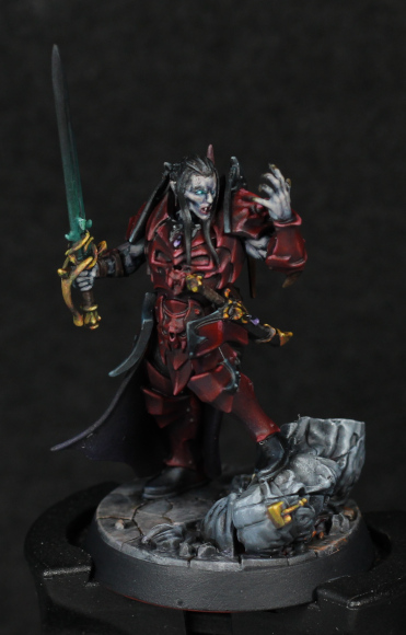
Crimson Court, Prince Duvalle - Part III (Showcase)


"Really must cut my nails."

I was going to give this model a break and instead post about another of the Crimson Court, but several circumstances resulted in me simply finishing Prince Duvalle instead. First, I was kind of inspired to just get the NMM gold done (using the exact method explored on the Lumineth painted a while ago) and after that there really wasn't much left to do. Second, my airbrush compressor fell apart. Quite literally - internal brackets snapped and it simply started to shake itself to pieces. I do have a spare compressor, but it doesn't have an attached tank so I'll use it just to finish off what I was working on before saving up for a new one.

What else helped to finish this model was not using every shade of paint, but instead just mixing up "close enough" on the palette. For the gemstones I used a single purple (Genestealer Purple) and just mixed it with a blue on the palette, some black, and some of the light grey. No need to waste time getting out four or five paints when mixing directly on the palette will do.

This bring me back to repeat an old topic: characters are great for experimentation, and there's often no need to repeat exactly what has been done before. Different shades and tones of the same colour can be mixed together without worry, and this really speeds up painting while allowing for a unique piece that increases knowledge and skill. There are times, however, where repetition is wanted, namely when painting an entire army. I have a particular step-by-step guide when painting Blood Angels, and I don't like to mix paints when doing so because I want to repeat it across the entire army. Having multiple paints and layering them in a proven formula helps paint more quickly with the desired result in that circumstance.

Back to the gold NMM, it does detract from the face. A brass would have been more appropriate I suppose, but just wanted to paint gold. It was very close to being too much, but I think it's on the acceptable side of the equation: the model still draws attention to the face purely from the sculpt, and the gold doesn't quite overpower that. It also fits the idea of a prince using weaponry that while functional also shows off status and wealth.

The base is far more interesting. The toppled statue is a essentially multiple drybrush passes of greys with a hint of blue, while the flagstones are greys, purples, red-browns, even a green wash (Athonian Camoshade to be specific, it's a great shade for more earthen tones). The mix of colours doesn't really show up too much in the end, but it makes an incredible difference when compared to just shades of grey. I could of pushed the effect a lot more, but I decided to simply be content with "next time". Aside from that, brighter flagstones might have clashed with the statue, and I really want that to be the focal point of the base. The status also has inlaid gold just to break up the monotony a little bit, and I think that worked particularly well.

On the point of drybrushing, and brushes in general, I'm actively trying to use my good brushes more often. I rarely touch them because they are the good brushes and only used in special circumstances, but the net result is that they are barely touched and are essentially going to waste. Brushes are not for display and I'd much rather they get put to good use than just sit there! I still take care of them as much as I know how, but the point remains (pun intended): don't leave good tools unused if you can paint better with them.

In finishing this particular model, disaster struck. I was using Purity Seal (good weather and compressor troubles mean leaving the airbrush varnish aside right now) outside and dropped the model directly into dirt. This made the dirt stick to the model, and the fall itself broke the sword. The sword is now at a slight angle, and I was forced to scratch some paint off in efforts to remove dirt and debris (the hair in particular suffered). I think I managed to recover everything well enough, but it was still annoying. Accidents happen.

I recently bought another model, so the current tally of permissible purchases is now standing at 8.5.

-- silly painter.


Wednesday, May 11, 2022

Crimson Court, Prince Duvalle - Part II


"Damn, my hand is all dirty now."

Some more progress on this vampire prince, adding more to the armour, starting on the sword, and of course the skin. There's also the cape, which dark as it is gets very little visual attention but still helps to border the rest of the model.

The cape itself I thought about for a long while before ultimately going back to the Sequitors for inspiration. It's painted in very dark purple tones using oil paints. The actual paint used doesn't give rise to any particular textured effect, but my own use of oil paints gives very different tones and gradients compared to the acrylics, and it's this which results in a subtly different highlight and shading finish - this difference coupled with the sculpted geometry helps to say "not metal armour". The result is still darker than I wanted, at least under normal lighting, but I'm not likely to touch it more. The cape is a secondary component to the model - it's not actually a focal point itself but instead supposed to help guide the eye to focal points, and as such it might actually be more effective in that role with a simpler paint scheme.

The skin did not turn out quite how I wanted either, and I ended up doing a fair bit of lightening and adjustments just about everywhere to get to where it is. Originally I had intended a cold, pale appearance, but it just looked like a frozen statue instead. Pale does not mean cold, it just means desaturated, and it's a mistake to learn from. I suppose the end result is, at least, unique.

  • Night Lords Blue over all the skin areas.
  • Mix a small amount of Ulthuan Grey into the previous step, and highlight where necessary. Then add more Ulthuan Grey and keep highlighting. This was done in several layers, and by the end there were very deep recesses of Night Lords Blue that created far too sharp of a contrast in tone, and so they were glazed over to harmonise everything a little more.
    • Side Note: mixing Night Lords Blue and Ulthuan gives a really nice colour, and probably would be excellent with various Horus Heresy era colours for Space Wolves.
  • Mix a small amount of Rakarth Flesh with Night Lords Blue, and glaze this over mostly upper areas. This was an attempt to bring a little more warmth into the skin tone but didn't quite work as I'd hoped.
  • Volupus Pink (Contrast) mixed with a lot of Contrast Medium to give a very light pink glaze, which was then used across most of the skin. This is a very subtle effect, but just enough to tip it over from code stone to a cold, undead flesh. Not wanting to risk ruining what was managed, I left it there.
  • The eyes are a simple Ulthuan Grey with Aethermatic Blue. I wasn't going to try for anything else when access to the left eye was difficult with a brush.

Armour trim was another area that I needed some time to decide on. Gold would have been too bright, taken too much attention away from the face. Black is a bit of a cheat, but it is rather neutral and I was getting bogged down. So black metal it was.

  • Corvus Black over all the trim.
  • Dawnstone glazed as a first stage highlight. I used an overhead lamp to figure out the appropriate areas for this.
  • Administratum Grey glazed as a second stage highlight, and edge highlights.
  • Ulthuan Grey mixed into the previous step to really brighten it up to almost white, then used for the more extreme highlight points.
  • Abbadon Black glazed into recesses and darker areas just to push the contrast a little more.

It still didn't grab my attention enough until I was looking around and spotted a model with a dark turquoise trim. This would have been much nicer than shades of grey, so I used Stegadon Scale Green and glazed that over the trim. It's barely noticeable, but does shift the colour ever so slightly away from grey and makes it that much more interesting. I probably would start from there, or perhaps Incubi Darkness, were I try this colour scheme again. It's all part of learning more about miniature painting, and I'm always pleased when I add to my pool of knowledge and experience.

The sword I went with the same approach used for Nekima. I won't repeat it all here, instead just search for that post. I'm going to borrow more from that model too for filling in the bones/tusks on the armour.

Still a couple of weeks left on this model most likely, but I've started many others in the meantime and I might post about them next. Skin tone exploration deserves a post very shortly.

-- silly painter.


Tuesday, May 3, 2022

Crimson Court, Prince Duvalle - Part I


You cannot unsee the pointy codpiece.

I've been wanting to start this particular model for quite some time, and I finally cleared enough models out of the way to start it.

To start with I had intended to go with a slightly more red tone, similar to previous fiery haired "dark" elf, but somehow this darker tone just seemed to fit the feel of the model so much more and so I just kind of went with it. More on how it was painted up in a moment.

I have a slight plan on how to go about the Crimson Court. I have an idea for all the models to use a similar armour colour, but equally every model being unique would make it all come together as a collection of individuals. Regardless, the whole leader vampire thing evokes Dracula comparisons, and the armour design used by Gary Oldman's Vlad the Impaler was somewhat iconic. That definitely inspired the look I'm going for here, and so a red main colour for armour it is. I've also been debating the magical qualities that might be present - the pose is one of summoning power, so it seems like there should be a hint of a green complementary colour somewhere - and the sword is an ideal interest point for this. I've done a black sword before, fading into green toward the hilt, and I think this would work here too. The skin I'll likely go for very pale, with either a blue or purple undertone. This would give that extra cold appearance, hinting more of this being an undead character. I'm also intending different skin tones for each of the Crimson Court, which in turn might influence the inspiration that I look to for each in turn.

The cape I'm caught on. Not purple, that would clash too much with the armour. Black seems too ordinary. I'm considering continuing with the crimson theme and go for a very dark red, but perhaps drybrushed or stippled to give it some texture. The armour trim I'm also not sure on yet, trying to decide between a golden look or black. The latter definitely works, I've painted enough to know that, but the catch is selling it as black metal. I'll need to think more that.

For highlighting reference, I pointed a desk lamp from above and took a photo. This naturally shows areas of highlight, especially after the primer is applied, and really made the process so much easier. When doing this kind of highlighting again, I'll definitely be following the same idea: take a reference photo to show where the highlights go.

In painting the armour I ended up using multiple paints, but really it could be cut down to about three. No reason that mixing the base tone with white wouldn't achieve a similar result. Still, I have the paints and it's a good opportunity to explore them and get a better feel for each.

  • Barak-Nar Burgundy as a base coat over all the armour.
  • Mephiston Red mixed with the previous colour and glazed to highlight a good portion. Mephiston Red is a very neutral red: it doesn't tend towards either the purple/pink side, or the orange/yellow end of the spectrum and so can be used to saturate without shifting the colour too much. A little was kept on the palette and glazed over areas there were becoming a little to pink as I went along.
  • Pink Horror was again mixed into the previous step and smaller highlights applied. About here I started to concentrate a little more on the upper areas which are naturally brighter, but also to help draw attention more to the chest and face.
  • Emperor's Children was the next colour to mix in and glaze. This was really only used for edge highlights, and thinned much more on the lower areas compared to the chest and shoulders.
  • Fulgrim Pink mixed in again and used for extreme edge highlights, particularly on sharp corners and those areas I really wanted to stand out. This is an "edge" paint, so the pigment count is very high. It's quite a bright paint, and should be added with care.
  • Following all of this, a little Abaddon Black was mixed with Barak-Nar Burgundy to add extra shadow and help define more of the sculpted shape of the armour. I never went to a pure black with this, instead keeping it a very dark burgundy to help push the contrast.

Over all I'm quite happy with how the armour turned out. I wasn't going for the whole NMM approach: shiny metal gives a lot of reflection and instead I wanted the shine of a hardened surface without necessarily being reflective. This gives a more menacing yet stylistic impression, fitting to the theme I'd like to convey.

There are enough other projects started right now that it might take some time to fully finish this particular model, let alone start on the rest of the Crimson Court. Updates on this model might be rare, or not, entirely depending on what motivates me at the time.

-- silly painter.