Sunday, June 25, 2023

Azrakh the Annihilator - Part IV


All trimmed up.

I've been motivated to keep working away at Azrakh, and for a model like this I really do need to take the motivation when I can. Other projects are being stalled, but the amount I'm learning is well worth it. In some respects the model looks very similar to last week, despite the amount of work I've done on it, but when looking more closely the detail starts to stand out.

The model still looks a bit bland and the reason for this is that the red armour hasn't had much in the way of highlighting yet applied. That's coming soon enough, but the silver/steel/black metallics are being done next.

Working through the armour trim I've definitely improved quite a lot. Using the box art and original artwork helps a lot, although I've adjust very small spots as I see fit. It's helping understand some of the NMM principles and how to portray light interacting with various shapes. I'm not going for physical accuracy, but instead readability. Basically the model should look cool but also be easy to make out details, shape, and volumes. Much of this comes down to edging with bright, near white mixes, particularly next to dark, shaded locations. Contrast is key.

While playing with the paints I decided not to use White Scar for white. I have trouble with acrylic white paints - they dry quickly, go chalky, and need constant cleaning of the brush. The flow improvers dry out far too quickly on the palette, so I tried using an ink instead (specifically Daler Rowney White). It takes a little practice, but ended up working really well when mixed with other paints and using only a very small amount to dot specific points (such as rivets). It's not quite as "pure" as White Scar, but it's close enough not to matter for my purposes. The ink does dry out quickly on the palette as well, but it mixes in with water again quickly enough and remains viable for a while that way.

Originally I looked at silver NMM recipes, then steel, before realising that I wanted neither. It's closer to steel, but a dark steel and I opted to adapt the black armour NMM from Juan Hidalgo. Same paints for the most part, but applied differently - think of it as using his recipe as the basis for my approach rather than copied vertabim. I'm also still exploring approaches, but I think this will be similar to what I end up with.

  • Skavenblight Dinge across the steel area.
  • Stormvermin Fur glazed as first highlights.
  • Administratum Grey as edge highlights.
  • Incubi Darkness / Black about 1:1 and glazed into darker areas.
  • Black for the darkest areas.
  • White mixed with Administratum Grey as extreme highlight points, with pure white generally reserved for small dots.

The use of Incubi Darkness was done just to add a hint, even if a barely visible one, to tie it together with the green used in the brass shading. There's also a lot of going backwards and forwards between different steps, glazing. fixing mistakes. Originally I started from black, but that works far better as a glaze to darken areas, so I've moved to Skavenblight Dinge instead as a midtone. There might not be as much of the midtone left alone, but it's still far easier to use as a starting point.

I might give the model a short break after completing the NMM steps. There's still the armour to highlight, a couple of smaller details, and of course the head. It's going to take a long while yet before this model is done - and there's a good deal of travel again coming up.

-- silly painter.


Sunday, June 18, 2023

Blood Angels Librarian Dreadnought - Part I


Excuse me sir, I have a question.

I've finally returned to some more dreadnought work, though admittedly very little because the bulk of painting time has been NMM trim on a certain other model. Much of the time in preparing a model like this is simply cleaning, positioning, and deciding on sub-assemblies for airbrushing and general painting.

The positioning of the Librarian here is based on some fairly popular artwork in which the force weapon is pointed towards the sky, summoning some psychic power perhaps. The left arm is normally pointed slightly higher, but I've not glued either arm in place just yet, and the photo angle doesn't show the pose as dramatically as a lower angle might (something I'll try remember for a future display). The red armour plates on the torso are also not glued in place just yet, because I intend to airbrush some metallics around the legs and torso just to avoid spending hours with a brush for the same. I have yet to decide if those metallics will be covered in an oil wash or not - it's still an incredibly effective shading technique and gives a much grittier feel that worked so well on the Titanicus Knights, but it's a painting hassle to setup, apply, then cleanup brushes and workspace that I never look forward to.

The airbrushing so far hasn't had a final highlight applied. I've held back so far because the airbrush was getting clogged at the time, and I'm considering if I should experiment with some of the highlighting methods. I could use a thinned white to increase the brightness of the later layer, and even then I'm not sure if I should follow up with Evil Sunz Scarlet or Blood Angels Red (Contrast) paint through the airbrush. I could also use a yellow instead of white, but then it's a consideration of which yellow. I think I'll have to find some spare bits and experiment with several combinations first, to then decide which I like best. It's not like I don't have many, many spare shoulder pads to use for this purpose.

I guess I'll try the various methods and then choose a couple to go forwards with. This isn't the only dreadnought in the pipeline, as I've also assembled a Furioso to work on at the same time and each could use a slightly different approach to the red highlights without looking out of place in the army - simply by virtue of there not being other large walkers to compare them to.

I'm also considering if I should buy a Nemesis Dreadknight as the basis for a conversion effort. I have quite a few spare pieces from the Blood Angels Dreadnought kits, and I could really go to town on that kind of conversion. Unfortunately it would add yet another dreadnought to try get done this year - and I have enough pending that completing them all in the next six months is unlikely as it is. This is also an idea that I'd likely look to ebay for first, seeing as it's an expenditure that won't be considered trivial.

-- silly painter.


Tuesday, June 13, 2023

Azrakh the Annihilator - Part III


When NMM makes the eyes tired.

After staring at the work in progress model one too many times and deciding I wanted to try finish it before the next Warhammer+ model comes along, I've finally progressed more on this insanity. I'm still following the box art as much as I can, and it's definitely forcing me to get a feeling for NMM, but there are times where I seriously regret deciding to paint the model this way.

Then there are other times where the results are amazing and it definitely looks far better than if I'd used metallic paints. Hopefully this will be the feeling whenever I manage to finish it all.

Rather obviously I'm not done with the trim yet, and the keen eye will notice a tone difference between the shoulder pad and everything else. I've not yet added Lamenter's Yellow glaze anywhere else yet, so I'm hoping that will harmonise everything - and if not, well...I'll deal with that later. I've otherwise tried to follow the formula from before, but given the months gap between then and now, then I shouldn't be surprised if it ends up slightly different. I may have to refresh the paint on the palette soon as well, which again might introduce some more variation.

I haven't done any more of the red armour yet. Nor have I started on silver and grey NMM areas. There is still an awful lot to go on this model, and it's taking time away from other projects, but I would like to get it finished.

The only other new item of note in this short post is the use of white recently on the palette. I've started to try using a white ink, which is surprisingly useful. It flows nicely when mixed into other paints, and doesn't separate or dry out as quickly on the wet palette. I think I still prefer White Scar for point higlights, with the ink being closer to Corax White, but the ink is probably going to be better for glazing. I'll continue with the model and see where I get.

And now back to the left arm.

-- silly painter.


Wednesday, June 7, 2023

Terminator Squad - Part I


I see a white dust and I want it painted red.

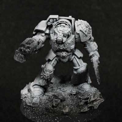
As the next round of background models I've started on more Shield of Baal models: a Blood Angels Terminator squad. These are the older models, but still look excellent on the table. As can be seen above, I've also decided to try a few things and see how it goes.

First off, I made a couple of assembly mistakes. The Sergeant has the wrong torso piece, it's on another squad member, so I'm not sure what to do about that yet. I'm thinking of going through spare bits and seeing if I add something to not-squad-leader that makes sense still. The other problem is the left pauldron - I attempted something one one (more on that in a moment) and it didn't work - meaning there's two "special" Crux-Terminatus icons. Little things, but still annoys me.

I still have some old Forgeworld resin shoulder pads, but seeing as they're not made anymore I tried to make a mould of them and copy the insignia onto plastic shoulder pads. It can be made to work, but the effort involved and the number of mistakes along the way was just too much. I could be at it for a week per should pad, and that's just a waste of time. There are limits, and I'm constantly trying to find ways to reduce my backlog faster, so I'm far more accepting of "less than perfection" these days. In this experimentation I ruined one of the plastic shoulder pads, so the Sergeant is now using one of the resin ones.

The right shoulder pad I cheated slightly with - it turns out that the Aggressor shoulder pads are an excellent fit for Terminators. Some excess trim needed to be removed, and there's a "cut" into a corner that doesn't match up, but none of that is really noticeable. I don't like decals and I had the spare shoulder pads, so it seemed appropriate.

One of the problems with older models is scale creep. The old Terminators are rather short compared to Primaris, and they would look rather small next to the newer Terminators, so I wanted to give them some extra height. I'm not willing to try bulk out the legs and give more torso - other than being a lot of effort, I'd also not do a great job of all of that. Instead I decided to raise the base just to make the models taller when standing next to others. I'm not sure how well it will turn out, but have to try. To do this I put each model onto a 32mm base, and then glued that to a 40mm base. The edges of the 32mm base where wrapped in milliput, with slate stones and skulls pushed into it to give more weight and to make it look less like a spherical mound. Some was glued on top as well just to break up the flat surfaces. Some PVA glue and sand added texture, with texture paint applied selectively where necessary. So far it appears to look alright, but again I'll need to wait for the models to be finished before I really know how it will turn out.

I'm going to try something different for painting the armour this time, which is why there looks like an excess of white highlighting. That's mostly just the angle. I used some black primer through the airbrush (no reason not to use a rattle can other than I need to use up the airbrush primer), and then highlighted with white mostly from above. I was perhaps a little too heavy with the white, and I didn't thin it enough - the spatter is most annoying. Hopefully this will fade with future steps, but the main reason for the white is to try make the red highlights a little more vibrant. I intend to use the darker red in the shadowed areas, then start covering the white with Mephiston Red and blending that into the darker locations. That should help inform where to apply Evil Sunz Scarlet, and if it works will give a much brighter finish.

In future I would like to try a yellow covered with Blood Angels Red, and perhaps compare that against white and grey covered with red as well, all using the airbrush. It's a bit late to do that across squads as it probably won't fit with the army, but I'll find models to use.

I do have some other models being assembled, but I probably won't start posting about them until initial airbrushing has been done. Hopefully not too many days until that's ready, I'm trying to use the airbrush once a day just as preparation for all of this.

-- silly painter


Friday, June 2, 2023

MkIV Assault Squad - Part III (Showcase)


Jumpy jump jumps.

The MkIV armour assault squad is now considered finished. It was a background task, but as I was close to having them done anyway I thought may as well complete them and move onto something else in the background.

Overall they look ok in a squad, but the sculpts definitely have a few issues up close. I did not bother to clean them up perfectly, and neither did I bother to fix up every single spattered appearance from the airbrush. This is something I'm doing more of basically because there's very little reason to do so: the models look fine as they are, and I know I can fix up all of those issues if I wanted to. I have the skills, so anything more for numbers is just going to take extra time and make painting frustrating instead of enjoyable.

The whole point of painting these models is to have fun. For the most part, I do. Sometimes I need to push myself however and picture how everything will look when it's all completed and on display. I'm not collecting an army to play with, it's just going to look nice on a shelf, and this is partially why I buy very few of the same thing. I want different models, different poses, different details. If I was painting exactly the same model over and over again, I simply wouldn't bother collecting anything. I'm therefore not in any hurry to paint more of these, unless perhaps they're in plastic.

I did re-edge highlight this squad after varnishing, just to bring out the edges again. Using thinned reds works nicely enough, particularly Wild Rider Red. That just looks old and faded with the varnish, but afterwards the vibrancy is restored and the armour returned to the strong red tones I favour. I still need to work on my value contrast when airbrushing though - it's still very subtle by the end and doesn't define volumes as well as I would like.

The decals (not really visible in the photo) I tried something different with here too, by using distilled white vinegar. It did make the decals very soft and helped them conform to the surfaces, but also created a milky look to the transparent sections that not even the matt varnish helped with. I had to paint over those areas to blend them back into the model, but it honestly did not work the way I wanted. I'll stick to other products in future.

Not too much else to mention. Painting-wise, nothing I've not already mentioned, but as the details became fewer I did manage to batch paint them more effectively. I'm not good at batch painting, but I'm slowly being able to do little bits & pieces at a time while listening to podcasts, music, etc. The next background model task will probably be another set of give, so perhaps I can continue that - if not, there is no harm to only doing what I feel like at any given time.

The count is increased and now stands at 12.

-- silly painter.