 |
| Cloak and dagger. |
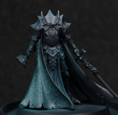
Needing a break from the dreadnoughts for a moment, I've decided to start some more models just for exploration of a few things. This is for motivational purposes more than anything else. Originally I was going to paint Karlina von Carstein far more simply - and I still intend to do the armour in possibly warmer metallic tones - but the cloak was too much of an opportunity to pass up. I've been experimenting with Contrast paints through the airbrush a lot recently, and I wanted to see if I could get a pattern showing through. Spoilers: mixed results.
The first step I took was a simple thinned white highlight. This isn't really a Zenithal highlight, but instead serves to sketch out how I want things highlighted. Sometimes this never makes any difference in the end, and only serves to better see the model - but that's still worth it in my mind.
With that much done, it was a bit of a painstaking process to then draw out some kind of pattern. I tried to go for something slightly fancy while avoiding any kind of tessellation which I felt would be far more difficult with the folds in the cloak, and also would give a much more mathematical look to what should be a cruel, aristocratic vampire. As I neared the end, I was somewhat worried that there wasn't enough contrast between the highlights and the pattern, and it would all depend on how thin the Contrast paint was.
 |
| My what a shiny cloak. |
I used Terradon Turquoise to glaze the cloak. It was stronger than I thought it would be, and I definitely should have thinned it at least a little when going through the airbrush. The pattern was completely washed out in places, although in the right lighting it can still be made out. While this is a shame, I at least learned the valuable lesson of needing to thin that particular paint (others I find don't require it - this one does!), and also however much contrast I think I have beforehand: more is needed. Using the Contrast range as a glaze can overpower similar value colours underneath, so the more contrast in value then the more detail comes through afterwards. This is really noticeable as the original white highlights fade off up the cloak.
 |
| Need to get her head in the game. |
I'm not certain if I'm going to try and go back over anything, or just leave it as it is. On the one hand it might look nice, but on the other I'm not entering this into competitions and I would really like to just finish off the rest of the model now. I'm pondering the armour colour, thinking that perhaps a red-brown tone to the armour would be suitable. I'd need to add some kind of dust and dirt of a similar colour to the hem of the cloak to balance it out a little, but I think it could work.
-- silly painter.
No comments:
Post a Comment