Showing posts with label karlinavonkarstein. Show all posts

Tuesday, January 16, 2024

Karlina von Carstein - Part III (Showcase)


Come closer, I want to hit you with my cup.

I managed to find enough free time to finish Karlina to an acceptable level. I'd already decided that tabletop level was good enough, which seems to be an ongoing trend for me lately, but I'm not unhappy with the results. I played around with a few areas just for fun, with the most noticeable being the base.

I was originally planning on grey flagstones, but that just seemed too boring, and I didn't think it would fit with the model: a relatively bright upper body from the reflections, relatively light base, didn't see it working. Instead I went with cobblestones of the red-brown range that I've seen across various old cities. Doombull Brown was the main colour, after which I sketched the basic pattern in black, and then mixes of burgundy, black, Stegadon Scale Green, anything on the palette really. Even white mixed in for freehand edge highlights. The idea is to give each cobblestone variation in hue and value, which makes for a much more natural look. I don't think I achieved my goal unless it's viewed from directly above - perhaps the cobblestones could be larger, which would help view the pattern while also making the shapes rougher around the edges. Next time.

I did use Doombull Brown mixed with black to very lightly drybrush over the hem of the cape which would more naturally pick up dirt from the ground. It doesn't have to be much: when in doubt, do less. More can be added later if necessary, where it's much more difficult to remove it if applied too heavily.

The cup isn't quite as blue as I was going for, but I don't feel like glazing over it and pushing the colour mores more. It still looks like silverware and on the model is distinct enough from the sword. The colours are mixes of Grey Knights Steel, Iron Hands Steel, Stormhost Silver, and some black edging or glazing where appropriate. There are no formal steps here, it was just put those colours down on the palette and play around.

The rose is straight forward:

  • Screamer Pink base.
  • Pink Horror along edges, some volumes.
  • Fulgrim Pink for specular highlights. This step is more than just dots of the brightest points, and instead shifts the rose more into a brighter pink colour.

Stegadon Scale Green for the vine, with some brighter colours from the palette mixed in to highlight. I'm not a fan of the outcome - I perhaps should've used a more dedicated green/brown paint, but it's such a minor detail that it doesn't really matter.

The last interesting tidbit is actually the skull detail (buckle, perhaps) on the leg. I decided to go for something a little different:

  • Daemonette Hide base.
  • Mix in black for shadows.
  • Slaanesh Grey mixed in stages to highlight different areas. Use unmixed for the brightest edges.

And that's all - it's not the number of colours used that matters, it's the contrast to define the shape which matters for small details. I think it turned out well enough here, but I did use a very fine pointed brush and magnifier headset to get it done.

And that sums up this special edition model. I had a bit of fun with it, practised volume highlights, experimented on the base, but I'm glad it's finished. I won't be putting a varnish over the top as that would ruin the metallics, but it's also not likely to become a gaming piece anytime soon.

The count is now around 5 I think, but I'll say 4. Good thing I have more models to finish off soon, and motivation to save money right now.

-- silly painter


Saturday, January 13, 2024

Karlina von Carstein - Part II


The helmet is really just a hair shaper.

With the theme of the year to complete works in progress, I decided to start with Karlina von Carstein. It's a different model to a Space Marine, there's no need to replicate steps across multiple models, and shouldn't take more than a week (hopefully, but been there before!) to finish.

With the basic tones of the cape done, I wanted to turn my attention to the armour, however assembling models is really motivating for painting. Getting the head ready for gluing in place seemed the logical step for this, so I needed to paint the face and enough of the helmet that I could do this step.

The face itself I wanted to give a cold appearance. This isn't anything to do with how soon she has fed, but rather a reflection of what I imagined the personality of this character to be. I wanted an older aristocratic Lady, cruel but not malignant, desiring status over slaughter. For this I went with cooler blue skin, but without purples or reds which might indicate anything more sinister. The face is also barely visible, so I wasn't interested in multiple shadow tones or a bewildering array of paints, just something simple to make it stand out a little.

  • Kantor Blue over the entire face.
  • Rakarth Flesh, built up or mixed with Kantor Blue to sketch out volumes. Occasionally more of the blue to re-define those shapes where things went too light (e.g under the eyelids).
  • Deepkin Flesh, which is a naturally pale blue skin tone anyway, for highlights on the nose, cheeks, chin.
  • Screamer Pink mixed with Rakarth Flesh for the lips.
  • White (or close to it) for the teeth. Note this is closer to grey, as a pure white is too overpowering - even just straight Deepkin Flesh would be fine here so long as there's contrast to the rest of the mouth.

The eyes I kept black, mostly because they were getting frustrating to deal with and because I actually like the look. It worked with Horus, and works here to give a soulless expression; perhaps her eyes go black when the bloodlust of battle is upon her.

The armour I honestly wasn't sure about and tried a few things before landing on what I think is an acceptable result. The colours are indeed matching the boxart very closely, but the boxart was too light for my taste with this model. I wanted a darker, brown, polished look to the armour. I also tried to paint TMM as though it were NMM for no other reason than practice at how light behaves on reflective surfaces, and the painting lamp provided a good, consistent reference light source.

Originally I tried Warplock Bronze layered over with Screaming Bell. That didn't look right at all, but I mention it here because the result was a kind of orange metal look which is very suitable for steampunk vibes - or the kind of look I prefer for fuel tanks. It doesn't make practical sense, but visually it's immediate obvious what they are.

I next tried looking at some of the brass paints, which also didn't work at first because I'm used to layering and glazing rather than mixing paints. When it comes to repeatability across an army scheme I still find mixing unwelcome because it's difficult to get the ratios correct - but that doesn't matter to a single model like this. So in the end:

  • Warplock Bronze base coat.
  • Drakenhof Nightshade for recessed shading.
  • Brass Scorpion mixed with Runelord Brass for a volumetric highlight.
  • Brass Scorpion mixed with Warplock Bronze for volumetric highlights in darker areas.
  • Runelord Brass for general edge highlights.

I still intend to apply some Canoptek Alloy along selected edges later, but that will have to be done sparingly because it's a pigment-heavy paint. It's also worth pointing out that the photo above looks odd because the lighting was at a different angle than I used for actually painting the model - so while it's confusing a little to look at, I think the purpose still serves. I could use a thinned varnish to knock back some of the glossy shine, but I'm not going that far with this model - I'll save the competition level finish for something like Horus Ascended.

I've started on some other materials with Barak-Nar Burgundy when it hit me that another feature of cloth material is that sometimes the shading is about saturation over colour shift. This basically means starting from a midtone it might be as simple as mixing in black for shading. Something to explore later as well.

The model is starting to come together now and at first glance there doesn't appear that much left to be done, but experience tells me that it'll still take me a few days at least. The sword and cup are likely to be done next just to round off the metallics, then the folds of the inner robes, the arms, the rose, before finishing off any other details and basing the model.

-- silly painter.


Tuesday, December 12, 2023

Karlina von Carstein - Part I


Cloak and dagger.

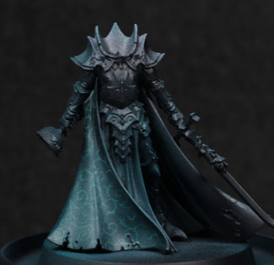
Needing a break from the dreadnoughts for a moment, I've decided to start some more models just for exploration of a few things. This is for motivational purposes more than anything else. Originally I was going to paint Karlina von Carstein far more simply - and I still intend to do the armour in possibly warmer metallic tones - but the cloak was too much of an opportunity to pass up. I've been experimenting with Contrast paints through the airbrush a lot recently, and I wanted to see if I could get a pattern showing through. Spoilers: mixed results.

The first step I took was a simple thinned white highlight. This isn't really a Zenithal highlight, but instead serves to sketch out how I want things highlighted. Sometimes this never makes any difference in the end, and only serves to better see the model - but that's still worth it in my mind.

With that much done, it was a bit of a painstaking process to then draw out some kind of pattern. I tried to go for something slightly fancy while avoiding any kind of tessellation which I felt would be far more difficult with the folds in the cloak, and also would give a much more mathematical look to what should be a cruel, aristocratic vampire. As I neared the end, I was somewhat worried that there wasn't enough contrast between the highlights and the pattern, and it would all depend on how thin the Contrast paint was.

My what a shiny cloak.

I used Terradon Turquoise to glaze the cloak. It was stronger than I thought it would be, and I definitely should have thinned it at least a little when going through the airbrush. The pattern was completely washed out in places, although in the right lighting it can still be made out. While this is a shame, I at least learned the valuable lesson of needing to thin that particular paint (others I find don't require it - this one does!), and also however much contrast I think I have beforehand: more is needed. Using the Contrast range as a glaze can overpower similar value colours underneath, so the more contrast in value then the more detail comes through afterwards. This is really noticeable as the original white highlights fade off up the cloak.

Need to get her head in the game.

I'm not certain if I'm going to try and go back over anything, or just leave it as it is. On the one hand it might look nice, but on the other I'm not entering this into competitions and I would really like to just finish off the rest of the model now. I'm pondering the armour colour, thinking that perhaps a red-brown tone to the armour would be suitable. I'd need to add some kind of dust and dirt of a similar colour to the hem of the cloak to balance it out a little, but I think it could work.

-- silly painter.