Sunday, February 25, 2024

Assault Intercessor with Jump Pack - Part I


Shiny armour is shiny.

As a bit of a background project (because I don't have enough of those already!) I bought a bunch of the older jump packs with the idea of converting an Assault Intercessor squad into a jump pack capable squad. This was before the newer models were released, but while I don't entirely dislike the newer jump pack design, the ankle thrusters look out of place to me. I also prefer the poses of the non-jump assault infantry, so just putting old style jump packs on them combines the best of both worlds really.

I also just realised that I haven't added all the appropriate bling to this model yet - various pouches, backup knife, holster, grenades, etc. I was apparently in a rush, so I'll need to glue them on later.

Mostly this model right now was an excuse to test a new way of painting up red armour. I don't have it fully nailed down yet, but I think it shows a lot of promise. The basic overview:

  • Dryad Bark / Mephiston Red in a 1:1 ratio, over the whole model (airbrush to make this easy). This will serve as the shadowed colour.
  • Mephiston Red (again with the airbrush) for basic midtone.
  • Averland Sunset (still with the airbrush) to sketch out highlights.
  • Blood Angels Red (Contrast) (yep, the airbrush) to cover the last layer and blend it all together.
  • Gloss varnish (airbrush still makes this easy).
  • Carroburg Crimson mixed with artist grade acrylic flow improver (not Lahmian Medium) and used as a pin wash.

There will of course be edge highlights later on, and a matt varnish followed by any edge higlight touchups, but that's the basic approach I'm trying to use now.

I've learned to properly thin paints in an airbrush, and that helps dramatically. Cleaning is quicker, fewer dry tip problems, and far more control. The Averland Sunset helps to show where the highlights will be without getting lost in smooth transitions, but I'm still getting used to upping the opacity with several layers here. The brighter it is, the more it will show through the Blood Angels Red filter.

The newer Carroburg Crimson formula works nicely as a pin wash when combined with acrylic flow improver. The older shade formula didn't seem to mix as well, and thinned out too much - just didn't seem to work as nicely. No water or dish soap was added - the flow improver has low enough surface tension as it is, and combined with the gloss varnish it was almost like working with an oil wash. The drying time is increased slightly too, so any mistakes can be fixed up quickly.

There are downsides of course. The gloss varnish obscures mistakes sometimes, and they only show up after the matt varnish is applied. I'm hoping that won't happen here, but I'm likely to do this first test model before I try move on to the next nine of the squad.

I'm both hopeful and slightly confident that this approach will work out. It's not necessarily fewer steps, but each step can be done with far more confidence. This means fewer mistakes to fix, and a greatly reduced time spent on each step. I should be able to get this basic level done much more quickly - but I'll very possibly only use this on basic squads. Special characters that I really want to stand out are still almost certainly going to use a trusty brush to really control the highlights.

I'll continue this model as I go with other projects, such as the Dreadnoughts which are next in line to be finished.

-- silly painter.


Imperialis Baneblades - Part II (Showcase)


11 barrels of bling!

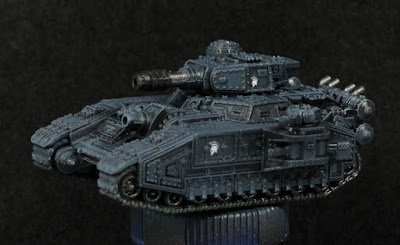
I'm calling the Baneblades here, if for no other reason than I've had enough of painting them. I messed up with them, and simply don't feel like investing the time to redo and recover them.

The main problem is the colour scheme: I don't like it at all. It doesn't work here. The models are simply too dark, which makes the Blingblade trim stick out too much, airbrushing didn't work, recess shading doesn't give enough contrast, the list goes on. The trim on the Blingblade I decided to cover up with Balthasar Gold because it was far too much of an eyesore, and I can tell why they have that trim on the Imperialis models: it outlines the shape. You can instantly see on the table what kind of tank it is, and I think it really works with the right colour scheme. In future I would probably do something like the Solar Auxilia with Contrast paints. I don't always like copying colour schemes, but I'm not sure what else I'd like to do here.

Drive me closer, I want to use flamers!

The second Baneblade I didn't paint the trim, and used Agrax Earthshade to dirty down some of the recesses, and I do like the end result much better, but it's still missing something. The shape isn't as well defined, so perhaps some more tone contrast on the edges could help with that. It's no good collecting more of the Imperial Guard tanks until I know how I want to paint them.

What did work was the barrels on the back. Warplock Bronze, and Screaming Bell over the top. I also mixed in Sycorax Bronze for additional highlights, and it ended up very close to how I wanted. I generally use this kind of look for canisters that might have a flammable liquid, or otherwise might need to deal with intense heat. It also gives much more visual interest to the models.

The viewports are basically Evil Sunz Scarlet. I tried a purple to shade them in places, and Fire Dragon Bright for highlights, but not much of anything other than the red shows up. The front headlights are Dorn Yellow covered with Talassar Blue, which gives a very bright, light, vibrant blue. Such points help to break up the plain colours and gives little hints of visual interest - it's not much, but it's critical to have.

Not much else to say. I should have started with drybrushing, then used contrast paints, and maybe a bit more drybrushing to highlight. Next time.

-- silly painter.


Sunday, February 11, 2024

Imperialis Baneblades - Part I


Blingblade.

I picked up a couple of Baneblades for Legions Imperialis because tiny tanks. They are not going to plan.

To start with I intended to follow the ideas from the Rhino experimentation. White undercoat, some edge highlighting, and then Space Wolves (Contrast) over the top. The problem really is that the design of the Baneblade doesn't have a whole lot of flat surfaces, even if the basic shape is a box. The detailing doesn't lend itself well to the highlighting I was trying to do, and there was insufficient space to give enough of a gradient. Instead I should've simply stuck with highlighting with a drybrush.

With all those guns, must have a convoy of ammunition behind it.

I've been practising my drybrushing with relatively cheap army painter brushes, and I can see the potential. The trick really is in getting the consistency of the paint just right - not flowing like a wash, but not actually dry either. It will take a lot of practice to get "right", but for a model like this it's an ideal approach.

I'm also attempting a different approach to some of the metallic areas. Instead of base coating and then washing into recesses, using a Contrast to darken and then layer over the top with a metallic. This is basically drybrushing but in a far more controlled fashion.

The other trick I've been trying here involves gloss varnish, Black Templar, and acrylic flow improver (not Lahmian Medium, which has other components that make is unsuitable here). Basically mixing the flow improver with a Contrast paint gives it a similar behaviour to oil washes over a gloss varnish, and I used it to recess shade the model. Using Black Legion would probably work better owing to its more concentrated pigment count, but the idea looks to be sound. The result rubs off quite easily too, so a matt varnish later will almost certainly be required, but mistakes can also be easily corrected. I will be trying this a lot more going forward, but it only looks to work properly with Contrast paints - I couldn't get the same effect with regular acrylics.

Unfortunately I'm not convinced with the golden armour trim look. The gold is too bright in contrast to the rest, so I've not done it on the other model yet. I'm unsure what to do here: go with the trim, or go with a far more unified armour panelling look? There are still plenty of details to fill in, so perhaps I should just do those first and see how I feel at the end. The Blingblade can be some rich aristocrat's personal command vehicle or something.

-- silly painter.


Terminator Chaplain - Part IV (Showcase)

Guidance counsel get serious.

Rather than spend any recent time with posts, I decided to simply finish this model instead. In what is becoming an annoying trend for the year, yet more health problems have made it take far longer than I'd like, but I'm calling it done now.

As an experiment in using Contrast through an airbrush it kind of worked. I wouldn't use the same approach for black again, at least not directly. I would probably prefer a very slight hint of blue were I to do this again, but whether that's mixing into the Contrast step or as part of the original volume highlights I'm not sure. I also would prefer some of the edges to be more sharply defined - and that's actually difficult to do with already desaturated colours. It ends up looking like the left hand, which doesn't look black then.

The lack of red on the pauldrons was a wiser choice I think. It fits within the overall theme much nicer, and ties in with the idea of leading Death Company, or someone close to joining them such as the storyline in Death of Integrity. The trim in gold was also a saner choice compared to trying to do everything black, which would only have worked had the black armour worked better.

The base was intended to be interpreted as either in a Space Hulk, industrial, or heavily constructed urban environment. It was initially too light and needed to be heavily toned down and given a small bit of interest to balance things out. It kind of works; I could do much more to it, but that's true of just about everything I paint up.

Faith is my shield!

The shield worked well enough in the end. The subtle red is nice, though next time I'd like to airbrush that first. That wasn't an option here as I didn't really know how I wanted it until much later. Although I did ruin one of the purity seals (the paint smudged out of place), the bones worked out nicely. I want to keep that in mind for skeletons in future:
  • Wraithbone base coat.
  • Druchii Violet in the shadows, recesses, and surfaces facing away from the light source.
  • Skeleton Horde over the whole surface - not too heavily, but not exactly light either
  • Wraithbone thinned and glazed to highlight again.
I'm convinced that a mix of primer, washes, and drybrushing could replicate the look closely enough for army painting. Even a base coat of violet and then zenithal of Wraithbone, then Contrast and drybrush should be efficient enough for painting, say, a Tomb Kings army.

Finally, decals and micro-pens make putting writing on scrolls incredibly simple. If I really wanted to take it a step further I would paint over the decals, but in this case it looks good enough as it is. The count is now at 4.5.

-- silly painter