Showing posts with label chaplain. Show all posts

Sunday, February 11, 2024

Terminator Chaplain - Part IV (Showcase)

Guidance counsel get serious.

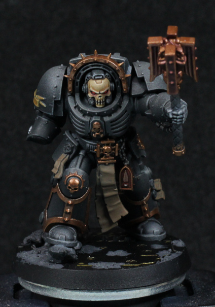
Rather than spend any recent time with posts, I decided to simply finish this model instead. In what is becoming an annoying trend for the year, yet more health problems have made it take far longer than I'd like, but I'm calling it done now.

As an experiment in using Contrast through an airbrush it kind of worked. I wouldn't use the same approach for black again, at least not directly. I would probably prefer a very slight hint of blue were I to do this again, but whether that's mixing into the Contrast step or as part of the original volume highlights I'm not sure. I also would prefer some of the edges to be more sharply defined - and that's actually difficult to do with already desaturated colours. It ends up looking like the left hand, which doesn't look black then.

The lack of red on the pauldrons was a wiser choice I think. It fits within the overall theme much nicer, and ties in with the idea of leading Death Company, or someone close to joining them such as the storyline in Death of Integrity. The trim in gold was also a saner choice compared to trying to do everything black, which would only have worked had the black armour worked better.

The base was intended to be interpreted as either in a Space Hulk, industrial, or heavily constructed urban environment. It was initially too light and needed to be heavily toned down and given a small bit of interest to balance things out. It kind of works; I could do much more to it, but that's true of just about everything I paint up.

Faith is my shield!

The shield worked well enough in the end. The subtle red is nice, though next time I'd like to airbrush that first. That wasn't an option here as I didn't really know how I wanted it until much later. Although I did ruin one of the purity seals (the paint smudged out of place), the bones worked out nicely. I want to keep that in mind for skeletons in future:
  • Wraithbone base coat.
  • Druchii Violet in the shadows, recesses, and surfaces facing away from the light source.
  • Skeleton Horde over the whole surface - not too heavily, but not exactly light either
  • Wraithbone thinned and glazed to highlight again.
I'm convinced that a mix of primer, washes, and drybrushing could replicate the look closely enough for army painting. Even a base coat of violet and then zenithal of Wraithbone, then Contrast and drybrush should be efficient enough for painting, say, a Tomb Kings army.

Finally, decals and micro-pens make putting writing on scrolls incredibly simple. If I really wanted to take it a step further I would paint over the decals, but in this case it looks good enough as it is. The count is now at 4.5.

-- silly painter


Friday, January 26, 2024

Terminator Chaplain - Part III


I'd like this guy as a school chaplain.

I wound up going with metallics for the chaplain, which so far seems to be working. The photo has them dulled down due to washes, but that will be fixed up later on. The main idea though is to be careful with the later highlighting and keep it consistent with non-metallic paint highlighting.

I'm using Balthasar Gold as the base here, just to keep it darker and in line with the gold method already used for the rest of Blood Angels that I've painted. There's also something else I've done: most of the details are gold, with very little variation in other colours. Sometimes I might paint a skull in bone colours, although for time saving practical reasons I've been doing less of that lately. I might try and paint a skull silver, but with a golden halo. None of that here: the trim and details are all the same. This isn't being lazy (although I certainly don't mind it being uncomplicated), but rather that I kind of felt it fit the model. Sometimes there's a certain elegance to simplicity. In the case of a Chaplain, I also feel that it lends an air of unyielding strength, the one in question devoted to their role and doesn't need flamboyance to show it. Sure that might be going overly analytical of a simple colour choice, but keeping in character to the model is what often informs how they're painted.

I don't have a photo of the shield, and was having a tough time deciding on the colours to use there. The background colour in particular I couldn't decide on, and then was playing with Blood Angels Red (Contrast) on a black background and thought it looked perfectly suitable. It was basically glazing the contrast paint on repeatedly until a transition from black to red started to appear. It's quite subtle, and I might need to edge some of it in Mephiston Red to bring it out a bit more, but thought it was a good experiment in yet another way to use Contrast paints. They're not normally applied over black.

The base I'm playing around with, but will probably go for something similar to the 30k assault marines in palette, with the idea that it can fit an industrial area or possibly the inside of a vessel. I don't have parts for "void war" bases or I'd use those: the armament suggests close combat in confined spaces (e.g a Space Hulk). I'll see how it goes.

Otherwise the model now feels to be well on the way, but there is one final note to make about it. With some details filled in, the black armour feels somehow "soft". That's only natural coming from the strong diffuse highlights; hardened black surfaces wouldn't have a reduced volume highlight profile, and be far more specular. I don't really want to fix this just yet, except perhaps on the feet, but at the end it might be a good idea to add very bright, defined edge highlights in places to darken the rest by comparison.

Definitely going with a white chapter symbol.

-- silly painter.


Thursday, January 18, 2024

Terminator Chaplain - Part II


Channel the rage.

I guess this is the next model to be completed, sorry dreadnoughts. I was inspired by Darren Latham's Legion of the Damned test (I don't have a specific link, but Google should easily show the model. There's freehand skull on a model and I like the colours, figuring they'd be suitable for the skull helm of a Chaplain.

I normally go for a shade of a blue or purple on skulls, but that creates a colder look - which is perfectly fine if I'm going for that, and it suited Lemartes rather well. The method here was a warmer bone finish, which to me fits with the "expression" on this model more, keeping a baleful glare without the starkness of brighter off-whites.

The steps here are again written directly from Darren Latham, but while presented as one colour then another, I mixed and layers between them all. The steps are more of a guideline, with going back and forwards as necessary.

  • Zandri Dust base.
  • XV88 for shaded areas and darker volumes. The brow and sides of the head are the most noticeable volumes that should be darker, but not the deep shadows of recesses.
  • Morghast Bone first highlight. Flow improver was used to thin and glaze this step.
  • Rhinox Hide in recesses.
  • (Ushabti Bone and Wraithbone were used in the original step, but I skipped these mostly because I was lazy at the time and the details so small that I mixed approximations from what was already on the palette.)
  • White for more extreme highlights. This step in particular was mixed with Morghast Bone and flow improver used to make sure the glazing was as smooth as possible.

The flow improver was key to the glazing being smooth, which can be troublesome with whites and lighter tones. I really should start using it more than just water because it really does help and I have plenty to work with.

The eye lenses I layered with pure white in preparation for next steps, and I figured instead of a normal gem or glass reflection effect I'd go for a glow. Maybe there's information being displayed on an internal HUD, but in any case I wanted a red glow to give the Chaplain more of a focused rage look. For this I used Blood Angels Red, and then played with adding white to try brighten the core lens area just to help it stand out more. This does turn pink, but it was helping - however ultimately I went over it all with Evil Sunz Scarlet mixed with a tiny dot of white.

The glow around the lenses I thinned Blood Angels Red with flow improver heavily to create a thin glaze and carefully built up multiple layers around the eye sockets - and even then I messed up a couple of spots and had to glaze Morghast Bone over it again. Lighter tones are troublesome for this, so I might one day try to first paint the glow, and then build up the main colours later, hoping that the red might still show through at the end. Or at least I could mix red in each step as I go.

I'm still torn between if I want to do NMM or metallics for the rest of the model. I have a concern that metallic shine will detract from that skull faceplate, and the head has set the need for more muted colours, but perhaps a matt varnish at the end can alleviate that problem. I'll try to fill in other details while I decide.

-- silly painter.


Tuesday, December 12, 2023

Terminator Chaplain - Part I


Biggus Stickkus

Continuing with more airbrushing entertainment, I bought this model because it looked cool and I could. I really wanted to give one of the new scale terminators a go, but painting an entire squad didn't seem right quite just yet - I've painted enough terminators recently, plenty of other red armour to go, but never had a chaplain in terminator armour.

After a lot of debate about whether to go with the shield or the storm bolter, I ended up with the shield. I could have tried to magnetise the two, but really I wouldn't be swapping them over and the rule of cool won out. Also, it's likely that a Blood Angels Chaplain would only wear such armour in some kind of boarding action where the shield could be used to greater effect.

First order of business is the pre-highlight with thinned white. This is done with multiple coats to build up the gradients, and while there is some "noise", it's no more than if drybrushing were used. Using white here means I'm going for a grey volume highlight - I could tint it slightly for blue, or purple, or any other colour, but if I want to match it against other black armour in the army then grey it is. The initial pre-highlight works really well already to give shape to the model, but it would get darkened later.

I painted most edges with Administratum Grey to ensure they would be more visible later. Following this I used Ulthuan Grey on the more prominent edges to further brighten them in the hopes they would really show through later.

When in doubt, hit it with a stick.

After all the pre-highlighting was done, I went over it with thinned down Black Templar Contrast. This once again teaches me that I need to really make edges super contrasting with the surroundings if they'll show though later, but also I perhaps should have used a smaller needle size with the airbrush. Thinning was done just with flow improver, but I'm curious what Contrast Medium might do. Something to explore later.

I'll need to add some edge highlights again in places, and probably a few select recess shade applications wouldn't hurt either. I think overall though it worked mostly as intended - enough that I would use this approach over previous methods of black armour when painting squads.

I had the idea of keeping the model virtually entirely black, but I might just go for gold trim instead. I'm tempted to try NMM for that just to keep the reflective nature of metallic paints from being too disjointed against the black. Guess I'll see how it goes later - and the dreadnoughts do have priority.

-- silly painter.