Monday, May 27, 2024

Mermaid of Warsaw - Part I


Strictly speaking a siren, not a mermaid.

This particular model hails from the Kontrast Festival, and it's taken me a year to start to figure out how I want to paint it. I was held back for a long time deciding the basic colours, and also looking for an appropriate plinth on which to mount it. Ideally I want a square plinth, and I'd like a backing plane to paint something else on - or I could simply use the excuse of oils on canvas at some point.

The brief overview of colours is for blues on the tail, golden hair, and tanned skin. Although it might appear to be oceanic to most, this should really be a river mermaid (syrenka) and I figure more sunbathing or time spent near the surface would apply. Colours are not everything for miniature painting of course, but more on that in a moment.

The model as seen is just a very quick impression to guide through later steps. There's every chance of the tones currently visible being completely masked by later steps, but it nevertheless serves to set the foundations of those steps. Everything so far is with an airbrush: priming, zenithal, tints. The zenithal was white ink heavily thinned - and the result was incredibly smooth. Multiple passes as necessary, and very little speckling as can sometimes happen with white. Always thin your paints. The zenithal set the volumes up with Dark Oath Contrast on the flesh, Aethermatic Blue on the tail highlights, and Talassar Blue in the darker areas. Those two "blue" paints from the Contrast range are seemingly very diverse for my uses, and work well with the scales: blue reflection from the water, yellow from the sun, and I hopefully setting up shimmering scales to work on later.

Golden or blonde hair I've attempted a few times on much smaller scales, and what I've learned is that yellow is probably not the best colour to be using. Ochre, browns, with very small hints of green (actually done by mixing in blue) and red are what I'll be looking at instead.

As mentioned before, this miniature isn't just about picking colours that look nice. It should mean something, it should try to evoke some particular feeling. Rivers aren't a deep blue like the ocean, but can reflect greens from surrounding trees, grasses, etc. The rock, well it doesn't particularly fit a river theme, but water flowing around it won't be foaming. Warszawska Syrenka is the symbol of Warsaw, and an important cultural icon. The expression on the face of the model is almost one of sadness, and coupled with the sword and shield could perhaps focus not on glorifying the symbol of protection of the city, but on the continuing strife that means protection is needed, and memories of a more peaceful time. A reflection on that theme however is that I'd like to portray the mermaid in a ray of light, surrounding by otherwise bleak weather; memories of a better time, but hope that weathering the storm will bring peace once more, and that future generations might not live under such dark clouds.

This theme will inform how I approach highlights, where I draw attention, how saturated colours will be in various locations, and even what kind of mood I'll need to be in when painting the model. This is not a tabletop game miniature, it's a display piece, and while I may not achieve the desired effect (from lack of experience if nothing else), it doesn't mean I won't give it my all to do the model justice.

-- silly painter.

Wednesday, May 22, 2024

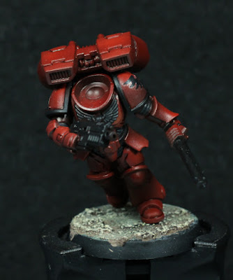
Assault Intercessor with Jump Pack - Part IV


Hard to walk straight when you can't see.

Very quiet on the paint front recently, however I've been trying to have at least a little slow progress even so. This is an opportunity to find ways of continuing to paint up models with the least effort possible at any one given time.

Batch painting is difficult for myself, however with limited time each day there is one approach I can use: keep a single paint on the palette and use that across multiple models whenever I get the chance. This setup means I don't need to do much layering, mixing, or otherwise switching between colours - it's really just put it to one side and pick up the brush when I have a few spare minutes. As such, I've been very slowly getting through all of the jump pack models and finally have all the actual jump packs glued into place.

One of my long standing gripes about painting over gloss varnish has been the difficulty in coverage of metallics. Most metallics cover better over a black undercoat, so I started to block in with my usual blacks when I decided to try out Black Legion. It's a Contrast paint, but actually has very good coverage and seems to apply quite well over the varnish. A massive time saver in the end - just paint it over the black areas and if necessary a thin second coat. I'll still highlight later, but it was much quicker than Abaddon Black (which I still find invaluable as a kind of glaze) at blocking everything in. Ideally I should also have filled in some areas of the backpacks too, but I realised that too late and I've already moved to filling in metallics by now.

I did try mixing Black Legion with Carroburg Crimson to darken some of the panel lining, but I didn't like the result. I find a couple of pin shades of pure Carroburg Crimson is better to my liking.

Not seen in the photo, I've made them another squad for the 3rd Company, and will probably make the right knee pad a red cross on a yellow background. The problem for the 3rd Company symbol is that there are relatively few white decals available, so I used yellow ones and painted over them with Corax White. Despite the name, this is actually a very bright grey, but looks white compared to the rest of the model and still allows somewhere to go for other highlights or reflection points.

There's still quite a lot to go on these models, but once some select areas of the jump packs are filled in then I can glue the helmets in place. Not long after I can probably attach holsters, and then it's "just" highlights and final details (and maybe purity seals). I'm intending to still edge highlight the red with Evil Sunz Scarlet before the matt varnish, and then Wild Rider Red after that as necessary. Is this going overboard for standard troops? Almost certainly, but lends itself well to the method of painting I'm being forced to do right now and lets me fix where the airbrushing wasn't as bright as I'd liked.

-- silly painter.


Friday, May 3, 2024

Commander Dante - Part I


Head hunting.

One of the first models that I painted when I got back to painting was Commander Dante. That was a finecast model, and I had painted the metal version long ago (and had also given that army away long ago). The new, Primaris, Command Dante is an excellent update to that old sculpt. The basic design remains the same, but has been updated with modern approaches to miniature design, and of course a slightly larger scale.

I was thinking for quite some time about how to paint the new model. I wasn't going to do NMM, but I also didn't want to go for a simple approach - I wanted to try use metallics to push the envelope and see what I could do with them.

Originally I tried to base coat with the airbrush using Balthasar Gold. I was definitely leaning towards the original paint scheme itself and I like the darker colour that gives a more antique and master crafted feel to the armour. Unfortunately I forgot to first base coat with Rhinox Hide, and didn't know how to properly thin airbrush paints at the time. The result was very poor coverage with an awful lot of speckling, and black does not work as a shadow colour here.

After a very long time trying to think how I might want to fix airbrushing mistakes, I finally decided to simply go in with a brush using the same colours and smooth out the initial highlight volumes. The airbrushing, for all of the mistakes I made, still shows the volumes nicely and gives a great idea of where to place highlights. It's about here where I thought to deviate slightly and take some hints from the idea of painting NMM, but with metallic paints.

Only the left leg has been started because I wasn't sure how it would turn out and figured the legs wouldn't draw as much attention as the face, but do offer a large enough space to get an idea about how the rest would end up. All I did was mix Rhinox Hide and Balthasar Gold in varying ratios, layering and glazing over the volumes. The Rhinox Hide dulls out the Balthasar Gold, giving a very satisfying satin finish - highlights are certainly more reflective than shaded areas, but not excessively so. Flow improver helps to thin the mixture, and I'm starting to experiment with Lahmian Medium to slightly dull the more "pure" metallic glazing. I do want contrast in surface finish (more matt in the shadows, satin or slightly gloss on the brighter points), but I want more control over it and I'm hoping the medium will permit that.

I'm quite pleased with the result so far. I've already started on the "face" (helmet) and have highlighted that up further with Gehenna's Gold and Auric Armour Gold along the same lines. Gehenna's Gold has some Rhinox Hide mixed in mostly for the surface finish, and while it works I'm still considering pushing it a bit further. The details need more highlight contrast to properly make them out, which is something often missed when using magnifying glasses all the time.

-- silly painter.