 |
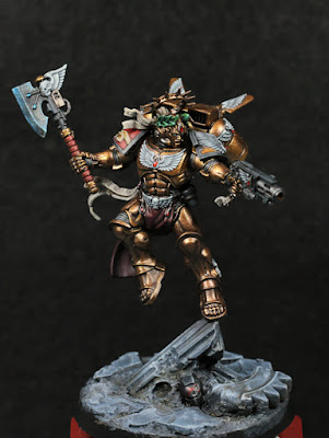
| Angel of Death. |
Despite not thinking I would manage this, I've actually been able to finish Dante over the last week. Everything just kind of fell into place, and I'm calling him done. Not that I'm entirely happy with everything: the axe blade in particular doesn't really do it for me, but I think I'll leave it as a reminder for later projects.
The base I think turned out better than I'd hoped. It doesn't clash with Dante, and I intentionally gave it a cooler, darker tone that was complimentary to the red, but contrasting to the warmth of Dante's armour. It's not actually much darker though: it's the glossy shine from the metallics that give that impression. Compared to the shaded areas, the base is actually a lighter tone. The rough painting approach is:
- Mechanicus Standard Grey / Black (3:1, or even 2:1, exact amount isn't important) as a base colour over everything.
- Chronos Blue drybrushed over all of the stone, with very light touches over the dirt and loose rubble.
- Stormfang Blue drybrushed as highlights over the previous step.
- Wrack White drybrushed onto the very edges of the stone, and again lightly over all of the dirt and loose rubble.
- Seraphim Sepia shade into random areas of the dirt. This isn't a heavy wash, just a light one to more or less glaze over them.
- Agrax Earthshade in the deeper recessed areas, and also glazed as a transition colour on stone, or where the previous shade was too red.
- Nuln Oil as a glaze more than a shade, mostly to define some of the carvings in the stone, or to darken some of the stone work. This is most noticeable where the broken pillar meets the ground.
I'm fairly pleased with the end result, and thankful that I made the decision earlier to strip the texture paint off and go with more of a "pillar crashed down from high into stone tiles" look. On a note about drybrushing: as it turns out, the Citadel paints for that are really good! They have the right consistency if using the right (_very_ slightly damp) brush, and moving between values slowly instead of any one large value jump (e.g white over black) helps smooth out transitions and helps prevent that grainy texture that drybrushing is so often associated with.
The half-tabbard is Barak-Nar Burgundy and Gal Vorbak Red, with mixes of black in there to shade things, and even the old Bloodletter Red to shift some of the volumetric highlights more. In general I didn't go for much in the way of extreme highlights, effectively only going as high as a mid-tone. This makes it look less reflective and more like material of some kind. I need to work on that kind of thing more, but I think the basic idea is sound.
 |
| Must have good type script for battle. |
I haven't magically become very good at writing on scrolls (although a size 0 Windsor & Newton is making short work of purity seals), but for the right pauldron I used the opportunity to give self-printed decals a go. My printer isn't configured for super high quality to leave it at that, but it does give enough of an outline that I can fill in the rest with a fine-tipped paintbrush. It has that "cheating" feeling, but ultimately I chose the font, I cut it to size and applied it, and I painted over it to clean up the lines, and if it gives me excellent lettering every time then who really cares? I have a bunch of names printed out to use in future as well. The skull is a little too bright white, even after I dulled it down slightly, but I need to stop somewhere and it's not bad at all. I'd work on it more if this was for a competition, but that's all.
No comments:
Post a Comment