Saturday, September 17, 2022

Operative Umbral-Six - Part I


Headless assassin inside a head.

As an initial disclaimer, I obtained some heavy inspiration from this video: https://www.youtube.com/watch?v=6QXvE2-dfRc

Of course, the final rendition looks quite different, and the approach has been modified greatly - I used it for inspiration, a base to build from, rather than simply copying and really wanted my own take model. I also spent a while looking at verdigris, seeing how it flows and builds up over time. Most modern statues where it's apparent are absolutely covered in it, to the point where none of the underlying copper colour is visible at all. I imagined that the statue here was more carefully looked after, perhaps regularly polished until war broke out and it was cared for a little less, before finally suffering some damage from the fighting. The assassin perched there poignant for the vengeance the Imperium visits upon those who desecrate such sacrilege against imagery of the Sisters, while fires burn in the streets below. The damage though, is perhaps relatively recent - exposing metal that hasn't yet had a chance to oxidise into verdigris.

All this backstory does play a role in painting. It informs which colours to use, how heavy to apply them, perhaps lighting angles, and so forth. Here, the assassin should be dark, and without many (if any) reflective points. The weathering on the statue will be less severe than other renditions of this model. Lighting is more intended to come from below rather than overhead, informing where to place highlights.

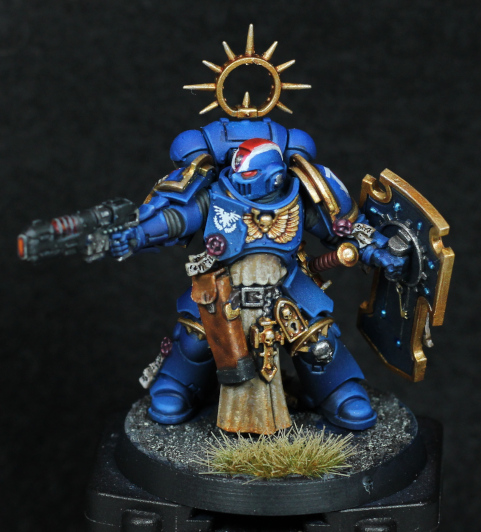
Before even priming the model, I decided to remove the Vindicare from the stand. Painting him/her separately would be much easier in theory, though in hindsight I probably could've just left the front of the statue off. No matter. If I ever want to use the model in a game (almost zero chance of that in all honesty) then removal will be useful - and there's always the excuse of just wanting to see if I could. So I cut the model clear, drilled some very careful holes for the smallest of my magnets, and then green-stuffed back over some the damage I caused when cutting. I could have done a better job at repairs, but motivation wasn't exactly at a high point - and a little damage seems to fit anyway. I did also have to slightly trim a few points to make the Vindicare fit better with the statue in place, but that's well hidden. The magnets aren't the strongest, but do keep everything place well enough for display purposes. Naturally the rifle has a hole drilled in the barrel.

Priming everything was done using one from Vallejo instead of the usual Citadel spray can. There's no sense in letting a bottle of primer go to waste, and using it through the airbrush means not having to leave models outside in dubious weather. It's acceptable on plastic, but doesn't bond very well on resin or metal. The Citadel spray primer is still superior in my opinion, assuming good weather.

The statue:

  • Leadbelcher base coat. This was intended to build up a slightly glossy undercoat, and give a lighter tone to the finish.
  • Balthasar Gold. Another base, but only needing a single coat. Completely even coverage is not required.
  • Runelord Brass (the old layer paint version) applied as what can only be described as a "wet drybrush". It was built up a little more heavily in highlighted areas.
  • Canoptek Alloy, applied similarly to the previous step and kept mostly as a highlight. The focus was on the lower left (with reference to the photo).
  • Coelia Greenshade applied over almost all of the statue. This was more of a glaze than a shade - while some areas were indeed given a shade, it was thinly glazed over flat surfaces too, acting as a subtle green filter.
  • Aethermatic Blue. I don't have Nihilakh Oxide and didn't want to but a whole bottle for this one model, so used a contrast paint instead. Aethermatic Blue is far more translucent and might take multiple layers to build up, but for my usage this was more preferable: I didn't want the intensity of Nihilakh Oxide to begin with, going for a more subtle expression of verdigris only beginning to appear.

There's some structural bracing to be painted up still, and I'll likely give that an oxidised and slightly rusted iron appearance. I had some practice of that with the base on Horus, and I'd like to repeat it here. I also intend to try give some warm highlights indicating flames from a street below, but now I'm not so certain about that. It would look much better if exaggerated, but doing so would need really give a light/dark contrast, which would make much of the statue verdigris hidden - basically, I'd need to start from scratch. I might simply darken some places with a filter of some kind later on instead - I like how the statue looks far too much and don't want to ruin it.

-- silly painter.


Sunday, September 11, 2022

Legion Scimitar Jetbikes - Part II


Some angels have wings. This one has a jetbike.

Managed over the course of a week to get some of the major colours blocked in on the jetbikes. This was mostly an exercise in airbrushing up to now, with the next steps switching to a normal brush to clean up a few details.

The red doesn't much explanation at this point, but regardless:

  • 50/50 Dryad Bark / Mephiston Red base layer.
  • Mephiston Red midtone.
  • Evil Sunz Scarlet for the highlight.

The metals were nothing special either, but were actually done before the reds:

  • Leadbelcher base layer.
  • Deathshroud clear into shadowed areas.
  • Iron Hands to "highlight" (it didn't really make much difference to me).
  • Castellax Bronze lightly applied across the top engine cover.

The last step just gives some variation to the metal areas, acting as a very slight colour filter that adds some visual interest. After the matt varnish step I'll likely push it a little further from the silver tones with metallic glazing. I actually find the metallic paints quite effective at glazing, but it will need to be done later to restore that metal sheen.

The riders are being done at the same time, but the temporary handles attached for painting don't make them easy to add for photos just yet. I'm hoping to have them ready in time for the next update.

Painting the metal areas separately from the red panels and using an airbrush presented an interesting challenge: how to mask off pieces of the model, and which order to do them in? I ended up painting the metal areas first, reasoning it was easier to fix them up than try to re-paint red gradients and transitions. In hindsight, this was the correct choice. Masking off areas however, that took a bit more thought. First of all, let the metallics sit for at least 24 hours to ensure they're fully dry and cured, giving them maximum adherence to the model. Don't really want the masking medium to strip the paint off. To mask areas off, I ended up using very cheap branch blu-tac. It's not as flexible or sticky as branded, but that actually made it fit for purpose in this case: the cheap variant was pliable enough to cut to shape and press over areas, but also peeled off very easily later on. As an added benefit, I can re-use it for masking other models in the future as well.

I've decided to properly glue all the flying stands in, but not glue to the clear bases yet. The stand will always be used anyway, and I find it useful when holding the model for painting.

Next steps are to fix a few small areas that weren't masked properly, or accidentally masked off entirely, before adding edge highlights to the red panels and then sealing it all with a thin gloss varnish. The matt varnish step later seems to be dulling the edge highlights, so I'll likely make them a little bit stronger this time and see how it goes. I'm also toying with the idea of adding a black strip across the front of the jetbikes, similar to the Thunderhawk Gunship, but black trim and gold filigree are a contender as well. That's a decision for another day.

There are likely to be sporadic posts over the next weeks, and possibly rest of the year. I'll still be painting, but trying to give weekly updates will be giving way to the necessity of a more flexible timetable.

-- silly painter.


Tuesday, September 6, 2022

Space Marine Heroes 2 - Part V


The enemy has time to bleed.

Not really deserving a full post, so this might be shorter but a couple more models are now "done". There are a few places on each where I'm not entirely happy, but they're not going into competitions and are well enough to give each model some presence, so I'm classifying them as done.

I struggled with the bases for a long while, and in the end Celestra Grey with Basilicanum Grey did most of the heavy lifting for me. Once that was done, the rest kind of just followed. There's a lot of neutral grey in there, but it's not colour I was interested in so much as a lighter value to offset the armour. I find it balances well against the Aquila on the chest, the Crux Terminatus, and the blacks elsewhere.

The assault cannon model (Brother Fuerran) has the best decal application of recent times, but it still look a lot to get it right.

Missiles.T That look like eyes. Well that's creepy.

Brother Ebellius could also have done with a little more work on the right knee pad, but I didn't want to ruin it with a poorly applied decal, or even worse freehand, so I left it alone. And now I look at the picture, there are two service studs on his head not painted - something very soon to be corrected! The chapter symbol decal was so troublesome that I ended up actually putting down a little gold freehand filigree - and it's not even decent by any stretch of the imagination, but still looks better than what it's covering up. The face also has so much character that I couldn't imagine using the helmet option.

With these two finished, the tally of models in the "1 for every 2 painted" now stands at 10.5, and hopefully will rise a bit more before the end of the year. There are still six more left in the Heroes 2 set that I have.

-- silly painter.


Sunday, September 4, 2022

Space Marine Heroes 2 - Part IV


Clawing his way through the enemy.

Continuing with the Space Marine Heroes 2 set, another Terminator is finished. I've been working on a small set of them rather than batch painting, so expect more coming soon. All are in some level of basic armour finished, and I'll just be working my way through them two or three at a time now.

There's nothing particularly new with the painting again. Same formula as normal for my Blood Angels approach. The gloss varnish step really does help with applying shades, but also makes the model difficult to predict how it will end up - the matt varnish is still only done almost at the end, but I have an understanding of how it will turn out now.

The gold was done slightly different, purely because I wanted to see how it would look. I borrowed the specific colours used on the Ultramarine Lieutenant. It works ok in some areas, bu perhaps I'll mix it up in future with the "normal" gold approach I've been using with Blood Angels. It would serve as an excellent way to mix up filigree on future models.

As a random note, Skrag Brown heavily thinned makes for a good rust colour.

Decals are once again a massive pain for me to work with. The sheet used is seemingly of lesser quality - the decal did not adhere nicely, and softener had an incredibly hard time getting rid of the silvering effect. I decided to cover some of that up with a bit of battle damage - there's already some on the sculpt anyway, so it's not entirely out of place. Just another example of why I always prefer to paint sculpted details, or freehand, given the option - but the models here are too connected to the shoulder pads and decals it is. I'm sure some of the next models will have the same problem.

The lighting claws are Hoeth Blue, Skink Blue, and Wrack White. I could then use Praxeti White if I really wanted to punch the white some more, but I'm leaving it as is for now. My drybrushing techniques have slowly been improving, with the key for myself being to wipe off most on a paper towel rather than a plastic palette. With a little more practice I could even see myself being able to paint the majority of a model with drybrushing - something to think about one day.

The left glove in black is of course something that's been done on Blood Angels Terminators for a long time, and it just adds so much to the model that I'm continuing the trend.

Now onwards to the next model!

-- silly painter.


Tuesday, August 30, 2022

Legion Scimitar Jetbikes - Part I


Admit it, you want to make "vroom vroom" noises.

Despite a bunch of Terminators still to get some attention, I have motivation to start on yet more models. This might put a bit of a strain on "numbers on the go", but at the very least I can get these started. The design of these jetbikes is visually incredible, and I've been wanting to have some of my own done up since I first saw them - and now is the chance.

A suitably large amount of planning has gone into assembly, colours, and even which stand height to use. These will be Blood Angels, naturally, and will likely be part of the 30k force that I have enough models for now. For this reason I'm using some of the older Forgeworld MkIV shoulder pads - the design is ever so slightly more ornate, and reflects the IXth Legion style, as opposed to the Blood Angels Chapter style. It's a small thing, but important.

There are three jetbikes in the kit, and I'm highly unlikely to be expanding that number anytime soon, so I can afford to be a little more careful with these models. While perhaps not a centrepiece, they will definitely demand attention on the tabletop, so I want them to look nice. The rough colour scheme will be red (of course) with black trim, and then gold filigree patterning on the armour panels. I'm considering a black/red split on the helmets, perhaps indicating them as a specialised unit, but that's not set in stone. More than likely I won't be going with yellow helmets, for no other reason than I consider that a 40k choice and helps to separate Legion and Chapter more.

I've magnetised the weapon options, which turned out to be a not too terrible experience. Just a matter of getting the right drill bit size, making an indent where the centre is, making a pilot hole and then drilling out just enough to fit the magnet. I didn't bother with any putty to help keep the magnets in place, but can easily adjust that if they come out later on. Aligning the magnets was also much easier than I'd originally thought too: there are convenient matching slots that can be used for this purpose. Without that I would have had to do a lot of careful measuring, marking, and slow drilling to get everything just right.

Speaking (writing) of alignment troubles, I did have to pin part of the jetbike in place. Where the rider's seat connects to the front, the attachment points aren't the best. There was just not enough surface contact to form a proper bond, so a small piece of paperclip is helping to strengthen that. To make sure this was all aligned properly, I first drilled one side and then used a smaller piece of paperclip sticking out. By putting a dot of paint on this and then connecting as close as possible to what it should be, I was able to get a matching guide point. A pilot hole and then drilling out more for the paperclip, and all just kind of worked. The hole is about a half-millimeter (or less) diameter larger than the paperclip just to give some wiggle room in matching the pieces - the glue will fill that in readily enough.

There are naturally some gaps when working with resin, and I used milliput for some of them. I tried liquid green-stuff as well, but that didn't work quite as well. The particular milliput I used was fine grain, and sanded back quite smooth. I suspect it will be my go-to for future resin gap filling. I also used milliput to add some padding underneath where the jet engine connects to the piece behind the rider. There are again poor connection points around there, but I couldn't get a good angle for pinning it. Seems to have offered good enough gap filling to keep everything securely in place.

For the joys of working in resin, this is one model I wouldn't mind seeing a plastic version of. Still, they're all assembled now, excepting some pieces left off for painting.

The bases I'm not decided on - I could leave them clear (and have covered parts in a masking glue to prevent paint getting on those areas) or paint up the base. And I still have to decide how to magnetise the base, if at all, for storage and transport. Plenty of time to decide on that, but I will glue the stand in place fully. The connection point could use the reinforcement, and I can always drill it out if I want to change anything later on.

Hopefully i can get started on airbrushing the bikes this weekend.

-- silly painter.


Thursday, August 11, 2022

Ultramarine Lieutenant - Part II (Showcase)


Defending the patch of grass!

I have very little to say. It's late, overly warm, and more besides. I have, however, managed to finish (except for some varnish in places) the Ultramarine Lieutenant. This means I've now painted all of the models in the Recruit Edition boxed set. This particular model was also not counted towards the running tally, which therefore still remains at 9.

There is not much to mention about what colours were used, save that the gold is Retributor Armour, Guilliman Flesh, Liberator Gold, and then edge highlights of Stormhost Silver. It's not my usual gold, but the last edge highlight really sells it much better than usual. It looks far superior on the actual model - for whatever reason this time, the photo doesn't nearly do it justice. I will likely try this on the Terminators in progress, just to see how it looks on a red backdrop - I suspect I will revert to a more favoured approach for Blood Angels, but even then some have details that would benefit from different golds.

If the enemy is close enough that a sword is useful, there's trouble. For the enemy.

The decal on the left shoulder pad was a failure, but I'm leaving it. I like to be reminded of what doesn't work sometimes. I also used a very small amount of oils - dirt on the bottom of the tabard / cloth, barely visible hints on the scabbard for the sword, and a little black at the bottom of the shield (which turned out the best blending very nicely in). And again it's not the pigment of oils that makes them useful, it's the ability to mix, blend, and the mediums used to work it. I would probably use them a lot more on busts or much larger scales - so I'll have to try that very soon.

Another difference was that I spent a long time on details. Not obsessing over them, but just being very careful with the brush most of the time. I still had an idea of how to paint parts though, so it didn't take that much longer overall, and right now was just what I needed: something slightly different.

Holidays coming up, so no new posts for the next two or three weeks.

-- silly painter.


Wednesday, August 3, 2022

Crimson Court, Gorath the Enforcer (Showcase)


So you're walking down a dark alley at night and see this guy...

For something a little bit different I've always wanted to try a model with a very limited palette, focusing on shape and form rather than colour. That's when I struck upon an idea with this model: it wasn't motivating me for whatever reason, but I considered that as a vampire he'd but out during the deep of night where colours are far more muted and with perhaps a little moonlight to to tease out that magical atmosphere.

Feels a bit like cheating, but I kind of like the end result. It's incredibly fast to do, evocative, and the yellow eyes absolutely sell that this is an undead creature and not just a statue.

The first step I tried was actually to use oils. I need more practice with them, and this seemed an ideal place to get some in. It didn't work in one sense, but has lead me to the realisation of how I would like to use oils on miniatures: not as base colours, but instead as filters over areas. Oils make for brilliant glazes, depending on the medium they are mixed with. So I think in future that's where I'll start to practice more: glazes, filters, pin shades.

Although a failure for base colours, I did recognise during some testing that nice colours for a moonlit evil are black (of course), a dark blue, violet, and a light blue. In that order, oddly enough, from darkest to lightest. Using the violet as a midtone just works - I can't really explain it proper colour theory, but the violet has a higher value than the dark blue, and so acts as a kind of value and chromatic highlight to bring out the features. Black of course is used for deeper recesses and added contrast, and light blue is the opposite - used to highlight some edges and for zenithal lighting based on relative location to the moonlight. In this case, the moon would be behind and to the (model's) left.

Caped, but not a crusader. And a notched mace.

After allowing the oils to cure slightly (and then varnishing because I'm impatient) I set to work to redo the model. The oil colours still come through in the end, but an airbrush just makes everything so much easier to do for this kind of effect.

  • Night Lords Blue as a basic dark blue. Kantor Blue would also suffice, but with the oils already giving quite a dark base to work from I went with Night Lords.
  • Phoenician Purple mixed with Khorne Red (3:1) for a violet hue, angled from the sides and top mostly. Focus was more on left for this.
  • Lothern Blue mixed with dirty water in the cup to then gradually add some highlights.

That's it for the airbrushing. A shade of black oil paint was then done to add some more depth in places and help define the shape. Mineral spirits (artist's grade low odour) really means you can just slap it on and it will settle in the recesses without worrying about tinting other surfaces.

Lothern Blue was then added in a few places for edge highlighting, but built up slowly rather than going for strong lines immediately. Using the same colour as the last airbrushing step just helps strengthen the colour without going too bold or bright. A tiny bit of White Scar mixed in on the palette also helps to make just a few of those edges really stand out, but the key behind all this highlighting is subtlety - I overdid it in a couple of places, and it's surprisingly easy for that to happen without noticing.

White Scar for the eyes and teeth, and some Iyanden Yellow contrast on the eyes to make them yellow, and that about wraps it up. There is some of that red varnish technical paint (Blood for the Blood God) on bottle at the hip - completely out of place, but basically I just wanted to. Call it a little experiment in perhaps one day doing a grey scale model, but then picking out points of interest in some hue (normally red) to catch the eye. A very common effect in cinematography. I can imagine a diorama with a horde of creatures in the night, surrounding a hero painted in red as they prepare to do battle.

Despite the speed at which this model was painted up (all told about half a day, but with a night break to let the oils cure) I quite like the end result. I like it much more than if I'd gone the traditional route. This simple experiment really gives so much more emotion to the end result. It's not just a miniature, it's almost a small scene from a larger diorama all on its own. A good way to wrap up the Crimson Court.

-- silly painter.

P.S - and that means 9 models in the running tally of how many I'm permitted to buy.