Tuesday, December 12, 2023

Terminator Chaplain - Part I


Biggus Stickkus

Continuing with more airbrushing entertainment, I bought this model because it looked cool and I could. I really wanted to give one of the new scale terminators a go, but painting an entire squad didn't seem right quite just yet - I've painted enough terminators recently, plenty of other red armour to go, but never had a chaplain in terminator armour.

After a lot of debate about whether to go with the shield or the storm bolter, I ended up with the shield. I could have tried to magnetise the two, but really I wouldn't be swapping them over and the rule of cool won out. Also, it's likely that a Blood Angels Chaplain would only wear such armour in some kind of boarding action where the shield could be used to greater effect.

First order of business is the pre-highlight with thinned white. This is done with multiple coats to build up the gradients, and while there is some "noise", it's no more than if drybrushing were used. Using white here means I'm going for a grey volume highlight - I could tint it slightly for blue, or purple, or any other colour, but if I want to match it against other black armour in the army then grey it is. The initial pre-highlight works really well already to give shape to the model, but it would get darkened later.

I painted most edges with Administratum Grey to ensure they would be more visible later. Following this I used Ulthuan Grey on the more prominent edges to further brighten them in the hopes they would really show through later.

When in doubt, hit it with a stick.

After all the pre-highlighting was done, I went over it with thinned down Black Templar Contrast. This once again teaches me that I need to really make edges super contrasting with the surroundings if they'll show though later, but also I perhaps should have used a smaller needle size with the airbrush. Thinning was done just with flow improver, but I'm curious what Contrast Medium might do. Something to explore later.

I'll need to add some edge highlights again in places, and probably a few select recess shade applications wouldn't hurt either. I think overall though it worked mostly as intended - enough that I would use this approach over previous methods of black armour when painting squads.

I had the idea of keeping the model virtually entirely black, but I might just go for gold trim instead. I'm tempted to try NMM for that just to keep the reflective nature of metallic paints from being too disjointed against the black. Guess I'll see how it goes later - and the dreadnoughts do have priority.

-- silly painter.


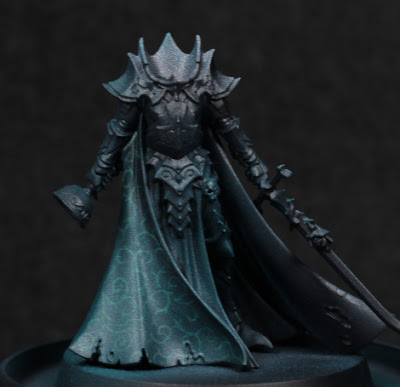
Karlina von Carstein - Part I


Cloak and dagger.

Needing a break from the dreadnoughts for a moment, I've decided to start some more models just for exploration of a few things. This is for motivational purposes more than anything else. Originally I was going to paint Karlina von Carstein far more simply - and I still intend to do the armour in possibly warmer metallic tones - but the cloak was too much of an opportunity to pass up. I've been experimenting with Contrast paints through the airbrush a lot recently, and I wanted to see if I could get a pattern showing through. Spoilers: mixed results.

The first step I took was a simple thinned white highlight. This isn't really a Zenithal highlight, but instead serves to sketch out how I want things highlighted. Sometimes this never makes any difference in the end, and only serves to better see the model - but that's still worth it in my mind.

With that much done, it was a bit of a painstaking process to then draw out some kind of pattern. I tried to go for something slightly fancy while avoiding any kind of tessellation which I felt would be far more difficult with the folds in the cloak, and also would give a much more mathematical look to what should be a cruel, aristocratic vampire. As I neared the end, I was somewhat worried that there wasn't enough contrast between the highlights and the pattern, and it would all depend on how thin the Contrast paint was.

My what a shiny cloak.

I used Terradon Turquoise to glaze the cloak. It was stronger than I thought it would be, and I definitely should have thinned it at least a little when going through the airbrush. The pattern was completely washed out in places, although in the right lighting it can still be made out. While this is a shame, I at least learned the valuable lesson of needing to thin that particular paint (others I find don't require it - this one does!), and also however much contrast I think I have beforehand: more is needed. Using the Contrast range as a glaze can overpower similar value colours underneath, so the more contrast in value then the more detail comes through afterwards. This is really noticeable as the original white highlights fade off up the cloak.

Need to get her head in the game.

I'm not certain if I'm going to try and go back over anything, or just leave it as it is. On the one hand it might look nice, but on the other I'm not entering this into competitions and I would really like to just finish off the rest of the model now. I'm pondering the armour colour, thinking that perhaps a red-brown tone to the armour would be suitable. I'd need to add some kind of dust and dirt of a similar colour to the hem of the cloak to balance it out a little, but I think it could work.

-- silly painter.


Thursday, December 7, 2023

Blood Angels Librarian Dreadnought - Part V


"I once caught a fish..."

Painting continues to be slow, and that trend will continue for at least another week. Consequently there does not appear to be took much progress on the dreadnought, but I have been experimenting with a couple of things.

Not seen in the photo are other winged blood drop symbols. I continued with the idea of mixing Contrast paints to see how that would turn out, without the need individually paint each "feather" separately. Mixing Apothecary White, Basilicanum Grey, and Contrast Medium seems to work alright, but I'm having trouble getting the ratios correct. Too much medium and the effect is far too minimal, requiring a second coat - and worse, the medium itself can build up and obscure detail. Too little medium and the effect is too dark. I'm only really interested in this type of approach for those details which are small and shallow, and otherwise too annoying to highlight individual lines.

I started to paint much of the left arm in a metallic paint, then stopped in one area and I've changed my mind - I'd rather have kept that red. I'll need to re-paint that area by hand, but that's for later as I go around fixing up mistakes. In general though, most other areas have their main colours decided on - always the most problematic step for me - so there's hope yet that I'll complete the model before the end of the year.

The base I've been thinking a lot over. I still have another similar base to paint for the Furioso Dreadnought, and I want to make the bases visually distinct to distract from them actually being the same sculpted base type. The bases obviously lend well to concrete or similar construction material, but could also lend itself to slabs of marble, granite, etc. This is when it occurred to me that there is one marble effect I've previously painted and want to return to, particularly because it's hidden beneath a model and not really visible: the "black with red veins of rock" marble on the base of Primaris Mephiston. Regarding colour and light theory, this won't separate the base from the dreadnought, but it will be different from other models.

Not much else to really say at this point. The exhaust ports I'll give a little more colour with metallics, which I find preferable to trying to give heat effects, and I still need to try out some mixes of washes or clear colour paints for piston oil effects. There's some Warhammer+ content on that which I may try out.

Other models are in planning stages, hopefully more on them soon.

-- silly painter.


Wednesday, November 22, 2023

Blood Angels Librarian Dreadnought - Part IV


Hey goa'uld, I can do that too!

(There will be grammar and spelling mistakes, but if I don't get this written out now then it'll be another week before I have the chance.)

There hasn't been much time for painting progress, but I have filled in some dreadnought details. This makes the model look far more complete than it really is - there are still arms to do, the power plant, the base, final edge highlights, decals, etc. It's nowhere near complete.

I actually decided to brighten up the edge highlights of the blue. This was just mixing a little more Baharroth Blue into the mix still on the palette and very carefully applying it to the most prominent edges.

Not too much to say about the yellow details. Again, I might highlight the motif on top with more white to give it a more reflective appearance, but that's a step for another time. Averland Sunset, Yriel Yellow, Phalanx Yellow. Same as used on the side cabling, although those were shaded with Agrax Earthshade and Seraphim Sepia.

The keys and Librarium symbol are plain Grey Knights Steel right now, with a slight Drakenhof Nightshade (barely visible). I'll do more of those details after the varnishing stage probably. The background is a little more interesting and was some experimentation with metallics in volume highlights. Warplock Bronze and Balthasar Gold, mixed in varying degrees and glazed. I like how it shows so far, but I'm aware that varnishing will change it considerably. I had intended to see if it would be something that might be suitable for shading, but I don't think I'll use in future - I'll stick with shade paints for the moment in similar situations.

The eyes on the helmet I debated leaving alone, but with more details done it was apparent something needed to draw attention back there. To that end I'm going for a glow effect, but it won't be anything particularly special: white (Corax White here) and a Contrast paint (Aethermatic Blue most likely).

The chained book cover is Lupercal Green. I mixed in a very, very small amount of white to highlight the upper edges mostly to see how the colours would mix rather than for any visual difference; the detail is too small for highlights to be noticeable.

Scrolls and paper used very similar colours to the normal approach for purity seals, but some slight variation:

  • Steel Legion Drab as a base coat.
  • Zandri Dust mixed into the previous colour and built up to pure Zandri Dust for initial highlights.
  • Agrax Earthshade glazed into recessed areas.
  • Seraphim Sepia glazed over selected papers to make them appear more aged.
  • Ushabti Bone built up for further highlights.
  • Pallid Wych Flesh glazed over more as appropriate.

The last steps used a small amount of Lahmian Medium to build up the glaze. Particularly for brighter or whiter colours, using a medium to thin it to glaze consistency gives a much smoother result than water. At a guess, water separates the pigment too much and leads to chalkiness, whereas a flow improver simply thins without changing too much else of the chemistry.

Lastly for the details so far: the winged blood drop icon. I wanted that to be white winged, but not with black shading. Blue is still much more indicative of sky, angelic, heavenly, and so I still wanted blue tinted recesses. To that end:

  • Corax White, with multiple thin layers to get an even, opaque coverage.
  • Apothecary White / Talassar Blue / Contrast Medium in a 1:1:2 mix, and heavily applied all over.

That's all. There's a much greater glow in the photo than in real life, and there's no real need to edge highlight anything. Contrast paints excel at this kind of task. If I were to continue with many more of these symbols I would play with the paints and dilution more, but for now it's ok. I can always knock it back further with Apothecary White later on.

Next steps are to fill in some metallic areas around the torso, perhaps some cabling, and then start to look at next pieces of the model. There will be a general harmonising at the end along with filling in the last details in one go (e.g gemstones) but it's about time to start more assembly.

-- silly painter.


Sunday, November 12, 2023

Blood Angels Librarian Dreadnought - Part III


'tis but a scratch!

Back to very little for painting again. This is a little frustrating, but I'll see if I can adjust to take more advantage of the precious free time I have, to be more efficient in my approach. This alone is a shame - I enjoy taking my time to paint a model, but I have far too many to get through to be quite so picky right now.

The metalallic parts are simple enough to need to explanation, and they 're not exactly the focus of the model. I will do more on them later for oil stains, lubricants, that sort of thing, but I'll try not to go overboard. I refer to them as "background framing" and don't really hold the viewer's attention - as a result, they can be rather simplistic without the overall quality of the model diminishing.

The "head" (or helmet, or sensorium, who knows) is a base of Balthasar Gold, some sepia tones washed over that, and highlighted with Gehenna's Gold. Just enough to glue everything in place. I'm still thinking over the eyes and if I'll leave them as they are, or do the whole Librarian psychic eye glow thing. Depends if I'll need to draw more attention there once the other details are filled in.

The blue sarcophagus is the most outstanding visual difference since the last update. I knew I wanted a darker blue, tending to black, in shadows but didn't want the cobalt blue of an Ultramarine for highlights. This keeps Librarians different and their own separate group. I ended up going with:

  • Night Lords Blue / Black (1:1 ratio). I also started moving more towards pure Night Lords Blue in those areas not within shadow.
  • Kantor Blue transitioned as first stage highlight, which was done through a combination of glazing and mixing on the wet palette with the previous paints.
  • Macragge Blue as a second stage highlight. Some care needs to be taken here, and it was again mixed with the previous step first. The real catch is that Macragge Blue is a step up in brightness, but also a deviation in tint from the other blues. It definitely benefits more from glazing for this reason, otherwise it's very difficult to get a smooth transition.
  • Druchii Violet used for recess shading. While I considered Nuln Oil or Agrax Earthshade, The red hint from violet gives a deeper and richer shade without desaturating. Just a fancy way of saying it looks more interesting. Also, Blood Angels. Perhaps a darker green would be suitable for Salamanders or Dark Angels.
  • Baharroth Blue mixed with Macragge Blue for edge highlights. Baharroth Blue on its own is far too much of a colour shift (it has more green in there) and looks completely out of place. An alternative to mixing is to edge highlight with Baharroth Blue, then glaze back over it with Macragge Blue to pull it back into an acceptable range.

For now the edges don't quite "pop" as much as I would like, so I may bump the contrast just a little more after varnishing.

And that's about all for now. Next I will likely start to fill in more details, particularly as the parchment should use very similar colours and should be relatively easy motivational wins. I will plan to simply get a small selection of paints and finish off details as I go around the model (with the arms yet to be properly started!). I'll leave armour edge highlights until after varnishing as that seems to be a good harmonising step.

And the moment I've been dreading is soon here: Legions Imperialis. I don't want to buy masses of those models to just sit in boxes, so I might simply buy one box at a time and paint it up before I allow myself to buy another. It will cost more in the long run perhaps, but it will keep the backlog more manageable.

-- silly painter.


Thursday, November 2, 2023

Terminator Squad - Part VI (Showcase)


Astartes Firestarter

Having now finished the Terminators and had a chance to compare before/after photos of the final edge highlighting, I've realised that the difference doesn't really show up on photos. This actually confirms what I suspected: the finish of the paint matters just as much as the pigment, and the lighting conditions and camera sensors have a habit of washing out some of that. The paint is ever so slightly more satin than the matt varnish, which makes the largest difference in the final edge highlight stage. Good to know.

That smile....

Overall I'm not the most impressed with the armour shading. I've done a lot better. I did learn a thing or two about the new approach tried here at least, and that will definitely feed into the next squad. The contrast between highlights and shadows simply isn't enough, but I'm fairly certain I can fix that in future.

With that much armour, quite why a low, stable stance is needed isn't clear.

Edge highlighting at the end has some benefits: it can be seen how the overall model needs to be adjusting. Doing it too early can be a bit of a waste in attempting to show off every single edge. Most often I actually needed to define the bottom of the left pauldron and keep it more distinct from the rest of the arm.
"Space Hulk Stance"

The bases do add some height. It is noticeable compared to other models, but I think worth the effect in also making the Terminators seem slightly larger.
Unfortunately the weapon targeting lens is a bit of a mistake. Not in the colours or technical approach, but it sticks out and draws more attention than I'd like. I should have left them alone here, or made them much darker at the very least. Perhaps one of the darker metallics underneath the gel paint.
More targeting lenses!

One of the more wise decisions was not attempting to paint details in a multitude of colours. Keeping things simple is not only easier to paint, but doesn't clash with the rest of the model. There are a few special details on most models, but they're the exception that proves the rule: less is more. Don't try to make the model "busy", or it just ends up messy.

I bought a Terminator Chaplain (because that model really looks cool), so between these models and that purchase the count is now at 4.5. I'm almost certain to break the count for the upcoming Legions Imperialis, where it's hoped I can paint those things much, much more quickly. I don't go for speed painting, but neither do I intend to put quite as much detail into that smaller scale.

-- silly painter.


Monday, October 30, 2023

Terminator Squad - Part V


Marshmellow Man's worst nightmare.

It's been a little longer than I'd planned since the last post, thanks to a few health issues (amongst other things). So these Terminators aren't quite done yet, but they are very close. They've all just been given a matt varnish, leaving some metallics, spots of gloss varnish, a few minor details....and edge highlights.

From the start I've been planning to give these models final armour edge highlights only towards the end of the process. The matt varnish simply dulls everything down too much otherwise. Actually I already applied a "pre-highlight", which now I need to go over again - and yes, this makes everything take that much longer, but still works in batch painting mode.

A note on batch painting: again, this is something generally not for me. I don't batch paint, so it's not actually what I did. I only had three colours (reds) I was using, which stayed on the wet palette, and I did one model at a time over the course of a couple of days. It's the same concept of batch painting, but not done in one sitting. Actually that approach in general was done to bring all the models to a similar level of completion around the same time: the reds, blacks, metallics, purity seals. I just keep the wet palette handy and do the same part of each model at different times of the day. When it comes to individual details, there's actually not a whole lot left over and they can be finished relatively quickly (and with more motivation).

On the heavy flamer for example, I picked out a checkered pattern on the side just to break up the monotony of colours a little. I was inspired by painting schemes of Rogue Trader and 2nd Edition, deciding to give it a little bit of flair. As something unique I was also far more interesting in seeing how it would turn out (bonus for motivation), and with the model already mostly complete I could immediately see if it worked or not.

Ultimately, health issues aside, I think the adjustments to the process have worked, and I'll continue to see how I can tweak my painting pipeline to get through more models without reducing the quality of the finish. I also now have a reference to compare before/after final edge highlights. Hopefully not too much longer and the squad will actually be done.

-- silly painter