Friday, December 29, 2023

Sons of Horus Rhino Transports - Part II (Showcase)


Rhino to war.

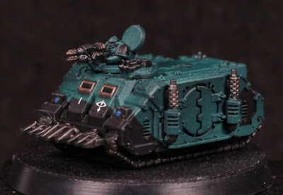
I could have posted earlier, but wanted to get the convoy finished up. No pictures of them all in a row because I don't have an appropriate background, but the idea is that two with the gunners and dozer blades are out the front, and the rest follow behind.

Ultimately I put far too much effort into these models, but they do look impressive all lined up. The main thing I would change is more shadow emphasis on the sides, and then recessed shading to give extra definition to the shapes. The models in general are uniformed in the colours, but I would like that to be slightly more the same shade. That's to be expected when using multiple Contrast layers over an uneven pre-highlight, which I'm sure will be improved on with a little more practice.

4 exhausts must mean 4 engines.

The black panelling was close to the usual grey black that I do, with one fewer step:

  • Abaddon Black
  • Corvus Black to highlight some panels, but mostly keeping it flat across surfaces.
  • Dawnstone to edge highlight.

That's really all. The focus is on defining shapes, not smooth blends: the models are far too small for anything else to matter. The front viewports are framed to give some more visual interest and create a slight focal point, but the "glass" is simply black - there was no intention to try make it look anything different. All of the metal parts are also painted black around here, which makes the metallic paint show up better afterwards. The viewport edges themselves were going to be simply Castellax Bronze, but I decided it needed to be brightened up slightly and so Sycorax Bronze was layered over the top.

Most metal was painted in Iron Warriors, with the exception of the tracks which were Iron Hands Steel. The exhaust stacks were very slightly highlighted with a mix of Sycorax Bronze and Iron Warriors, but it's not visually significant.

Caledor Sky for the headlights, some red dots on targeting lenses, and Warpstone Glow on hatch lenses. The latter could've been brighter, but also isn't necessary at all. Again, with the size, no sense in trying to give them a reflective look unless it's being entered into a competition.

Captain Blackdoor.

The final touches were decals of course, although a very (very) thin wash of black was added afterwards to tone down the otherwise bright white of those decals, and Wyldwood thinned with water and washed over the tracks. The intent was simply to muddy the tracks a little, make it seem like they've been driving over a battlefield and have picked up some dirt. I could have added some weathering as well, but it just doesn't seem worthwhile: the oil wash already dirties the tanks somewhat and gives them a used look.

I've considered trying to add magnets or cut small trenches in the tracks to put metal strips into, but ultimately I'll probably just make some kind of small boxes or sectioned tray to store them in. Varnish should protect the paint for a long while. A couple of Baneblades are next up for tanks, but there are many other works in progress that I'd like to finish off as well - guess I'll see what inspires me next.

-- silly painter.


Sunday, December 17, 2023

Sons of Horus Rhino Transports - Part I


Tiny Tanks.

Naturally I have something from Legions Imperialis. The full release box I couldn't justify, but a squadron of Rhino transports? Now that's something to play with.

I've decided to paint up the Epic models as Sons of Horus, simply to avoid the truly massive amount of red that I already have for 40K models. It does mean that some of the titans might have to be alternative colours to what I've already been dealing with, but there's time enough to ponder on that.

One of the driving goals here is to not care quite so much about the details on these models. There's no way I'm going to ever finish them if I try to paint them to the standard of their larger counterparts, but equally I didn't want them to be too bland. I'm trying for a basic colour, simple highlights, then fill in basic details. Keep the colours to a minimum, keep edge highlights to a minimum - if they're going to be done at all. Recess shading can serve just as well to help define shapes, and it's here that oil washes can be useful.

Turret gunner has eye lenses on the helmet.

Of course there are some mold lines that exist when pictured up close, but they're almost invisible when first priming the models. I'll have to keep an eye out for a few usual suspects later - for now almost all the troublesome areas will be painted black which should hide them again. And naturally I need to paint in eye lenses, because I can.

To start with on these models I used a thinned white (White Scar) to sketch out the basic highlight areas. This doesn't impact the end result, but it does make the model easier to see. I may well avoid this step in future now that I know what I'm doing. After this I coated the entire model with Sons of Horus Green. This serves as the mid-tone, and a follow-up Lupercal Green (which is a darker colour) in shaded areas. The trick behind this with an airbrush is to really thin the paints with flow improver and thinner. It's almost wash or glaze consistency, just enough to tint the existing colours more than anything else.

Once here I wanted to try something else and used Typhon Ash (thinned of course) to apply a pre-highlight. This should serve to keep the next step brighter in highlighted areas, but not substantially change anything darker. Terradon Turquoise through the airbrush using either thinning, or preferably just a smaller nozzle. The smaller nozzle means a finer spray of the Contrast paint, which should stop it from overpowering the pre-highlight like happened that last time I tried this. And it mostly worked quite well this time around, although I needed to apply two coats in places when I'd thinned it too much as well. Not every single rhino looks exactly the same when doing it this way - there is some slight variation in tone, saturation, etc, but it's close enough and practice will improve on it more.

While I'm happy with how this turned out, it's also far too many steps. In future I intend to give a darker blue base coat, sketch highlights with Typhon Ash again, and then directly to Terradon Turquoise. The result should be very similar, but with 3 fewer steps - and possibly something that could be done in a single sitting. I'll eager to try that out, but don't have any spare models to test it on just yet.

Oil washes are still annoying for me. Mixing up the wash, keeping a mask on because the "odourless" spirits still smell, and dealing with drying time are all very frustrating. I pin washed a couple of Rhinos, then got annoyed at how long that was taking and drenched most of the rest. Wiping away the excess also took a while, but unfortunately the cotton pads I was using caught on edges far too easily and put small fibres everywhere. I am not taking that approach again. I had forgotten a single Rhino, and so I tried a different approach with that one: black acrylic with water and dish washing liquid to help break surface tension. That works almost as well as the oil wash, but only across a gloss surface. So I'll need to gloss varnish before that, but I think it will be the approach I use in future.

Acrylic pin washed.

The oils still give sharper definition, but I think with a bit of practice and experimentation (perhaps with a Contrast paint, which might need less dilution with water) then I can improve on things more, even if it's good enough already.

Next step is going to be blocking in metal areas in black, adding some basic hull stripes or patterns, and decals. The decals are a problem though: putting them on hatches is problematic because of the centre line, which will obscure the decal, but also be troublesome for a decal to kind of fold into. I may need to resort to getting very good at free-handing the Eye of Horus.

-- silly painter.


Tuesday, December 12, 2023

Terminator Chaplain - Part I


Biggus Stickkus

Continuing with more airbrushing entertainment, I bought this model because it looked cool and I could. I really wanted to give one of the new scale terminators a go, but painting an entire squad didn't seem right quite just yet - I've painted enough terminators recently, plenty of other red armour to go, but never had a chaplain in terminator armour.

After a lot of debate about whether to go with the shield or the storm bolter, I ended up with the shield. I could have tried to magnetise the two, but really I wouldn't be swapping them over and the rule of cool won out. Also, it's likely that a Blood Angels Chaplain would only wear such armour in some kind of boarding action where the shield could be used to greater effect.

First order of business is the pre-highlight with thinned white. This is done with multiple coats to build up the gradients, and while there is some "noise", it's no more than if drybrushing were used. Using white here means I'm going for a grey volume highlight - I could tint it slightly for blue, or purple, or any other colour, but if I want to match it against other black armour in the army then grey it is. The initial pre-highlight works really well already to give shape to the model, but it would get darkened later.

I painted most edges with Administratum Grey to ensure they would be more visible later. Following this I used Ulthuan Grey on the more prominent edges to further brighten them in the hopes they would really show through later.

When in doubt, hit it with a stick.

After all the pre-highlighting was done, I went over it with thinned down Black Templar Contrast. This once again teaches me that I need to really make edges super contrasting with the surroundings if they'll show though later, but also I perhaps should have used a smaller needle size with the airbrush. Thinning was done just with flow improver, but I'm curious what Contrast Medium might do. Something to explore later.

I'll need to add some edge highlights again in places, and probably a few select recess shade applications wouldn't hurt either. I think overall though it worked mostly as intended - enough that I would use this approach over previous methods of black armour when painting squads.

I had the idea of keeping the model virtually entirely black, but I might just go for gold trim instead. I'm tempted to try NMM for that just to keep the reflective nature of metallic paints from being too disjointed against the black. Guess I'll see how it goes later - and the dreadnoughts do have priority.

-- silly painter.


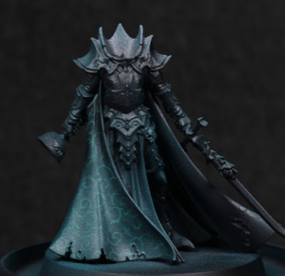
Karlina von Carstein - Part I


Cloak and dagger.

Needing a break from the dreadnoughts for a moment, I've decided to start some more models just for exploration of a few things. This is for motivational purposes more than anything else. Originally I was going to paint Karlina von Carstein far more simply - and I still intend to do the armour in possibly warmer metallic tones - but the cloak was too much of an opportunity to pass up. I've been experimenting with Contrast paints through the airbrush a lot recently, and I wanted to see if I could get a pattern showing through. Spoilers: mixed results.

The first step I took was a simple thinned white highlight. This isn't really a Zenithal highlight, but instead serves to sketch out how I want things highlighted. Sometimes this never makes any difference in the end, and only serves to better see the model - but that's still worth it in my mind.

With that much done, it was a bit of a painstaking process to then draw out some kind of pattern. I tried to go for something slightly fancy while avoiding any kind of tessellation which I felt would be far more difficult with the folds in the cloak, and also would give a much more mathematical look to what should be a cruel, aristocratic vampire. As I neared the end, I was somewhat worried that there wasn't enough contrast between the highlights and the pattern, and it would all depend on how thin the Contrast paint was.

My what a shiny cloak.

I used Terradon Turquoise to glaze the cloak. It was stronger than I thought it would be, and I definitely should have thinned it at least a little when going through the airbrush. The pattern was completely washed out in places, although in the right lighting it can still be made out. While this is a shame, I at least learned the valuable lesson of needing to thin that particular paint (others I find don't require it - this one does!), and also however much contrast I think I have beforehand: more is needed. Using the Contrast range as a glaze can overpower similar value colours underneath, so the more contrast in value then the more detail comes through afterwards. This is really noticeable as the original white highlights fade off up the cloak.

Need to get her head in the game.

I'm not certain if I'm going to try and go back over anything, or just leave it as it is. On the one hand it might look nice, but on the other I'm not entering this into competitions and I would really like to just finish off the rest of the model now. I'm pondering the armour colour, thinking that perhaps a red-brown tone to the armour would be suitable. I'd need to add some kind of dust and dirt of a similar colour to the hem of the cloak to balance it out a little, but I think it could work.

-- silly painter.


Thursday, December 7, 2023

Blood Angels Librarian Dreadnought - Part V


"I once caught a fish..."

Painting continues to be slow, and that trend will continue for at least another week. Consequently there does not appear to be took much progress on the dreadnought, but I have been experimenting with a couple of things.

Not seen in the photo are other winged blood drop symbols. I continued with the idea of mixing Contrast paints to see how that would turn out, without the need individually paint each "feather" separately. Mixing Apothecary White, Basilicanum Grey, and Contrast Medium seems to work alright, but I'm having trouble getting the ratios correct. Too much medium and the effect is far too minimal, requiring a second coat - and worse, the medium itself can build up and obscure detail. Too little medium and the effect is too dark. I'm only really interested in this type of approach for those details which are small and shallow, and otherwise too annoying to highlight individual lines.

I started to paint much of the left arm in a metallic paint, then stopped in one area and I've changed my mind - I'd rather have kept that red. I'll need to re-paint that area by hand, but that's for later as I go around fixing up mistakes. In general though, most other areas have their main colours decided on - always the most problematic step for me - so there's hope yet that I'll complete the model before the end of the year.

The base I've been thinking a lot over. I still have another similar base to paint for the Furioso Dreadnought, and I want to make the bases visually distinct to distract from them actually being the same sculpted base type. The bases obviously lend well to concrete or similar construction material, but could also lend itself to slabs of marble, granite, etc. This is when it occurred to me that there is one marble effect I've previously painted and want to return to, particularly because it's hidden beneath a model and not really visible: the "black with red veins of rock" marble on the base of Primaris Mephiston. Regarding colour and light theory, this won't separate the base from the dreadnought, but it will be different from other models.

Not much else to really say at this point. The exhaust ports I'll give a little more colour with metallics, which I find preferable to trying to give heat effects, and I still need to try out some mixes of washes or clear colour paints for piston oil effects. There's some Warhammer+ content on that which I may try out.

Other models are in planning stages, hopefully more on them soon.

-- silly painter.