Friday, December 29, 2023

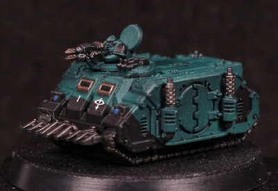
Sons of Horus Rhino Transports - Part II (Showcase)


Rhino to war.

I could have posted earlier, but wanted to get the convoy finished up. No pictures of them all in a row because I don't have an appropriate background, but the idea is that two with the gunners and dozer blades are out the front, and the rest follow behind.

Ultimately I put far too much effort into these models, but they do look impressive all lined up. The main thing I would change is more shadow emphasis on the sides, and then recessed shading to give extra definition to the shapes. The models in general are uniformed in the colours, but I would like that to be slightly more the same shade. That's to be expected when using multiple Contrast layers over an uneven pre-highlight, which I'm sure will be improved on with a little more practice.

4 exhausts must mean 4 engines.

The black panelling was close to the usual grey black that I do, with one fewer step:

  • Abaddon Black
  • Corvus Black to highlight some panels, but mostly keeping it flat across surfaces.
  • Dawnstone to edge highlight.

That's really all. The focus is on defining shapes, not smooth blends: the models are far too small for anything else to matter. The front viewports are framed to give some more visual interest and create a slight focal point, but the "glass" is simply black - there was no intention to try make it look anything different. All of the metal parts are also painted black around here, which makes the metallic paint show up better afterwards. The viewport edges themselves were going to be simply Castellax Bronze, but I decided it needed to be brightened up slightly and so Sycorax Bronze was layered over the top.

Most metal was painted in Iron Warriors, with the exception of the tracks which were Iron Hands Steel. The exhaust stacks were very slightly highlighted with a mix of Sycorax Bronze and Iron Warriors, but it's not visually significant.

Caledor Sky for the headlights, some red dots on targeting lenses, and Warpstone Glow on hatch lenses. The latter could've been brighter, but also isn't necessary at all. Again, with the size, no sense in trying to give them a reflective look unless it's being entered into a competition.

Captain Blackdoor.

The final touches were decals of course, although a very (very) thin wash of black was added afterwards to tone down the otherwise bright white of those decals, and Wyldwood thinned with water and washed over the tracks. The intent was simply to muddy the tracks a little, make it seem like they've been driving over a battlefield and have picked up some dirt. I could have added some weathering as well, but it just doesn't seem worthwhile: the oil wash already dirties the tanks somewhat and gives them a used look.

I've considered trying to add magnets or cut small trenches in the tracks to put metal strips into, but ultimately I'll probably just make some kind of small boxes or sectioned tray to store them in. Varnish should protect the paint for a long while. A couple of Baneblades are next up for tanks, but there are many other works in progress that I'd like to finish off as well - guess I'll see what inspires me next.

-- silly painter.


Sunday, December 17, 2023

Sons of Horus Rhino Transports - Part I


Tiny Tanks.

Naturally I have something from Legions Imperialis. The full release box I couldn't justify, but a squadron of Rhino transports? Now that's something to play with.

I've decided to paint up the Epic models as Sons of Horus, simply to avoid the truly massive amount of red that I already have for 40K models. It does mean that some of the titans might have to be alternative colours to what I've already been dealing with, but there's time enough to ponder on that.

One of the driving goals here is to not care quite so much about the details on these models. There's no way I'm going to ever finish them if I try to paint them to the standard of their larger counterparts, but equally I didn't want them to be too bland. I'm trying for a basic colour, simple highlights, then fill in basic details. Keep the colours to a minimum, keep edge highlights to a minimum - if they're going to be done at all. Recess shading can serve just as well to help define shapes, and it's here that oil washes can be useful.

Turret gunner has eye lenses on the helmet.

Of course there are some mold lines that exist when pictured up close, but they're almost invisible when first priming the models. I'll have to keep an eye out for a few usual suspects later - for now almost all the troublesome areas will be painted black which should hide them again. And naturally I need to paint in eye lenses, because I can.

To start with on these models I used a thinned white (White Scar) to sketch out the basic highlight areas. This doesn't impact the end result, but it does make the model easier to see. I may well avoid this step in future now that I know what I'm doing. After this I coated the entire model with Sons of Horus Green. This serves as the mid-tone, and a follow-up Lupercal Green (which is a darker colour) in shaded areas. The trick behind this with an airbrush is to really thin the paints with flow improver and thinner. It's almost wash or glaze consistency, just enough to tint the existing colours more than anything else.

Once here I wanted to try something else and used Typhon Ash (thinned of course) to apply a pre-highlight. This should serve to keep the next step brighter in highlighted areas, but not substantially change anything darker. Terradon Turquoise through the airbrush using either thinning, or preferably just a smaller nozzle. The smaller nozzle means a finer spray of the Contrast paint, which should stop it from overpowering the pre-highlight like happened that last time I tried this. And it mostly worked quite well this time around, although I needed to apply two coats in places when I'd thinned it too much as well. Not every single rhino looks exactly the same when doing it this way - there is some slight variation in tone, saturation, etc, but it's close enough and practice will improve on it more.

While I'm happy with how this turned out, it's also far too many steps. In future I intend to give a darker blue base coat, sketch highlights with Typhon Ash again, and then directly to Terradon Turquoise. The result should be very similar, but with 3 fewer steps - and possibly something that could be done in a single sitting. I'll eager to try that out, but don't have any spare models to test it on just yet.

Oil washes are still annoying for me. Mixing up the wash, keeping a mask on because the "odourless" spirits still smell, and dealing with drying time are all very frustrating. I pin washed a couple of Rhinos, then got annoyed at how long that was taking and drenched most of the rest. Wiping away the excess also took a while, but unfortunately the cotton pads I was using caught on edges far too easily and put small fibres everywhere. I am not taking that approach again. I had forgotten a single Rhino, and so I tried a different approach with that one: black acrylic with water and dish washing liquid to help break surface tension. That works almost as well as the oil wash, but only across a gloss surface. So I'll need to gloss varnish before that, but I think it will be the approach I use in future.

Acrylic pin washed.

The oils still give sharper definition, but I think with a bit of practice and experimentation (perhaps with a Contrast paint, which might need less dilution with water) then I can improve on things more, even if it's good enough already.

Next step is going to be blocking in metal areas in black, adding some basic hull stripes or patterns, and decals. The decals are a problem though: putting them on hatches is problematic because of the centre line, which will obscure the decal, but also be troublesome for a decal to kind of fold into. I may need to resort to getting very good at free-handing the Eye of Horus.

-- silly painter.


Tuesday, December 12, 2023

Terminator Chaplain - Part I


Biggus Stickkus

Continuing with more airbrushing entertainment, I bought this model because it looked cool and I could. I really wanted to give one of the new scale terminators a go, but painting an entire squad didn't seem right quite just yet - I've painted enough terminators recently, plenty of other red armour to go, but never had a chaplain in terminator armour.

After a lot of debate about whether to go with the shield or the storm bolter, I ended up with the shield. I could have tried to magnetise the two, but really I wouldn't be swapping them over and the rule of cool won out. Also, it's likely that a Blood Angels Chaplain would only wear such armour in some kind of boarding action where the shield could be used to greater effect.

First order of business is the pre-highlight with thinned white. This is done with multiple coats to build up the gradients, and while there is some "noise", it's no more than if drybrushing were used. Using white here means I'm going for a grey volume highlight - I could tint it slightly for blue, or purple, or any other colour, but if I want to match it against other black armour in the army then grey it is. The initial pre-highlight works really well already to give shape to the model, but it would get darkened later.

I painted most edges with Administratum Grey to ensure they would be more visible later. Following this I used Ulthuan Grey on the more prominent edges to further brighten them in the hopes they would really show through later.

When in doubt, hit it with a stick.

After all the pre-highlighting was done, I went over it with thinned down Black Templar Contrast. This once again teaches me that I need to really make edges super contrasting with the surroundings if they'll show though later, but also I perhaps should have used a smaller needle size with the airbrush. Thinning was done just with flow improver, but I'm curious what Contrast Medium might do. Something to explore later.

I'll need to add some edge highlights again in places, and probably a few select recess shade applications wouldn't hurt either. I think overall though it worked mostly as intended - enough that I would use this approach over previous methods of black armour when painting squads.

I had the idea of keeping the model virtually entirely black, but I might just go for gold trim instead. I'm tempted to try NMM for that just to keep the reflective nature of metallic paints from being too disjointed against the black. Guess I'll see how it goes later - and the dreadnoughts do have priority.

-- silly painter.


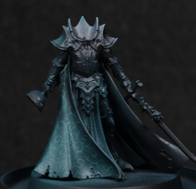
Karlina von Carstein - Part I


Cloak and dagger.

Needing a break from the dreadnoughts for a moment, I've decided to start some more models just for exploration of a few things. This is for motivational purposes more than anything else. Originally I was going to paint Karlina von Carstein far more simply - and I still intend to do the armour in possibly warmer metallic tones - but the cloak was too much of an opportunity to pass up. I've been experimenting with Contrast paints through the airbrush a lot recently, and I wanted to see if I could get a pattern showing through. Spoilers: mixed results.

The first step I took was a simple thinned white highlight. This isn't really a Zenithal highlight, but instead serves to sketch out how I want things highlighted. Sometimes this never makes any difference in the end, and only serves to better see the model - but that's still worth it in my mind.

With that much done, it was a bit of a painstaking process to then draw out some kind of pattern. I tried to go for something slightly fancy while avoiding any kind of tessellation which I felt would be far more difficult with the folds in the cloak, and also would give a much more mathematical look to what should be a cruel, aristocratic vampire. As I neared the end, I was somewhat worried that there wasn't enough contrast between the highlights and the pattern, and it would all depend on how thin the Contrast paint was.

My what a shiny cloak.

I used Terradon Turquoise to glaze the cloak. It was stronger than I thought it would be, and I definitely should have thinned it at least a little when going through the airbrush. The pattern was completely washed out in places, although in the right lighting it can still be made out. While this is a shame, I at least learned the valuable lesson of needing to thin that particular paint (others I find don't require it - this one does!), and also however much contrast I think I have beforehand: more is needed. Using the Contrast range as a glaze can overpower similar value colours underneath, so the more contrast in value then the more detail comes through afterwards. This is really noticeable as the original white highlights fade off up the cloak.

Need to get her head in the game.

I'm not certain if I'm going to try and go back over anything, or just leave it as it is. On the one hand it might look nice, but on the other I'm not entering this into competitions and I would really like to just finish off the rest of the model now. I'm pondering the armour colour, thinking that perhaps a red-brown tone to the armour would be suitable. I'd need to add some kind of dust and dirt of a similar colour to the hem of the cloak to balance it out a little, but I think it could work.

-- silly painter.


Thursday, December 7, 2023

Blood Angels Librarian Dreadnought - Part V


"I once caught a fish..."

Painting continues to be slow, and that trend will continue for at least another week. Consequently there does not appear to be took much progress on the dreadnought, but I have been experimenting with a couple of things.

Not seen in the photo are other winged blood drop symbols. I continued with the idea of mixing Contrast paints to see how that would turn out, without the need individually paint each "feather" separately. Mixing Apothecary White, Basilicanum Grey, and Contrast Medium seems to work alright, but I'm having trouble getting the ratios correct. Too much medium and the effect is far too minimal, requiring a second coat - and worse, the medium itself can build up and obscure detail. Too little medium and the effect is too dark. I'm only really interested in this type of approach for those details which are small and shallow, and otherwise too annoying to highlight individual lines.

I started to paint much of the left arm in a metallic paint, then stopped in one area and I've changed my mind - I'd rather have kept that red. I'll need to re-paint that area by hand, but that's for later as I go around fixing up mistakes. In general though, most other areas have their main colours decided on - always the most problematic step for me - so there's hope yet that I'll complete the model before the end of the year.

The base I've been thinking a lot over. I still have another similar base to paint for the Furioso Dreadnought, and I want to make the bases visually distinct to distract from them actually being the same sculpted base type. The bases obviously lend well to concrete or similar construction material, but could also lend itself to slabs of marble, granite, etc. This is when it occurred to me that there is one marble effect I've previously painted and want to return to, particularly because it's hidden beneath a model and not really visible: the "black with red veins of rock" marble on the base of Primaris Mephiston. Regarding colour and light theory, this won't separate the base from the dreadnought, but it will be different from other models.

Not much else to really say at this point. The exhaust ports I'll give a little more colour with metallics, which I find preferable to trying to give heat effects, and I still need to try out some mixes of washes or clear colour paints for piston oil effects. There's some Warhammer+ content on that which I may try out.

Other models are in planning stages, hopefully more on them soon.

-- silly painter.


Wednesday, November 22, 2023

Blood Angels Librarian Dreadnought - Part IV


Hey goa'uld, I can do that too!

(There will be grammar and spelling mistakes, but if I don't get this written out now then it'll be another week before I have the chance.)

There hasn't been much time for painting progress, but I have filled in some dreadnought details. This makes the model look far more complete than it really is - there are still arms to do, the power plant, the base, final edge highlights, decals, etc. It's nowhere near complete.

I actually decided to brighten up the edge highlights of the blue. This was just mixing a little more Baharroth Blue into the mix still on the palette and very carefully applying it to the most prominent edges.

Not too much to say about the yellow details. Again, I might highlight the motif on top with more white to give it a more reflective appearance, but that's a step for another time. Averland Sunset, Yriel Yellow, Phalanx Yellow. Same as used on the side cabling, although those were shaded with Agrax Earthshade and Seraphim Sepia.

The keys and Librarium symbol are plain Grey Knights Steel right now, with a slight Drakenhof Nightshade (barely visible). I'll do more of those details after the varnishing stage probably. The background is a little more interesting and was some experimentation with metallics in volume highlights. Warplock Bronze and Balthasar Gold, mixed in varying degrees and glazed. I like how it shows so far, but I'm aware that varnishing will change it considerably. I had intended to see if it would be something that might be suitable for shading, but I don't think I'll use in future - I'll stick with shade paints for the moment in similar situations.

The eyes on the helmet I debated leaving alone, but with more details done it was apparent something needed to draw attention back there. To that end I'm going for a glow effect, but it won't be anything particularly special: white (Corax White here) and a Contrast paint (Aethermatic Blue most likely).

The chained book cover is Lupercal Green. I mixed in a very, very small amount of white to highlight the upper edges mostly to see how the colours would mix rather than for any visual difference; the detail is too small for highlights to be noticeable.

Scrolls and paper used very similar colours to the normal approach for purity seals, but some slight variation:

  • Steel Legion Drab as a base coat.
  • Zandri Dust mixed into the previous colour and built up to pure Zandri Dust for initial highlights.
  • Agrax Earthshade glazed into recessed areas.
  • Seraphim Sepia glazed over selected papers to make them appear more aged.
  • Ushabti Bone built up for further highlights.
  • Pallid Wych Flesh glazed over more as appropriate.

The last steps used a small amount of Lahmian Medium to build up the glaze. Particularly for brighter or whiter colours, using a medium to thin it to glaze consistency gives a much smoother result than water. At a guess, water separates the pigment too much and leads to chalkiness, whereas a flow improver simply thins without changing too much else of the chemistry.

Lastly for the details so far: the winged blood drop icon. I wanted that to be white winged, but not with black shading. Blue is still much more indicative of sky, angelic, heavenly, and so I still wanted blue tinted recesses. To that end:

  • Corax White, with multiple thin layers to get an even, opaque coverage.
  • Apothecary White / Talassar Blue / Contrast Medium in a 1:1:2 mix, and heavily applied all over.

That's all. There's a much greater glow in the photo than in real life, and there's no real need to edge highlight anything. Contrast paints excel at this kind of task. If I were to continue with many more of these symbols I would play with the paints and dilution more, but for now it's ok. I can always knock it back further with Apothecary White later on.

Next steps are to fill in some metallic areas around the torso, perhaps some cabling, and then start to look at next pieces of the model. There will be a general harmonising at the end along with filling in the last details in one go (e.g gemstones) but it's about time to start more assembly.

-- silly painter.


Sunday, November 12, 2023

Blood Angels Librarian Dreadnought - Part III


'tis but a scratch!

Back to very little for painting again. This is a little frustrating, but I'll see if I can adjust to take more advantage of the precious free time I have, to be more efficient in my approach. This alone is a shame - I enjoy taking my time to paint a model, but I have far too many to get through to be quite so picky right now.

The metalallic parts are simple enough to need to explanation, and they 're not exactly the focus of the model. I will do more on them later for oil stains, lubricants, that sort of thing, but I'll try not to go overboard. I refer to them as "background framing" and don't really hold the viewer's attention - as a result, they can be rather simplistic without the overall quality of the model diminishing.

The "head" (or helmet, or sensorium, who knows) is a base of Balthasar Gold, some sepia tones washed over that, and highlighted with Gehenna's Gold. Just enough to glue everything in place. I'm still thinking over the eyes and if I'll leave them as they are, or do the whole Librarian psychic eye glow thing. Depends if I'll need to draw more attention there once the other details are filled in.

The blue sarcophagus is the most outstanding visual difference since the last update. I knew I wanted a darker blue, tending to black, in shadows but didn't want the cobalt blue of an Ultramarine for highlights. This keeps Librarians different and their own separate group. I ended up going with:

  • Night Lords Blue / Black (1:1 ratio). I also started moving more towards pure Night Lords Blue in those areas not within shadow.
  • Kantor Blue transitioned as first stage highlight, which was done through a combination of glazing and mixing on the wet palette with the previous paints.
  • Macragge Blue as a second stage highlight. Some care needs to be taken here, and it was again mixed with the previous step first. The real catch is that Macragge Blue is a step up in brightness, but also a deviation in tint from the other blues. It definitely benefits more from glazing for this reason, otherwise it's very difficult to get a smooth transition.
  • Druchii Violet used for recess shading. While I considered Nuln Oil or Agrax Earthshade, The red hint from violet gives a deeper and richer shade without desaturating. Just a fancy way of saying it looks more interesting. Also, Blood Angels. Perhaps a darker green would be suitable for Salamanders or Dark Angels.
  • Baharroth Blue mixed with Macragge Blue for edge highlights. Baharroth Blue on its own is far too much of a colour shift (it has more green in there) and looks completely out of place. An alternative to mixing is to edge highlight with Baharroth Blue, then glaze back over it with Macragge Blue to pull it back into an acceptable range.

For now the edges don't quite "pop" as much as I would like, so I may bump the contrast just a little more after varnishing.

And that's about all for now. Next I will likely start to fill in more details, particularly as the parchment should use very similar colours and should be relatively easy motivational wins. I will plan to simply get a small selection of paints and finish off details as I go around the model (with the arms yet to be properly started!). I'll leave armour edge highlights until after varnishing as that seems to be a good harmonising step.

And the moment I've been dreading is soon here: Legions Imperialis. I don't want to buy masses of those models to just sit in boxes, so I might simply buy one box at a time and paint it up before I allow myself to buy another. It will cost more in the long run perhaps, but it will keep the backlog more manageable.

-- silly painter.


Thursday, November 2, 2023

Terminator Squad - Part VI (Showcase)


Astartes Firestarter

Having now finished the Terminators and had a chance to compare before/after photos of the final edge highlighting, I've realised that the difference doesn't really show up on photos. This actually confirms what I suspected: the finish of the paint matters just as much as the pigment, and the lighting conditions and camera sensors have a habit of washing out some of that. The paint is ever so slightly more satin than the matt varnish, which makes the largest difference in the final edge highlight stage. Good to know.

That smile....

Overall I'm not the most impressed with the armour shading. I've done a lot better. I did learn a thing or two about the new approach tried here at least, and that will definitely feed into the next squad. The contrast between highlights and shadows simply isn't enough, but I'm fairly certain I can fix that in future.

With that much armour, quite why a low, stable stance is needed isn't clear.

Edge highlighting at the end has some benefits: it can be seen how the overall model needs to be adjusting. Doing it too early can be a bit of a waste in attempting to show off every single edge. Most often I actually needed to define the bottom of the left pauldron and keep it more distinct from the rest of the arm.
"Space Hulk Stance"

The bases do add some height. It is noticeable compared to other models, but I think worth the effect in also making the Terminators seem slightly larger.
Unfortunately the weapon targeting lens is a bit of a mistake. Not in the colours or technical approach, but it sticks out and draws more attention than I'd like. I should have left them alone here, or made them much darker at the very least. Perhaps one of the darker metallics underneath the gel paint.
More targeting lenses!

One of the more wise decisions was not attempting to paint details in a multitude of colours. Keeping things simple is not only easier to paint, but doesn't clash with the rest of the model. There are a few special details on most models, but they're the exception that proves the rule: less is more. Don't try to make the model "busy", or it just ends up messy.

I bought a Terminator Chaplain (because that model really looks cool), so between these models and that purchase the count is now at 4.5. I'm almost certain to break the count for the upcoming Legions Imperialis, where it's hoped I can paint those things much, much more quickly. I don't go for speed painting, but neither do I intend to put quite as much detail into that smaller scale.

-- silly painter.


Monday, October 30, 2023

Terminator Squad - Part V


Marshmellow Man's worst nightmare.

It's been a little longer than I'd planned since the last post, thanks to a few health issues (amongst other things). So these Terminators aren't quite done yet, but they are very close. They've all just been given a matt varnish, leaving some metallics, spots of gloss varnish, a few minor details....and edge highlights.

From the start I've been planning to give these models final armour edge highlights only towards the end of the process. The matt varnish simply dulls everything down too much otherwise. Actually I already applied a "pre-highlight", which now I need to go over again - and yes, this makes everything take that much longer, but still works in batch painting mode.

A note on batch painting: again, this is something generally not for me. I don't batch paint, so it's not actually what I did. I only had three colours (reds) I was using, which stayed on the wet palette, and I did one model at a time over the course of a couple of days. It's the same concept of batch painting, but not done in one sitting. Actually that approach in general was done to bring all the models to a similar level of completion around the same time: the reds, blacks, metallics, purity seals. I just keep the wet palette handy and do the same part of each model at different times of the day. When it comes to individual details, there's actually not a whole lot left over and they can be finished relatively quickly (and with more motivation).

On the heavy flamer for example, I picked out a checkered pattern on the side just to break up the monotony of colours a little. I was inspired by painting schemes of Rogue Trader and 2nd Edition, deciding to give it a little bit of flair. As something unique I was also far more interesting in seeing how it would turn out (bonus for motivation), and with the model already mostly complete I could immediately see if it worked or not.

Ultimately, health issues aside, I think the adjustments to the process have worked, and I'll continue to see how I can tweak my painting pipeline to get through more models without reducing the quality of the finish. I also now have a reference to compare before/after final edge highlights. Hopefully not too much longer and the squad will actually be done.

-- silly painter


Thursday, September 28, 2023

Terminator Squad - Part IV


The crux terminatus of the matter.

Free time to paint has been very rare recently, so I'm not getting a whole lot done. As a consequence, posts are becoming fewer and further between - and this one won't be very long at that.

I've managed to finish the bases on the Terminators. They do look much nicer all painted up, and while I haven't yet compared them next to anything else just yet, the paint slightly hides the "standing on a hill" effect from before and makes the older models seem just slightly larger than they are. Only slightly, but I'm hopeful it'll be enough to fit in with the rest of the army better.

I didn't put any effort into the skulls. Wraithbone, Skeleton Horde, highlight with Wraithbone again. I could do more, pick out edges, deepen shadows, and some variation, but really there's not much point. Defined enough, moving on!

Rocks I tried something new with:

  • Mechanicus Standard Grey
  • Agrax Earthshade, notably where rock meets sand.
  • Stormvermin Fur (which ties it into the Zandri Dust of the sand more)
  • Terminatus Stone (of course)

Actually the rocks came out rather well. I need to experiment with mixing other colours for variation - shifting the grey with greens, purples, browns, creams, reds, etc, instead of just monotonous grey.

Nothing else is yet new. I've been painting the blacks, eye lenses, Crux Terminatus icons, etc, all in a batched method. Relatively few paints are involved, and with the wet palette I can just do a little every so often throughout the day. I'm not going to be fancy with most of the smaller details, instead relying on metallics to give them some visual interest. I'm steadily headed into "just get them done" mode, and will get as far as I can with batched painting before switching to individual, unique details. I also want to buy a few new things, so need more models finished first.

Lastly, the armour still hasn't had final highlights applied. I'm holding out there until most other details are done, and I'm expecting it will make the armour "pop" that little bit more without the need to be so precise earlier on in the process.

All told, at least another couple of weeks before these are finished. If I had a couple of days with just a few hours of free painting time then a week easy, but I don't and so at least two weeks it is. That's also very probably going to be my next post, but we'll see.

-- silly painter.


Thursday, September 14, 2023

Jain Zar - Part II (Showcase)


That's an impressive pony tail.

It's been a little while since I was last intending to post, but things keep getting in the way right now. I'm having to restructure routines a little bit, so I suspect for the rest of the year painting will be sporadic again, but it certainly won't stop. And despite not getting much else done, I have at least managed to complete Jain Zar.

(note: forgive many spelling and grammar mistakes that will no doubt exist - I need sleep!)

I'll admit that I lost some motivation part way through this model and it took a bit of a change of perspective to get that back and complete it. I basically decided not to care so much about painting precision (which is very much Golden Demon style) and care more about the "feel" of everything. That's not to say I'm unhappy with the model, quite the opposite, but it's not competition level.

Last time I had some trouble deciding on how to paint the various "red" material (cloth, streamers, grips, etc). One of the differences between materials that gives visual clues to how hard the surfaces is, comes from reflections: strong edge highlights, value contrast, bright points, all give an impression of a hardened surface reflecting light. Keeping midtones and shadows, but without much in the way of highlights, will give more of a cloth impression and is exactly what I did for the loincloth. Deepened the shadows with blue mixed with burgundy, increased some areas with Mephiston Red added instead, and that was about it. The hairband increases the light/shadow contrast and has a Druchii Violet wash to help give definition, but the extremes aren't like edge highlights on armour. The streamers are just glaze highlighted with Mephiston Red and not much else.

The handles I thought worked well enough that I might start to use something similar on future models:

  • Barak-Nar Bugundy
  • Druchii Violet
  • Word Bearers Red, focusing more on surfaces facing any light source.
  • Tuskgor Fur, and more prominent highlights.

The hair I like the least, mostly because black hair is difficult enough at the best of times and yet I wanted it distinct from some of the armour. I ended up with:

  • Daemonette Hide lightly brushed over the upper areas.
  • Night Lords Blue mixed in and the lightly brushed over lower areas that still received highlights.
  • Mephiston Red / Dryad Bark (1:1) mixed in again and sparingly added to shaded areas.
  • Nuln Oil to add some depth around where the hair meets other surfaces, e.g around the mask, hairband.

Black armour is semi-NMM heavily influenced from Juan Hidalgo's tutorials:

  • Skavenblight Dinge to place some reflection points and highlights.
  • Stormvermin Fur glazed to increase the value of those points.
  • Administratum Grey for more extreme edges.
  • White for dots of the brights points.
  • Black glazed as appropriate to smooth transitions or darken areas.

The real difference is that the armour is more black than steel. The weapon uses the same colours as I use for Blood Angels black armour, while a little Dark Reaper and Thunderhawk Blue (glazed back where necessary) give the shaft minor visual interest.

The eyes are very simple: Ulthuan Grey, White Scar, and then Aethermatic Blue. It's not enough to really bring focus to the face too much (at least not from the angle the photo is taken), but I'm not entirely sure I want that - I want the miniature as a whole to be the focus, not one individual part of it; it's difficult to get an impression of fluid motion if all the attention is on the mask.

Spirit stones are Mephiston red and Yriel Yellow mixed in various proportions, with the usual black darkened area and a white spot highlight (and then gloss varnish at the very end).

The blades I tried some NMM with. Very similar to the black armour, but swap out Administratum Grey for Ulthuan Grey and shifting everything into the bright grey spectrum rather than black. I played with inks a fair bit as they're very useful for glazing: black for the black areas of course, but a little crimson to reflect the streamers, and green (with a blue tint) for the tri-blades. I also had some of the Night Lords Blue on the palette and so mixed that with Ulthuan Grey and very (very) lightly glazed that on top of the other weapon as a sky reflection. That glaze is really the keystone to it all. There are of course glazes and glazes and glazes to try get some blending going on, during which I realised that very shiny metal quite often doesn't have smooth blends because it's reflecting solid objects with defined borders.

Am I happy with the blade NMM? No, not really, but I can myself starting to understand it more and with practice I'll probably be semi-decent at it one day.

With Jain Zar done, the could should be at 13, however I bought some Assault Intercessors and old-school jump packs while the latter are still available. I just think that combination looks better than the newer design, personal preference. That effectively brings the count back down to just 3. This makes me want to finish the Terminators next while I look around for motivation to get back onto the Dreadnoughts.

-- silly painter.


Sunday, September 3, 2023

Terminator Squad - Part III


Chainfist. For when you really want to cut something.

It's been a little while since the last post, what with travel, work, and a bunch of other hobby time intrusions, and sometimes it can be difficult to get moving again on projects. Which is actually something that "background projects" can sometimes help with (at least for me).

I've lost a little steam on the Dreadnoughts and Jain Zar, and the latter in particular is very difficult because I simply don't have the motivation and inspiration to figure out what or how to paint next. The one thing that does help me get over this is to finish a model - a catch 22 when it's the lack of motivation stopping me from progressing. Switching to a background project, such as these Terminators, is what helps get me back on track: there are no surprises in what or how to paint everything. I just need to get it done - and there's the second problem. Getting started again, even without blockers, is sometimes difficult by virtue of not knowing where to start; I want the models done, but don't feel like grinding through it all.

To get some level of progress there visually needs to be a relatively high level of change from minimal painting effort. Metallic details (here I'm trying Iron Hands Steel, though perhaps it's a little too bright - I'll know after the matt varnish stage) are a good way to start - just load some on the palette and work away at each model. I don't need to swap paints around, and each "session" can be just five or ten minutes. I don't need to sit for hours to paint models - quite frequently I only do a small bit over a handful of minutes, then come back later for a few minutes more. That one colour on the palette all setup and ready means I can just go at it the moment I feel motivated.

After the metallics are in place, black paint on any chest Imperial Aquila, chapter symbols, gun casings, just setting the base colour for next steps. I can later go back over again with only a small selection of paints to fill in the highlights and shading - and suddenly the models are starting to look a lot more completed (even if they're not really), and I'm starting to get motivated to do more.

I still need to apply black shading to some recesses on the Terminators, and the I'll likely get one of the most troublesome bits out of the way: black weapon casing highlights. They take a while for me to do properly, and I will really try next time to mask off some of the areas and hit it with the airbrush (or rather hit it with paint sprayed out of the airbrush) to see if that will be more efficient. Still, I'll work at it over the next day or two, and then get started on the Crux Terminatus of each, followed by the eye lenses. Somewhere in there I'll very likely start to pick out pieces on other models and get those projects moving forwards as well.

That's the plan anyway, so I'll see how it pans out in a week.

-- silly painter


Monday, August 14, 2023

Boarding Actions Terrain - Part I


Let's look behind door #1.

For something different I've been experimenting with assembly and coming up with a painting approach for the boarding actions terrain set. I know I have a whole heap of other models to finish as well, but the past week has been a little messed up and I haven't had much in the way of spare concentration or motivation. Playing around with a terrain test piece was just something to be done very casually. I'm also away with travel once more soon, so it'll be another couple of weeks before I can post again.

I also make no apologies for the extra number of spelling and grammar errors. My head isn't in the best shape right now.

The boarding actions terrain box contains a lot of plastic. From the outset I knew this wasn't going to be something I could spend a long time filling in details on, performing perfect blends, etc. I'm also going to need to limit the colours used for the majority of it - I won't be giving individual colours to each key on the keypads for example, cables are likely all to be the same colour, etc. Mostly I need things simple, or I'll never get it all done.

To begin with: assembly. I spent ages scraping and filing down mould lines, and that just was never going to happen for all of it. So I've invested in a couple different grits of sandpaper and tried that on all the doors. A lower grit to perform some fast removal of mould lines, higher grit to smooth the surface later. It worked surprisingly well, and should work even better on the larger wall sections

There are small pieces that glue onto wall sections, mostly to hold the doors in place while allows them to swing open and shut. I considered for a while if I should glue it all together first, or paint the doors and wall sections separately. I opted for the latter, but the "door hinges" can be easily attached with pva glue for priming and airbrushing, and then properly glued in place when the door is ready. The catch with that is that if too much paint is applied on the door then it can cause the door to get stuck and not open/close properly.

Looking around for colour inspiration, I ended up liking those used by Duncan Rhodes. I didn't end up copying direction, but I was definitely influenced by the look. Starting with a black primer, I then used thinned down (a lot) White Scar to give a basic lighting scale. Several layers were used to build it up slowly, making it much lighter near the top; the floor area would accumulate far more dirt, stains, etc, and is going to be further away from light sources and so should be darker. Thin airbrush paints from Citadel, they do need it. I'm learning a lot more about thinning paints through an airbrush and basically building up just like with palette paints. After this step, Space Wolves Grey straight through the airbrush, and that's the basic wall background colour.

The doors I wanted to stand out, but not conflict with the wall. I thought about it for a while, and then while looking at recent bases painted for the MkIV Assault Squad and Azrakh, it just seemed a perfect fit for the doors. I haven't finished it yet, but it's the same basic approach: metallic (Leadbelcher here but I've done the rest of the doors with Iron Hands Silver, which is much darker), Incubi Darkness, and building up from there. The photo still needs some Rhinox Hide dirt and rust, and then probably Leadbelcher (or something) on corners and edges.

The little sign panels are so far white with Reikland Fleshshade followed up with Seraphim Sepia to give that rust stained look. Not sure how I'll paint the framing and symbols/numbers just yet. Maybe a bronze outline, and red symbols.

I did try an ink thinned with a hefty amount of flow improver to use as a wash over the whole surface, and then used a damp brush to clean up some the more flat areas. I'm convinced this can work, particularly because the ink and flow improver takes a little while to dry, but here I think it was thinned too much and didn't really show up much once it dried. I'm going to try an oil wash next, but not until I've painted in more cabling and piping. I've bought cotton pads to wipe off most of the oil wash, and might end up using a paint brush to be more precise in areas. I'll decide if a drybrushing pass to pick out edges is needed after that or not - maybe it would add some more, but it's also a time consuming step that could easily be carried too far.

I will very likely paint some glow around the lights, but deciding which light is "on" is another decision that will take time. In the photo above it would look out of place if the door was closed but included with any lighting glow, and it would look equally out of place if there was a glow while the door was open.

Finally, select few details will probably be done to a higher standard to the bulk of the wall and doors, because it's the details which stick out and catch most of the attention. Putting more effort into smaller areas might come across as counter-intuitive, but I find myself looking at them more than other areas and so deserving of extra attention.

-- silly painter.


Sunday, August 6, 2023

Blood Angels Furioso Dreadnought - Part I


Some serious upper body strength.

While the Librarian is moving painfully slow, I decided to get the next Dreadnought started - a Furioso variant. This will share many of the same painting steps and so I decided to get both to about the same starting level before continuing - as such, this post is mostly about airbrushing.

To begin with, I somehow managed to damage the tip of the "good" needle for my good airbrush. It's still functional and so I won't buy a replacement just yet (unless the next time I use it causes problems), but it really does show how careful one must be with them. I don't even know how I managed it.

Anyway, the first thing done on this model was to try and airbrush some of the metal components. That proved less than stellar. The Air range from Citadel is a bit hit & miss at time, but the metallics are very poor in my opinion. The coverage isn't great, the result is "noisy" (for lack of a better term), and they clog readily. I might have to try again at some stage with a larger nozzle size and little bit of flow improver and thinner. This will necessitate multiple coats, but might give a better result. I might even have something perfect to test that against soon.

With the red armour I intended to use a larger nozzle (0.4mm) to base coat and run through an initial highlight, but wasn't thinking and used the smaller (0.2mm) instead for everything. At least I had good control: even if I was being lazy and didn't mask edges off this time when highlighting, the result was mostly good enough. It was also a good test to see how the colours and control might go on larger batches of smaller models.

In any case, the usual 1:1 mix of Dryad Bark and Mephiston Red was applied all over, and then highlighted up with Mephiston Red. I've been learning to use thinner and flow improver a lot more, and other than not clogging up the airbrush as much, I'm very tempted to apply both on the Mephiston Red step and use more layers in future. I'll experiment and perhaps pre-mix a bottle if it works out. Next up was a 1:1:1 mix of thinner, flow improver, and Averland Sunset. Just like before, I then went over it with Blood Angels Red directly from the pot. The Averland Sunset I perhaps should have used a second layer with - it was quite as bright in some places as I would have liked - but I can hopefully fix that with some appropriate edge highlighting in places.

The lessons to take away: thin the paints before going into the airbrush, mask off edges on larger models to keep proper shading and that flat panel look, and go brighter than you might think with the Averland Sunset step. With the thin paints I think this is where an airbrush can really shine: use something thicker for a base colour to setup with, and then use thin layers to build up glazes and filters of colours. Less speckling, more control, and easier to clean.

-- silly painter.


Jain Zar - Part I


"Storm of Silence", or maybe "Silent, but deadly."

Another model that has been sitting in the pile for a while is the relatively recent Phoenix Lord of the Howling Banshees: Jain Zar, the Storm of Silence. I really like the sculpt, a refresh of which was sorely needed compared to the old one. This new version is an even more dynamic pose and really sells this idea of a dancing whirlwind of blades, graceful but with terrible purpose. To do that, the sculptor obviously wasn't going for inredible realism, not with that amount of hair - and I think that's best. This is a model, meant to capture the feeling a particular character and their traits rather than be an accurate depiction of their physical form. That's always been the case for Games Workshop, but I think this model captures the idea particularly well and I've been thinking how to paint it for quite some time. I will state that I did not, and do not, intend to paint this model to the same technical level as Azrakh. That model was for learning more than anything else, and this one I want to play more with the overall composition of light and colour.

Originally I had intended to paint the armour in a similar bone pattern to the Avatar of Khaine, but when I came to it, it just didn't seem to fit. The armour has hardened surfaces, but don't really look like additional pieces compared to the rest of the bodysuit - more like they're part of it, not overlaid. Something rigid like bone wouldn't do.

Looking back at the original model there are blues and violets, which is when I was struck by an odd piece of inspiration from the background story. Jain Zar existed before the Fall of the Aeldari, and was apparently part of a precursor to Drukhari - which traditionally are painted with a hefty amount of purple. The particular power in the warp that spawned from the downfall of the Aeldari is also often painted with purples, violets, and burgundy. It occurred to me that this probably came from colours of the Eldar civilisation - and so the armour of Jain Zar might have a nod to that.

To start with the colours, the blade isn't final. That was simply messing about with blues on the palette, and I intend to paint over it later - although I do like the idea of a blue hint to the blade. The hair I had also airbrushed first, using some purples and whites in very thin layers to build up the volumes...and then promptly ruined the lot by using Black Templar over the whole thing. I thought it was thinned enough, but everything just went black again afterwards. Oops.

The main armour is a combination of six paints, however only three of them are really needed. I used six because I wanted to get a feel of the paints, not for any transition reasons, and I did blend between all of them on the palette quite a lot. The closer a paint comes to white, the more difficult I find it to glaze and blend with other colours, and it took quite a while to get this far. I also tried to avoid very strong value contrasts between "panels" and "garment" - I wanted to give an impression of a hardened surface that is also part of the more flexible material, and softening the edge transitions can help do that. The colours used are:

  • Barak-Nar Burgundy, mostly in shadowed areas.
  • Daemonette Hide.
  • Warpfiend Grey.
  • Slaanesh Grey.
  • Ionrach Skin.
  • Deepkin Flesh.

If I were to choose only three, I'd go for Barak-Nar Burgundy, Daemonette Hide, and Ionrach Skin. Those were the colours used the most, and mixing to various degrees between them can give close approximations to the others.

The lighter areas are the right breast, right side of the face, and right arm. I imagined the light coming from the weapon, or close by it, fading towards darker colours on the opposite side and towards her feet. This would naturally draw the eye to upper chest, and I'm hoping a spot of colour on the mask will draw attention more directly to the facial area. I've yet to decide on which colour for the eyes - red, blue, or teal. The vambrace and and other more obvious armoured parts I'm intending to borrow from something done on Azrakh by making them "shiny black" rather than silver, with a little Dark Reaper just to add interest (I'll probably using Thunderhawk Blue to highlight that just a little more later on). I'd considered using metallic paints, but that somehow doesn't gel with the concept of the Aeldari using Wraithbone for their manufacturing, and the shiny surface would almost certainly detract away from everything else. So in this case, using NMM techniques again seems appropriate.

I've used Barak-Nar Burgundy as the base colour for cloth, weapon grips, etc, merely as a colour sketch at this stage. I'll probably go for reds on the spirit stones, maybe a blue here or there, and the burgundy seemed appropriate as a starting point. I don't want a bright red, so I'll see where this takes me.

The base came about almost by accident. While I didn't want bone coloured armour on Jain Zar, it did seem suitable for the ruins of some ancient shrine perhaps. Morghast Bone, Seraphim Sepia, Skeleton Horde, and Screaming Skull. Actually Seraphim Sepia looks very much similar to Skeleton Horde, with the paint consistency more the different than anything else. While doing that I realised that it was a good value contrast to Jain Zar; she is using darker tones overall, and so a brighter and more colourful base might serve as a good contrast to that. I also reasoned that perhaps the ruins are from a time long past, maybe on a world that is now quiet from the echoes of past wars - or in other words, plants have started to grow on it. This would add a splash of colour and visual interest, and as a bonus needs no sculpting from me. I also conveniently recently was gifted some "flowers" that I wanted to try out. Between those, some grass tufts, and a small amount of flock glued in place, the base turned out alright. It needs a bit of tidying up still, and a few overhanging parts could be trimmed back, but I think overall it serves the purpose I intended.

I'm not sure where to go with the hair next. I want it to read as black hair, but some volume highlighting needs to be done. Perhaps a light "dampbrush" with a mostly desaturated violet, followed up with Nuln Oil to bring it back and better define some areas. I'll consider further as I get more of the armour completed.

-- silly painter.

Monday, July 31, 2023

Terminator Squad - Part II


Shiny in red.

This won't be a long post, and mostly some commentary about how went a white zenithal to help highlighting. The short version is: it didn't help much.

The idea wasn't so much to have the white undercoat show through, but instead to help guide where to place shadows and highlights without having to change my process too much. In that regard it kind of worked - before varnishing to lock down the paints it did have more visible shaded areas than I have been getting, but the difference wasn't significant. I'll wait to see how they end up, but I suspect that for the next squad I'll try Averland Sunset and Blood Angels Red like with the Dreadnought. 

It is worth noting that there has been no edge highlighting done on any of the squad yet. I'm going to leave that to just before (and maybe a little bit after) the next varnish step. This will definitely help make the model more readable, and might trick the eye into seeing more shading than there really is.

I definitely think something needs to change on how I use the airbrush for painting up squads: I could just leave it and be happy enough, but I do want that little more "pop" out of volumes and I'm out of ideas that don't change the paints being used. The trick will be to keep everything looking cohesive as an army. I guess future experimentation will tell.

The bases I'm not sure will turn out as I really wanted, but as an experiment that's acceptable. I just wanted Terminators to look more comparable to the new sculpts (whenever I get those) but the height on the bases really does stick out. I'm hoping that painting it all relatively flat will reduce that effect. On a note about the bases, I was uncomfortable with the pressure on them given by the painting handles. Instead I epoxy glued a washer to a 32mm base, and just use magnets on the 40mm to hold it in place. The model is still firmly held in place and I've no need to try any other painting handles. Plus I now have an abundance of washers that I'll need to find a use for.

-- silly painter.


Thursday, July 27, 2023

Azrakh the Annihilator - Part V (Showcase)


Also known as "Chainfinger".

Finally calling this model done. I could do more. I could always do more. Some of the face can be cleaned up, some of the green glow behind the head could be brightened, the base is quite plain, etc. I've just reached the motivational limit on this model however, and I'm calling it done.

What a monster to paint up, but an impressive result in the end. And I learned a lot about NMM techniques. On that note, the photo above does not do it justice at all. Between the lighting, camera settings, jpeg compression, scaling, etc, it loses some of the brightness of the extreme highlight points which sell the NMM effect. Too bad, but the actual model does look better.

Ultimately the model is very readable. The shapes are clear, the volumes are clear, the details are easily discernible. The face I actually think is one of my better ones, even if half of that is the great sculpt it's still the look of a mentally unstable and very angry character. For the face I wanted a pale look, but with deep shadows to give that kind of drawn, aged look:

  • Bugman's Glow in two or three thin layers to give a solid base to work with.
  • Darkoath Flesh applied all over, but not too liberally. I also removed any pooling in the eyes and mouth.
  • Bugman's Glow again to start building up the more raised areas.
  • Cadian Fleshtone glazed along upper surfaces, leaving some of the previous step alone.
  • Kislev Flesh glazed more to act as a pale filter and offer yet more highlighting.
  • Flayed One Flesh for the most prominent highlights (nose, chin, forehead, cheeks). I also mixed in a very small amount of white ink for the most extreme highlights.

The eyes are white, and then Iyanden Yellow. Nothing special there. Lips are some of the flesh tones mixed with Khorne Red for a dark pink. The tattoo on the head is purposefully a little less "perfect" than in references - I figured it was done with the blood of opponents and without much care given over to artistry. The teeth are white, then black washed into the recesses and excess removed. I could definitely do more here, but just really can't be bothered.

The green glow emanating from behind the head is different to reference pictures. I didn't make the grooves in the cowling (for lack of a better term) be the source of any lights because it would be difficult to make them not look dark while still having a glow on the outer edges. This is something that to me doesn't fit nicely on the box art, even if it's very striking on the original Mark Gibbons artwork. So I just had the glow coming from deep behind the head somewhere.

  • Waywatcher Green (the old glaze paint) glazed over the head. This was actually a mistake - the paint must have gone slightly bad, or I'm using it in an unintended fashion: some areas it dries nearly white. I've had this problem with shades before as well. Mostly it ended up ok, but I'm not sure about using that paint in future.
  • Waaagh Flesh to give the initial light volumes. This is actually used up to the most outer edges of the glow, where the light naturally falls off the most.
  • Kabalite Green for some edges and general inner surfaces more affected by the light source.
  • Warpstone Glow for edges and sharply defined points.
  • Warpstone Glow / White, which was mixed and used for extreme highlight points. This is far too desaturated for the most part, so I ended up adding more white into the mix to really define the extreme highlights, and then afterwards glazing back over them with Warpstone Glow to give more of a vibrant, saturated green.

For just about every steps written above there's often not a clear application of one paint and then another. I mixed colours on the palette quite frequently to help smooth out transitions, and went back and forth between steps to fix mistakes or adjust if I felt it wasn't looking quite right.

The base I glued some brass detailing onto, and then painted it all just like with the recent MkIV Assault Squad. I toyed with the idea of adding a pile of skulls, but that would have added too much noise and taken focus away from the facial area - not something I wanted to do after putting in all that effort. I then thought about putting some cabling across the floor, but paperclip I was going to use was too heavily influenced by the magnet underneath the base. I could use putty to roll out something, but this is another item that I think is just too much effort to continue with. I did use Black Templar, thinned and feathered out, to darken the base around the feet - some of that isn't a trick of the lighting, it's actually how I painted it.

And with this model done, the tally is now at 12.5 and I can start thinking of what to focus on next.

-- silly painter.


Sunday, July 23, 2023

Blood Angels Librarian Dreadnought - Part II


The highlight of the party.

After travels and some minor health complaints, I'm finally back to painting. There isn't actually all that much to show since the last post as I've only just had a chance to get back into it, however I wanted to record some airbrushing from today.

I pulled out a few spare shoulder pads and did some small experiments in layering to see if I could get some more vibrancy out of the initial airbrushing stages. In particular I wanted to use this Dreadnought as a test piece - being a Librarian there's an excuse for the colours to slightly differ from the rest of the army. I tried white, yellows, and building up reds before a final coat of Evil Sunz Scarlet on some, and Blood Angels Red on others.

The idea struck me that perhaps I could learn from what I'm doing with Ultramarines and use a Contrast paint through the airbrush as a final filter step. The major benefit for me in this approach is being able to more easily see where the highlights will be and making sure they don't blend too much into shadowed areas - whites or yellows against a red base make it instantly visible where the highlight is. I'm hoping this will build up more tonal variation in the final result than what I'm otherwise getting with the airbrush.

Unsurprisingly white with a filter just ended up looking like pink. Not what I was going for. Using a bright yellow such as Flash Gitz Yellow was closer, but still further into the orange spectrum than I wanted. Averland Sunset is a far more muted yellow/yellow-orange and looked about right. So that's all that's really been done since the last photo.

Yellows and whites have a habit of speckling quite a lot for me. I could play with the air pressure, nozzle sizes, distance, etc, but I'm not as proficient with the airbrush as all that. I do find that changing the flow properties of the paint helps me more, i.e thinners and flow improvers mixed with the paint. I find this reduces speckling and also results in a much thinner coverage - perfect for highlighting where I can use two or three passes to build up the transition and mistakes aren't too troublesome. I used 6 parts thinner, 3 parts flow improver, and 6 parts paint, mixed well.

With the Averland Sunset stage done, it was then a simple case of cleaning out the airbrush and the some Blood Angels Red directly from the pot. This sprayed directly over the top gives the picture above.

I might have gone for too much tonal contrast, but I'm sure that will get knocked back by the time edge highlights, shading, details, and varnish is all applied. A good first try in other words. I would like to try this further, however think I might instead use the normal method on the next Dreadnought just to see how it matches up. I strongly suspect I'll be doing more of this Contrast approach on future models though, notably the resin Contemptors that are still to come.

-- silly painter.


Sunday, June 25, 2023

Azrakh the Annihilator - Part IV


All trimmed up.

I've been motivated to keep working away at Azrakh, and for a model like this I really do need to take the motivation when I can. Other projects are being stalled, but the amount I'm learning is well worth it. In some respects the model looks very similar to last week, despite the amount of work I've done on it, but when looking more closely the detail starts to stand out.

The model still looks a bit bland and the reason for this is that the red armour hasn't had much in the way of highlighting yet applied. That's coming soon enough, but the silver/steel/black metallics are being done next.

Working through the armour trim I've definitely improved quite a lot. Using the box art and original artwork helps a lot, although I've adjust very small spots as I see fit. It's helping understand some of the NMM principles and how to portray light interacting with various shapes. I'm not going for physical accuracy, but instead readability. Basically the model should look cool but also be easy to make out details, shape, and volumes. Much of this comes down to edging with bright, near white mixes, particularly next to dark, shaded locations. Contrast is key.

While playing with the paints I decided not to use White Scar for white. I have trouble with acrylic white paints - they dry quickly, go chalky, and need constant cleaning of the brush. The flow improvers dry out far too quickly on the palette, so I tried using an ink instead (specifically Daler Rowney White). It takes a little practice, but ended up working really well when mixed with other paints and using only a very small amount to dot specific points (such as rivets). It's not quite as "pure" as White Scar, but it's close enough not to matter for my purposes. The ink does dry out quickly on the palette as well, but it mixes in with water again quickly enough and remains viable for a while that way.

Originally I looked at silver NMM recipes, then steel, before realising that I wanted neither. It's closer to steel, but a dark steel and I opted to adapt the black armour NMM from Juan Hidalgo. Same paints for the most part, but applied differently - think of it as using his recipe as the basis for my approach rather than copied vertabim. I'm also still exploring approaches, but I think this will be similar to what I end up with.

  • Skavenblight Dinge across the steel area.
  • Stormvermin Fur glazed as first highlights.
  • Administratum Grey as edge highlights.
  • Incubi Darkness / Black about 1:1 and glazed into darker areas.
  • Black for the darkest areas.
  • White mixed with Administratum Grey as extreme highlight points, with pure white generally reserved for small dots.

The use of Incubi Darkness was done just to add a hint, even if a barely visible one, to tie it together with the green used in the brass shading. There's also a lot of going backwards and forwards between different steps, glazing. fixing mistakes. Originally I started from black, but that works far better as a glaze to darken areas, so I've moved to Skavenblight Dinge instead as a midtone. There might not be as much of the midtone left alone, but it's still far easier to use as a starting point.

I might give the model a short break after completing the NMM steps. There's still the armour to highlight, a couple of smaller details, and of course the head. It's going to take a long while yet before this model is done - and there's a good deal of travel again coming up.

-- silly painter.


Sunday, June 18, 2023

Blood Angels Librarian Dreadnought - Part I


Excuse me sir, I have a question.

I've finally returned to some more dreadnought work, though admittedly very little because the bulk of painting time has been NMM trim on a certain other model. Much of the time in preparing a model like this is simply cleaning, positioning, and deciding on sub-assemblies for airbrushing and general painting.

The positioning of the Librarian here is based on some fairly popular artwork in which the force weapon is pointed towards the sky, summoning some psychic power perhaps. The left arm is normally pointed slightly higher, but I've not glued either arm in place just yet, and the photo angle doesn't show the pose as dramatically as a lower angle might (something I'll try remember for a future display). The red armour plates on the torso are also not glued in place just yet, because I intend to airbrush some metallics around the legs and torso just to avoid spending hours with a brush for the same. I have yet to decide if those metallics will be covered in an oil wash or not - it's still an incredibly effective shading technique and gives a much grittier feel that worked so well on the Titanicus Knights, but it's a painting hassle to setup, apply, then cleanup brushes and workspace that I never look forward to.

The airbrushing so far hasn't had a final highlight applied. I've held back so far because the airbrush was getting clogged at the time, and I'm considering if I should experiment with some of the highlighting methods. I could use a thinned white to increase the brightness of the later layer, and even then I'm not sure if I should follow up with Evil Sunz Scarlet or Blood Angels Red (Contrast) paint through the airbrush. I could also use a yellow instead of white, but then it's a consideration of which yellow. I think I'll have to find some spare bits and experiment with several combinations first, to then decide which I like best. It's not like I don't have many, many spare shoulder pads to use for this purpose.

I guess I'll try the various methods and then choose a couple to go forwards with. This isn't the only dreadnought in the pipeline, as I've also assembled a Furioso to work on at the same time and each could use a slightly different approach to the red highlights without looking out of place in the army - simply by virtue of there not being other large walkers to compare them to.

I'm also considering if I should buy a Nemesis Dreadknight as the basis for a conversion effort. I have quite a few spare pieces from the Blood Angels Dreadnought kits, and I could really go to town on that kind of conversion. Unfortunately it would add yet another dreadnought to try get done this year - and I have enough pending that completing them all in the next six months is unlikely as it is. This is also an idea that I'd likely look to ebay for first, seeing as it's an expenditure that won't be considered trivial.

-- silly painter.